
You are using an out of date browser. It may not display this or other websites correctly.
You should upgrade or use an alternative browser.
You should upgrade or use an alternative browser.
Serious [Review] Art of The Week
- Thread starter Danny
- Start date


holiday adi
黑色土人
- Joined
- May 9, 2016
- Messages
- 540
- Nebulae
- 1,229

Im pretty happy with this one, I had planned for it to be alot darker but I think I prefer it this way.
it looks like the map had a stroke and is now shining light upside down
really nice details, just a great piece overall, it's just the fact i keep thinking about the lamp lmao
Elan
Proton
- Joined
- Apr 26, 2016
- Messages
- 203
- Nebulae
- 570
Yeah the lamp was supposed to emit a dim yellow light but was set too weak to properly show up. The light you can see was actually from off scene to the left but with the poor positioning of the lamp, i guess it looks like its coming from the lamp. Ill probs re render it tonight and try to fix some of the texture's in the process.it looks like the map had a stroke and is now shining light upside down
really nice details, just a great piece overall, it's just the fact i keep thinking about the lamp lmao
Reactions:
List
D
Deleted member 5162
Guest
Heck
Nucleus
- Joined
- Feb 12, 2017
- Messages
- 1,309
- Nebulae
- 1,129
Dicknose
Whatever happens, happens.
- Joined
- Oct 11, 2016
- Messages
- 2,048
- Nebulae
- 1,632
Who tf are you on Project Renegade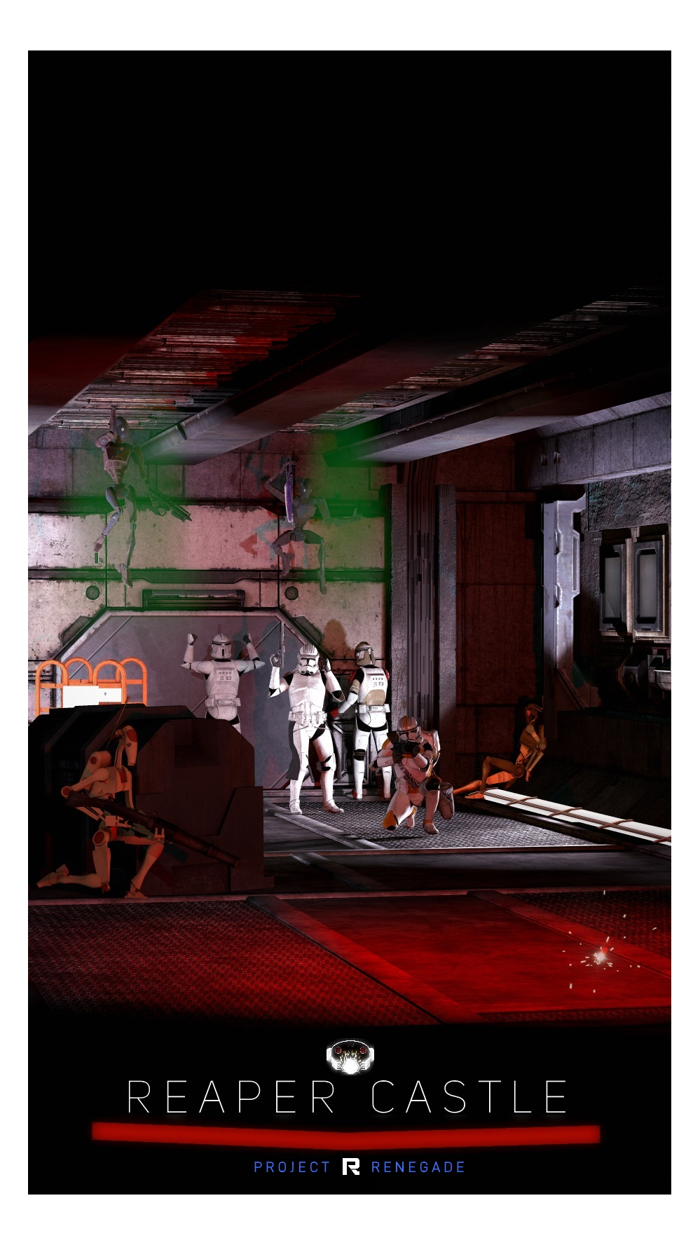
An event poster for SWRP that I made in Autumn, I dont think it ever got used.
D
Deleted member 5162
Guest
Donald J. Trump
King of Nebulous
- Joined
- Feb 25, 2017
- Messages
- 75
- Nebulae
- 212
INB4 Photos are hard to Critique but I shall post them anyways!
Fuji Velvia 50
Hasselblad 500cm
Zeiss Planar 80mm f/2.8
4k Scan - Click Image to see full detail

Fuji Velvia 50
Hasselblad 500cm
Zeiss Planar 80mm f/2.8
4k Scan - Click Image to see full detail
Reactions:
List
Rondal
And whole beasts of nations desire power
- Joined
- Apr 26, 2016
- Messages
- 2,953
- Nebulae
- 5,656

Lokinase
Proton
- Joined
- Nov 19, 2016
- Messages
- 169
- Nebulae
- 407
Danny
Visual Powerhouse
- Joined
- Apr 26, 2016
- Messages
- 1,267
- Nebulae
- 5,181
Happy Sunday my friends,
I’m currently enjoying a holiday in Küblis, and my wifi isn’t fantastic so I may or may not write the review. As just loading this page took a while.
Either one of two things will happen if I don’t get it done:
One of the OTHER JUDGES will write a review.
Or I’ll get back to it as soon as I’m home.
Feel free to create this weeks entries in the mean time, just this review will be late.
Take care, ttyl.
Reactions:
List
- Joined
- Apr 26, 2016
- Messages
- 17,275
- Nebulae
- 24,626
Danny
Visual Powerhouse
- Joined
- Apr 26, 2016
- Messages
- 1,267
- Nebulae
- 5,181
- Joined
- Jul 30, 2017
- Messages
- 7,268
- Nebulae
- 23,748

holiday adi
黑色土人
- Joined
- May 9, 2016
- Messages
- 540
- Nebulae
- 1,229

Danny
Visual Powerhouse
- Joined
- Apr 26, 2016
- Messages
- 1,267
- Nebulae
- 5,181
AOTW / WEEK 8.9/53 / 2020
We fem-punk-garage-indie band music now
I didn't forget, I just thought I'd let it roll around.
I had a great holiday though, other stuff to write at the bottom too.
I get that the light is coming in from the top left, but it's also as if the lamp is inverted? Unless that was the intent but then beneath the lamp isn't lit up either. Confusing. Great scene though, it's just missing some life or proof of lack of life. Difficult to explain but let me try: the bare minimum of life, in any picture that's lacking people is drifting particles of dust. Doesn't need to be dust city, but like something shining in the light rays would really top it off - small consideration anyways. Great work.
Great definition on the image as well but that depth of field ReaLLY StrONG bro it's like this guy in my FACE. Regardless. Cute pic, good exposure, good contrast, good looking hedgehog.
Hell this is a 9.99999/10 image right here.

Now these are some classy images right here.
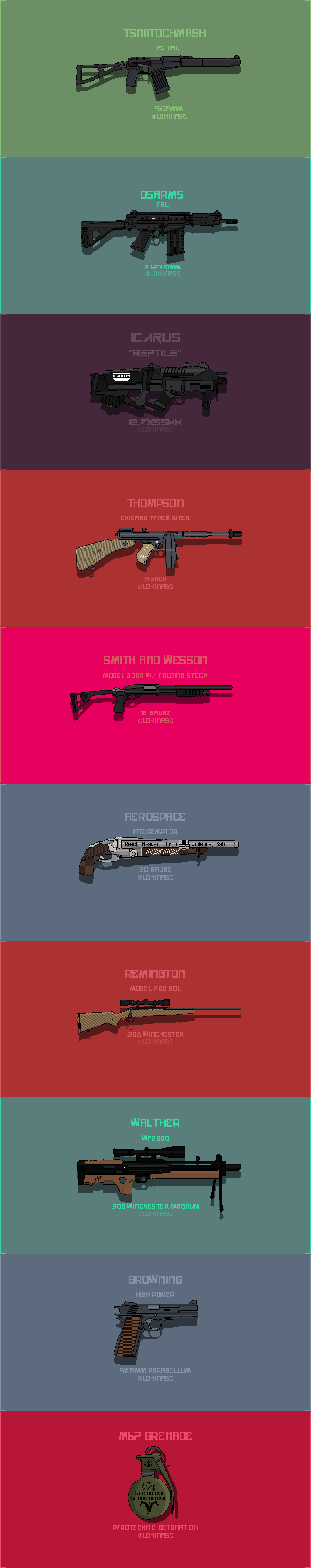
I don't know what they're for, or if they're for anything. But the designs and detail in these pixels are pretty stellar and I love it. Gotta say the best one IMO is the aerospace model shotgun, has some awesome details on there. Great stuff.
Winners... what are you really winning?
You name in bold text?
Well this time @Lokinase is getting the BOLD treatment.
and some 'honour' for @Gaben I suppose.
-

I am now owner of the thread.
Finally. As I am clearly the only REAL judge.
But not for much longer.
@Adi wants to give judging a go. So we're gonna alternate.
He's gonna do the next review.
Great submissions this week guys, sorry this one was late just been mega busy!
Have a good week.
TTYL
- Danny.
We fem-punk-garage-indie band music now
I didn't forget, I just thought I'd let it roll around.
I had a great holiday though, other stuff to write at the bottom too.
Heyyy I remember see this somewhere before. It's old but y'know I don't have an issue with offering some critique anyways from my high horse. First off, it's pretty dark my guy which is a shame because that's really the only thing letting it down: lighting fx. Like, think of how much more KINO and EPIC it would be, if the muzzle flashes/explosions were creating some tangible light on surfaces. I get that realistically they don't produce that much light. But it would compliment the image perfectly.
This is interesting. It's good, great even - but the lighting looks like some kind of optical illusion or mistake (in a good way).
I get that the light is coming in from the top left, but it's also as if the lamp is inverted? Unless that was the intent but then beneath the lamp isn't lit up either. Confusing. Great scene though, it's just missing some life or proof of lack of life. Difficult to explain but let me try: the bare minimum of life, in any picture that's lacking people is drifting particles of dust. Doesn't need to be dust city, but like something shining in the light rays would really top it off - small consideration anyways. Great work.
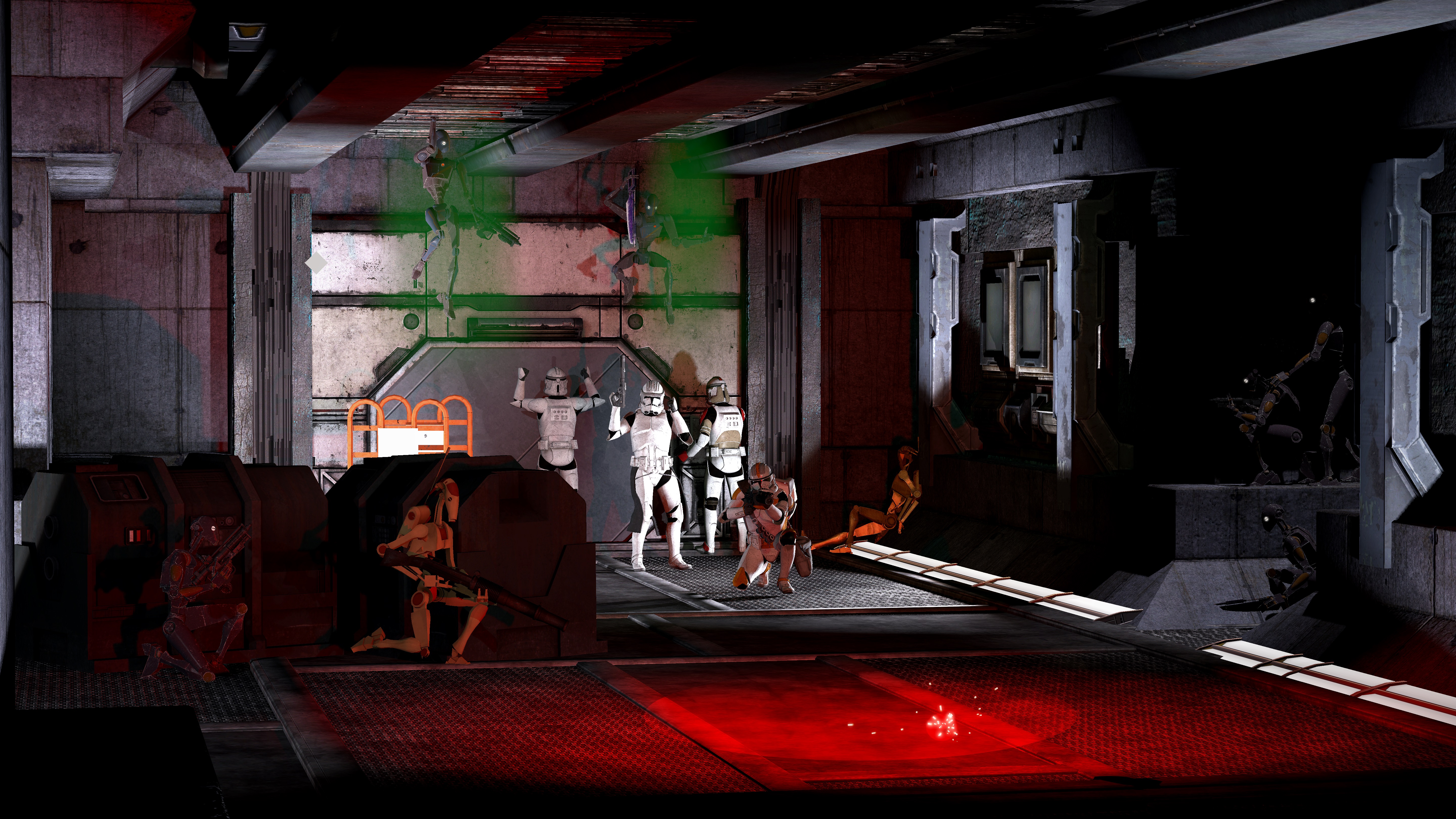
Gotta say I'm impressed Gaben I had no idea you were capable of this. This is great! You have to look a bit in depth to get it, but the postures, positions, lighting is all pretty spot on. Maybe the only thing confusing to me is the green gas but I don't know my star wars very well so maybe that's something I don't understand. I especially like the design(s) at the bottom of the poster version. Great work - if I had to offer any critique it would be just think about having closer angles on posters. Like when things are far away - they look better in a landscape picture. Just makes for easier viewing in posters if the main parts are closer. Coolio.
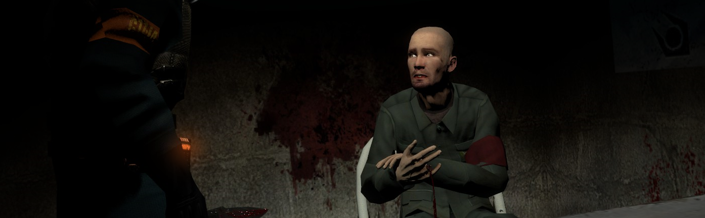
This is good! The facial emotion on the guy is actually spot on and I love it. as well as the finger detail which I didn't spot at first but that's super well done. (Remember our one rule on gore tho in future but this is pretty tame). The letterbox aspect ratio is quite fitting too, especially when taken into consideration for a character bio - only thing I'd have added personally is some way to identify who or what the character is on the left. (I get it's a cp) but a light shining on his back to put a shadow on the wall would put a clear picture in people's minds. Just the small story details and showing of narrative yknow? Great work though.
I love this! For a moment I thought it was that weird reverse kodak film you can get that turns green to red but it really do just be that colour. The way the sun hits the right side and changes the colour of the leaves is awesome. Great consideration of Fstop nd exposure. Love love LOVe.
My guy really got pet hedgehog. Love it.
Great definition on the image as well but that depth of field ReaLLY StrONG bro it's like this guy in my FACE. Regardless. Cute pic, good exposure, good contrast, good looking hedgehog.
Hell this is a 9.99999/10 image right here.
Now these are some classy images right here.
I don't know what they're for, or if they're for anything. But the designs and detail in these pixels are pretty stellar and I love it. Gotta say the best one IMO is the aerospace model shotgun, has some awesome details on there. Great stuff.
I do not fully understand what has happened here, but the portrayal of the scene is pretty good even if the poses are pretty simple, it almost has a bit of a fish eyes lens to it though which doesn't fit well in portrait ration y'know? Noice.
This is pretty metal. I like the mix of colours and neon shines that come off the pillars and stuff. It does really add to the picture seeing how it's a landscape. In a way it really centres my vision in the middle. And the text at the top is very well crafted and considered. But I say this ALL THE TIME. Some posters, and in this case I believe - this picture would benefit from being shorter on the dies and more closed in since there isn't much else to show. Good stuff.
Winners... what are you really winning?
You name in bold text?
Well this time @Lokinase is getting the BOLD treatment.
and some 'honour' for @Gaben I suppose.
-
I am now owner of the thread.
Finally. As I am clearly the only REAL judge.
But not for much longer.
@Adi wants to give judging a go. So we're gonna alternate.
He's gonna do the next review.
Great submissions this week guys, sorry this one was late just been mega busy!
Have a good week.
TTYL
- Danny.
Reactions:
List
D

