M

You are using an out of date browser. It may not display this or other websites correctly.
You should upgrade or use an alternative browser.
You should upgrade or use an alternative browser.
Completed [Competition] Art of The Week
- Thread starter lemon
- Start date
- Status
- Not open for further replies.

Deleted member 374
jesus christ denton
- Joined
- Apr 26, 2016
- Messages
- 11,399
- Nebulae
- 23,204

Piggo
Electron
- Joined
- Jan 24, 2018
- Messages
- 513
- Nebulae
- 680
But all that can happen is that you see the errors of the smoothing, the low poly count and the old texturespersonally i love the hl2 models
gives the pose a gritty demeanour
I mean the bottom right dude is almost smiling
Thats nothing to do with the poser, thats purely the models fault. They're ageing badly and i wish there was a replacement.
Deleted member 374
jesus christ denton
- Joined
- Apr 26, 2016
- Messages
- 11,399
- Nebulae
- 23,204
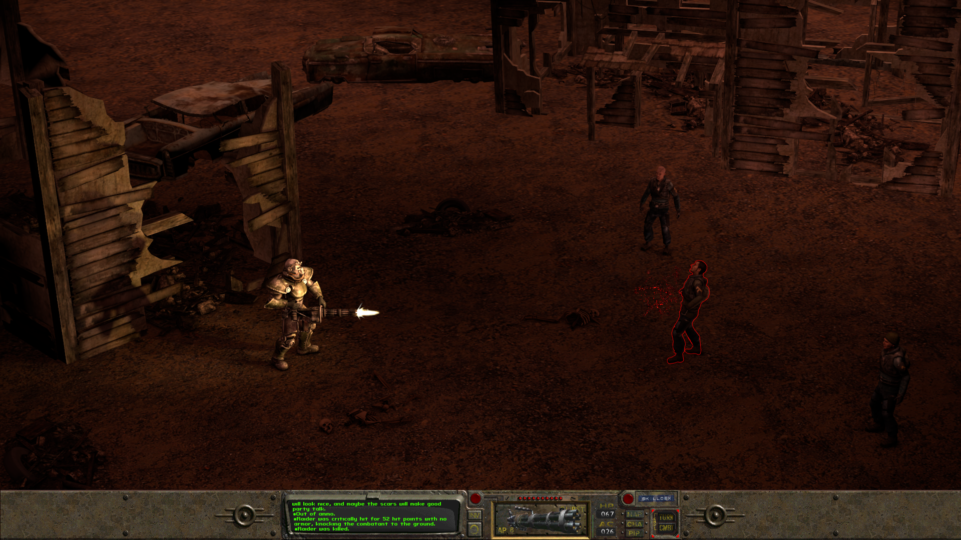
so what's the story? textbook gang violence? smack party gone wrong?
- Joined
- Apr 26, 2016
- Messages
- 25,704
- Nebulae
- 110,631
M
Man wearing a helmet
Guest
so what's the story? textbook gang violence? smack party gone wrong?
don't be askin' me no questions - i only took the picture. you a cop?
liew
Don't Shoot I'm Too Short
- Joined
- Apr 26, 2016
- Messages
- 2,956
- Nebulae
- 5,699

lemon
Sells cheap beer
- Joined
- Apr 26, 2016
- Messages
- 1,426
- Nebulae
- 3,434
3 hours of sleep a day isn't enough I think
@John McRee, a simple, but well done picture. I really like the posing here, for once I’m happy that some ragdolls are stiff, as stalkers shouldn’t be too dynamic. The only “dynamic” one here, is the one in the middle, but even then he feels stiff, with his back very straight. Generally speaking, it’s good, I’ll tell you that. However, I’d say that the lens flare in the middle is a little bit too much. It also feels very artificial, since it only appears in the center, while most of the fire is one the left, where there’s no flare. Either way, overall it’s a well done poster, just with one bigger issue. Neato,

@liew, an interesting piece, yet a little bit dull after looking at it for a while. It has some concept - a guy walking drunk through a deserted street. We've all been there, so it's nice and relatable, but I can't quite see anything other than that, and it's a little shame, considering how much work was put into the environment and lighting. You could've added some beggars, maybe some drug addicts, gangs, whatever you fancy, anything that'd fill it up a bit. I can't say that it's bad though, I'm in love with that lighting, even though it reflects a little weird from the main guy. It's alright overall, something I could see in a comic for example, but not as a front page
@liew, and then you change your entry. Honestly, it's way better and gives me Borderlands vibes, looks like someone has been playing it recently. Eh, fuck it, you get honorary, it's good enough, plus you actually fixed what I had trouble with in your previous pose, without me even complaining. Talent it is I guess,

@Dinguss, a straightforward screenshot, but I'll agree it's made well. Wouldn't put it as a wallpaper, but yeah, it's alright
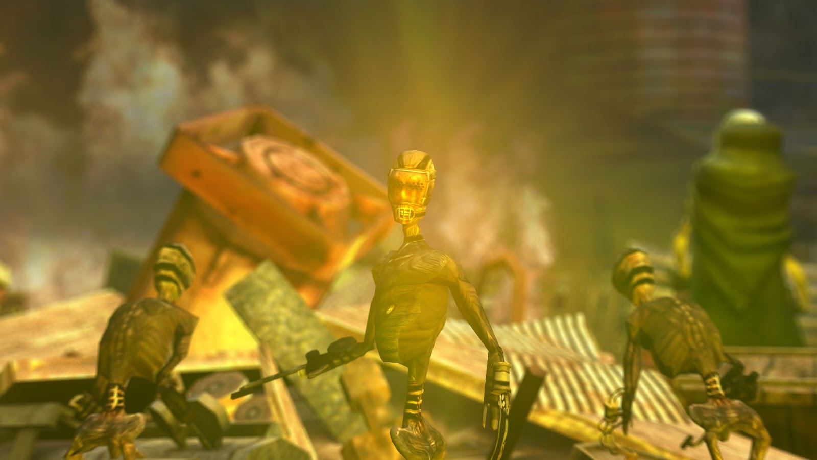
@shibe, @karl-police, sometimes the greatest of minds come together to form a miracle of an art. I'm literally speechless, and I'd give you the LemonPunch Goodiebag if we'd still have them
on a serious note tho, Boi as much decent as it's dead, so I can give it a thumbs up. That hunter though looks like it had a stroke, or something, but honestly, that's better drawing than I'd do, so I'm positive about this one too
@Lokinase, very good DLC, especially for it's price. It's simple, but effective and I think it should stay just as that: a simple and nice looking poster, with pleasingly looking colors.


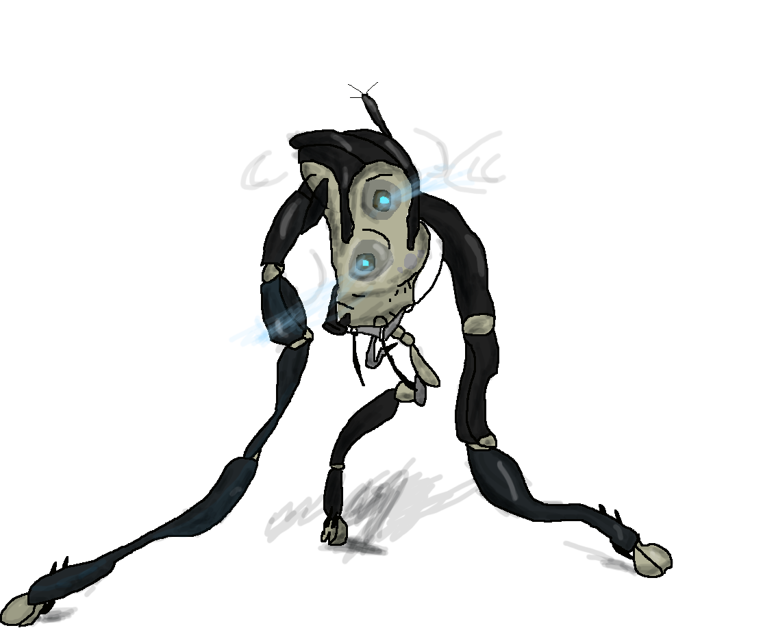
And the goldie: @Piggo, who is lucky I’m in a good mood rn, so I actually chose what
he discarded, because it was simply way better, as it's modeling afterall

@John McRee, a simple, but well done picture. I really like the posing here, for once I’m happy that some ragdolls are stiff, as stalkers shouldn’t be too dynamic. The only “dynamic” one here, is the one in the middle, but even then he feels stiff, with his back very straight. Generally speaking, it’s good, I’ll tell you that. However, I’d say that the lens flare in the middle is a little bit too much. It also feels very artificial, since it only appears in the center, while most of the fire is one the left, where there’s no flare. Either way, overall it’s a well done poster, just with one bigger issue. Neato,

@liew, an interesting piece, yet a little bit dull after looking at it for a while. It has some concept - a guy walking drunk through a deserted street. We've all been there, so it's nice and relatable, but I can't quite see anything other than that, and it's a little shame, considering how much work was put into the environment and lighting. You could've added some beggars, maybe some drug addicts, gangs, whatever you fancy, anything that'd fill it up a bit. I can't say that it's bad though, I'm in love with that lighting, even though it reflects a little weird from the main guy. It's alright overall, something I could see in a comic for example, but not as a front page
@liew, and then you change your entry. Honestly, it's way better and gives me Borderlands vibes, looks like someone has been playing it recently. Eh, fuck it, you get honorary, it's good enough, plus you actually fixed what I had trouble with in your previous pose, without me even complaining. Talent it is I guess,

@Dinguss, a straightforward screenshot, but I'll agree it's made well. Wouldn't put it as a wallpaper, but yeah, it's alright

@shibe, @karl-police, sometimes the greatest of minds come together to form a miracle of an art. I'm literally speechless, and I'd give you the LemonPunch Goodiebag if we'd still have them
on a serious note tho, Boi as much decent as it's dead, so I can give it a thumbs up. That hunter though looks like it had a stroke, or something, but honestly, that's better drawing than I'd do, so I'm positive about this one too

@Lokinase, very good DLC, especially for it's price. It's simple, but effective and I think it should stay just as that: a simple and nice looking poster, with pleasingly looking colors.
So ye, here are your big guys, starting with the honorary:
@dee pixel, @goose, @Dicknose, @liew
@dee pixel, @goose, @Dicknose, @liew
And the goldie: @Piggo, who is lucky I’m in a good mood rn, so I actually chose what
he discarded, because it was simply way better, as it's modeling afterall
Last edited:
Reactions:
List
Deleted member 374
jesus christ denton
- Joined
- Apr 26, 2016
- Messages
- 11,399
- Nebulae
- 23,204
lemon
Sells cheap beer
- Joined
- Apr 26, 2016
- Messages
- 1,426
- Nebulae
- 3,434
shibe
Molecule
- Joined
- Apr 26, 2016
- Messages
- 4,646
- Nebulae
- 8,995
mfw im rated with the god karl as a pair3 hours of sleep a day isn't enough I think
@John McRee, a simple, but well done picture. I really like the posing here, for once I’m happy that some ragdolls are stiff, as stalkers shouldn’t be too dynamic. The only “dynamic” one here, is the one in the middle, but even then he feels stiff, with his back very straight. Generally speaking, it’s good, I’ll tell you that. However, I’d say that the lens flare in the middle is a little bit too much. It also feels very artificial, since it only appears in the center, while most of the fire is one the left, where there’s no flare. Either way, overall it’s a well done poster, just with one bigger issue. Neato,
@liew, an interesting piece, yet a little bit dull after looking at it for a while. It has some concept - a guy walking drunk through a deserted street. We've all been there, so it's nice and relatable, but I can't quite see anything other than that, and it's a little shame, considering how much work was put into the environment and lighting. You could've added some beggars, maybe some drug addicts, gangs, whatever you fancy, anything that'd fill it up a bit. I can't say that it's bad though, I'm in love with that lighting, even though it reflects a little weird from the main guy. It's alright overall, something I could see in a comic for example, but not as a front page
@liew, and then you change your entry. Honestly, it's way better and gives me Borderlands vibes, looks like someone has been playing it recently. Eh, fuck it, you get honorary, it's good enough, plus you actually fixed what I had trouble with in your previous pose, without me even complaining. Talent it is I guess,
@Dinguss, a straightforward screenshot, but I'll agree it's made well. Wouldn't put it as a wallpaper, but yeah, it's alright
@shibe, @karl-police, sometimes the greatest of minds come together to form a miracle of an art. I'm literally speechless, and I'd give you the LemonPunch Goodiebag if we'd still have them
on a serious note tho, Boi as much decent as it's dead, so I can give it a thumbs up. That hunter though looks like it had a stroke, or something, but honestly, that's better drawing than I'd do, so I'm positive about this one too
@Lokinase, very good DLC, especially for it's price. It's simple, but effective and I think it should stay just as that: a simple and nice looking poster, with pleasingly looking colors.
So ye, here are your big guys, starting with the honorary:
@dee pixel, @goose, @Dicknose, @liew
And the goldie: @Piggo, who is lucky I’m in a good mood rn, so I actually chose what
he discarded, because it was simply way better, as it's modeling afterall
our love is like a chocolate bar left in a slav bar
Reactions:
List
Dicknose
Whatever happens, happens.
- Joined
- Oct 11, 2016
- Messages
- 2,048
- Nebulae
- 1,632
Piggo
Electron
- Joined
- Jan 24, 2018
- Messages
- 513
- Nebulae
- 680

- Status
- Not open for further replies.