Because it's Christmas next week, I'll be gone for obvious reasons. Have a good one guys
@Dallahan, since it's just a screenshot you took, I can't really give you the credit for it. I gotta admit though, while Ready Player One was meh, this scene looked awesome, and whoever made it into a real thing here deserves a
I give a review on your drawing later on, just wanted to stick this one here
@Corey,
@John McRee summed it up nicely, although you can skip the "rule of thirds" part:
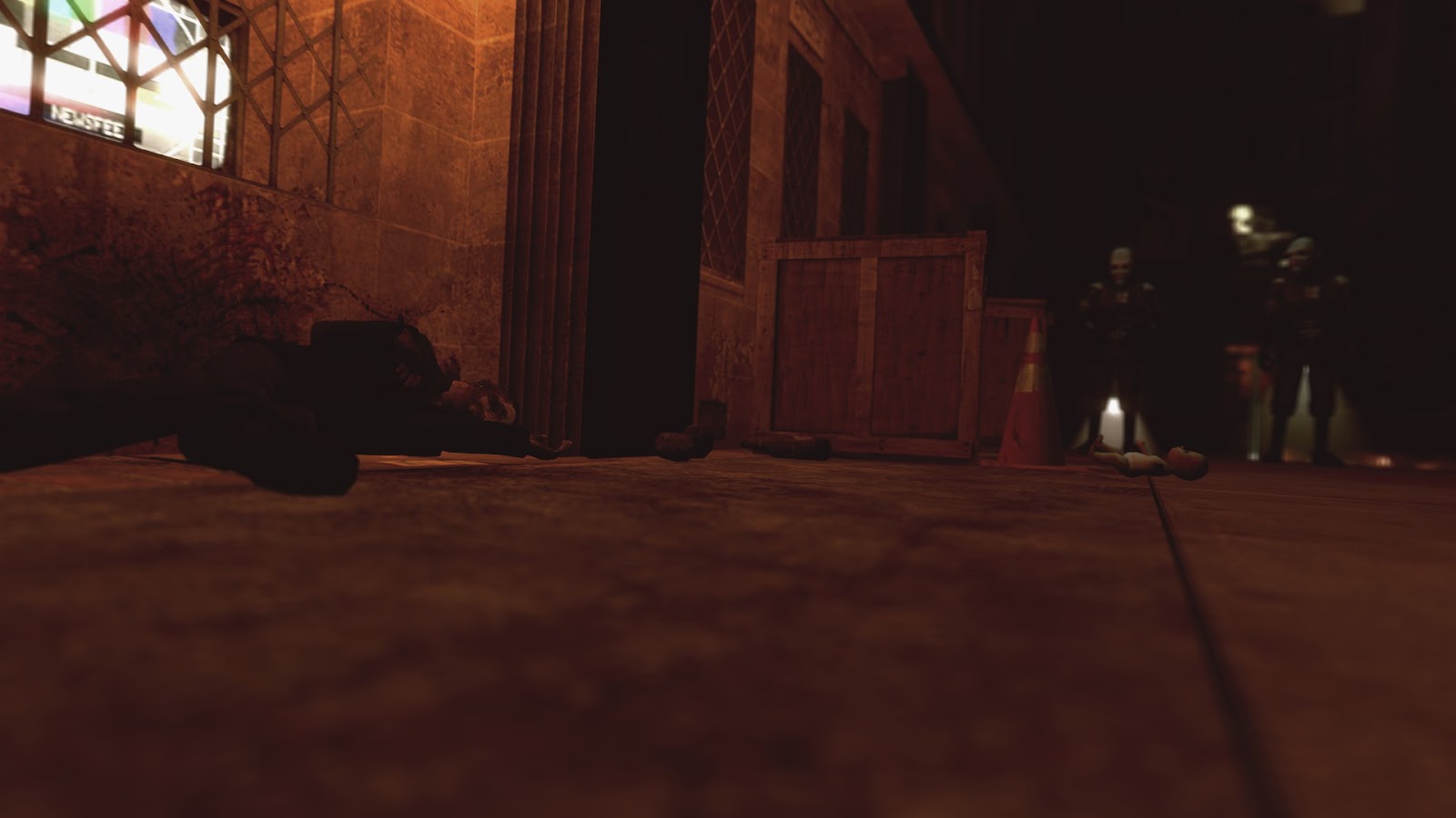
my dude, you need to add better lighting.
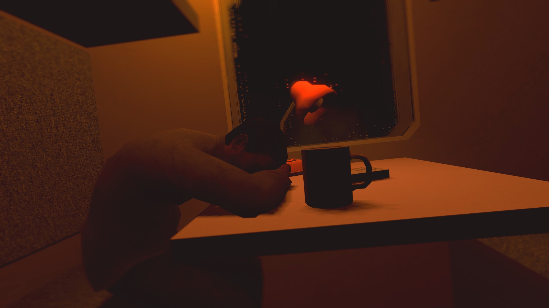
There's clearly a warm light above the body, yet the body is barely even touched with it. It makes sense if he was brighter, and would help with the focus a hell of a lot more. Also, you should consider the rule of thirds (picture-wise) in this, because he's not really in that area. It feels like the crate is what we should be focusing on. Little gripe here, too, but the DoF on the CPs is a bit too weak so all it does it just look blurred rather than in the distance, and the TV right next to the dead guy has no actual light projected around it. Just some static, simple white or bluish light would work but it just ain't here chief. Also make sure you get your angles in check, cos the horizon is pretty off there and it feels weird.
also if you're emphasising a dead guy in a corner, do a shot of the alleyway and have the dead guy land in a third of the picture at the side. trust me, it'll look nice.
I'd also move that camera up a notch, half of the screen is just ground. Rest just as John said and it'll be grrreat
@egg, I was about to write something about your previous poster, something about how dark it was and now you present me with this. The good thing is, it's better, I see some concept here. The bad thing, it's boring. It looks as if you'd just zoom in on some poster and apply text, it's incomplete. Idk, I approve the minimalism, but this is a bit too much of it
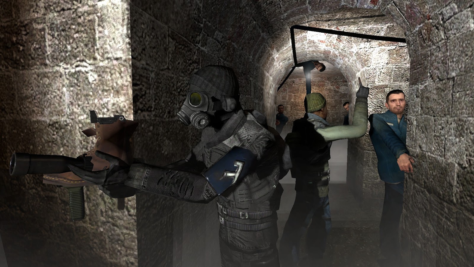
@ConstantDisplay, I actually told you before what I'd improve here, but imma do it again. Imo, it needs few more ragdolls there, few more characters to give it a bit more life. I'd also move the camera a bit more to the back, so we could for example see what that lady on left is doing there, plus it'd give the viewer a bigger perspective. Other than that, it's pretty cool, I really like what you do with the shadows
@aphoticDeception, I'll guide you to our
guide list for more in-depth advices, but here's what I think. First of all, I'd spend a bit more time with posing, a generally good tip when it comes to it, is that you should try to get in the desirable pose first in real life to see how your character should bend and which muscles should he use to actually look realistic. Then, I'd highly suggest you to play with fingerposing and faceposing. as they're so important, that if left unchecked, can literally take you out of the picture and make it look as if no thought was put into your poster. Also, light is generally speaking very rarely pure white, play around with colors and see which fit the picture the most in your opinion.
@Lokinase, you're improving at such a fast pace, that I currently have no option than to just give you a
, because I'd like to put a spotlight on few other individuals, rather than to give you another win. This one is just spot on, congrats fam
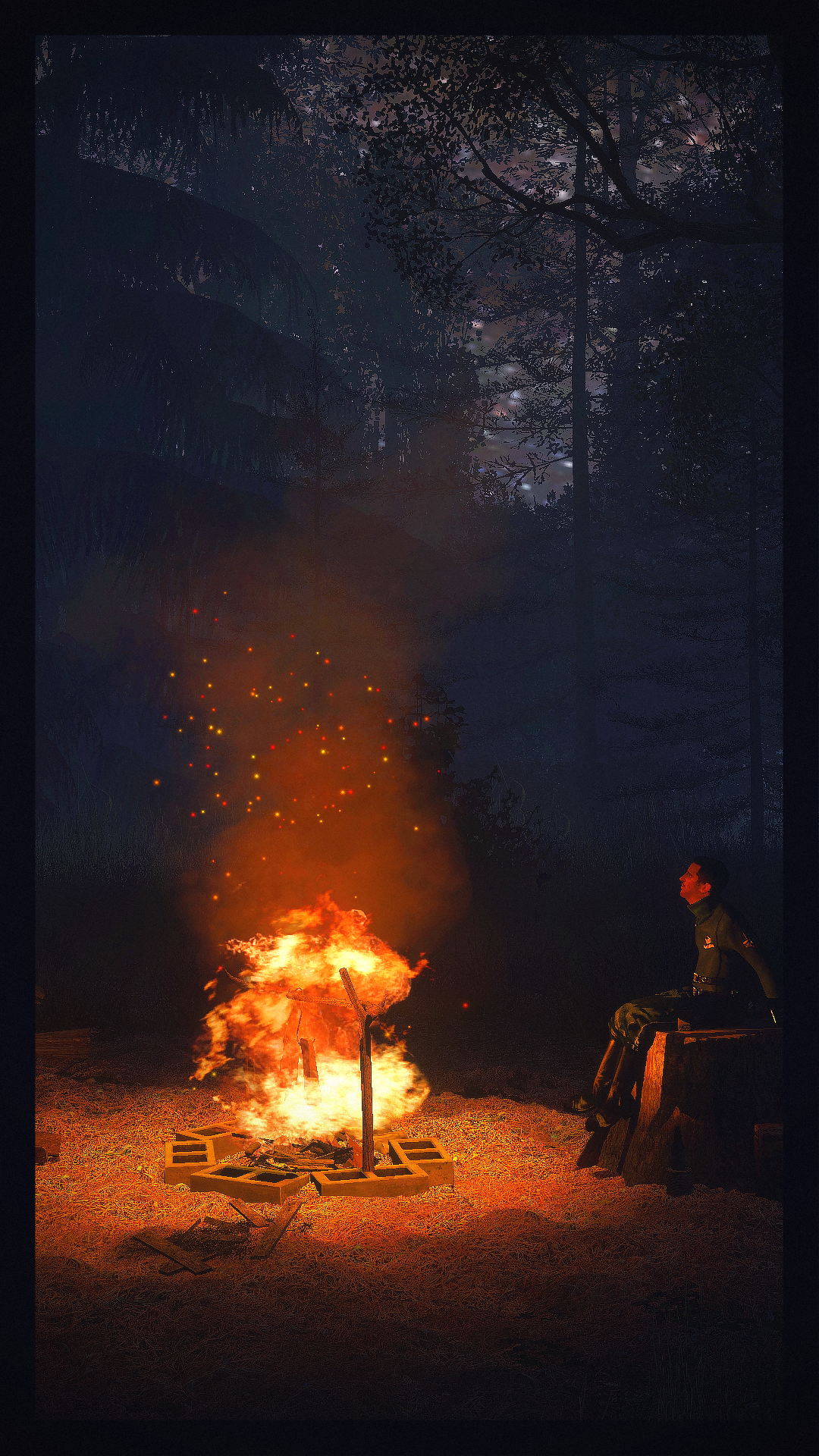
@Antloin, that's a very experimental picture coming from you. Vertical posters can be tricky to pull of, but you did it decently, I especially like these fire embers and the sky. However, there's one, really big issue here, and that is very low resolution on the materials in it, and that includes fire, ground, sky, and the render itself. If you'd bump those render settings up (which I think is explained how to in one of the Gmod guides) you'd end up with a much better picture. Other than that though, I honestly love it and can't wait to see more, both the framing and lighting is spot on. This is probably your best one, and definitely deserves a
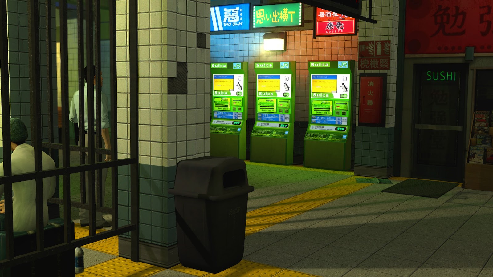
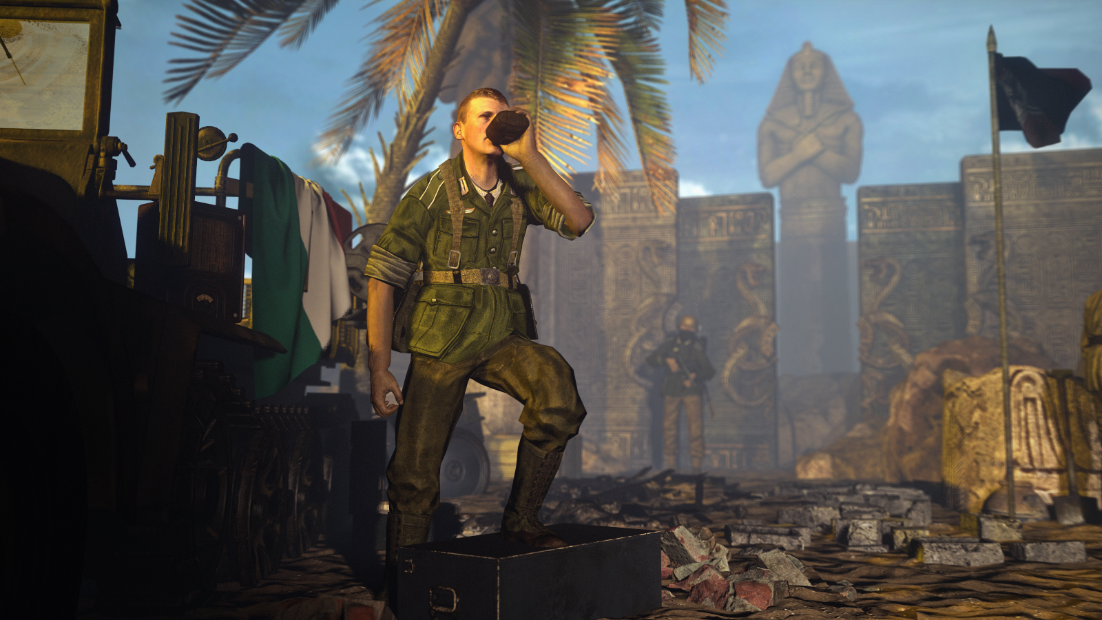
@liew, simple in concept, but well done overall, this poster could be a nice loading screen for some Gmod server. It's one of these pictures that isn't overly too exciting to look at, but with some context, like a paragraph of story underneath it, does really well. In technical terms, it's quite well posed, I just see this guy's left foot going through the box it's placed on, plus his hips look a bit weird, but it isn't too distracting. I give this one 7/10, with a possibility of 9/10 if it'd come with the story I was talking about earlier.
@Piggo, the fuck is this swearword doing here bud
I obviously give you
because of the posing and lighting, but honestly, your poses have gotten a little bit stale lately, at least the ones you post here. I hate jungles, plus I want to see more action man
@Corey, that's a bit empty poster mate, I'd add more stuff here, and move the camera further back to give you more space for the said stuff
@fermii socii, I was really close to giving this one a honorary, but after a bit of thought, I decided to just give you
, here's why. First off, I'd like to point out that these shadows, lighting and posing combined with a really good framing make it look like a vertical photo with a flash, which is very fucking good. I also like the quality of water and that there are a few buildings in the back, so it looks even less artificial. However, the quality of the picture is less than needed to be actually pleasurable to look at, plus it is a recreation of an already exiting art. However, despite these two issues, you have more than enough for a
, but I won't give you any win
yet. Don't want you to get too cocky with winning on the debut
@Neythi, you're getting better at this fam. Others said that you should remove the splatter from that knife wound, but honestly, it wasn't too bad, plus now it looks just like a little, red dot. I'd add far more blood on that blue shirt, plus move the knife far deeper into him. Aside from that though, it's a very solid picture with good lighting and posing. I also see some circle on the green shirt guy's head, but I have no idea if that's some reference to Detroit: Become Human, or just something not important at all. 8.5/10 on this one, very nice,
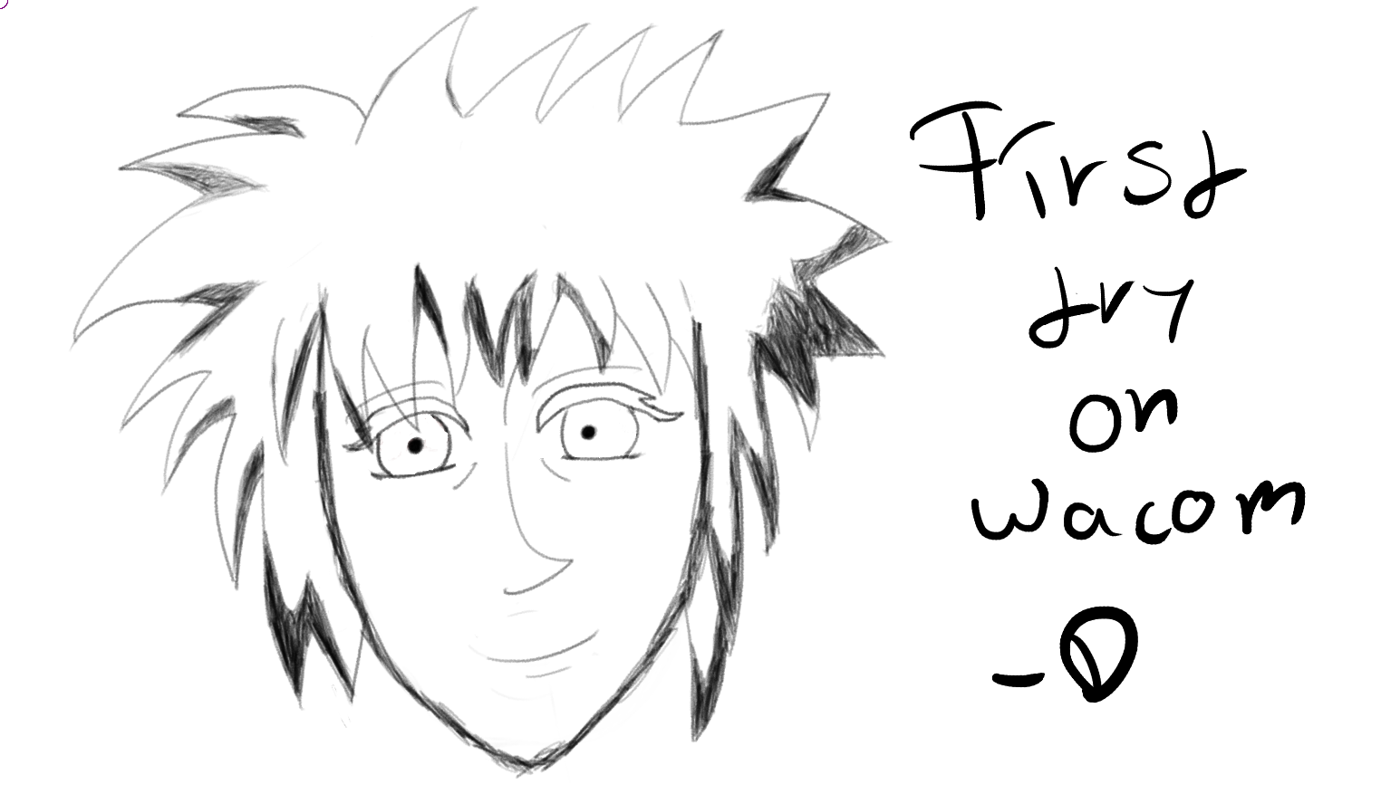
@Dallahan, not a drawings guy, as I often say, but as for a first ty it's not too shabby at all. However, I would add a little bit of shadowing here and there, especially on the cheeks and nose, as the picture seems really flat now. Also, as
@RGB once said, doing lots of lines instead of just one is alright for beginners, but looks worse than the second one. Also, add more black, it's a bit too bright right now, compared to the text beside it. Nice for a first try though, how much did the Wacom cost you? I was actually thinking about buying one
@Mizaye, love ya bb. I think it's pretty good, just that the couch is taking a bit too much space, I guess.
otherwise
@aphoticDeception, as above, I direct you to our
guides, they hold a ton of fun stuff and colorful pictures. This one is pose made out of pure fun, and I really like those. Even if amateur and clearly incomplete/lacking of quality, it's nice to look at, reminds me of the good old times. Before I get too sentimental here, let me give you a an advice: look at other people's poses/movie posters/comics, as they can show you a ton of great scenes that you can try to reproduce and learn a lot in the process. Just write "movie scene" in Google Pictures and try to recreate one of them, preferably something more ambitious than just a portrait, although these teach you a lot about faceposing and lighting as well. Good luck mang, there isn't that much you need to learn now, especially that you seem to grasp the basics of posing and framing
And the winners I almost forgot to put in are:
First, best place: @Pale Rider
Pure originality, I'm honestly amazed on how something so simple can look so good
Second, and third, and fourth, and fifth places:
@John McRee, @Dicknose, @Elan, @Lambda Coyote
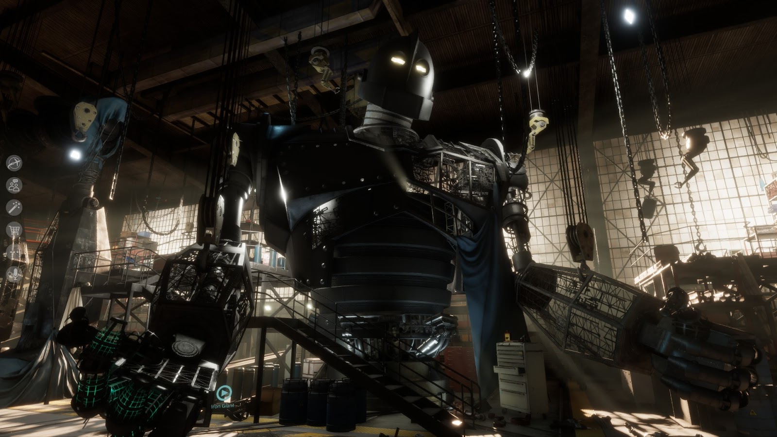
I honestly have troubles with saying if this one is a photo,
or a Gmod pose, or a combination of both. Well done
Follow me on Reddit fam
Coming back with style I see. They should pay you for that, if they aren't already
Although it's fairly basic, the lighting gives this one a very good atmosphere.
Nice framing and posing as well, I just couldn't stop myself for giving
you a silver for this poster
See you in two weeks, I'm off to eat some pierogi and bigos
Merry Christmas you all