I think we gotta disqualify from winning some time else he's just gonna win every week. We got another show-off here huh. Really though, your composition and use of lighting has come through hugely in the last few weeks and it's taken you from good but flat poses to some of the best pics not just as poses but as fully realised images that could totally stand on their own.
Finally some original material from me, nothing special really, but I tried. Never really pose that often unless I‘m really bored. Here ya go.
Nice pose, interesting filter, but it's got a lot of grain and doesn't really evoke much of anything. I enjoy the work but I don't really know what I'm looking at, and with it being so much of one-tone it doesn't work out much as pic I wanna see a lot of either.
Im back with more crappy photos and I will never leave until I win UwU
I don't know enough about photography to critique the finer points but your depth of field is a little off here, subject is a little out of focus. Colours and composition are otherwise real neat.
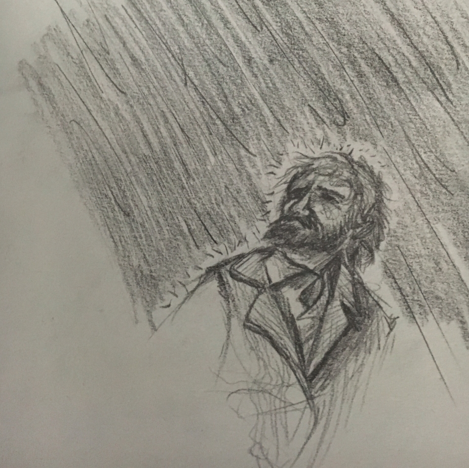
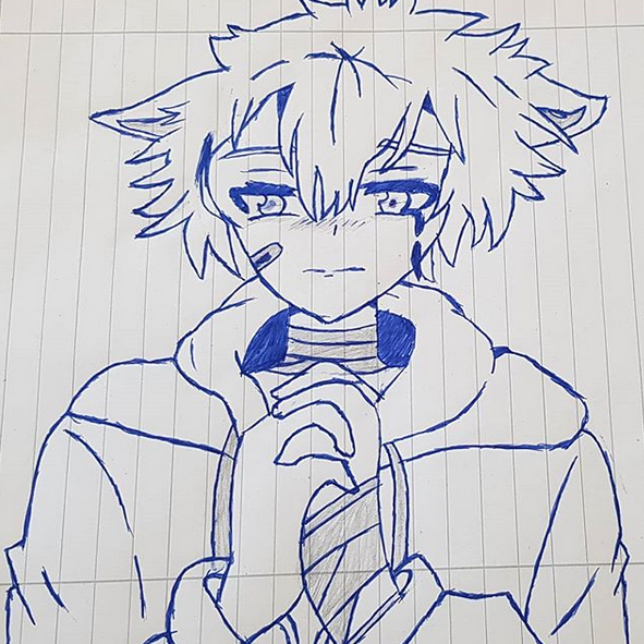
Real simple. Real solid. Being drawn roughly on paper and pencil worked well for the idea.
idk if there's a theme but i'm fairly satisfied with this one
This is a real nice edit and if it wasn't for the one off-coloured section on the left side, second panel down, this'd get real high marks and might be my pick of the weel. That one panel being the wrong shade for no discernable reason upsets the composition. If it's intentional I can't see why. I have no feedback otherwise on how to improve because it's real nice work.
Ey there ! It's been a while since I've made something of a sort like this but meh..what the hell :). (PS: Is me , MisterEasy for those who remember me)
A very clearly-understood and well-defined pose. Simple but functional lighting. The colour palette is a little bland and make the pic very drab without anything else to really lift it up. There's nothing technically wrong with it, but also nothing that makes it pop out.
I forgot to put this when I finished it this week
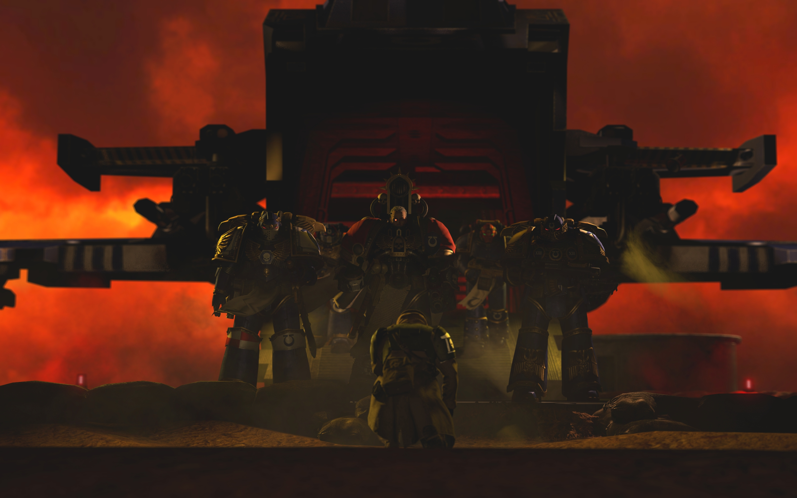
Too flat, too simple, and the shading is too weak and should be beefed up to be darker. The sky needs more vibrancy and richness, and the dirt needs to look like dirt, with a little more rippling texture and grit. That wouldn't be such a big deal if it wasn't the entire image's focus, so instead it really stands out here. Human is a little stiff, likely attributed to their armour, but still a problem area.
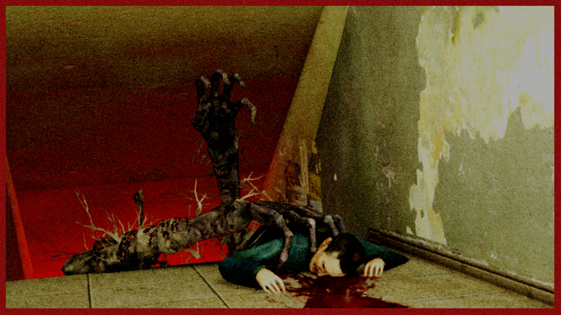
started off as just a chernobyl theme picture inspired by that new series, turned out into a stalker themed one
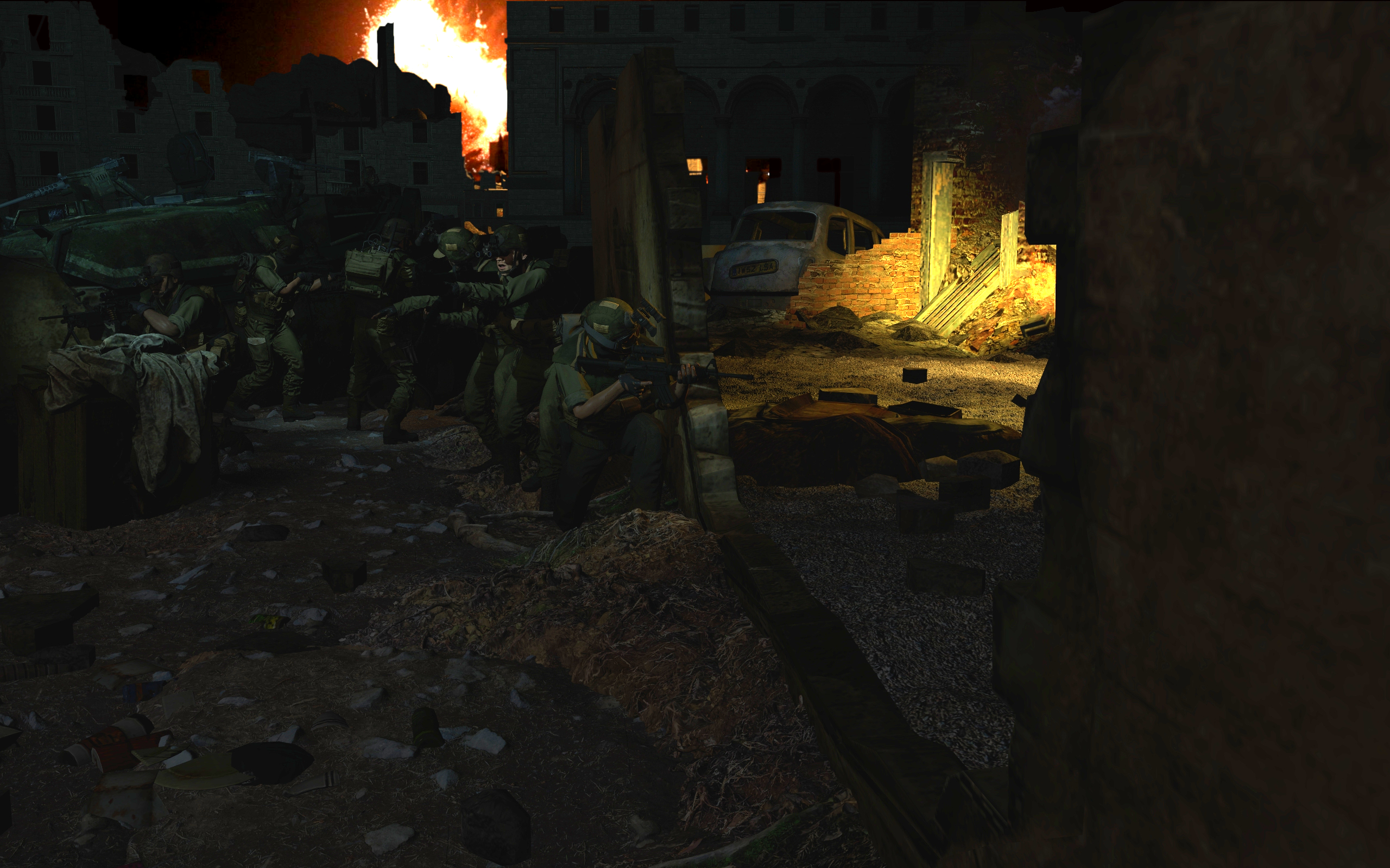
Ah jeez, this one's hard to critique because it's real well-done, but what stands out to me as an issue, if there is any at all, is the characters themselves don't quite look like they're part of their environment. They look very much dropped into place. There's almost an outline around them, and their lighting is just a touch off from the environment.
Battle of the wide angles
@MaXenzie submit something so we can have a lethal 3 way AoTW with G like old times.
Wow lame
Guess it's landscape theme
The only thing that kills this pic is the competition. Your models are, of course, dated. The lighting is a little weak and the saturation could be boosted, but it's real solid.
Hey you don't get two entries. Also it's another pic that'd win automatically. Again that use of lighting has really paid off.
Anyway I think it's real hard to pick a winner, we got a lot of solid pics, but I'm going with
@Dudu Fadende because the man's a machine at pumping these out at a phenomenal rate, and his rate of improvement has been pretty impressive. His work's quality rivals some of the others here, neck and neck, and I say he's probably won out because posing his figures, the way he does, to make them all so dynamic andas if captured in-motion is pretty exhaustive and impressive.
My runner-up picks are
@fosset @Danny and
@Neythi all as joint-second, because they're all amazing landscape images.
I guess it really was landscape week.
Now, unless anyone stops me I'm gonna call it a cool dogs doing things dogs shouldn't be doing themed week.