Danny
Visual Powerhouse
- Joined
- Apr 26, 2016
- Messages
- 1,267
- Nebulae
- 5,181
Here we gooo
When I scroll up a down really fast it feels like an illusion.
This is nice, I like the colours you used but I am severely angry with how the text just cuts off at either side. Don't think I've ever been this upset in my life. Also; layering text on text = bad idea. Unless the colours are like TOTALLY different ends of the spectrum it's always cool to have a barrier behind the main line of text - I know you tried with the combine symbol but it was no a good idea to lower opacity to like 30%, the barriers are important!!!! Nice work though, feel like with refinement this woulda been coolio.
I like this, this is real nice. Simple poses with one guy in though should have some classy thought. Only two things to criticise here. One, the back posture because idk if you've ever tried sitting like that but your neck would come forward a bit. Mate here looks stiff as a board for someone aboutta die maybe. The hands and wrists of everything else looks good. Two, the black boxes on either side when shifting lines of the picture is avoided by just cropping the picture in a little OR instead of moving a part of the picture, you just stretch it on either side :^), trade secrets here. Unless you wanted the black boxes, which they're ok just make ofr a messy border sometimes.
This really is a spoopy looking picture, all I woulda wished for is some really edgy lighting. I really like how the picture reads, as if that first man died, and the killer/thing is going for the next person (assuming the camera is the next person). And the eyes are like the reaction of that person and I have never really seen that be done here before. Very nice stuff but as I mentioned; lighting.
My Winning Vote: @Piggo

Honourable Vote for "One Billion Neb Points": @Neythi

-
Don't agree with my criticism? Sorry? Idk.
Hope whatever I said was useful to you guys!
Have a good week and good luck with your next submissions!
Woah. You're mental to be breaking down artistic boundaries like this ;^).

I am not quite an expert at drawing, so I hope my rather amateur outlook on this drawing gives some good queues. I have zero idea what is going on; at first I thought they were taking cover from a blast or something. Then I saw the shadows on the rocks behind, then I realised there's a campfire behind the one on the right and so I thought are they falling down onto something? But the one on the left has a hand stretched out, idk my guy. You're really good at drawing, just can't tell if this is like a scene or just an example of nice illustration :v.

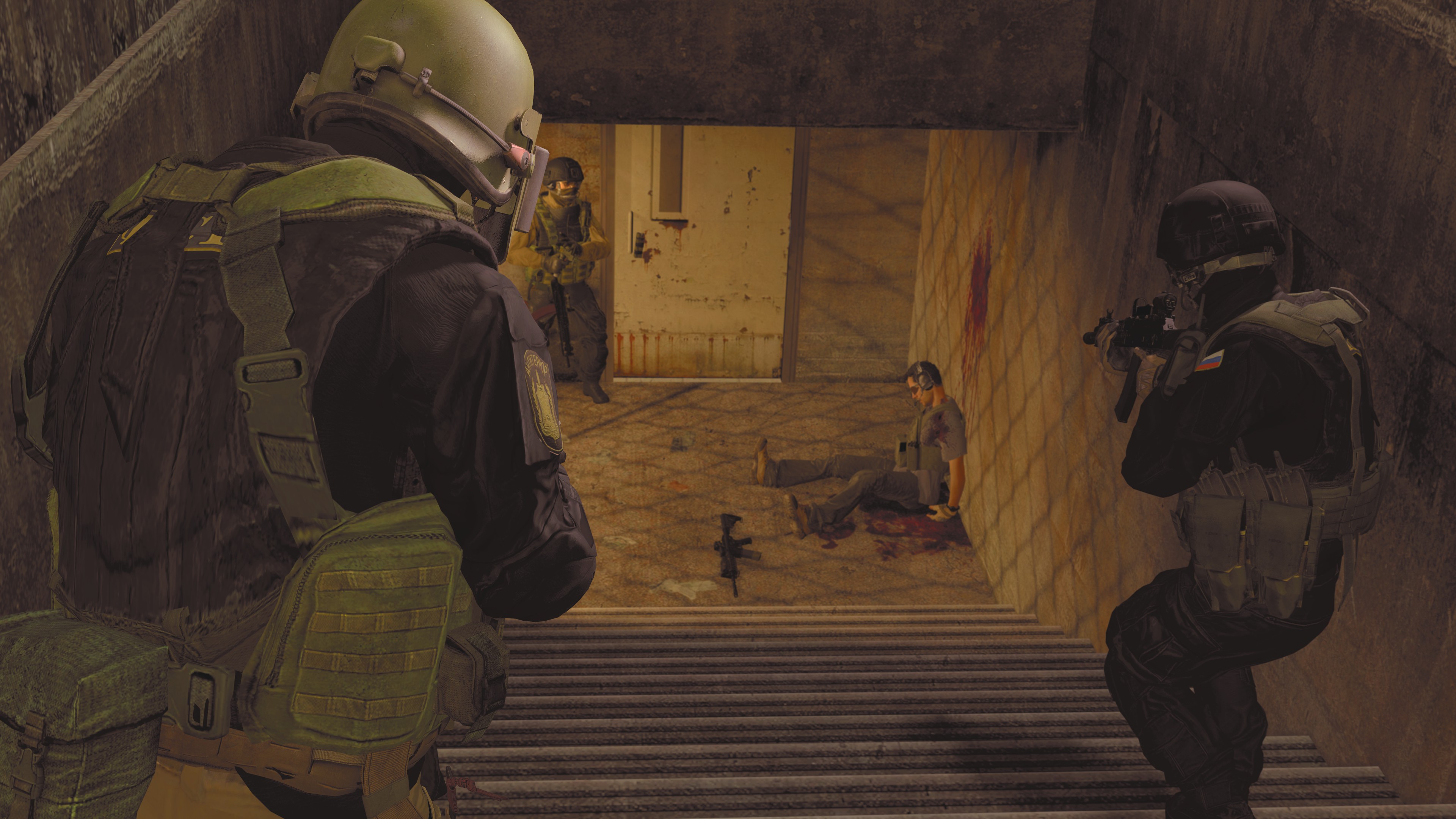
This is really good! At first I was like wow lightings a bit meh, but the ambience of the picture really sells it and the level of consistency is really good! Not to mention the walk downstairs while holding a gun pose which to me is like the most difficult type of posture to make. I would've added some extra minor details, like just some loose props or light from under the door but the simplicity is really nice as well. Always something more to consider sometimes.
This is pretty jazzy and I do love it, but for the sake of criticism I'll be nit picking, just a couple design gripes:
- Box Resolutions
- They're ok, and this is great believe me - but poster designs in a box are typically meant to be either really full or quite empty, not so much as a mix of both like we have here. With some structure along the bottom and then free'd up high (I recognise this can sound stupid, but box designs are like the difference between a GOOD album cover and a bad one, for a weird analogy). If the poster were a bit narrower you could add more layers of buildings along the bottom and allow for the negative space with text above and it would probably flow as a picture better.
- Colour Consistency
- Again, nit picking - colour work is fantastic but there are two minor inconsistencies, one of which I reckon you've got away with quite nicely - maybe it's intentional idk. The second man forward, the one that is NOT dead - has a colour which doesn't correlate with any layer of the picture such as the first man. The second thing, is how nothing in the picture has any clear shading besides the citadel but I think you got away with it quite nicely really. A bonus critique: Would've been cool if the blood on the sword was the same red as the text or vice versa; but I am just a strong believer in "the fewer colours the better".
Ravoux huh? Like the painting?

When I scroll up a down really fast it feels like an illusion.
This is nice, I like the colours you used but I am severely angry with how the text just cuts off at either side. Don't think I've ever been this upset in my life. Also; layering text on text = bad idea. Unless the colours are like TOTALLY different ends of the spectrum it's always cool to have a barrier behind the main line of text - I know you tried with the combine symbol but it was no a good idea to lower opacity to like 30%, the barriers are important!!!! Nice work though, feel like with refinement this woulda been coolio.
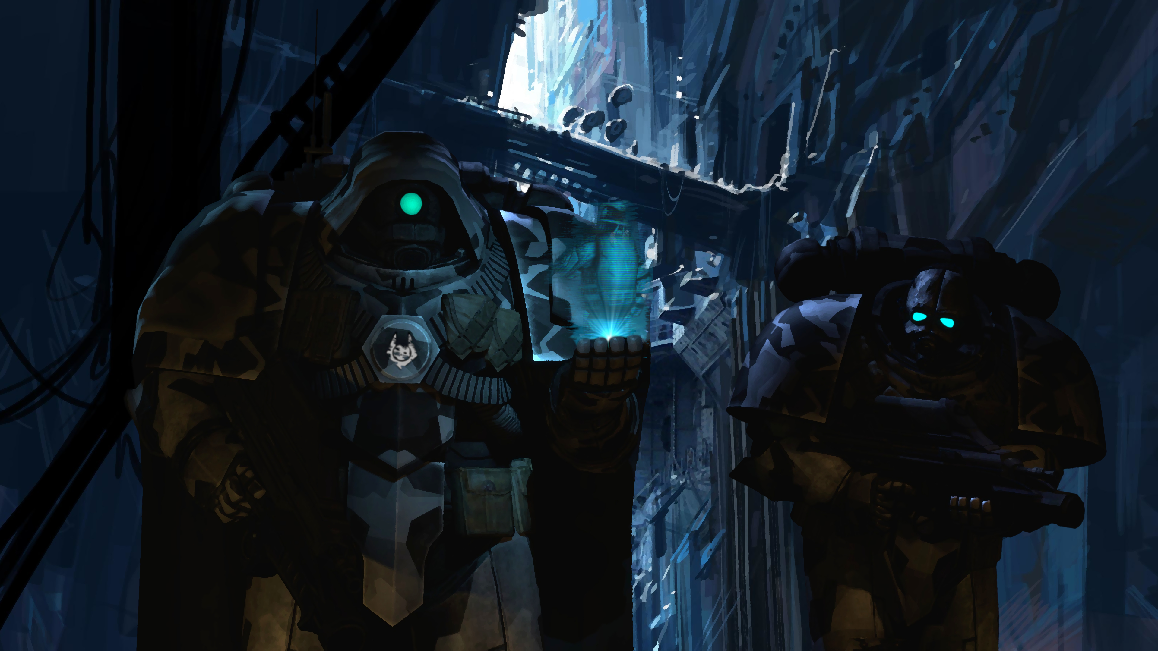
Ah, great - another metal gear guy. An amazing angle; and I'm a good lover of the "use part of the picture as a border" technique, haven't seen that since nam. The colouring is super good as well as you can see most of the pose outside even though is dim so looks like a lot of thought went into that. I got no problemo with this one, nice work piggy.
Re TRo WaVe IS mY Lif E

I like this, this is real nice. Simple poses with one guy in though should have some classy thought. Only two things to criticise here. One, the back posture because idk if you've ever tried sitting like that but your neck would come forward a bit. Mate here looks stiff as a board for someone aboutta die maybe. The hands and wrists of everything else looks good. Two, the black boxes on either side when shifting lines of the picture is avoided by just cropping the picture in a little OR instead of moving a part of the picture, you just stretch it on either side :^), trade secrets here. Unless you wanted the black boxes, which they're ok just make ofr a messy border sometimes.
Cursed 4chan images.

This really is a spoopy looking picture, all I woulda wished for is some really edgy lighting. I really like how the picture reads, as if that first man died, and the killer/thing is going for the next person (assuming the camera is the next person). And the eyes are like the reaction of that person and I have never really seen that be done here before. Very nice stuff but as I mentioned; lighting.
Just a couple things. This is a really nicely coloured picture and I like the vibes, but why shadow the text and stuff when it's perfectly readable anyways? Might've looked better shaded if it wasn't such a harsh black into the picture but I think it would've been good without the shadow and down a size or two. Only other thing is the two men in the bottom, from that angle it looks a little out of place but if you had put them (or try putting them) towards the centre of the picture on that ledge and scale their size down for the perspective they'd be ok!!! Keep it up though, it is hard to blend poses to a real picture!!!

My Winning Vote: @Piggo
Honourable Vote for "One Billion Neb Points": @Neythi
-
Don't agree with my criticism? Sorry? Idk.
Hope whatever I said was useful to you guys!
Have a good week and good luck with your next submissions!
Reactions:
List