>Luna
Proton
- Joined
- Aug 13, 2017
- Messages
- 191
- Nebulae
- 815
Wait, no, i wish to change my entry:
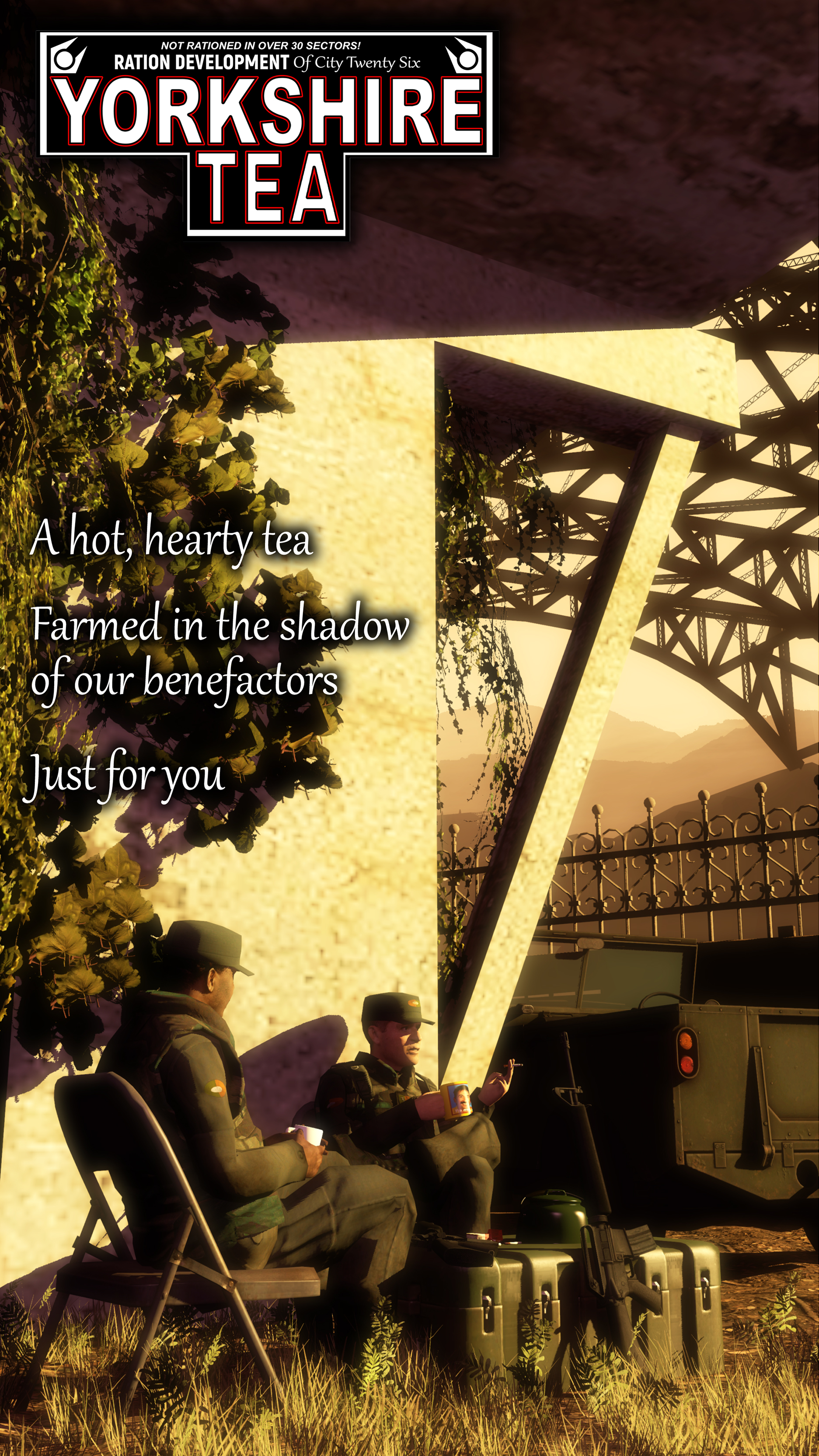
got some constructive criticism nobody asked for :0 i think this is real nice! the scene is very detailed and i am a fan on the layout, but im not a huge fan of the font you used on the text. i feel like a cleaner sans-serif with more uniform lines would look a lot nicer with the composition you've used - think helvetica or arial-esque shapes. loopier, more handwritten fonts are nice and informal, which makes sense for tea i suppose, but in the context of an advertisement, and also in contrast to the rest of the text in the image, it seems kind of out of place. just my onion after being yelled at for many a year in art school for my font choices. very nice™ otherwise though!