Gabby
Atom
- Joined
- May 28, 2016
- Messages
- 3,242
- Nebulae
- 3,238

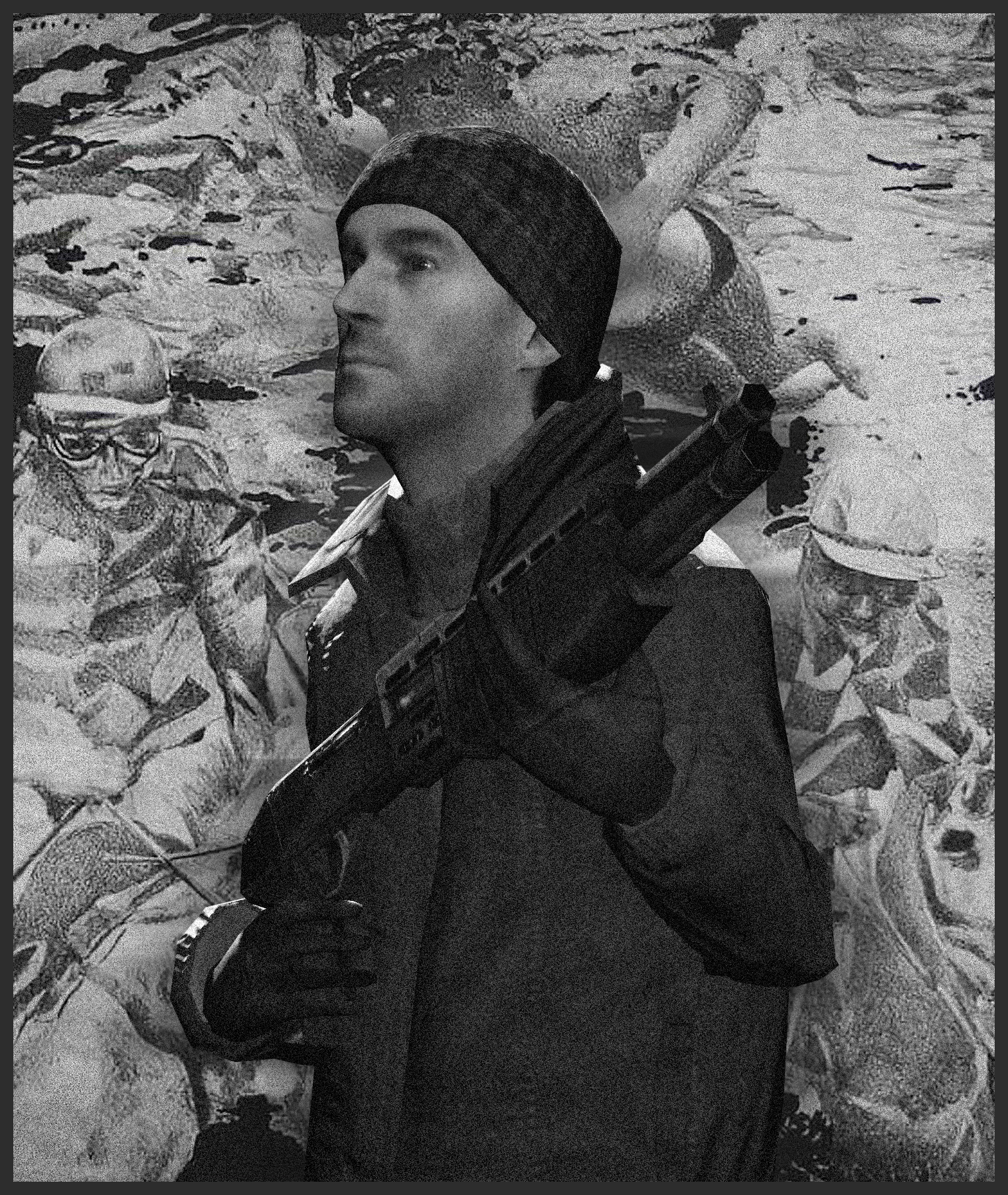
Great mix of colours here IMO, and the VHS/RGB mix really works with the purple and blue in the background too. Especially liking the 3D details with the border and the shading work as well under the arms and legs, really adds those last details. V good, v nice. Nothing bad here - besides maybe some more colour on the astronaut? Looks great as it is in B/W anyways.

AOTW / WEEK 3/52 / 2020
I probs already posted this song before but I like it so-
Le'go.
Again, the post processing kinda makes this picture for me - honestly though the positioning and posing don't look like they've had much thought involved? Idk it's hard not to sound mean. But like the blank room of Gm-Construct (presumably) is kinda weird to see in a pic, and it's very dark... makes the angle kinda confusing too? As you can only see one leg clearly. You've got the ability to make a more considered pose my guy just maybe use the same model in another tight space and add some props around? Maybe some more light? Could be on to something :^).
Great mix of colours here IMO, and the VHS/RGB mix really works with the purple and blue in the background too. Especially liking the 3D details with the border and the shading work as well under the arms and legs, really adds those last details. V good, v nice. Nothing bad here - besides maybe some more colour on the astronaut? Looks great as it is in B/W anyways.
Me like the edits going on here, the pose itself is pretty easy and simple and my only recommendation would be to maybe spend more time positioning fingers on these poses? Like it doesn't look like much of a tight grip going on-on either hand. I really-really-really like the abstract looking background though. Really sets it apart. Great work.
If someone had to win, I'd like if it were @Cow.
-
my submission
Nice submissions this week guys.
Hope my feedback was useful.
TTYL.
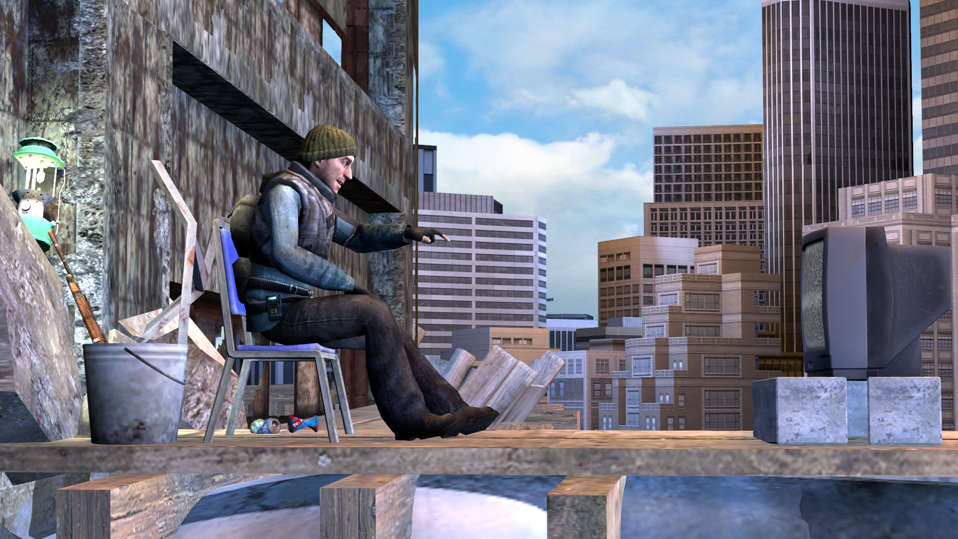
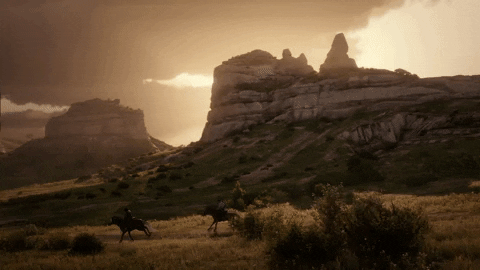
Still waiting on that lighting fix my guy, but this ain't really bad lighting either. Looks fairly neutral with the base picture that's close. It's the far away objects/buildings which kinda look dodgy. If I were doing the picture myself I'd even think it'd look 10x better as a nighttime pose. The way it's laid out is really good, including the posing and positioning. But yeah, maybe just the environmental light needs a bit of shifting. Coolio.
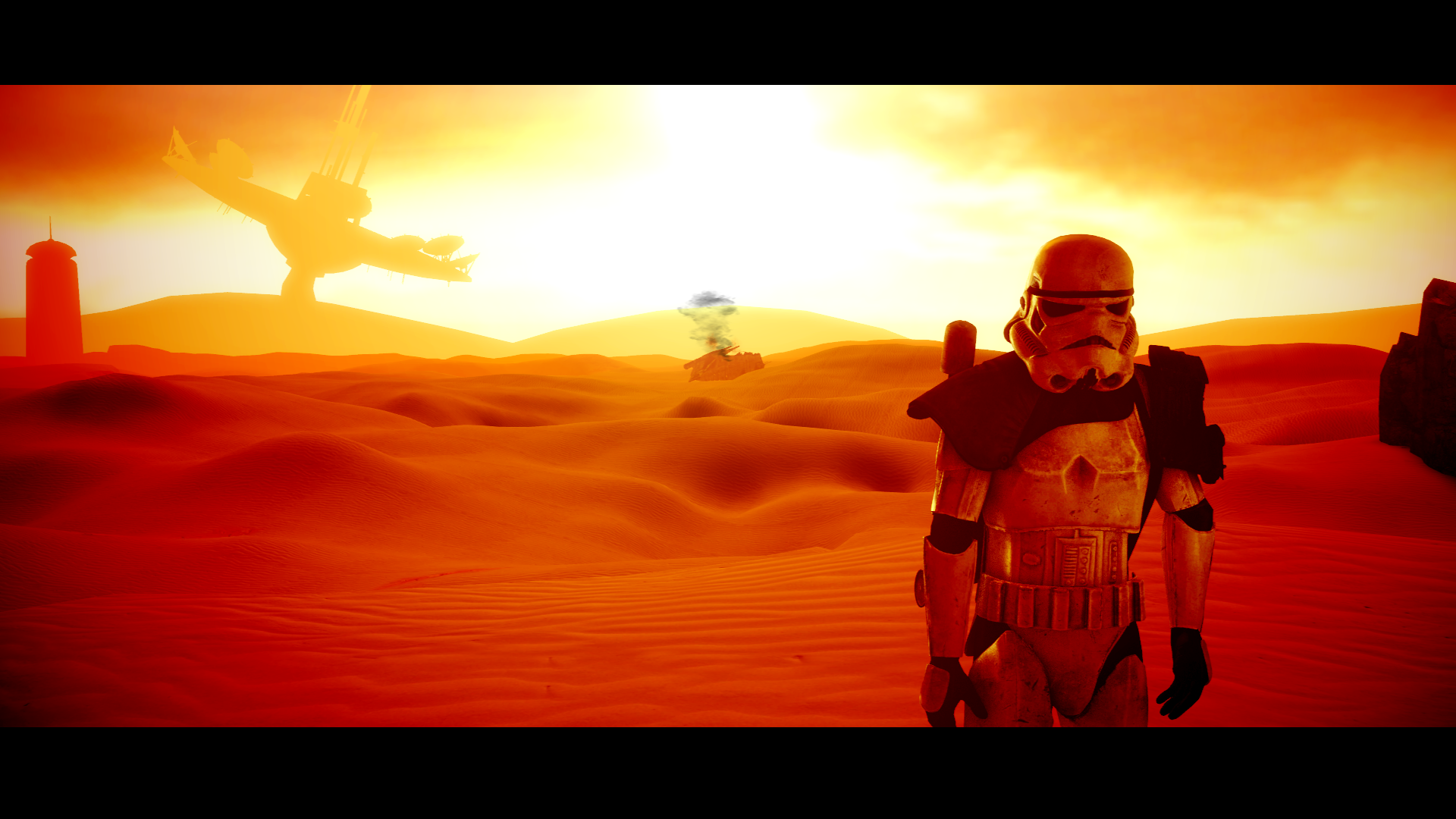
this pic be ORANGE bro, but I'm all for it. The colour looks really good. Shades are great on the dunes, and the array dish in the back - it's all perfect. Things I'd consider though: The smoke colour of the downed ship, would be slightly tinged with orange as the light is behind it? Or so I'd think. And the Trooper is very stonish, like not naturally posed if you get my meaning. Perhaps if he had a weapon or object to hand to help that staggered "just-been-in-a-crash" look. Good stuff.
tyvm xoxoactually kino
You must have been painting one of the paintings on my wall tooI tripped on shrooms and made this