Serious [Review] Art of The Week

Danny

Visual Powerhouse
Joined
Apr 26, 2016
Messages
1,267
Nebulae
5,181
AOTW / WEEK 36 OF 53 / 2020

Going somewhere without any signal tomorrow, so we doing this a day early
nothing you can do about it either
why would you care anyways

lets go

image0.jpg

image0.jpg
Just figured I'd quote myself from before;
These are both very nice portraits, for once people followed the preaching of 'keep in what you need'. And it pays off so well! The soft and wet lighting over each picture is excellent as well, just about sells an ambient cutout rather than some kind of studio environment. The texturing on both pictures are amazing as well, the mix of grain and different discrepancies adds a lot of character.
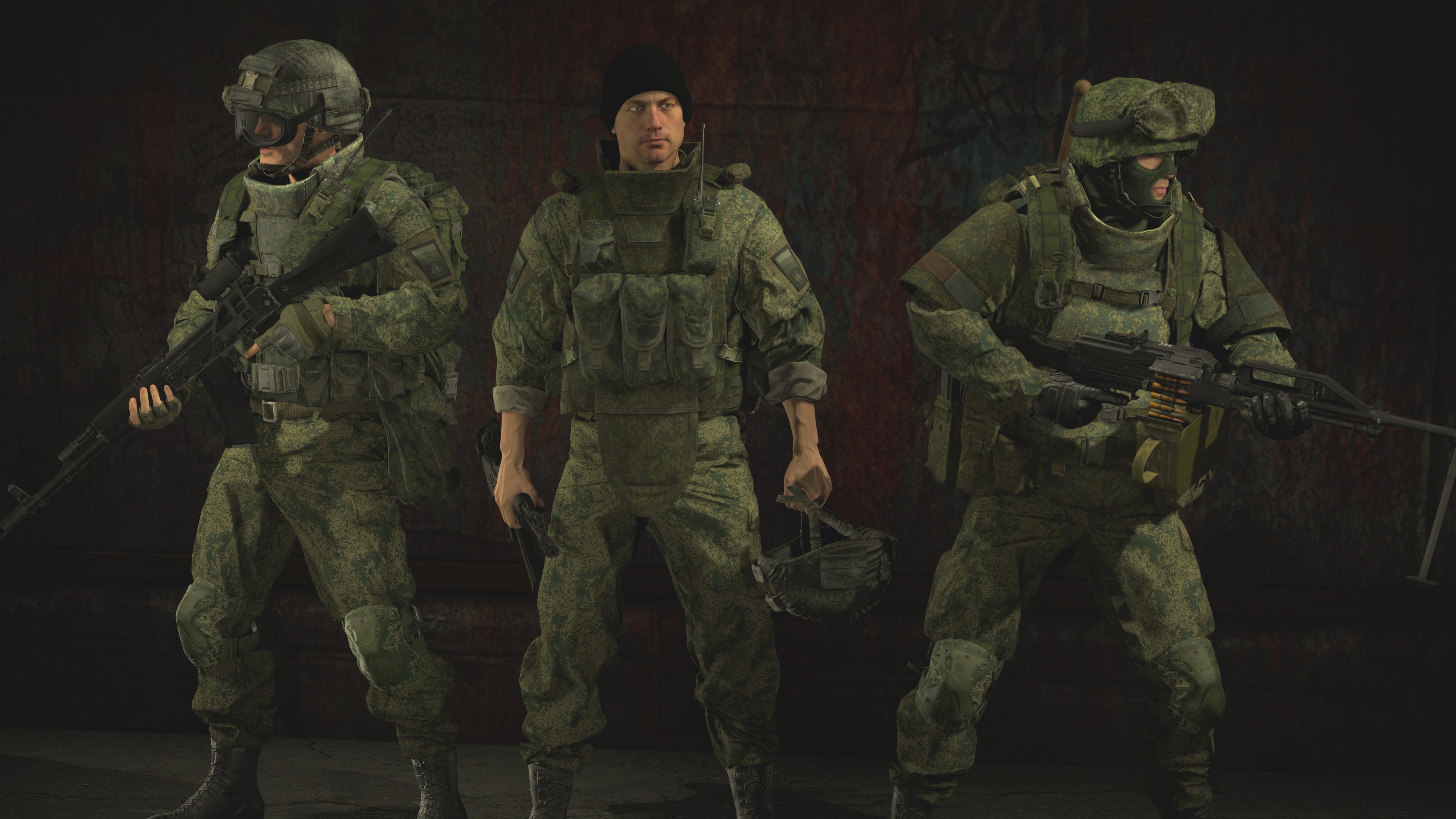
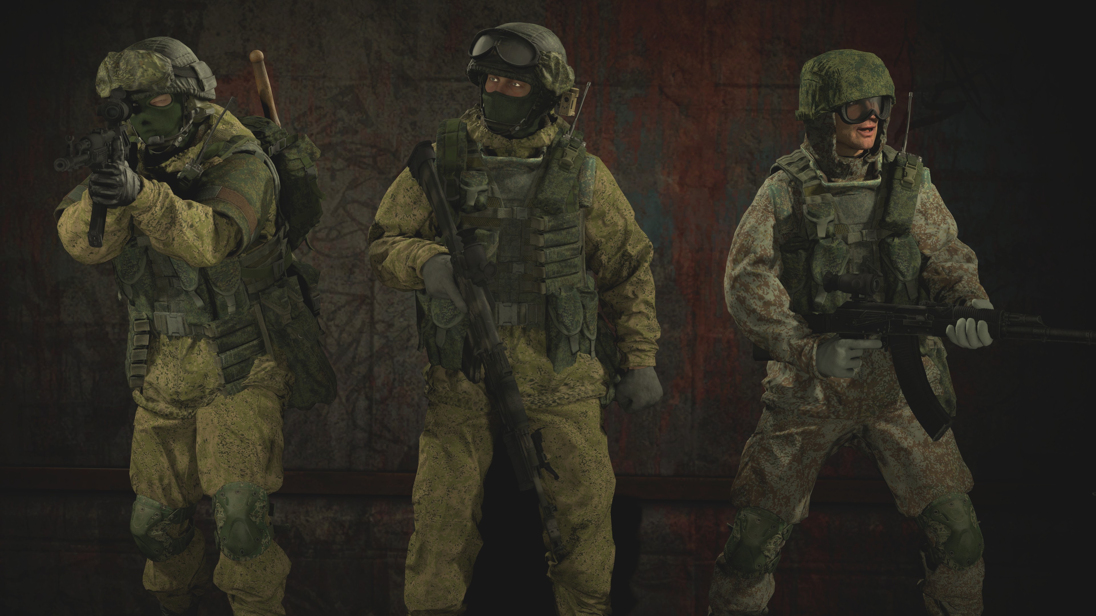
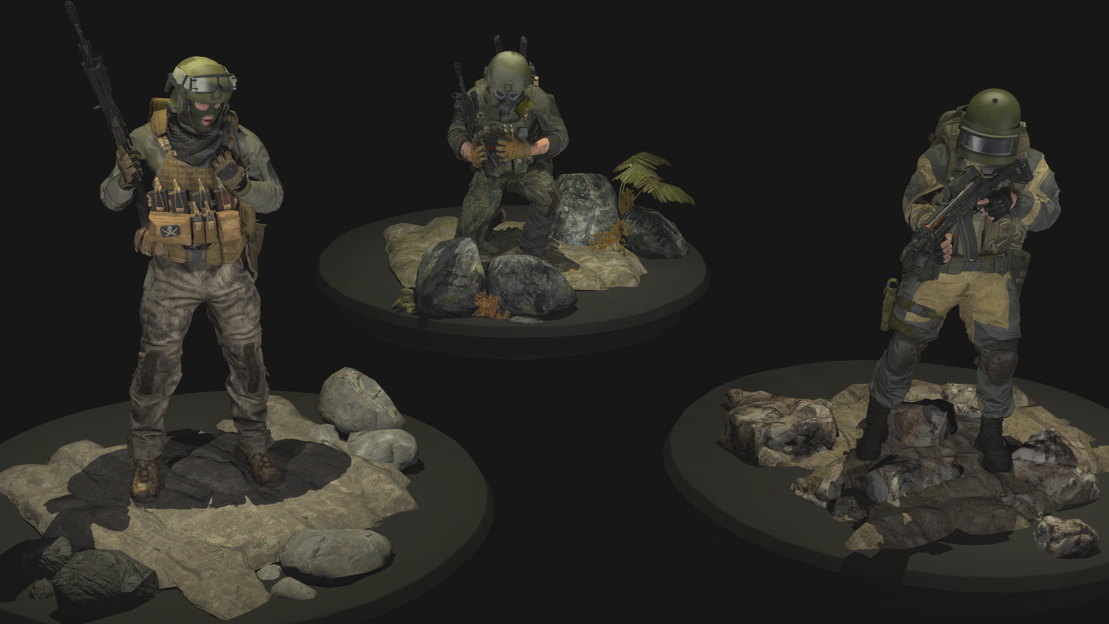
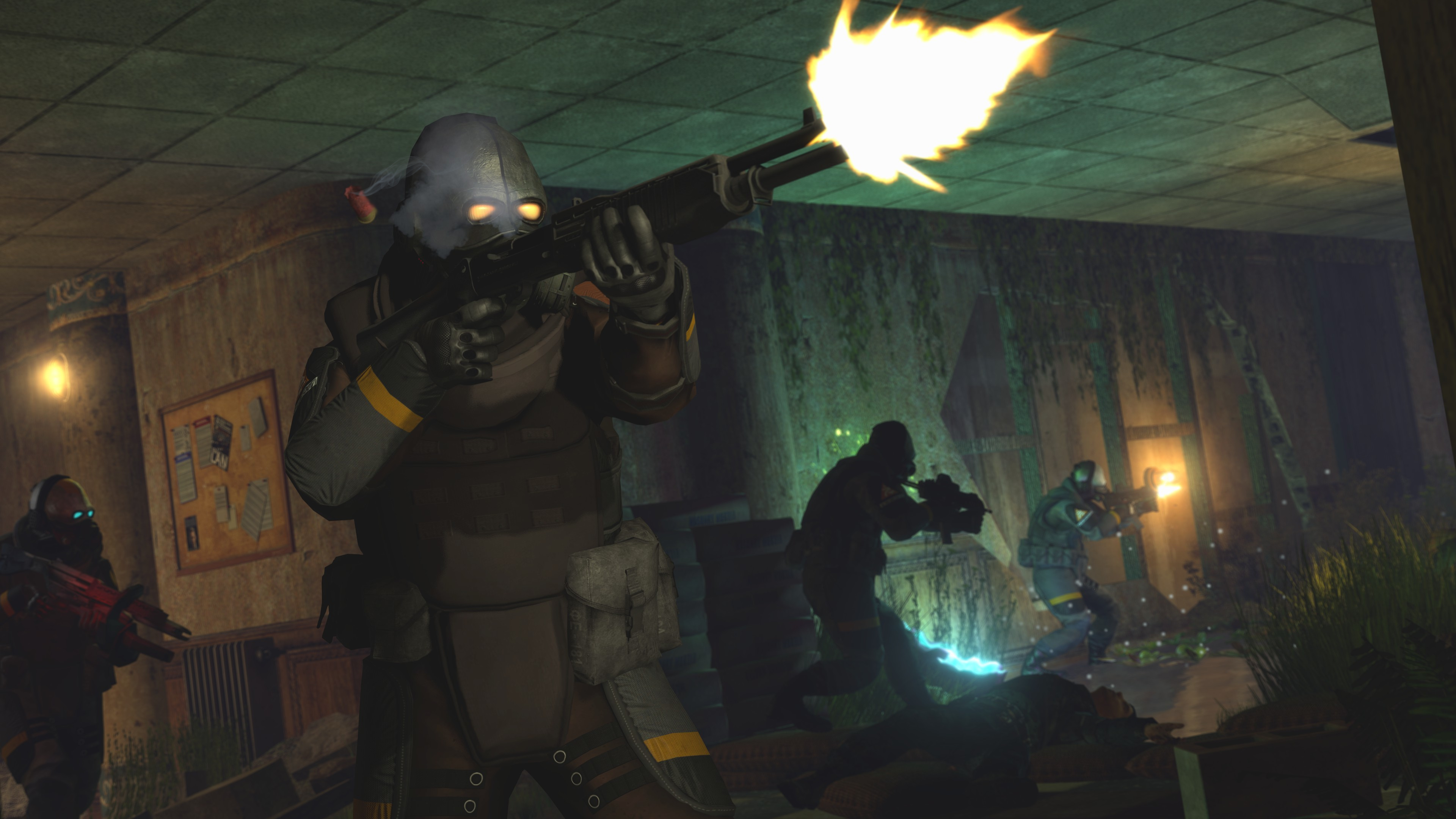
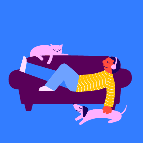
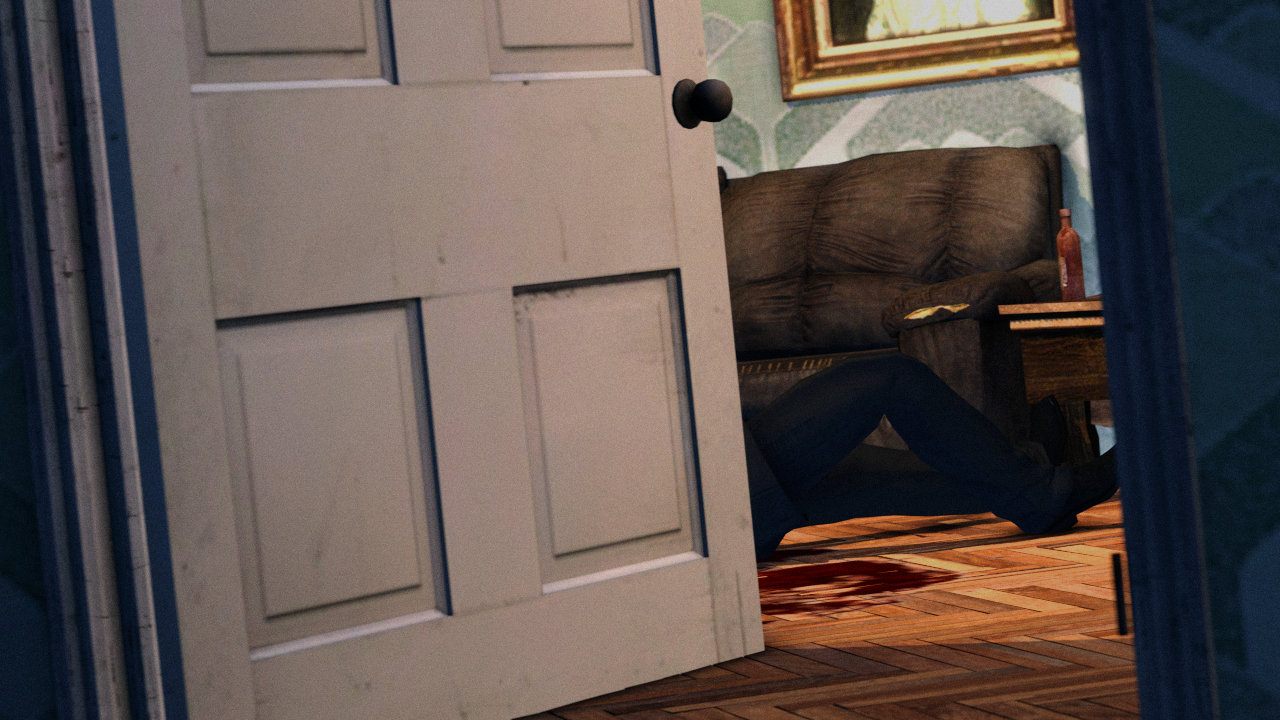
I like them, they're great even. I'd still look out for the clipping lighting though such as on the black and white image. And maybe rub over the edges that seeped out the border you've put over the edges. They're very samey to before, but maybe the next step is to create a very simplistic scene with just two models interacting with each other in one image instead of just one dude in there? Spice it up a little, somehow :^)


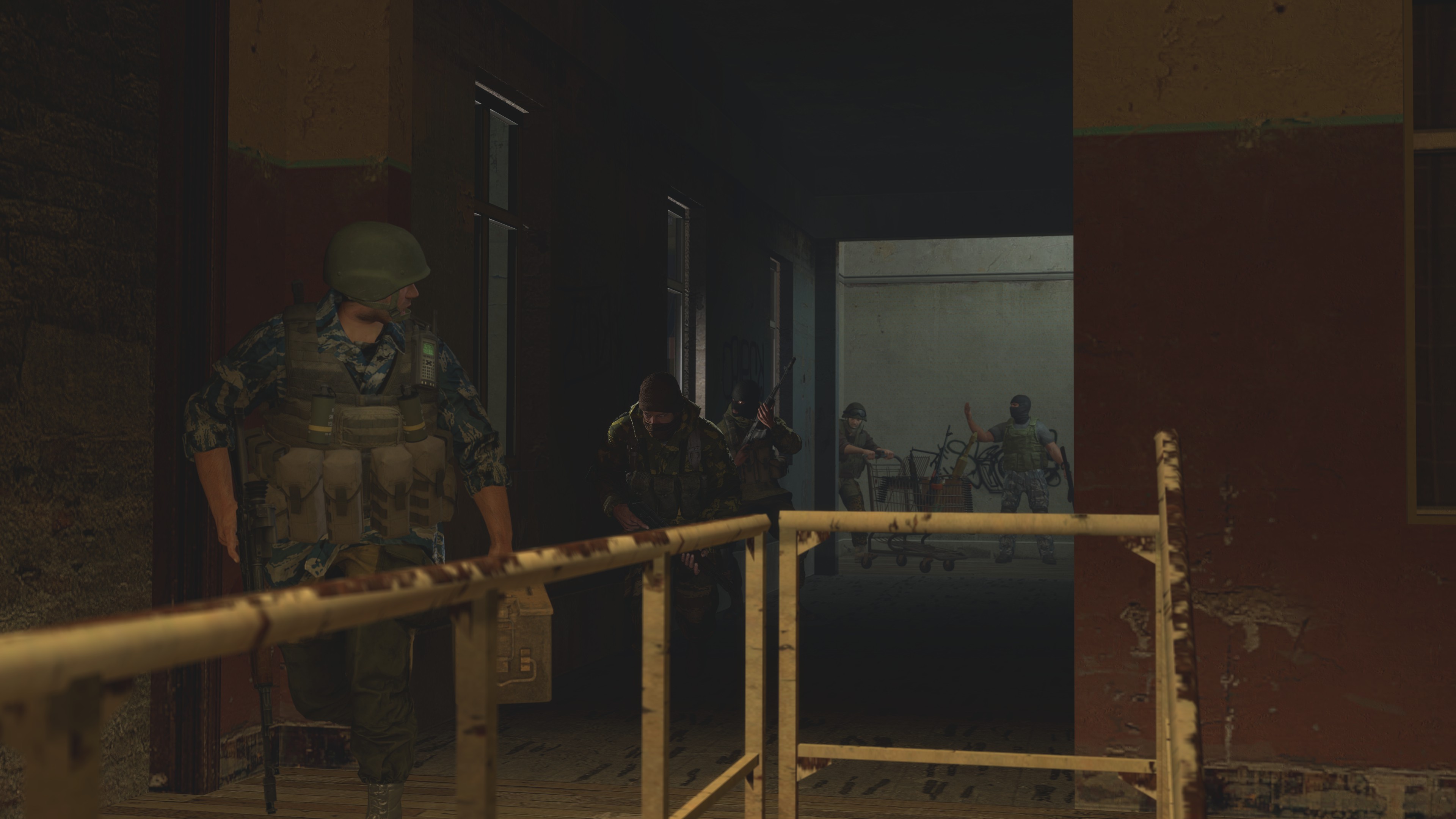
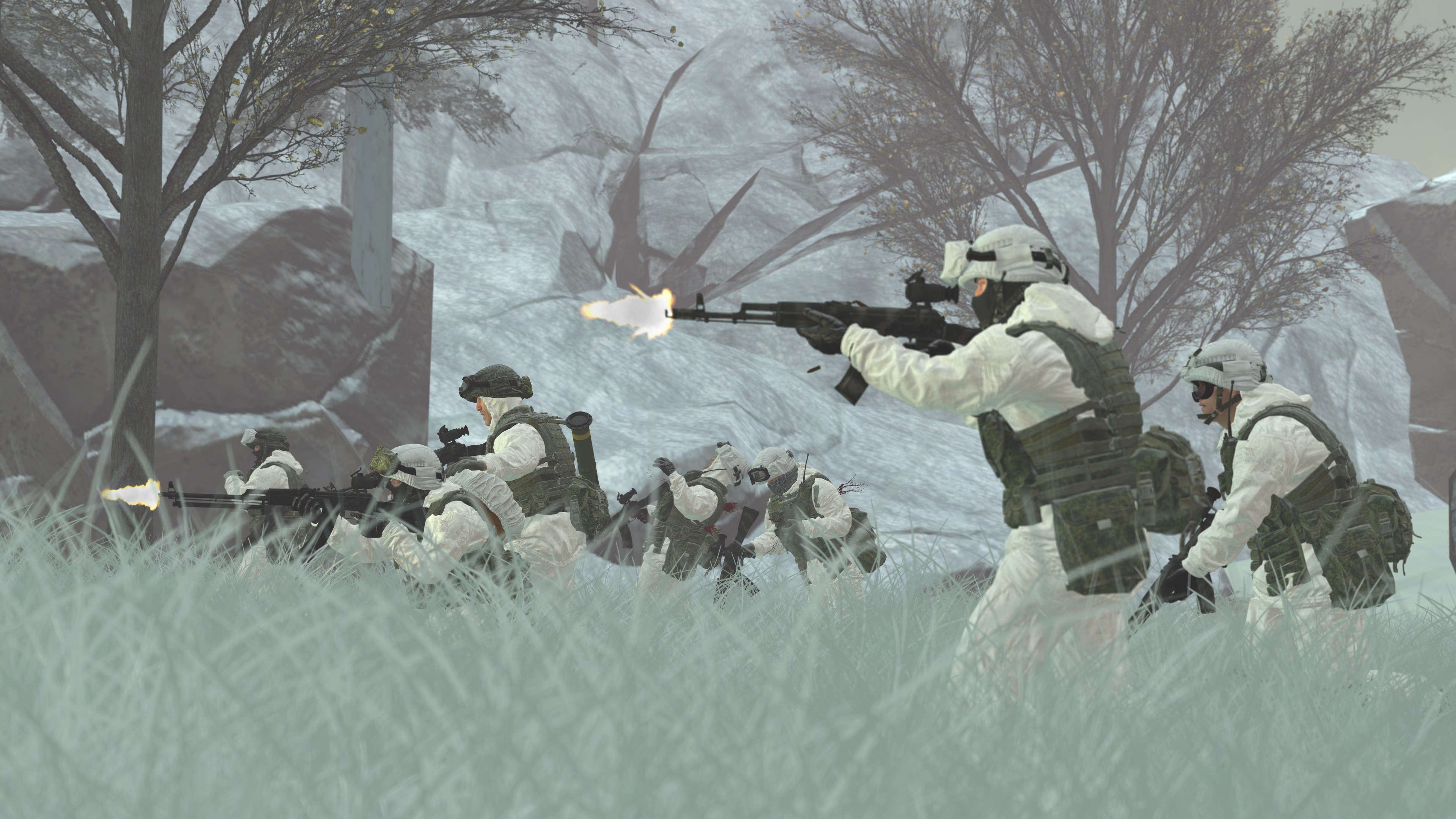
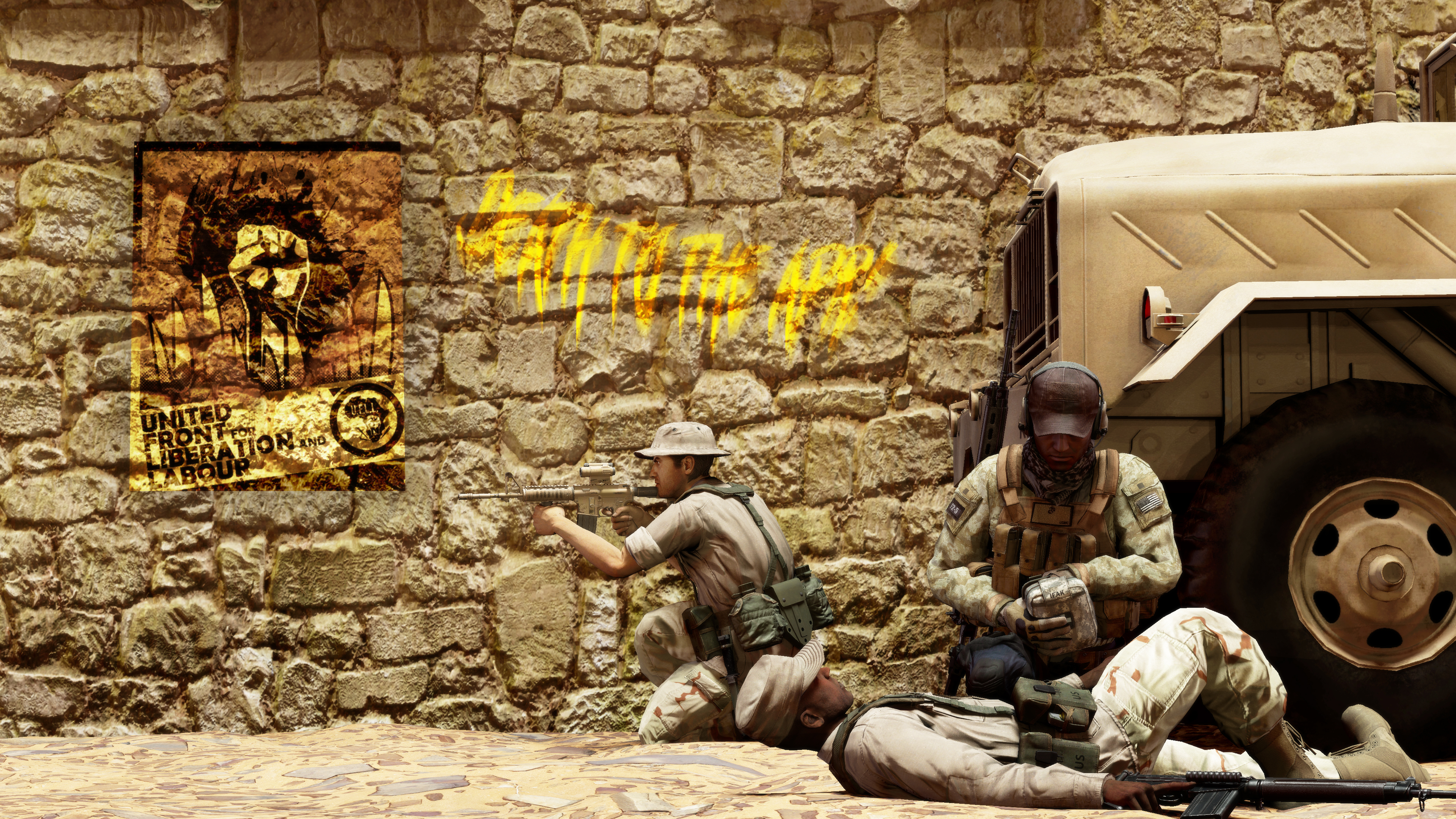
This is a fab scene build, gotta say I really like it. The lighting is just right for some kind of bleak russian day or something. BUT, lets take a second to look at the woman on the right - (nit picking really), that the scene itself is perfect, just that walking animation maybe needs a little tweeking imo to look less cookie cut or more natural even. Otherwise there is absolutely nothin wrong here. The use of text is great as well! Hope to see more of it :^)
-


No one gets the ✨boldthis week...
Till next time
-

giphy.gif


Last edited:
Reactions: List

Danny

Visual Powerhouse
Joined
Apr 26, 2016
Messages
1,267
Nebulae
5,181
AOTW / WEEK 38 OF 53 / 2020

After some time away, I remembered I had a responsibility here

The models and settings being used is fab, it's just the darkness of it all - makes it look like a SplinterCell screenshot or something. I would always encourage some lighting in some capacity in every image. The source isn't necessary to show but like imagine; a orange streetlight coming from the top right, or a campfire in between the two men. Shadows being cast, are always better than just a shadow. Keep it up brother

Image Dump
Very good
coolio.gif


CYvRp1K.jpg

Lighting scares me, I don't know why.
I gathered the two images were the same besides some added grain. Really what this image needed was some depth of field on the flowers closest to the camera. If you could make the focus point the two men speaking in particular - it would have been very cinematic and cool. The odd bluesuits in the back make it a bit difficult to gauge the setting too. Always got to have model consistency in these images bro. Aside from that, the colours and text are great additions to the picture too :^)

-

No boldies this time
Take care

giphy.gif
 
Last edited:
Reactions: List

Ricsow

professional retard
HL2 RP Administrator
Media Developer
Joined
May 10, 2018
Messages
5,296
Nebulae
16,345
Another Trey Young post, coming right up
image8.jpg

I know you recommended making multiple characters in one pose, but I just wanted to post this one here
 
Reactions: List

Danny

Visual Powerhouse
Joined
Apr 26, 2016
Messages
1,267
Nebulae
5,181
AOTW / WEEK 39 OF 53 / 2020

Here we go
Also, spent a lot of time adding a hall of fame to original op, check it out if you want - has all previous 'winners'

It is certainly reminiscent of that one image, interesting to have this spin on it of course. If there's anything to highlight; it is the lack of highlights. The lighting from the right and center is very smooth and well done - but that shining light from the left could've been more bright to show some more depth in the models perhaps? See how they almost looked shaded in as if it were a painting with no clear indications of light besides the back of their helmets. Otherwise, the posing and positioning is on point. Goodo

Heyyy, more lights! I can see the image, and spooky shadows that stand in the distance ominously. With the added mask of texture over the top two which is a great addition to give the picture more character. So you had the scene, models and character - but just some more backdrop perhaps is what is missing. Like, debris on the bridge, or maybe some crates on the sewer canal below that you can see through the grates. Body of the image is great, just wish there was more meat to it :^)

Mmmmm 4k, can really feel the texture in this one with the rock wall and the poster / graffiti thing. Looks pretty harshly implemented but it adds some good color and contrast with the rest of the image. Including the graffiti text as well. Can't pick anything out to criticize or offer much feedback on besides the aforementioned overlay usage with the poster. That's very very nit pic tho - good work piggy :^)

Only thing this image seems to tease is good interior lighting chief, like the door and the inside is great but I wanna see more! This looks like the in-between moment of something important in a comic where the next image shows the real details! Give us all a little more to look for, even if the door was open just a little more to see whatever there is to see! Otherwise, I don't see much here at all besides the nice lights

This image is very bright my friend, I really would've put some more contrast or shadows in - especially since the MP5K model is doing it on its own so instead of this flat image you get like a weird 3d illusion at the bottom that comes from the inconsistent lighting. Secondly, I think some more consideration for posing would've been good, some blank anim of a dude standing is not as interesting as say: someone struggling to stand with their fallen comrade on their back, barely able to hold onto their weapon etc. Just some food for thought
-

This week's highlight is @Piggo
23000e940e7b.jpg

Who shares a spotlight with @Fatality
siiSNLx.png

-

giphy.gif

ttyl fellas
 
Reactions: List
D

Deleted member 5162

Guest
POSTER.png


another poster for a nearly non-existent server wooo

I couldn't be really bothered trying to add grass and add more lighting, since my PC was heating up in the map for particularly no reason, even if the render distance was cut down. So I wanted to finish up quickly, still turned very nice but could've been better.​
 
Last edited by a moderator:
Reactions: List