AOTW 13 of 52, 2021
-
Another great piece here man, what I think works best here is the amount of detail. Like the most minute things that people may not really pick up on such as the amount of debris scattered, the helmet, the smoke in the distance is easy to be missed by some ppl (but I know the struggle). MY favourite detail being the motion blur on the mechanisms of the canon. Or the house to the right behind the tree. While I enjoy the wide angle aspect I think there could have been a more intense image if you used a tighter lens. Either way, superb!
Good use of filter and masking here. I do think that the filtering takes away some of the definition, making particular parts look over exposed (really bright) like the barricade just behind the guy looks insanely bright for whatever reason. And it's a shame to not see more edges on the uniform. The edges on the image that have been chipped away are super cool, I especially like the film-burn kinda thing on the top left. For some general feedback; when using filters intensely, try to leave something you made behind otherwise it just kinda gets deep fried. Coooooooool
Some great pictures you posted but this one here is my favourite so Imma focus on it. The skybox is perfect and the lighting you've gone with compliments it really well, especially how the rocks further back are more de-saturated and have a kind of haze about them like sea-spray or something. adds some really good atmosphere. It's a shame that the most complex pose of the picture gets lost in the rock via camouflage but I think that's one of the best parts. The wide angle works good here, you get a real effect from the environment with not too much to focus on besides the guys on the left. I personally woulda tried filling that right side with something though? Maybe a boat in the distance or smn. COOOOOOL
A lot of emotions in this picture. Not entirely sure what to make of it. Dead zombie? Cool, guy with a gun and clipping model (small detail I know), kinda cool - gun looks big. Dude sat at the chair is probably my favourite part of the image which I think shoulda been focused on a bit more. Has the most character out of everything in the image with his shady lighting and slouched posture. So yeah key thing is to consolidate what the emotion and scene of the image is. This is a compliecated and explosive kinda thing you've made. Cool
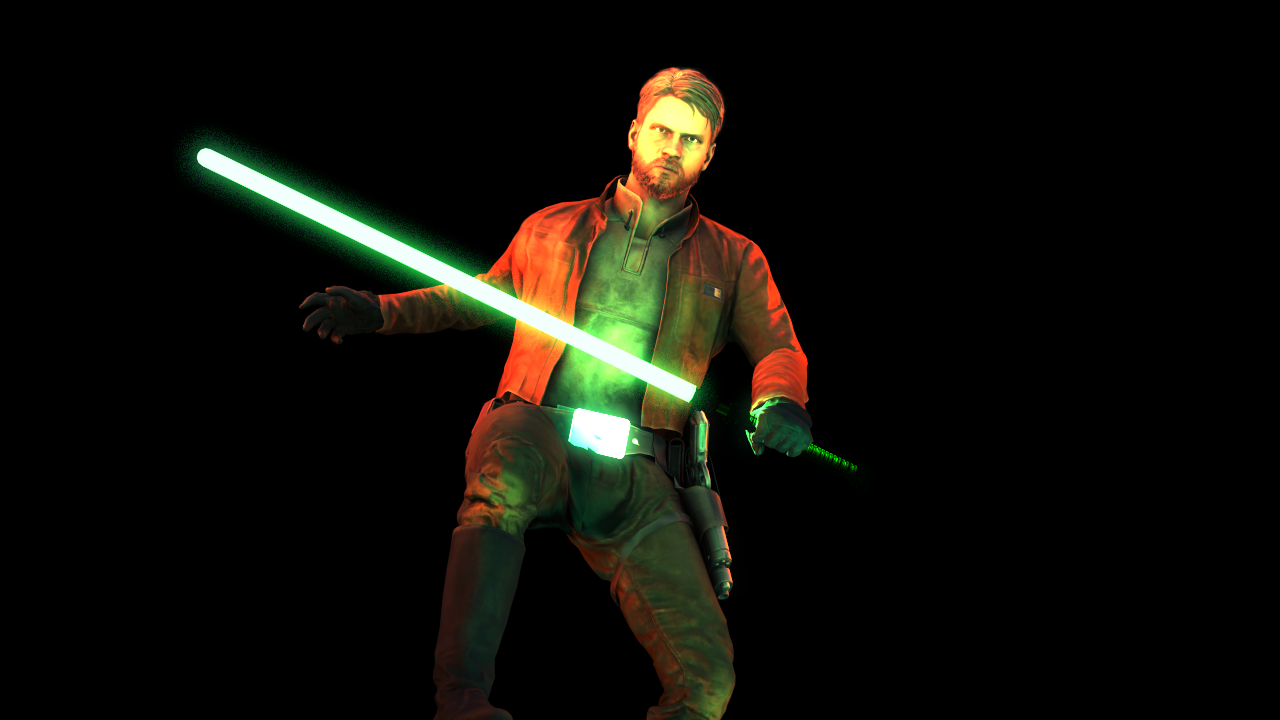
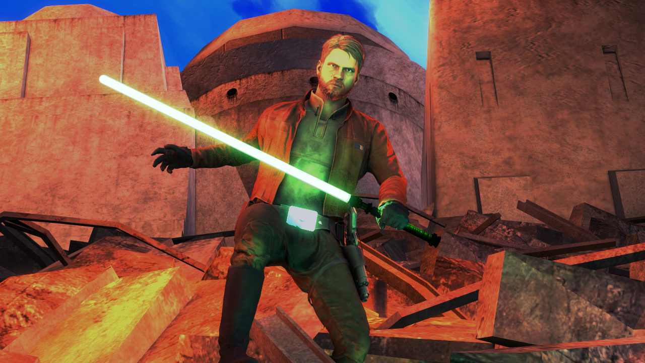
Helluva action-like posture, and the lighting works super good in the black background version although the red is a little stylistic. I much prefer the version with the background but the lighting is tooooootally messed up. LIke bright blue skies but the walls are so dark such. Would've focused more on like a solid sunlight kinda thing and then lightly highlight the model with a green that matches the saber. So yeah: portrait hella cool, full scene coulda used some more thoughtful lighting perhaps
-
Overall feedback:
Think about ya angles and how tight your frames are for images. Consolidate themes and narratives, find your focus points and work around them (if applicable). Be careful not to sacrifice too much of your images for filters!!!!!!!!!!!!!
I really like @TwistedSilicon 's picture this week
-
Nice subs, ttyl