Serious [Review] Art of The Week

Sil

jus one more fing
Joined
Aug 28, 2016
Messages
6,398
Nebulae
8,137
I consider these to be my magnum opus of paint.net
YcwAkWs.jpg

oz3MVID.jpg
 
Reactions: List
D

Deleted member 5162

Guest
25cecbc120d7e3aa59b5e431f10115fe.jpg


I dont know where to put this, so I'll put it here, the work isnt obviously mine of course.
So I thought, since we've got ourselves a new Interim Administrator, how about we do the same thing with this poster, just do some little changes and put our guy in here?​
 
Reactions: List
D

Deleted member 5162

Guest
ddhhwry-567fb827-7834-487f-a99f-95f63ea7e953.png

ddhk7o4-7f917c35-808f-4192-a053-729c49a5b38c.png


Here's the original picture, use this for your poster if you wish, I sucked at it.​
 
Last edited by a moderator:
Reactions: List

Danny

Visual Powerhouse
Joined
Apr 26, 2016
Messages
1,267
Nebulae
5,181
A.O.T.W S2, W23 (07.10.2019)

Busy week no? Mine has been, uni is suffocating me.
Hopefully will find time for NATO.

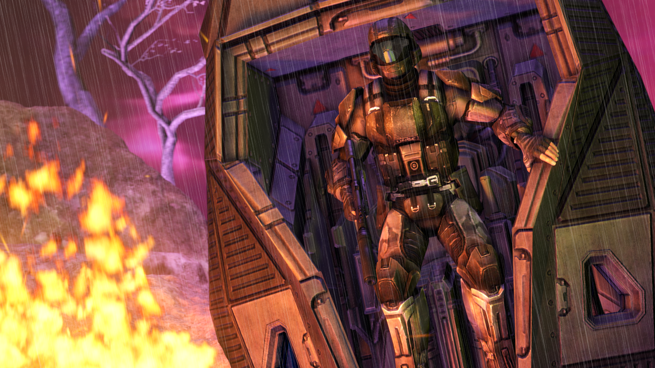
You rub the ration packet and this guy comes out? Wdyd?
Besides that, this is really good and especially for paint.net, I remember using that stuff back in the day bro. Seriously a good little edit that gave me a chuckle.

This really is, quite needlessly big. Besides that I have some other pointers and things to say. The colours and what you've chose to include like the pattern of the combine and whatnot behind the man is very good. There's good editing here, but honestly I think the font was a poor choice. There's a mix of texture work here that kind of confuses the illusion of the poster you were going for. It woulda been good to go over the edges of the black lines behind the man as well because stretching it does just create this jagged look. In summary, great idea, great foundations, just needed those finishing touches and thoughts.

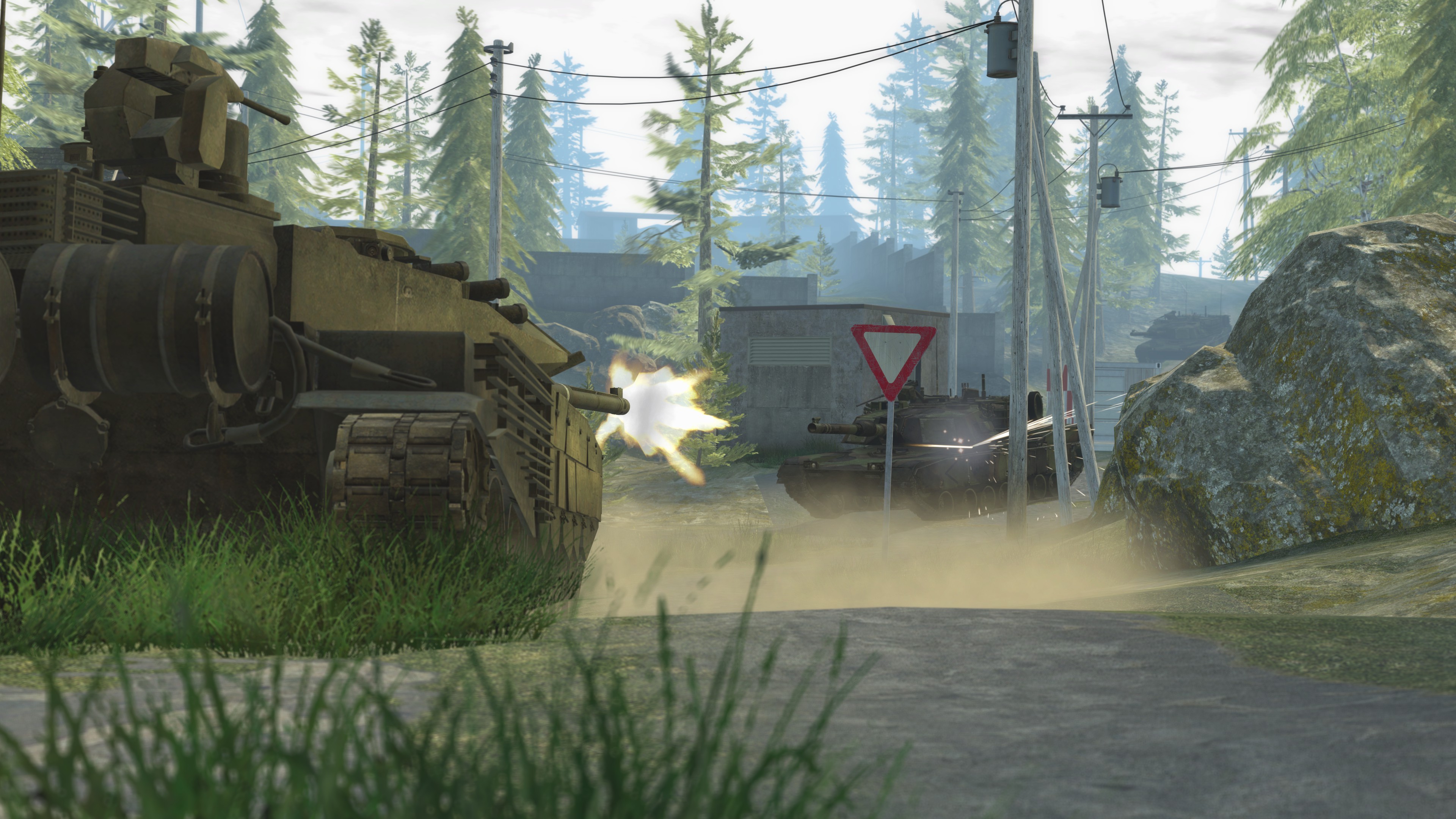
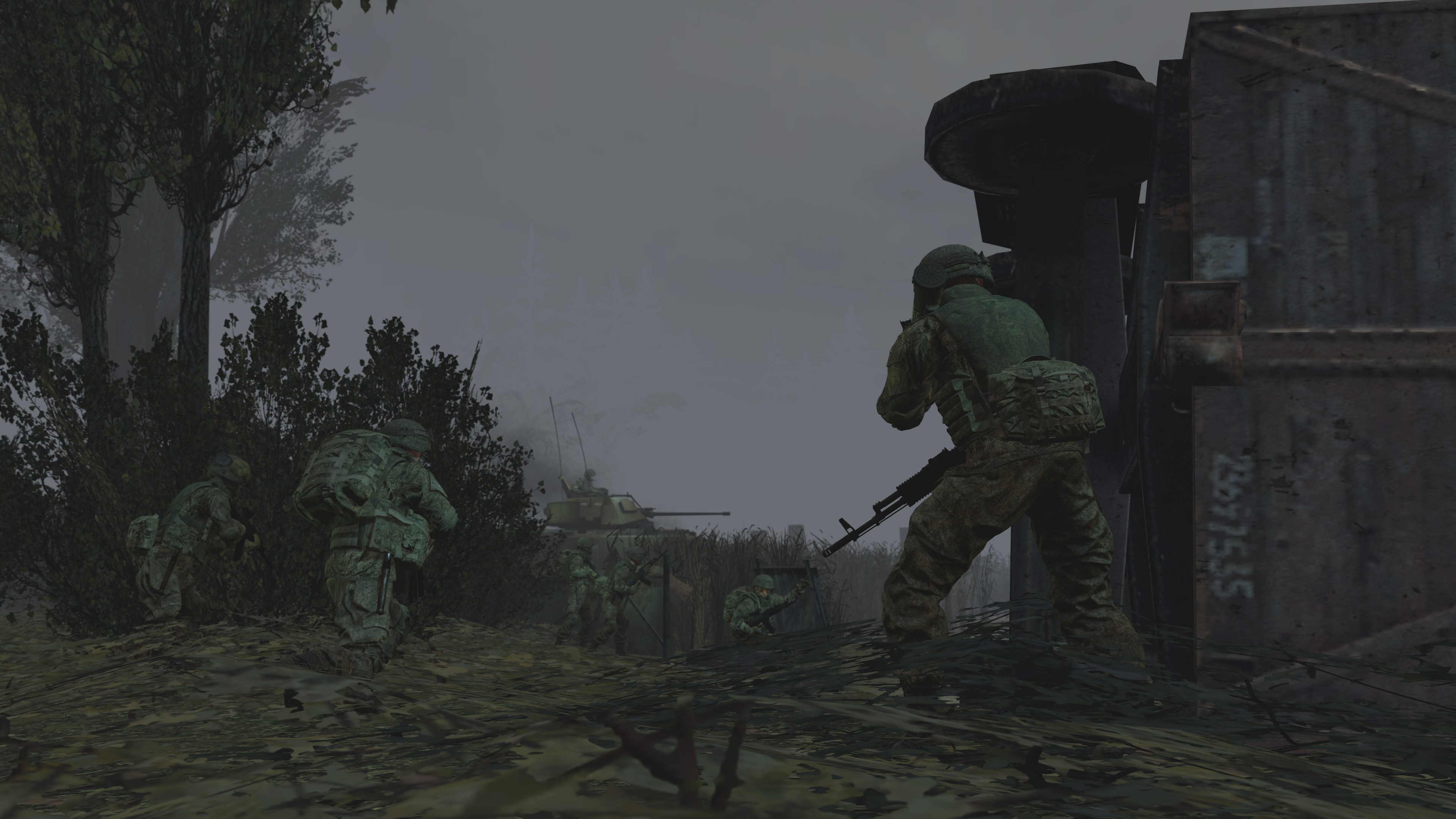
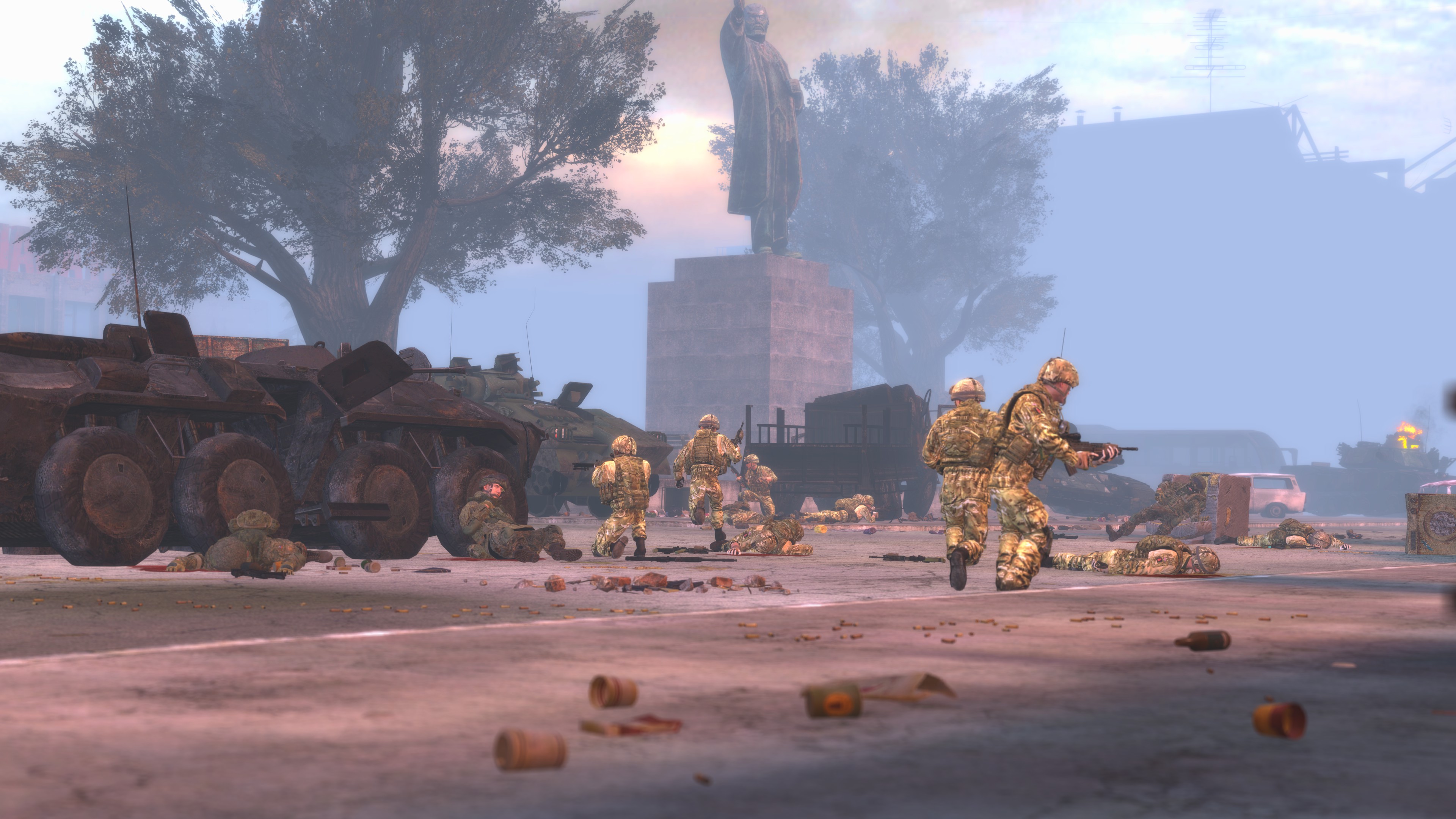
Man this is a throwback, I used that exact boat and models for a poster once. Anywho, this is really pretty! You must have a thing for the colour orange atm which is understandable. I too like the colour of citrus. The composition of both subjects like the boat(+soldiers) and the helicopter seem perfect, and the angle of the sky is great as well. I know from experience that water is the worst thing ever on SFM and Gmod, could never find a good substitute so I'd always add it in post edits'. Great work.

MY WINNING VOTE: @Piggo
Kc0zUu7.jpg


-

giphy.gif

hey, it was October 3rd this past week.
It's week 2 of university year two and so far I had about 10 hours to play video games throughout the last week.
Life is shit just wanna be an art student again bro what the frick.
Will post about the halloween competition soon.
@me if you need me for criticism.
Gonna be posting these early from now on as I have uni 11-6 every Monday this semester.

TTYL.
- Daniel.
 
Reactions: List

steambored

Make no mistake, this is a one-way trip.
Joined
Apr 26, 2016
Messages
1,207
Nebulae
2,013
gcxSXEB.jpg
it aint pretty and it aint finished but man i gotta put it here
 
Last edited:
D

Deleted member 1435

Guest
25cecbc120d7e3aa59b5e431f10115fe.jpg


I dont know where to put this, so I'll put it here, the work isnt obviously mine of course.
So I thought, since we've got ourselves a new Interim Administrator, how about we do the same thing with this poster, just do some little changes and put our guy in here?​

aesthetically cool
but the slogans are cringy
 

Danny

Visual Powerhouse
Joined
Apr 26, 2016
Messages
1,267
Nebulae
5,181
A.O.T.W S2, W24 (14.10.2019)

Bad week, great weekend.
You?

Both of these images are great, there isn't MUCH detail in them (IMO) but the subject is there, and it's all really well posed and touched up afterwards. Actually kind of feels like halo lighting to me as well. And so I offer you this counter point, if you use less things in the background I believe it's always better to have some lens/depth of field blur. Because then only the things in focus 'matter', for lack of a better term. Great stuff.

Looking good! I real scene! Some techie spy infiltrating a slum house I like to think. The lighting is super good as well, feels like the hoodie is lighting up just enough from it and the glows of the dots and lines on the hand are great as well. He just looks a little... stiff? Given he's a robot anyways. Like it's hard to gage what he might just be looking at cus it's like he's holding the gun to look at it but??? IDk?? You got it down tho bro I like it.

Such a great dog and such a great picture, I think the focus is just right because it starts to fade out about a meter or two behind'em y'know? And the colours are great but it's a shame there wasn't enough light to show a little more. Fantastic picture. Fantastic dog.

@steambored your pic won't load for me? Idk if you wanna try to repost or dm me it?

NO WINNER, CAN'T QUITE DECIDE. BUT IF WE WERE TO JUDGE IT ON CUTEST DOG IT'D GO TO: @Inaudible™
3V2tPGi.png

-

giphy.gif

Halloween event starts on the 20th.
Will make a new thread.

Something something, @ me for immediate feedback.
Good submissions! Good times! Good vibes!

TTYL,
- Daniel.
 
Reactions: List