A.O.T.W S2, W33 (16.12.2019)
it been a week
we go
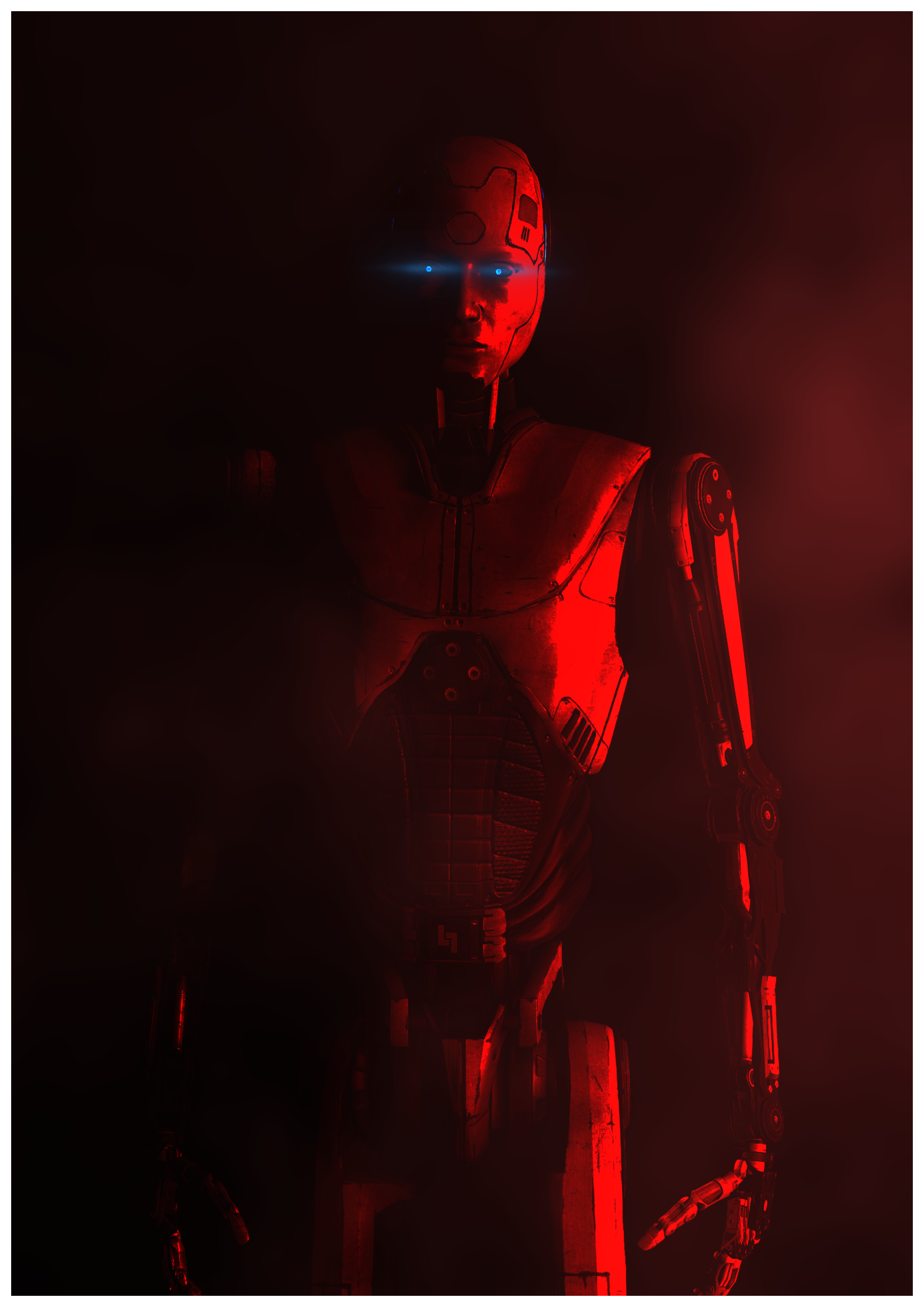
Great use of a portrait aspect ratio, shows just enough and the shadows that go with the lighting are great! The red light shows enough and the glowing eyes add on a very cinematicy kinda vibe. Great work, not much to disagree on as it's just a simple portrait.
The first one is great, albeit missing some lighting to really see the gun in the man's hand. But the camera angle is quite unique and shows a lot of the arm which I like. But yeah, the lighting is a bit off, literally turned off. The second picture I had to get my head around. Because due to the perspective 'Pinello' looks like a giant. The blood spray is cool too, good work but maybe some simpler text would benefit too? Like there's more going on in the text than the images yano? Coolio.
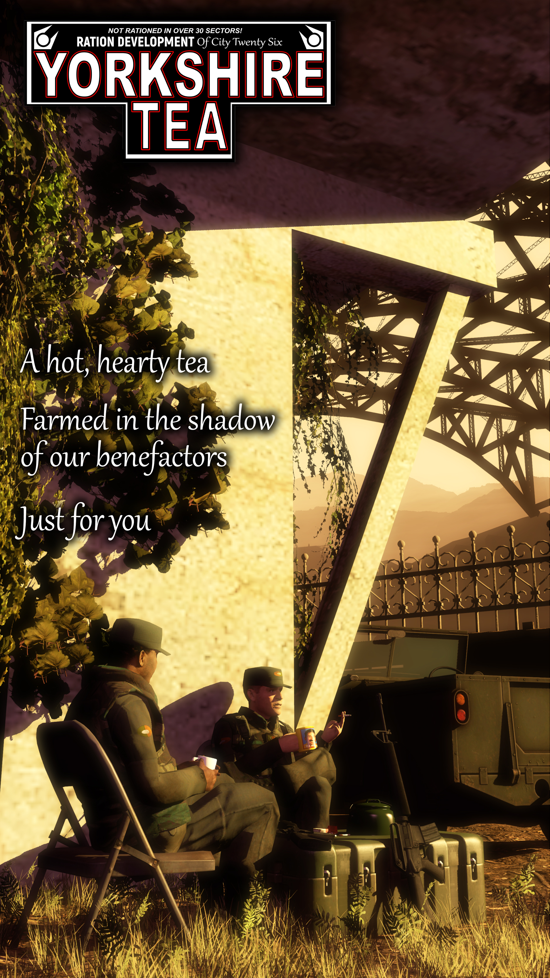
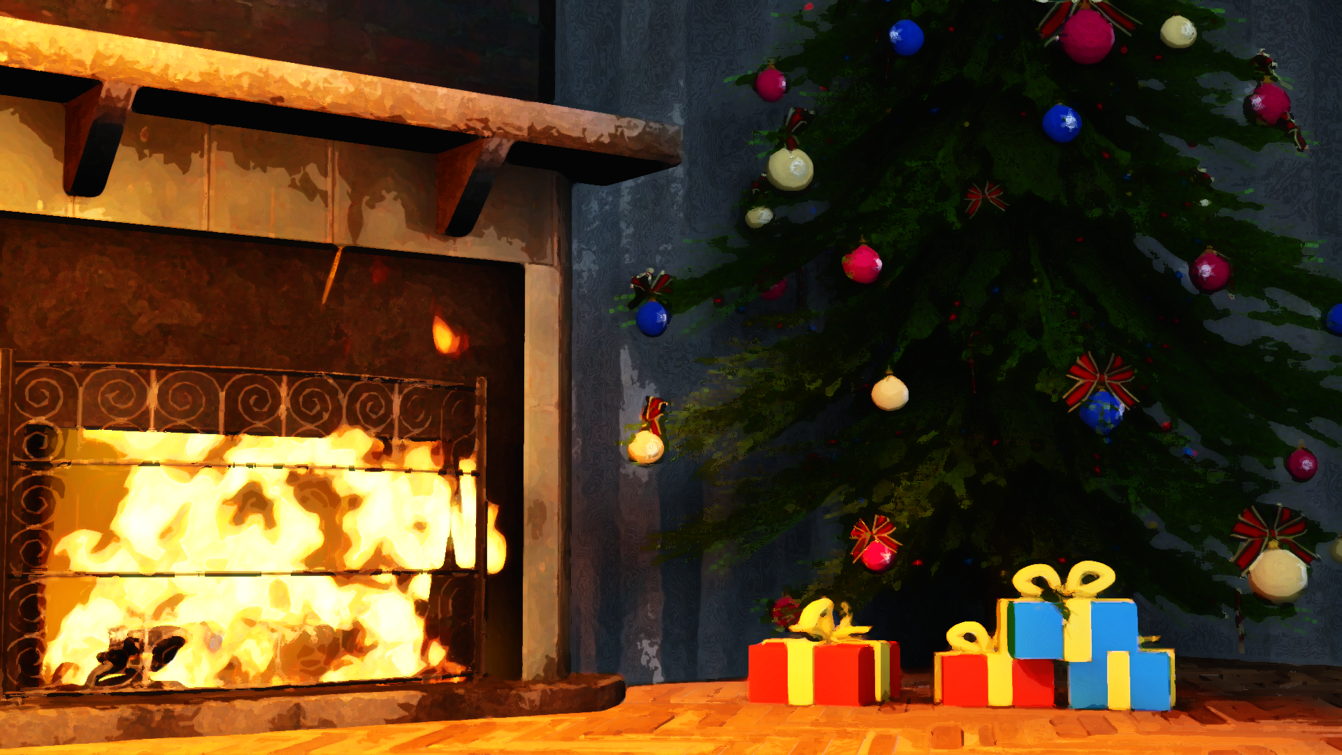
Liking the full orangey/pale yellow kind of pallet that stays consistent with the picture. Creates this global overhead sun effect which I really like to see - drawn shadows and all that. With enough detail to show a good scene of two guys enjoying a cuppa. But I wouldn't call it much of a commercial poster yano? I think it's just the placement of the text, like if it were more centred it would look less like a leaflet. Nice stuff bro.
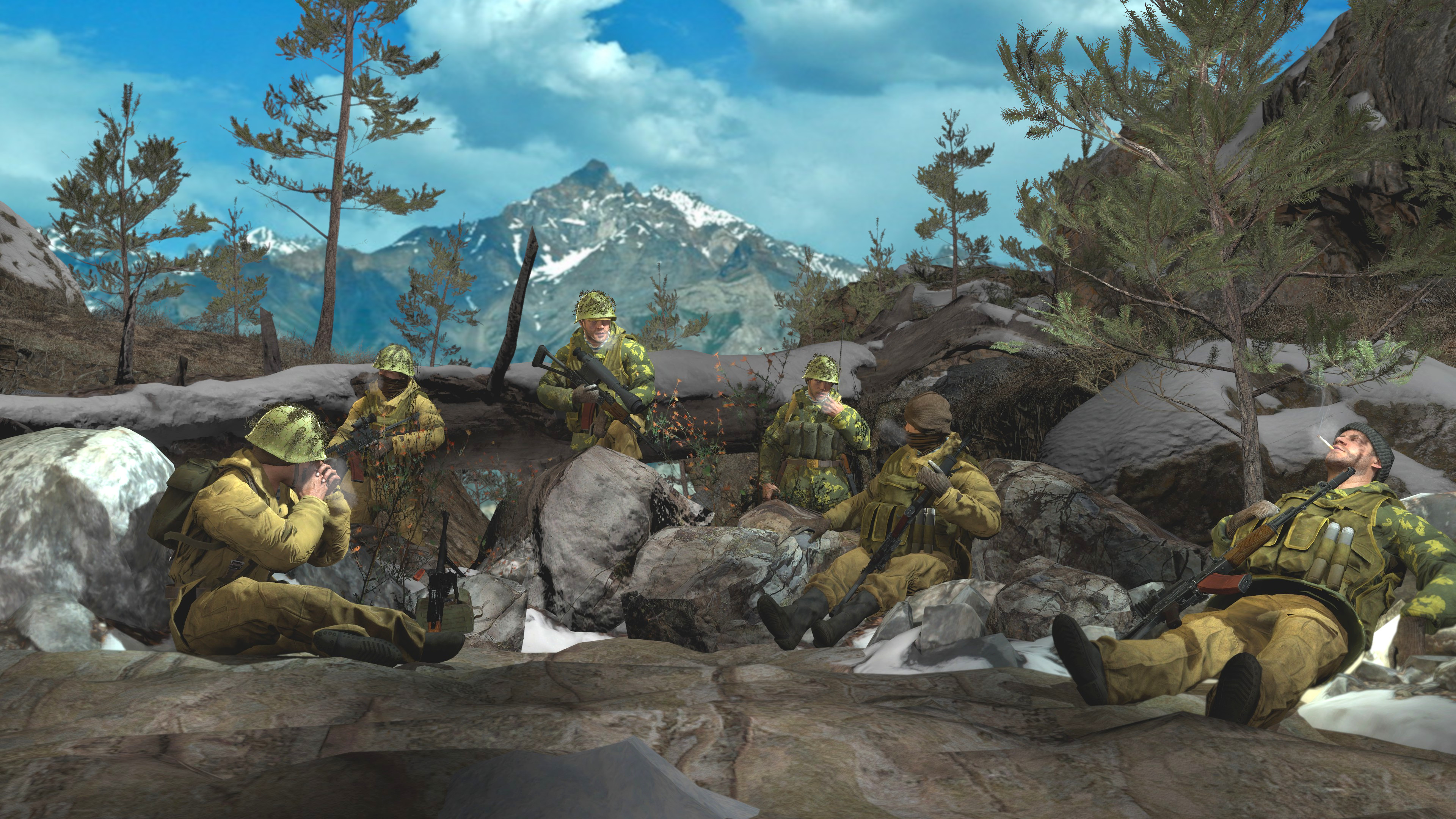
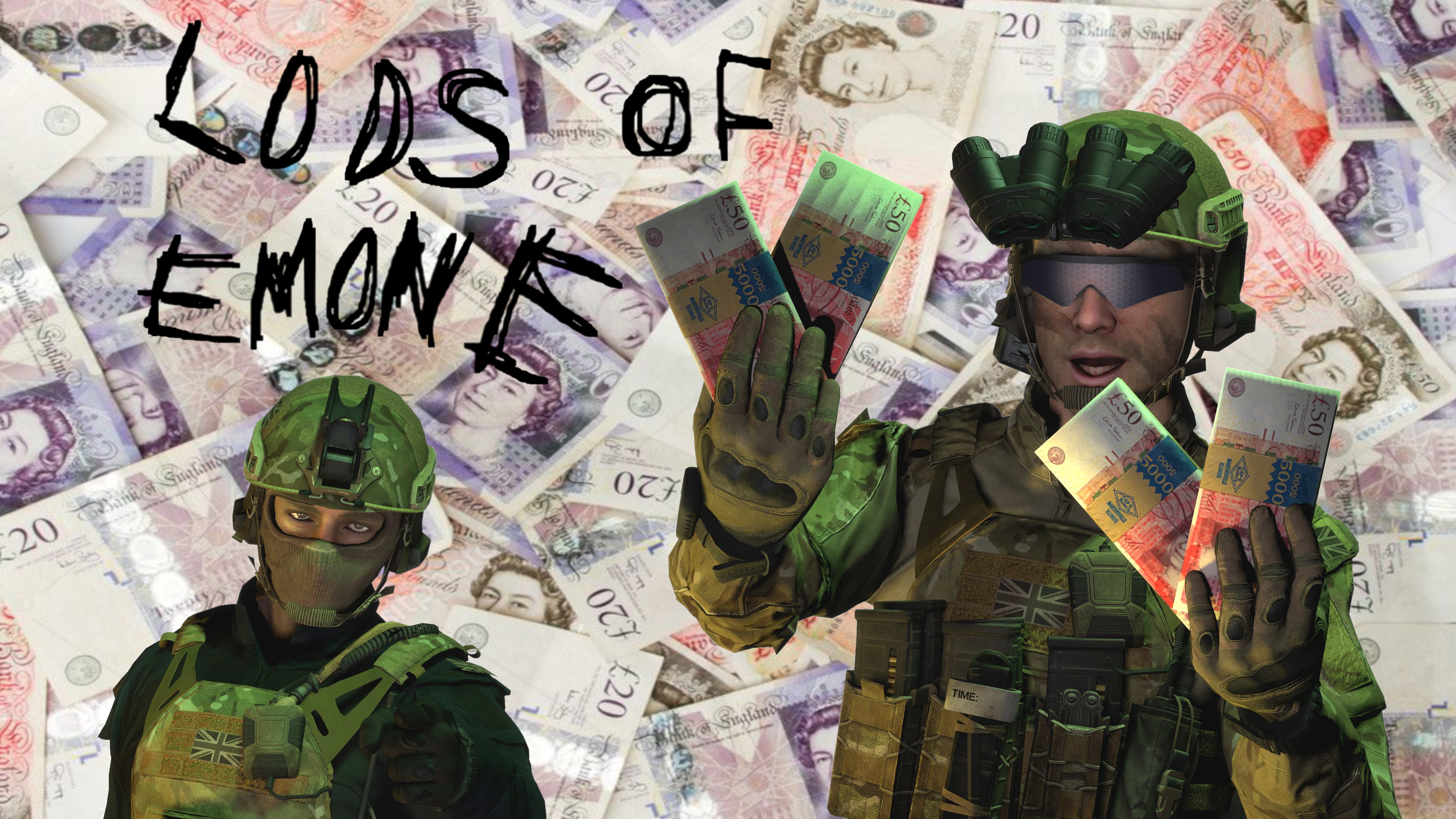
You submitted a few so I chose my favourite one, and it's my favourite for the variety of poses and things going on although it's a pretty simple looking build.What's great is the daytime lighting though, it's really well balanced and understood from all angles as there's no pure black shadows which is great.
-
MY WINNING VOTE: @Dudu Fadende
Honorary Vote for "I don't like Tea very much personally but this is good": @Piggo
-
Great submissions this week guys, not many bad/negative things to be said in feedback.
Keep up the good work but obvi take some time off too! I had work today and I'm burned out... but It's christmas soon!
@me or whatever, take care.
-Daniel.