AOTW 2022
Liking the colours and attention to detail on the face, even if it is just some smudged paint textures. The picture itself to me just looks like a dazed and confused person - not sure if you were trying to get much more across. On the technicality of the painting through, the shades and proportions are great - the only thing which I find a bit strange to look at is the neck? Feels a little small? - hope to see some more!
Angle is pretty cool, I feel like this image isn't entirely complete though - I know I've left it pretty late to say that. But if you could imagine with me: some more direct sunlight on the first and second shooter - you can fill in some of the gaps between trees with some shrubs and bigger bushes - maybe a carriage? Could even stage some kind of completed stage coach theft in the background or something - to illustrate some more narrative than a duel? Just spit balling. Work on some crazier lighting I say.
Image 1
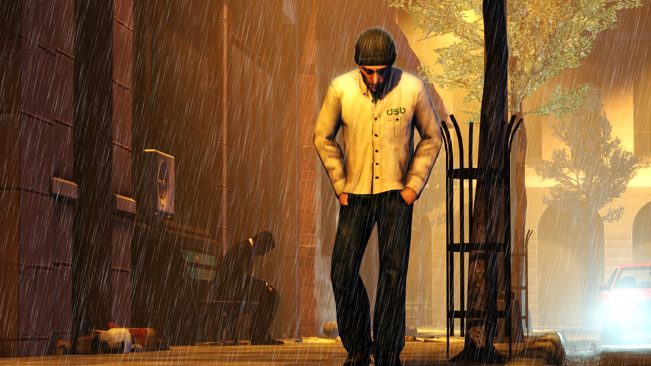
Some decent scene building going on here in the background, especially like the car which has fallen off to the side. Just feel like the dude staring right us is kinda freaky though, which you've probably done on purpose to great effect. I think I would've lowered his shoulders a little since it looks very robotic - if that's the case then cool.
Image 2
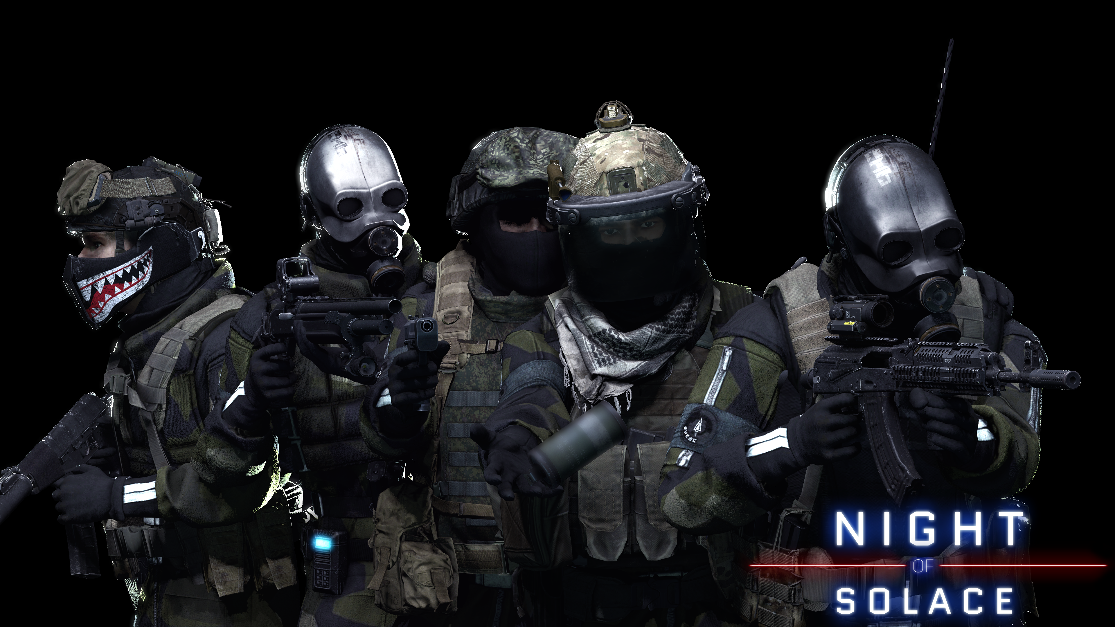
Pretty cool stack up, didn't really see the thrown grenade the first time. The lighting is really nice, I like that you can just about make things out. It's a nice promo image. The text/design for "Night of Solace" looks cool on both images too.
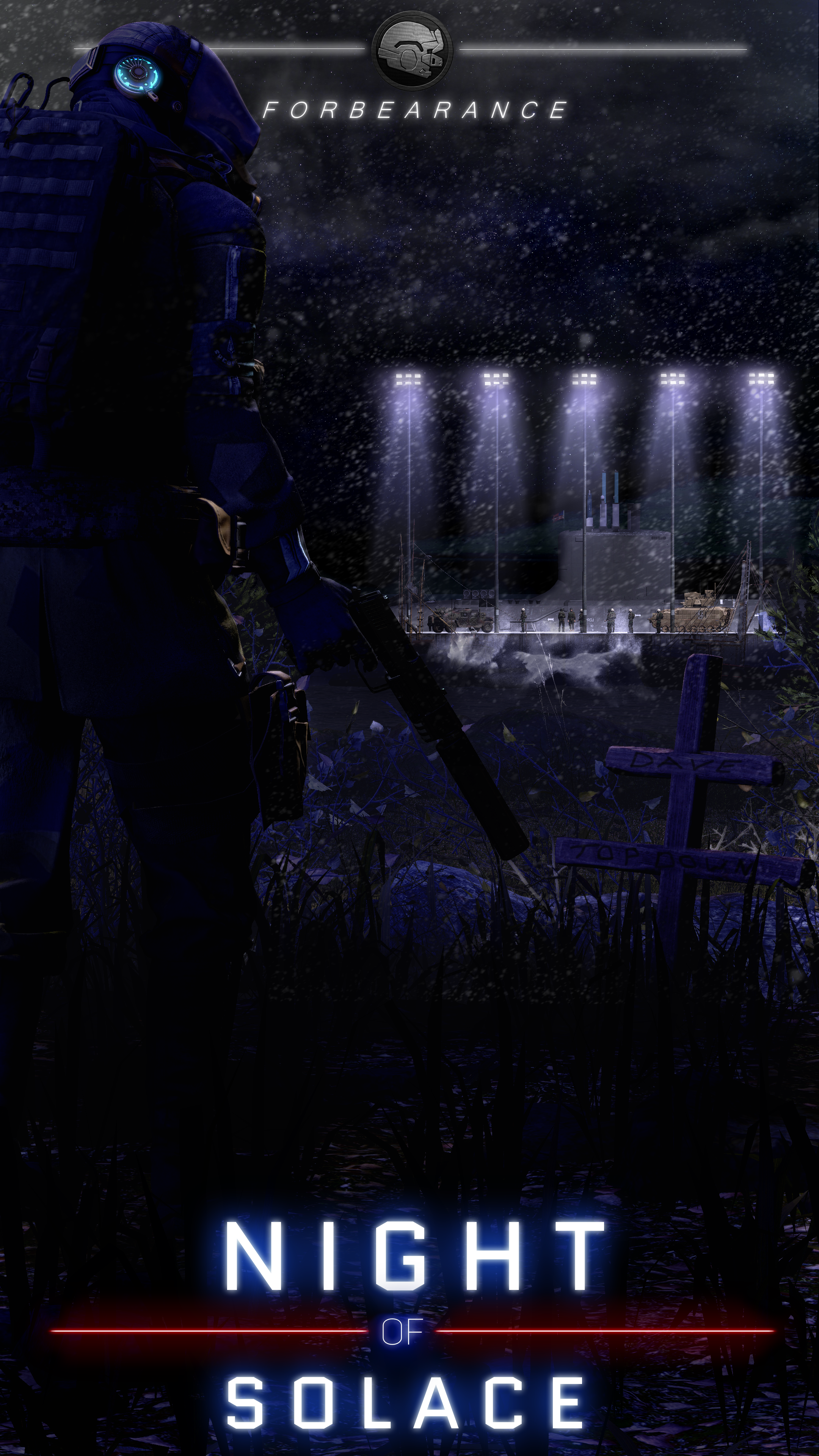
Really liking this one here, the shine of the light on the floor and how it beams down is really nice. The scenebuild you've got going on works great as well. You've made a wrecked city beautifully - always find these kind of hard cus it's either too much debris or too little but this is really cool. Only thing which really lets this down is the title at the bottom and header at the top. Text may have looked better smaller - the black gradient is really what lets the header down imo.
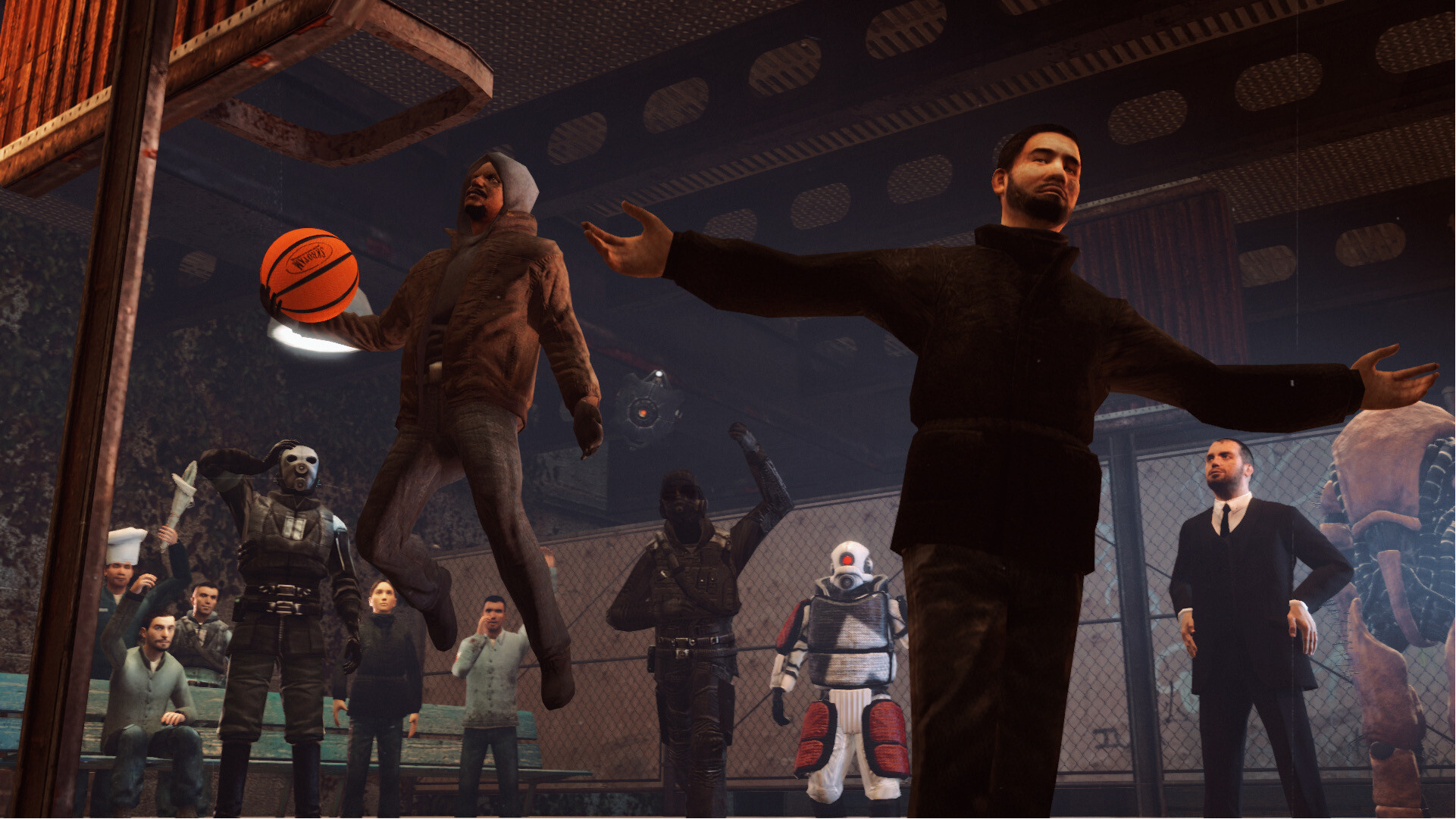
Love these builds that just look like Gmod backgrounds for the main menu. Don't really have much feedback to offer here. It's fun, it's silly and a light hearted. All the poses are pretty good - angle is great, lighting is ok too. Nice work Ricsow.
Liking the angle here, rain effect is pretty cool too - depending on the tool you are using for post-fx it woulda been cool to see the rain kind of
change colour depending on what's around / behind it? You know how rain kinda gets lit up by car lights, or you can barely see it when its got shadow behind it - that kinda stuff. It's really just environment building and a bit OTT but just some feedback I thought of. Otherwise the scene build itself is nice and simple - trees look a little funny / bright but ah well. Nice stuff.
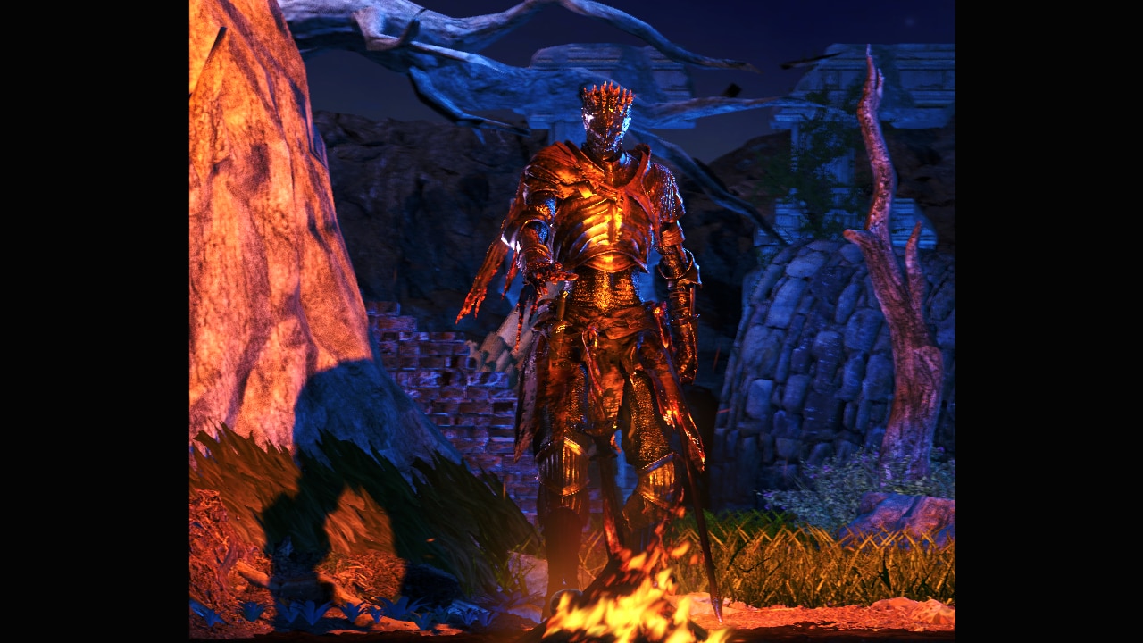
Lighting is pretty intense in this one which I like, especially the shine on the armor - just looks really cool. I also like the choice of blue instead of just darkness of night, fits really well here with the shade of red. Outside of the build, I think ya could've cropped out the black bars on either side but otherwise cool cool cool.
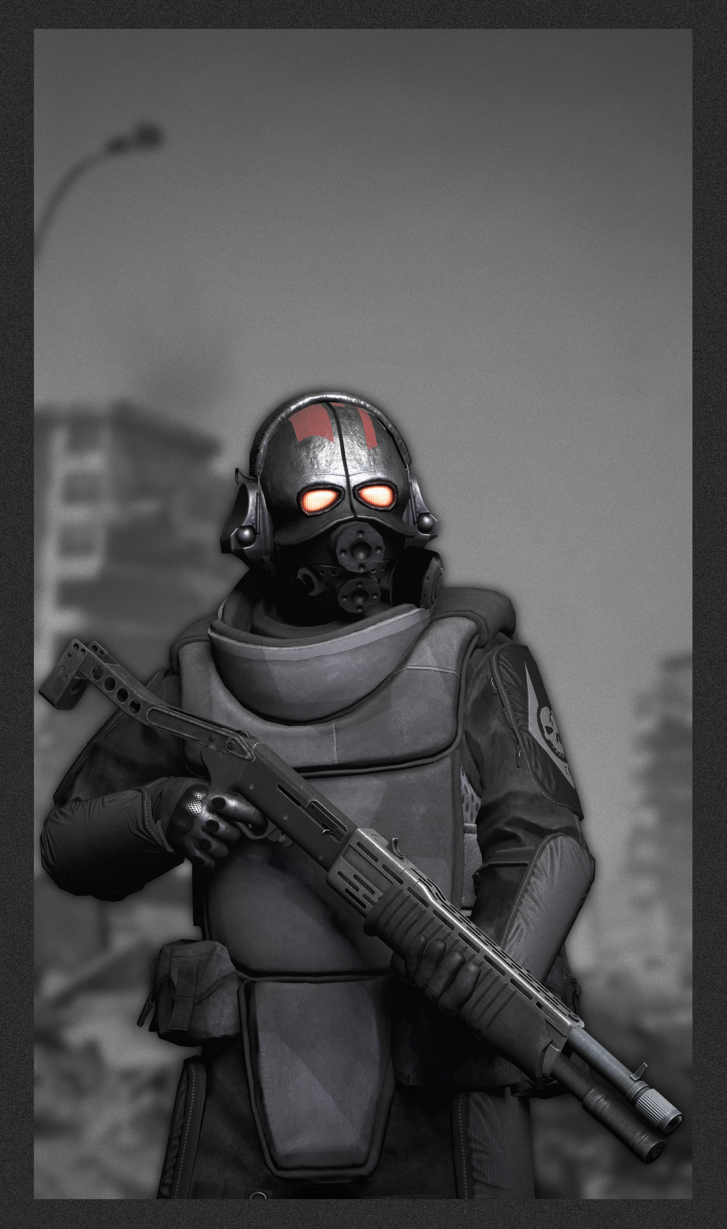
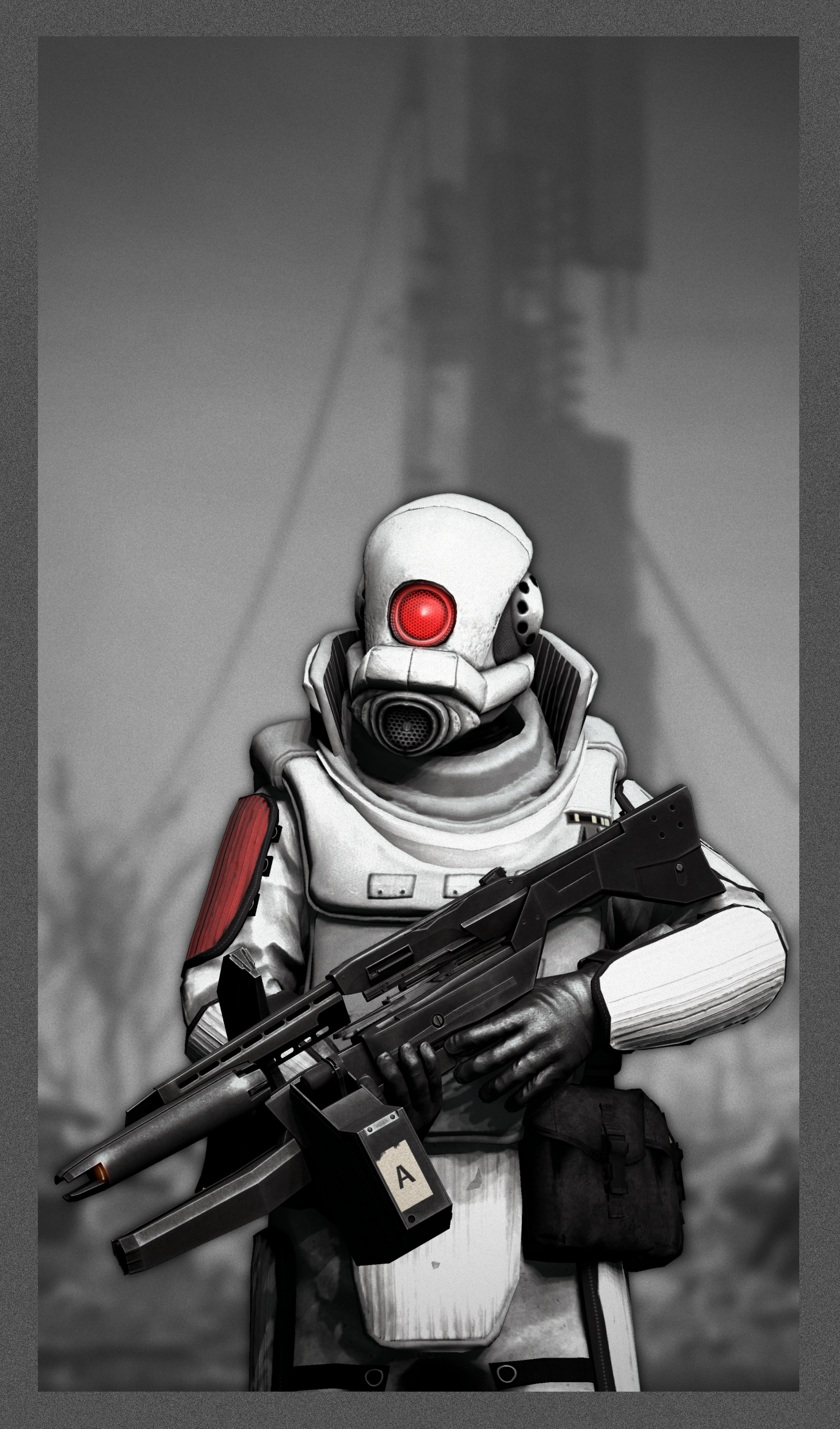
Nice screenshots. Can't tell if these are builds or not but the post fx looks cool - really digging the black and white and extra glow on the third image. Just looked up what ZetaPlayers are. Funky stuff lol.
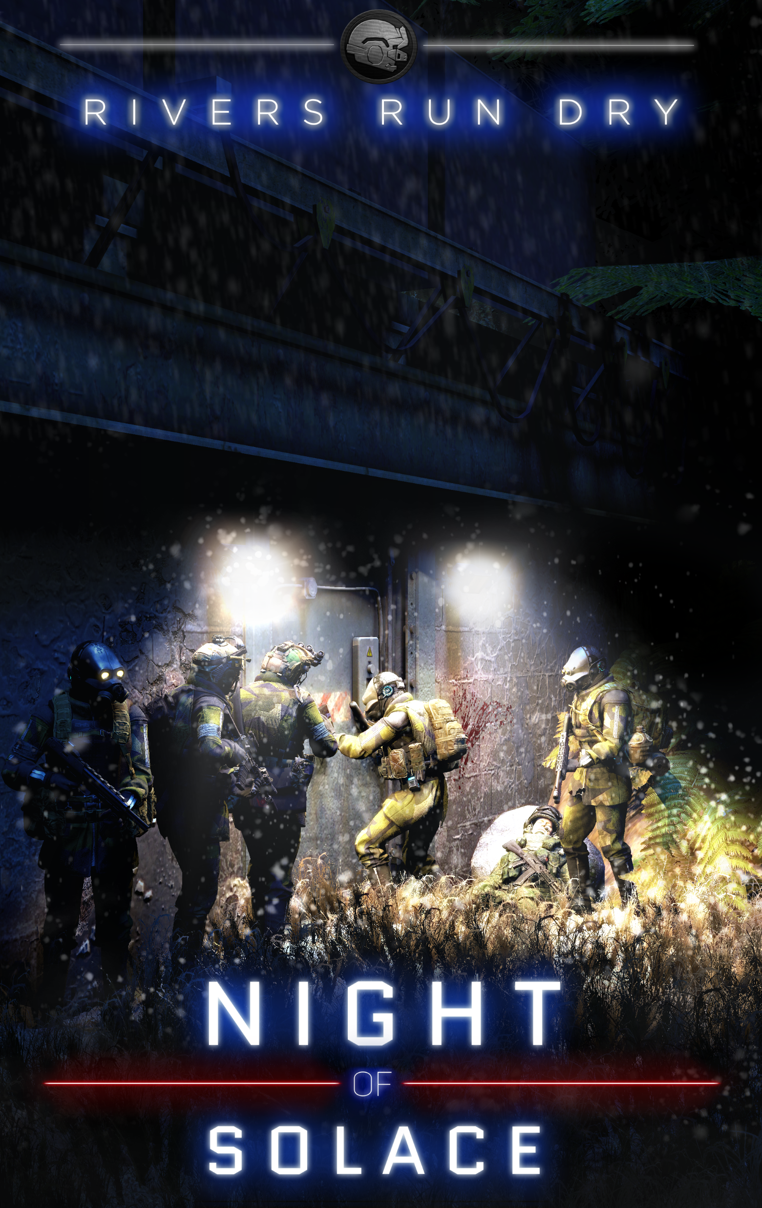
This is a really nice scenebuild, the bunker and the soldiers getting ready to go in looks super cool. The only thing which I think lets this image down is the sheer level of post fx - like the clumpy things all over the image, feels unnecessary or maybe could've been made smaller? Guessing that tit is meant to be rain or snow - just a little too clumpy imo. Titles and text looking good though!
-
Technical achievement highlight @Antloin
Cool points highlight @Ricsow
Upcoming skill highlight @Fucked Up Individual
-
Don't have much time for lots of feedback and ideas so I just gave my initial thoughts.
TTYL.