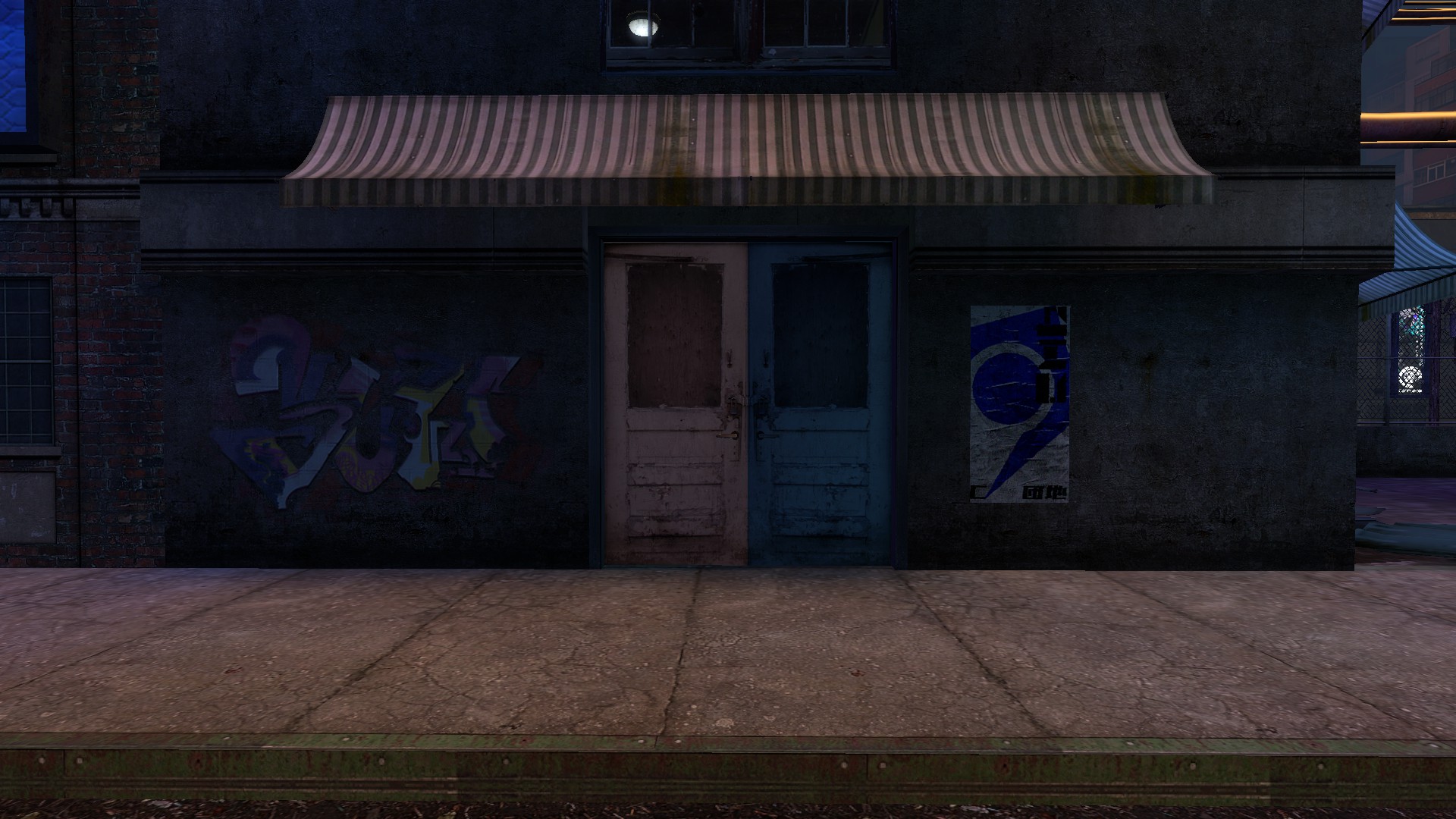
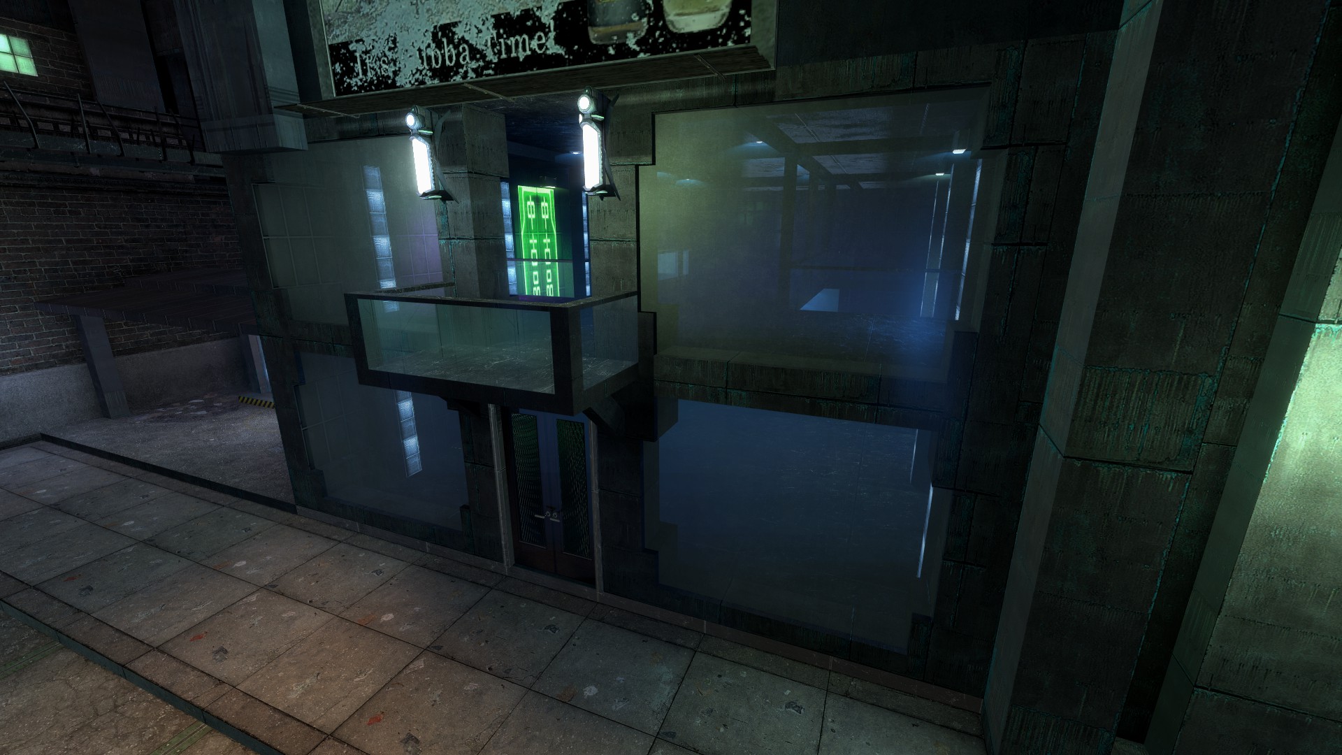
yorokobi sushi, the odd ugly duckling of all the businesses on mainstreet is sort of out of place imo. what could make it look better is:
- removal of the breen posters, potentially replaced with either nothing or japanese/tokyo/city 8 posters.
- removal of the cluttered garbage on the ground that is absent from every other business.
- get rid of the window.
- make it look relatively appealing, maybe change the color tone and get rid of the fact that every wall seems to be a different texture/color.
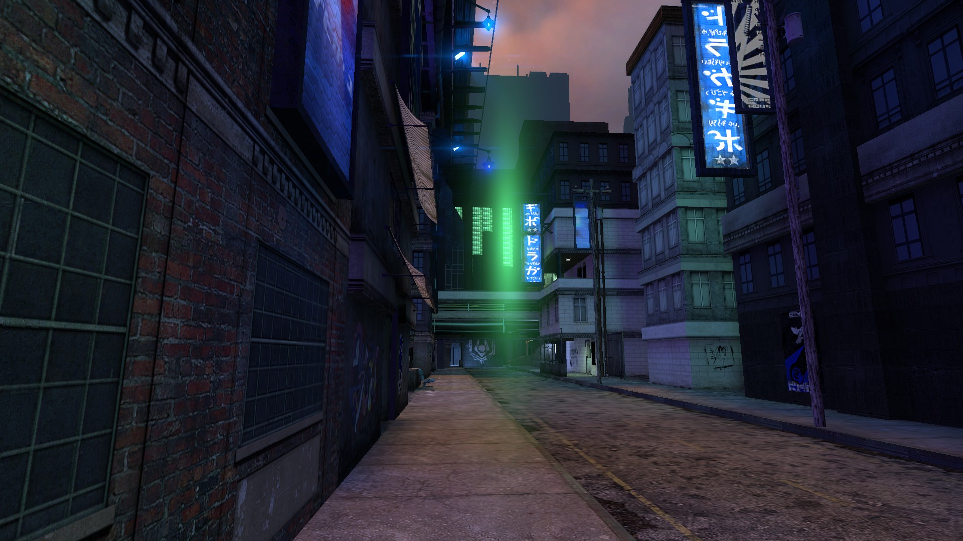
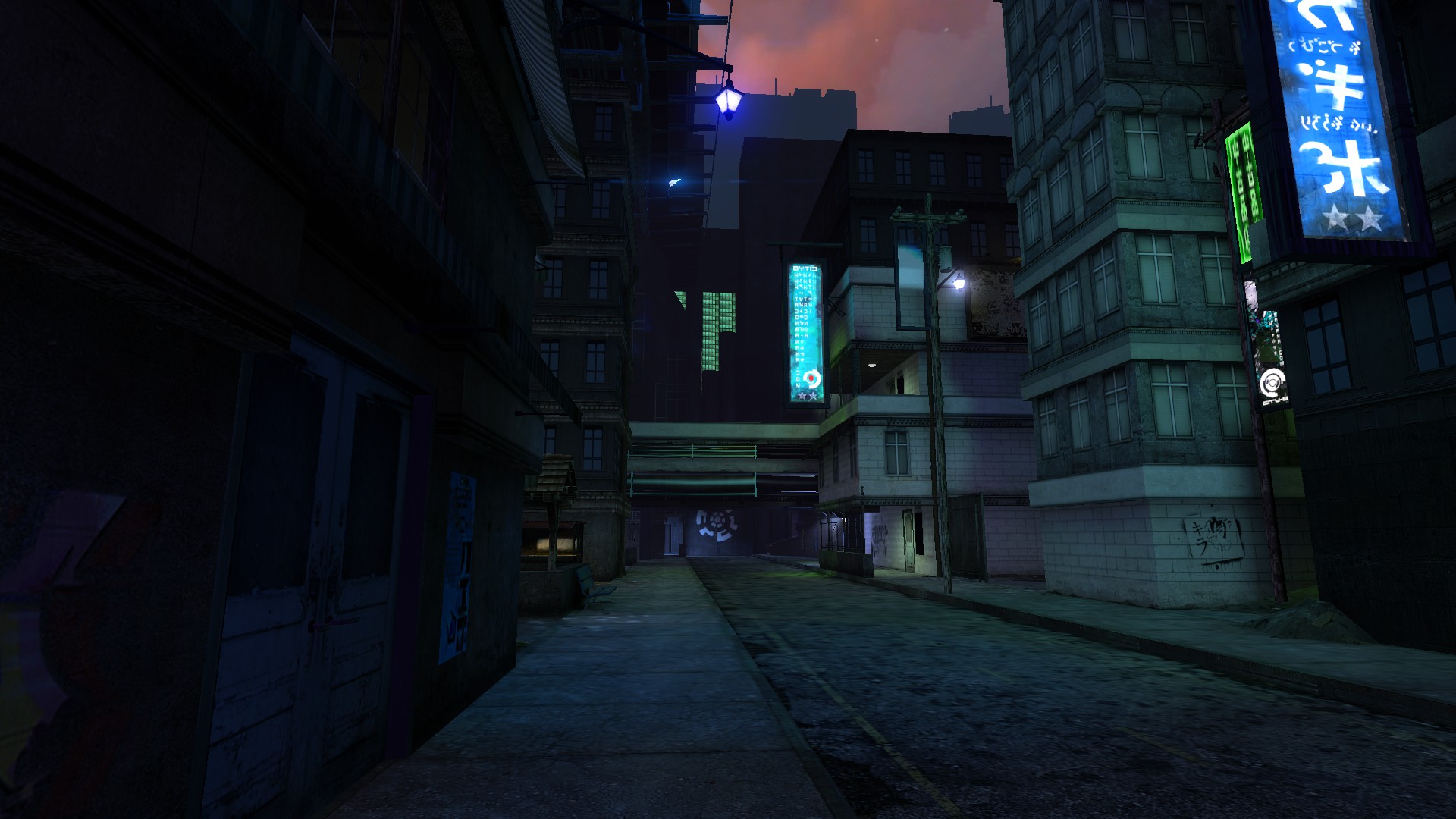
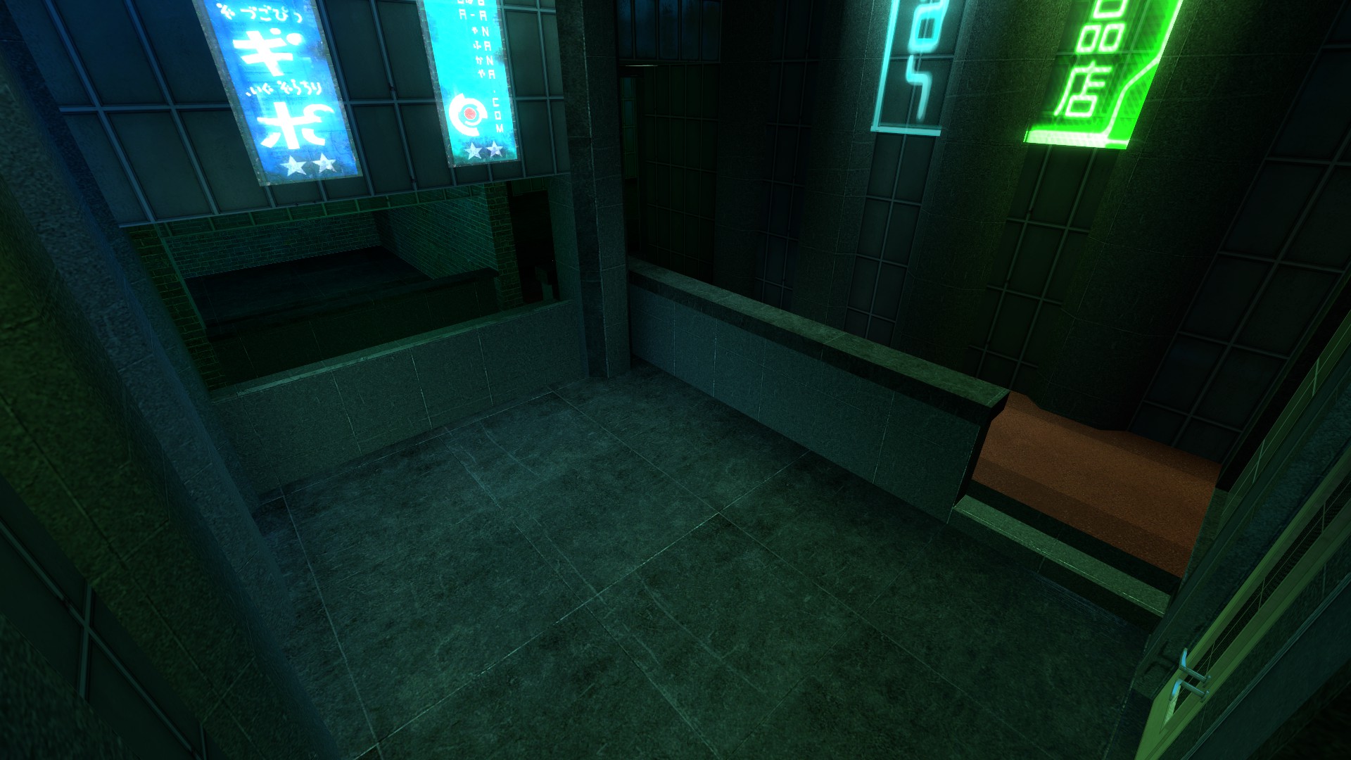
- neon signage and lots of it
- removal or replacement of the window shutter. people walk in and out of the backroom anyways because it gets locked and it always looked awful. metal shutter would be better.
its hands down the ugliest business on mainstreet in need of renovations.
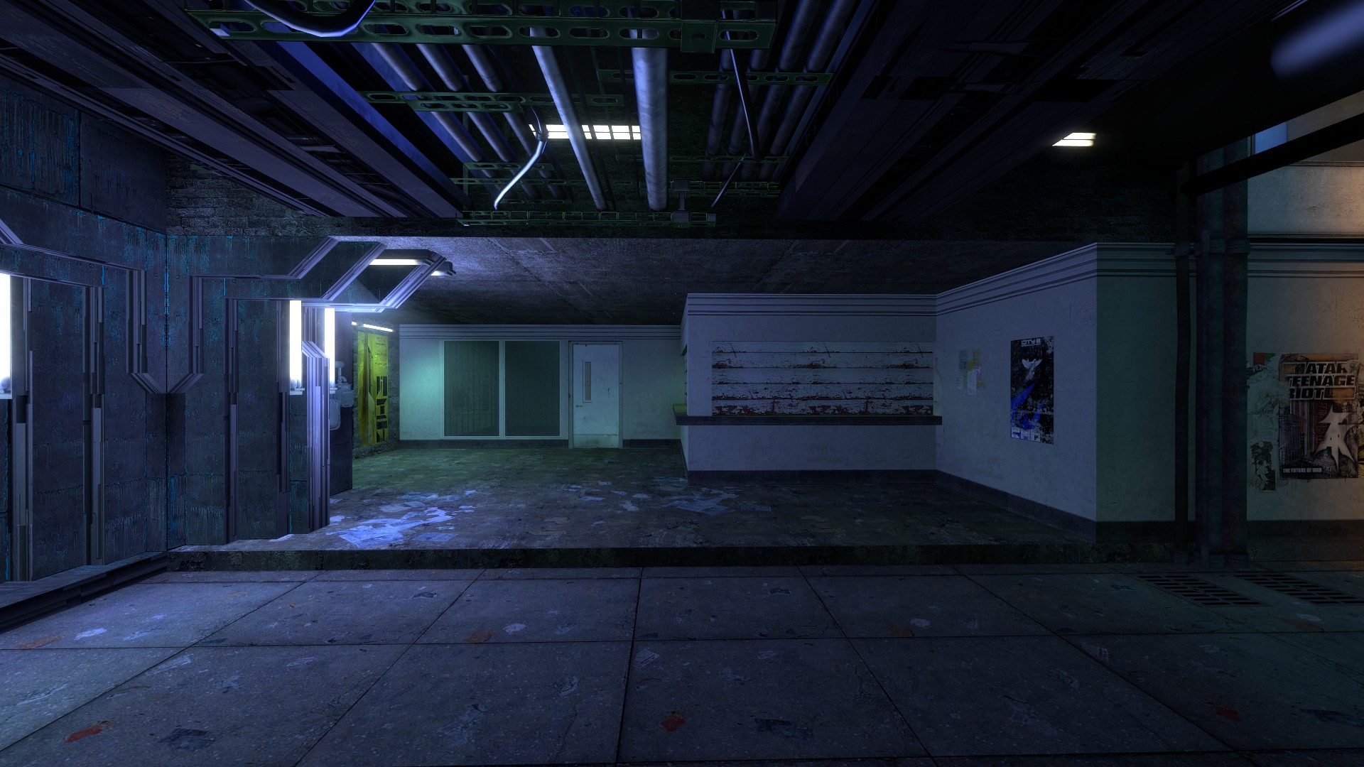
comparison
roof is made of concrete
floor is made of paper.
left side is made of union metal
right side is made of drywall
poster wall on left is made of brick or some shit
shutter made of finally aged painted cedar
you get my point its fucking awful and out of place in tokyo, particularly on mainstreet.
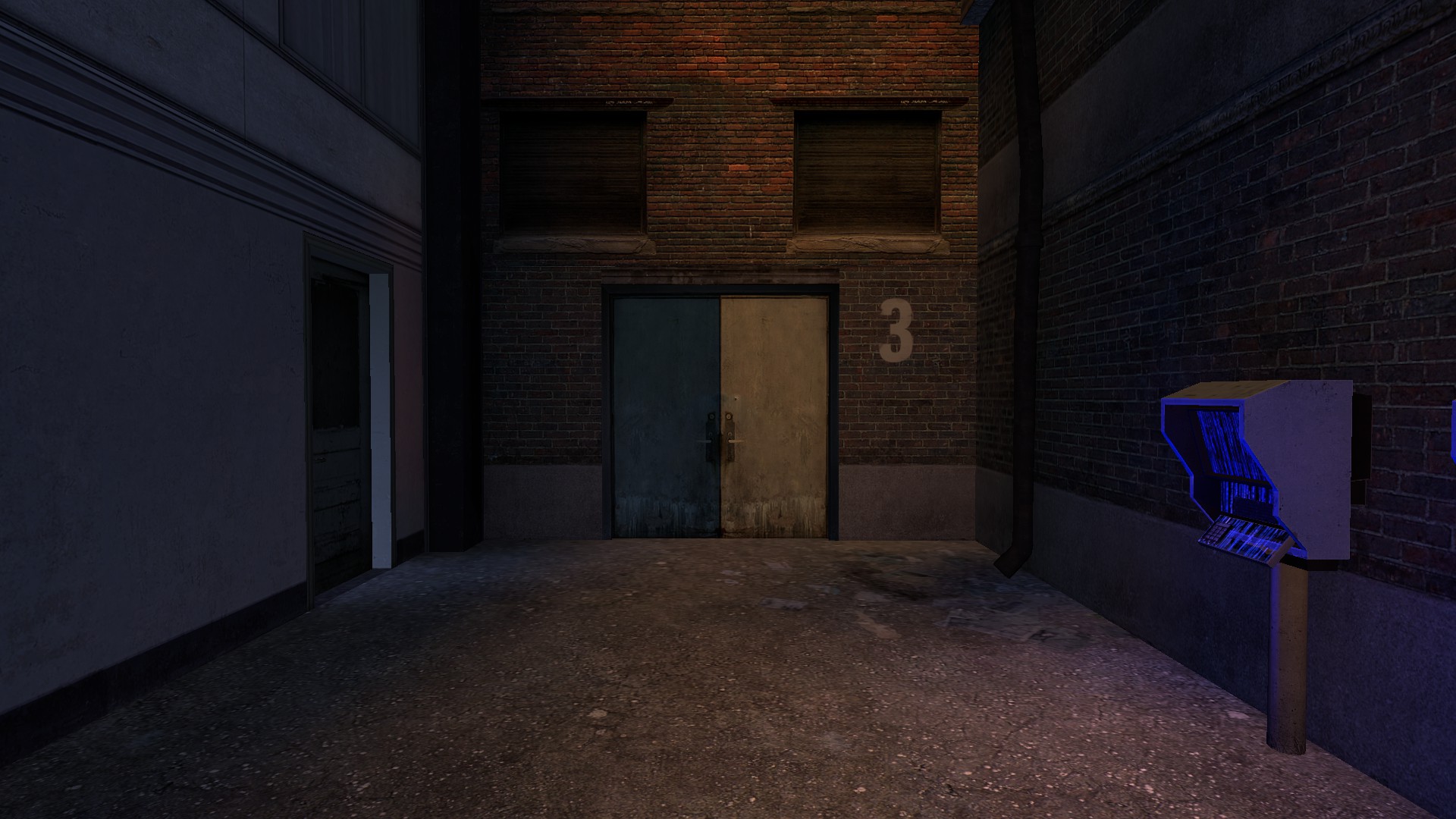
not that it matters because this is only in neb lore, but you would think the kobayashi-affiliated business would actually look minimally acceptable and have the only building in the main city with paper clutter
idk, i just sort of scouted it out for the first time and realized how ugly the store is compared to literally anything, even the devil's arse.
i don't see any reason for it not to made to look acceptable/satisfactory when you have literal night clubs with neon in two other places other than it not being worth the effort, which as you are a developer i can understand.
any effort given towards this ugly ass business would be appreciated.