- Joined
- Apr 27, 2016
- Messages
- 1,822
- Nebulae
- 7,106
what ota laddercan i ask one thing
is the ota deployment ladder fixed

what ota laddercan i ask one thing
is the ota deployment ladder fixed
what ota ladder
It's Gorillaz.you can attack anime however you want but not even the flames of the seven hour war were enough to kill it
i only intended for it to be used like, oncei love cats but there's a hell of a lot of them on the billboards lol
If it looks like anime it is anime (edit: well, at least partially)It's Gorillaz.
nazis and maoists were bad guys but people still buy into their bullshit because of le epic "take back ur future" or "eat the rich" fashwave/commiewave shitin my personal view; CP propaganda posters are absolutely pointless to make or put on (and union factions to some extent).
the force needs no advertisement. no amount of 'we are the good guys we protect you' is going to change anyone's opinion on it. we already know what CP is, what it does, and why you should like/dislike them. it takes up space without providing any roleplay value back
posters should be made for more nuanced and player made initiatives - gangs and political groups. poster spaces should be reserved for these things to be added and removed as we see fit, and default map posters should be ones that blend into the setting without being too intrusive; the previous posters are just fine for this.
this isn't to say you haven't put effort into gathering these images and placing them properly and we don't appreciate it, you have and we do, but i disagree with the change in the first place
I've made the version I sent to bq public on my profile, gathering feedback till thursday
https://steamcommunity.com/sharedfiles/filedetails/?id=2395878954
https://steamcommunity.com/sharedfiles/filedetails/?id=2395624135
already changed the sun lighting & poster lighting since this, & unlocked the loyalist door
just be honest with what you guys think is right/wrong, after thursday it do be permanent
oh and there's a lot of dev bright lights during the night just ignore them


i only intended for it to be used like, once
i'll make moreyeah I didn't have enough, I'll sauce some more posters by the end of the week
i didnt actually notice the amount of cats till now
not one butI've made the version I sent to bq public on my profile, gathering feedback till thursday
https://steamcommunity.com/sharedfiles/filedetails/?id=2395878954
https://steamcommunity.com/sharedfiles/filedetails/?id=2395624135
already changed the sun lighting & poster lighting since this, & unlocked the loyalist door
just be honest with what you guys think is right/wrong, after thursday it do be permanent
oh and there's a lot of dev bright lights during the night just ignore them
fournot one but TWO admin boxes, that's epic as hell. Map looks good, enough change that it's still new and exciting, but not so much that it's completely mind boggling to understand the new layout/changes
as far as it seems about 90% of criticism is regarding the posters, I have some ideas I'll run past my two poster beasts later today

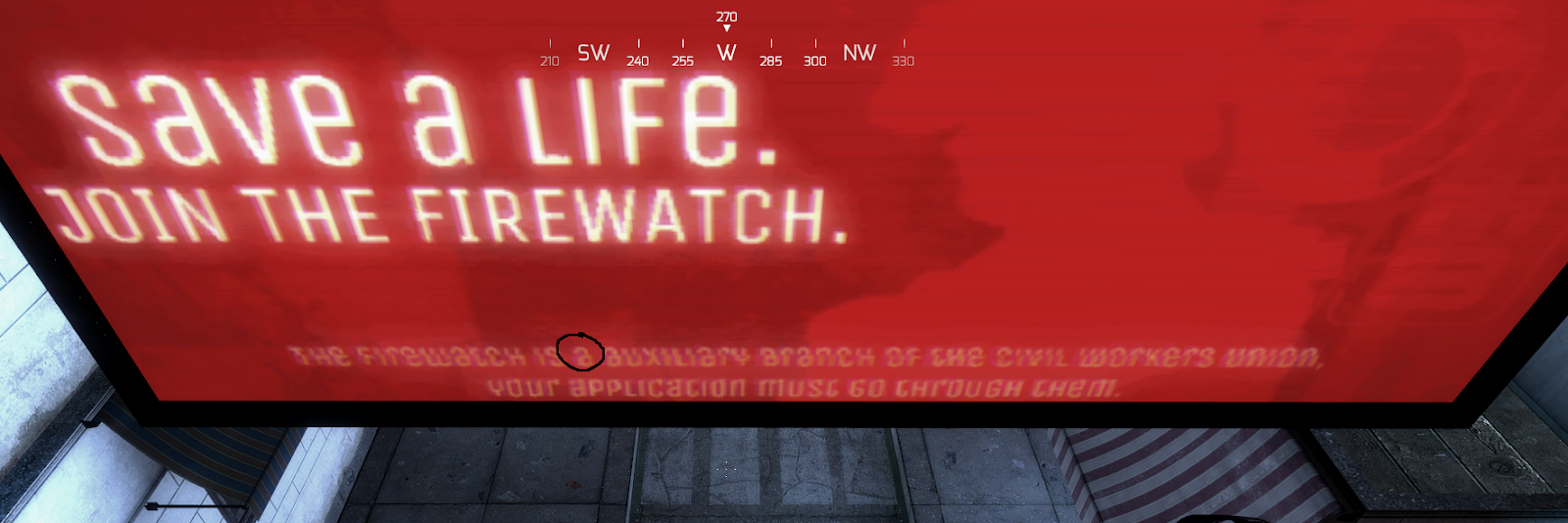
I recommend avoiding posters that have a colour pallet based off of white & a random colour like the ones you see atm, moreso the firewatch posters, terminal conglomerate poster, and the >B Breen Water poster. Give them some various colours, pink, blue, black, white, anything that stands out, because you want posters to stand out.as far as it seems about 90% of criticism is regarding the posters, I have some ideas I'll run past my two poster beasts later today