HAHA GOT SPARE TIME
@slugman ,
what is actually happening within this? Is this a logo/typeface you made or spray painted onto something somewhere, or is this a screenshot from a map? x.
@Mickey Toast ,
I think you're onto something pretty good here. I myself, cannot draw so well, or near as good as this (and I'm an art student). I think you need to work on a colour palette perhaps, limit yourself to a few colours and see what you're good with and what you're not - then perhaps try out some anatomy work for the hands you've done, as they're pretty good, but some fingers are needlessly big. x.
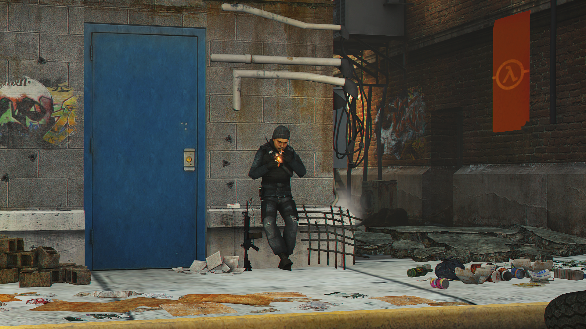
@Maxim ,
You're onto a pretty good concept of stuff I've never really seen much of before with SFM/Gmod work. But from looking at last weeks and this weeks post you need to stop basing your work off default SFM animations. They can look good but you need to make some things look different or else it'll look like you've really just copy-pasted a lot of things, such as the saluting CPs in this one. Work more on this linework based art though, it can look really good with some refinement :ok: xx.
@Anleas ,
You've made a pretty good piece of work from that reference picture, however, you should never work with block colours (that have no shading, i.e the dragon's skin and shell) and then have gradient behind it looking as if it's supposed to shine. You should either work with just block colour, no shading and a limited colour palette, or, have more contrast gradients and shading. IF you have both together you essentially create what looks like an unfinished piece of work. x.
@Eddard Stark ,
I love a good portrait picture, but you can't mount it on pink no matter what. Also it's weird to look dead at someone when they have a mask on in artwork, I find when making something like this, you create a full animation and then zoom in on their head/upper body from different angles until you reach a nice one. The colour work and positioning works perhaps as it's Kylo, but please. No pink borders. x.
The drawing is also very nice, but I think Scone's done a good job on critiquing xx.
@dee pixel ,
Art comes in many forms, did you know they chained a dog to an exhibition and no one was allowed to feed it and then it died and people called it art??? That's what your work reminds me of. Whats the context? x.
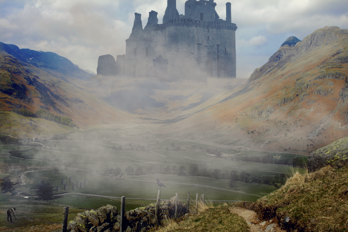
@Scone ! ,
This poster reminds me of an NCR poster type thing from Fallout NV, add some more colour too it. My GF thought it looked like a beige Mount Rushmore, work more on this kind of stuff and experiment further :ok:. x.
@MaXenzie ,
I've always valued your diversity in work (and the amount of times you change your neb pic) and I really like this as well, the background you've put it on also captures a really good thug/urban aspect. But I wouldn't make it as harsh personally, I really like the level of detail put into it as well, work on some more anatomy of stuff and come back with more sxc muscular men xx.
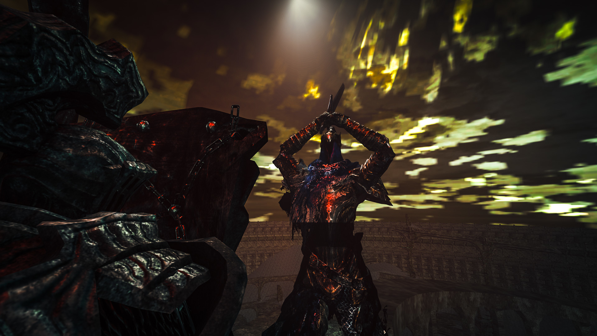
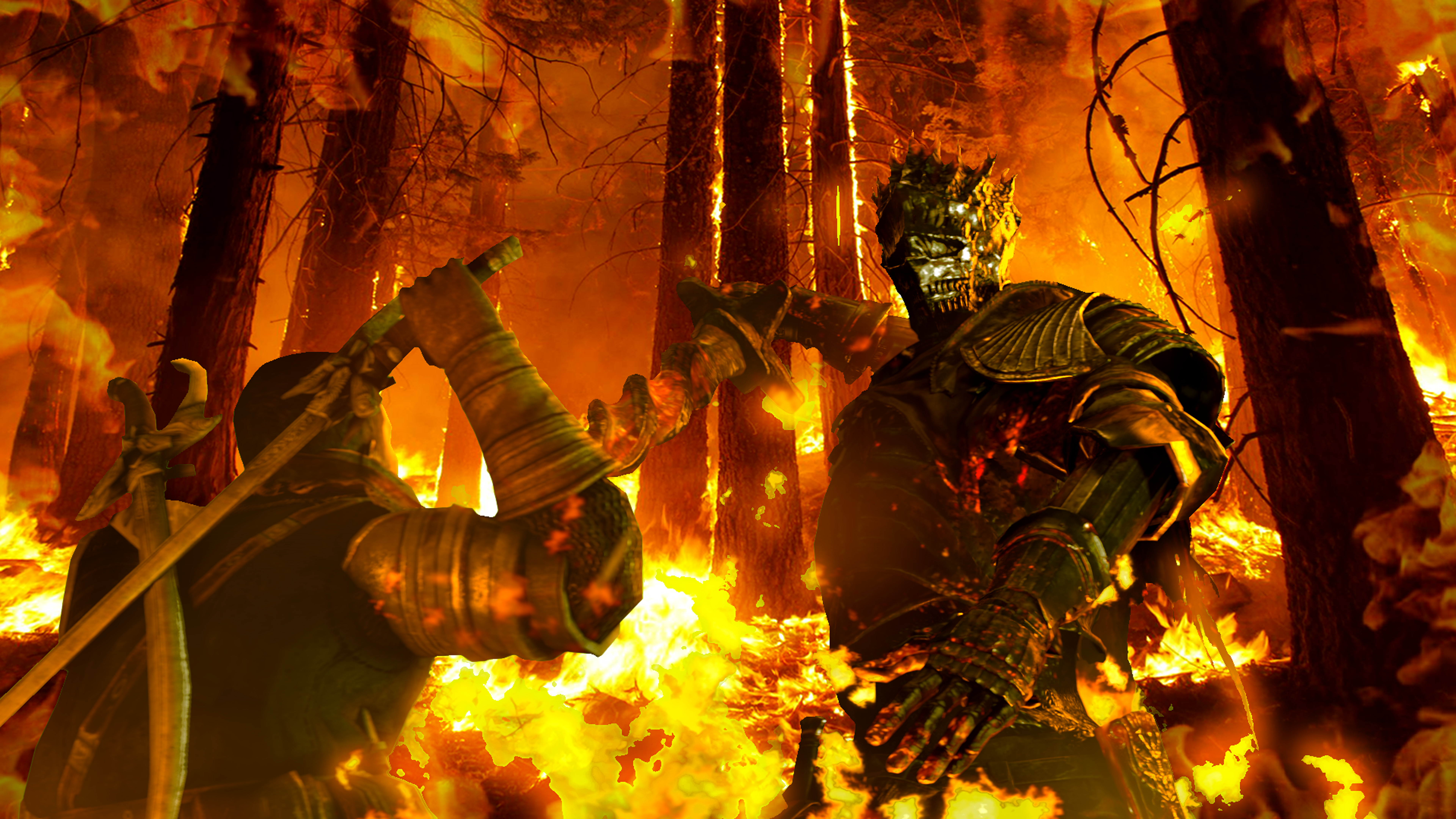
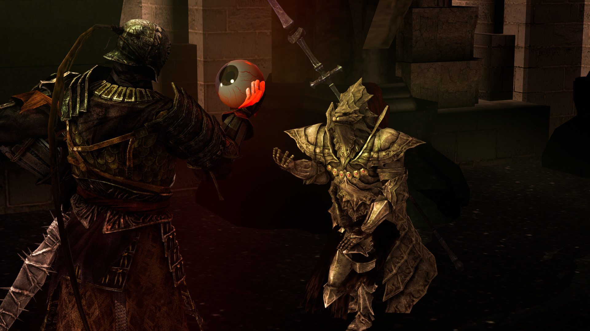
@$Vex$ ,
As Erkor said, that's quite a wide lens my man. Everyone here seems to be onto something but need to refine it more to execute perfectly, make some more Dark Souls stuff. Anyone can pose some men with some rooty-tooty-point-and-shooties but making swordplay poses is something that is lacking incredibly. Use sharper, more narrow lenses, some brighter lights for colours and you're onto a winner xxx.
@Pale Rider ,
I'm not entirely sure what's going on here but I like it a lot, try this technique of colours on some other stuff and I think you can come up with some very aesthetic looking stuff.
I've changed my mind, my winner is;
@$Vex$ ,
I've chose it because I think this the type of work that seems to be lacking around this website, it's needing some improvement but I think it's a change we all want to see a little more of perhaps(?), idk, just an opinion.
idk if I said some of the same stuff as scone tbh I didn't look through it very thuroughly.
I hope I was ok judge.
Might make something of my own soon.
@Lemon Cuntcake thanks for letting me judge, love.
xxx