
You are using an out of date browser. It may not display this or other websites correctly.
You should upgrade or use an alternative browser.
You should upgrade or use an alternative browser.
City 9 - Map in progress
- Thread starter Roby
- Start date

- Joined
- Apr 26, 2016
- Messages
- 25,739
- Nebulae
- 110,800
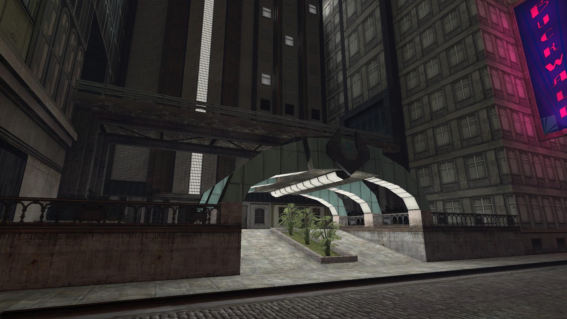
hi you tought i was done with this map,
well think again
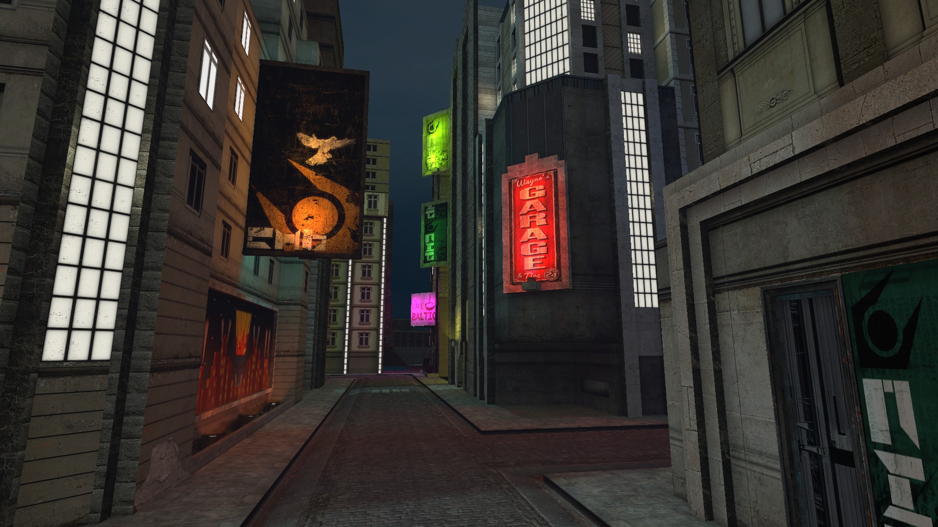
i just re-did the layout of the map again and im fully satisfied with it's circular street layout for maximum looping CCA patrols
well think again
i just re-did the layout of the map again and im fully satisfied with it's circular street layout for maximum looping CCA patrols
Reactions:
List
Thanks for the tip, I'll fix it and probably add some lighthing effects too.Only complaint is that the Combine logo looks a little stubby, vertex editing the top two points to extrude farther would make it look a lot better
Other than that, stellar work
Reactions:
List
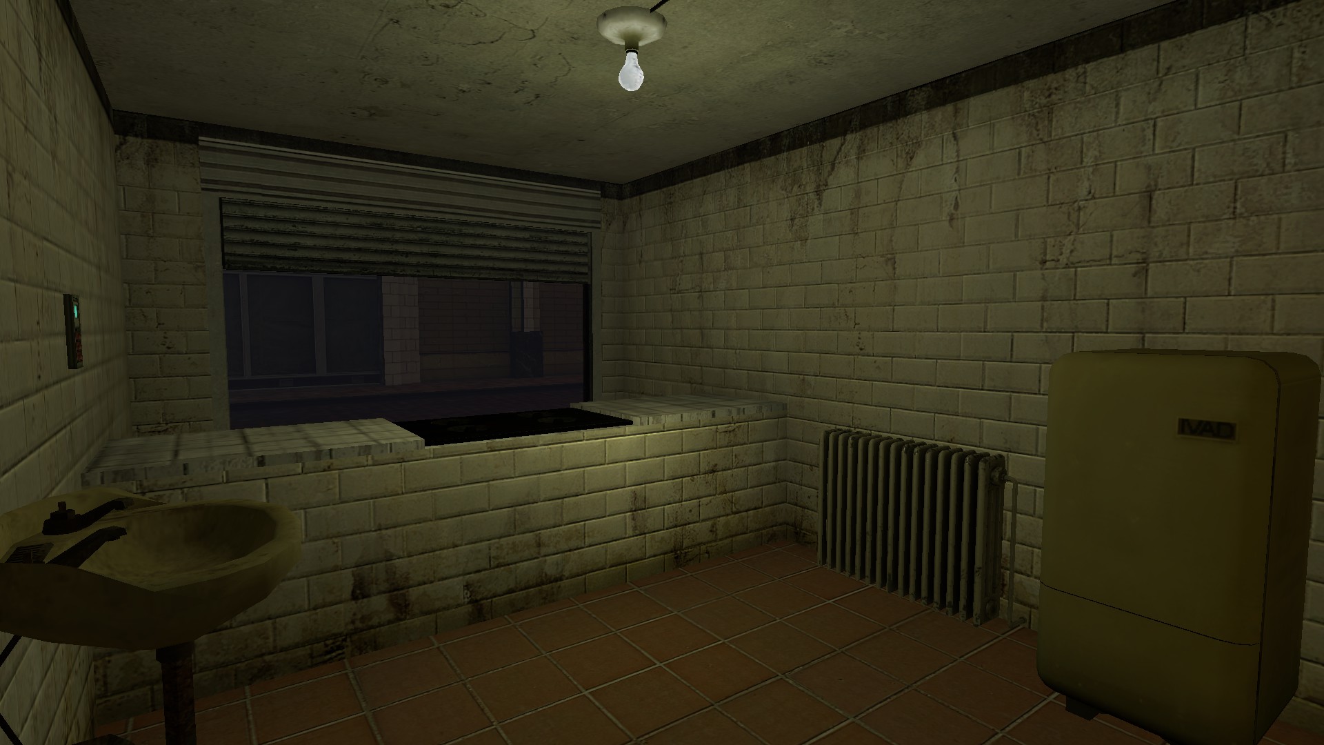
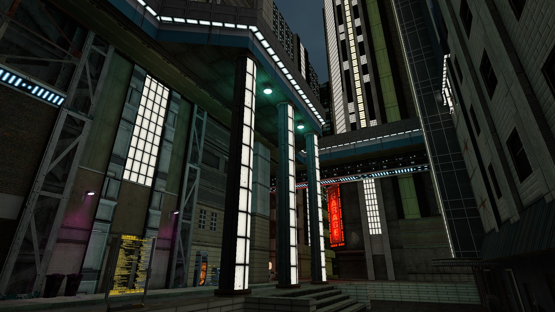
Fast food storeCould I ask about what the second picture represents?
It seems to be some kind of store, but I'm unsure of what it is.
rang
aussie turk
- Joined
- May 24, 2016
- Messages
- 1,705
- Nebulae
- 3,282
Shadow Flex
Nucleus
- Joined
- Apr 26, 2016
- Messages
- 1,031
- Nebulae
- 1,248
I definitely like what you're doing here, but I'd say you still have work left for you in two key areas.
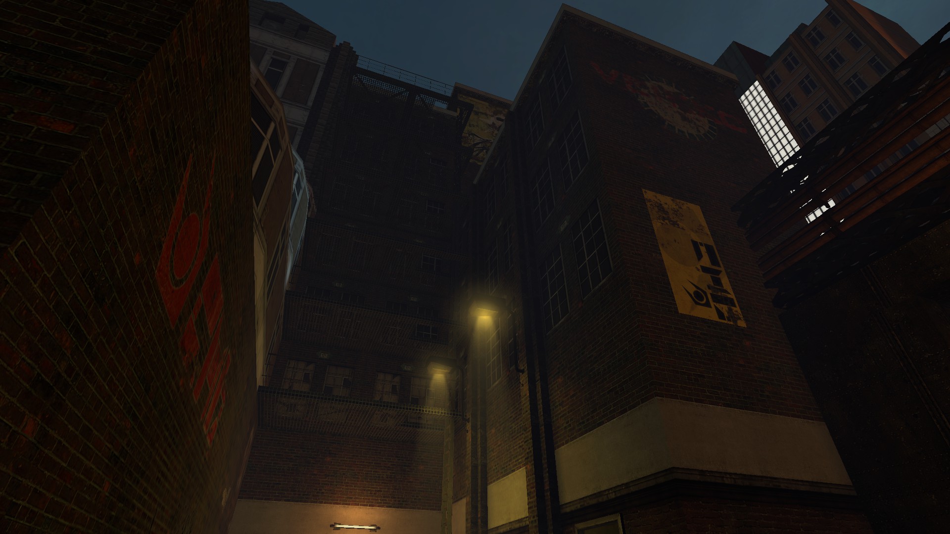
The lighting is a bit basic. It works for the atmosphere you're trying to build and it gives off a classic beta vibe, but unfortunately it's beta in quality too. Work on the brightness -- some areas are a bit too dark, others need to be darker. Create a contrast with brightness alone so that the player constantly switches between them as he travels. It makes him weary and cautious. The color palette needs some refinement, as well as the positioning. In the first picture with the banners, each of them has a different color, which overloads the viewer's sensory input (a fancy way to say eyes). While such a theme works for a cyberpunk setting for example, it doesn't fit what you're going for.
Also, use clever saturation and desaturation of colors to better adapt the lighting -- desaturate your overall lighting and only saturate the highlights -- such as posters and so forth. If there's too much saturation going on, the viewer will be overstimulated and will grow tired. If there's no saturation and everything's grey and dull, they'll get bored. There's a fine balance between both.
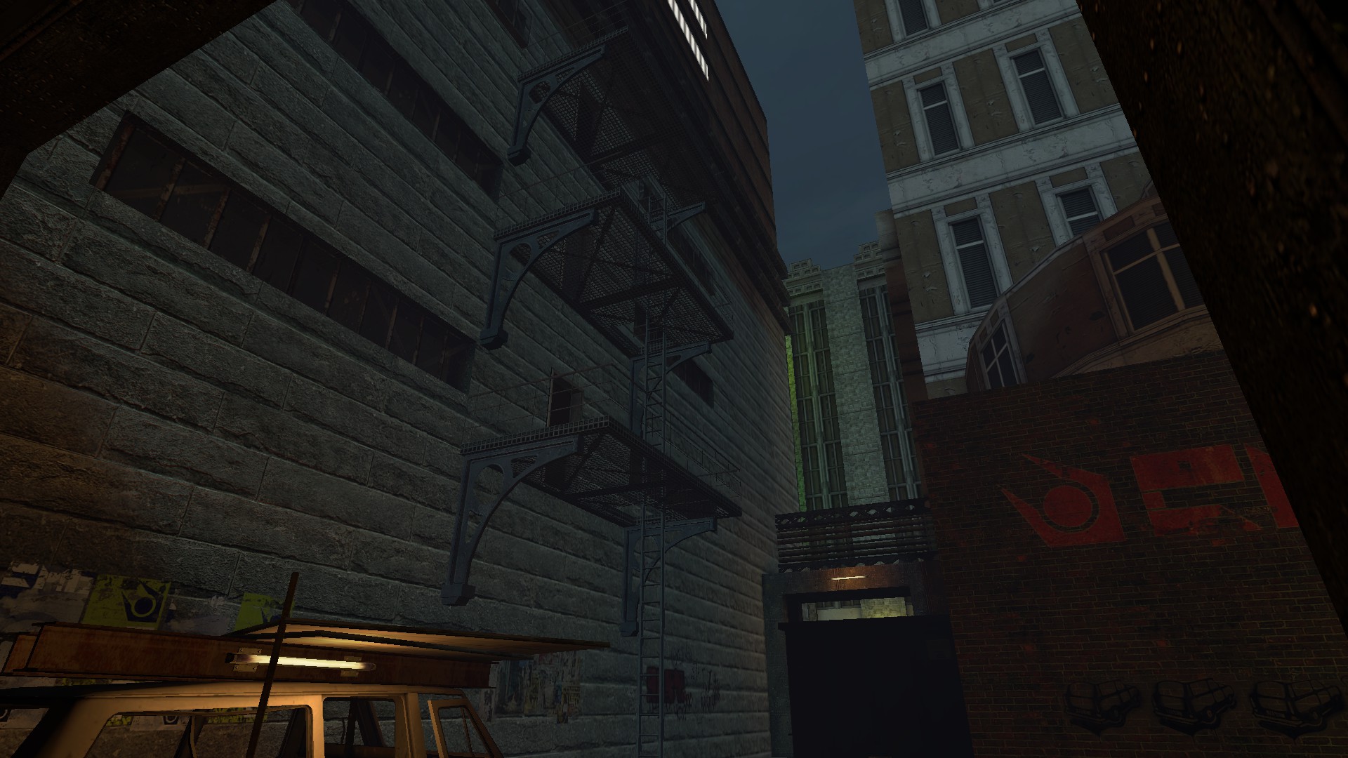
As for the second point, the brushwork looks interesting, but it needs some detailing. It's rough and edgy. Smooth it out a little bit and introduce some props and models. It's too empty and it lacks a personality -- use graffiti and posters on walls to achieve that.
I can talk in specifics if I could take a look at your compiled work. This is just a general overview. I understand if you do not want to do such a thing.
The lighting is a bit basic. It works for the atmosphere you're trying to build and it gives off a classic beta vibe, but unfortunately it's beta in quality too. Work on the brightness -- some areas are a bit too dark, others need to be darker. Create a contrast with brightness alone so that the player constantly switches between them as he travels. It makes him weary and cautious. The color palette needs some refinement, as well as the positioning. In the first picture with the banners, each of them has a different color, which overloads the viewer's sensory input (a fancy way to say eyes). While such a theme works for a cyberpunk setting for example, it doesn't fit what you're going for.
Also, use clever saturation and desaturation of colors to better adapt the lighting -- desaturate your overall lighting and only saturate the highlights -- such as posters and so forth. If there's too much saturation going on, the viewer will be overstimulated and will grow tired. If there's no saturation and everything's grey and dull, they'll get bored. There's a fine balance between both.
As for the second point, the brushwork looks interesting, but it needs some detailing. It's rough and edgy. Smooth it out a little bit and introduce some props and models. It's too empty and it lacks a personality -- use graffiti and posters on walls to achieve that.
I can talk in specifics if I could take a look at your compiled work. This is just a general overview. I understand if you do not want to do such a thing.
Reactions:
List
I definitely like what you're doing here, but I'd say you still have work left for you in two key areas.
The lighting is a bit basic. It works for the atmosphere you're trying to build and it gives off a classic beta vibe, but unfortunately it's beta in quality too. Work on the brightness -- some areas are a bit too dark, others need to be darker. Create a contrast with brightness alone so that the player constantly switches between them as he travels. It makes him weary and cautious. The color palette needs some refinement, as well as the positioning. In the first picture with the banners, each of them has a different color, which overloads the viewer's sensory input (a fancy way to say eyes). While such a theme works for a cyberpunk setting for example, it doesn't fit what you're going for.
Also, use clever saturation and desaturation of colors to better adapt the lighting -- desaturate your overall lighting and only saturate the highlights -- such as posters and so forth. If there's too much saturation going on, the viewer will be overstimulated and will grow tired. If there's no saturation and everything's grey and dull, they'll get bored. There's a fine balance between both.
As for the second point, the brushwork looks interesting, but it needs some detailing. It's rough and edgy. Smooth it out a little bit and introduce some props and models. It's too empty and it lacks a personality -- use graffiti and posters on walls to achieve that.
I can talk in specifics if I could take a look at your compiled work. This is just a general overview. I understand if you do not want to do such a thing.
Actually most of the brushwork is still heavy WIP, the buildings will have good forms but im making the basic crude layout so i won't have to plan it again and again, the photos are just a tease
Reactions:
List
This map will no longer be released in the near future, I've moved on to another project: a cyberpunk RP map.
Reactions:
List
Oh.. why @Roby ?
Dunno man, I lost interest in that map because it became too simpler and vanilla-ish
'77 East
`impulse-approved
- Joined
- Jul 17, 2017
- Messages
- 11,578
- Nebulae
- 27,430
Dunno man, I lost interest in that map because it became too simpler and vanilla-ish
Just out of curiosity, would you mind releasing the .vmf for people to play around with?
Just out of curiosity, would you mind releasing the .vmf for people to play around with?
I don't see why not
https://www.dropbox.com/s/bptfqljq5nlgjw2/rp_dystopia.vmf?dl=0
Reactions:
List
'77 East
`impulse-approved
- Joined
- Jul 17, 2017
- Messages
- 11,578
- Nebulae
- 27,430
This might seem a little strange, but it seems that the version issued doesn't contain scarcely anything save for part of the main street; there's no sign of the caverns, the CWU building or even the aforementioned Nexus - perhaps you've released a different version or said resources were scrapped early on.
-(BREAD)-thebiggerboat3
Proton
- Joined
- Apr 26, 2016
- Messages
- 149
- Nebulae
- 38
This would be a nice map to switch to once City 24 plays it's part. Very efficiently contrasts from the pompous dramatics that City 24 makes use of and is a great return to the gritty, industrial-esque roots we all remember.
'77 East
`impulse-approved
- Joined
- Jul 17, 2017
- Messages
- 11,578
- Nebulae
- 27,430
This would be a nice map to switch to once City 24 plays it's part. Very efficiently contrasts from the pompous dramatics that City 24 makes use of and is a great return to the gritty, industrial-esque roots we all remember.
1. It's been cancelled.
2. In it's current state, it's nowhere near ready even if it was.
-(BREAD)-thebiggerboat3
Proton
- Joined
- Apr 26, 2016
- Messages
- 149
- Nebulae
- 38
Well, damn. It was shaping up to be something really worth while. That's disappointing.1. It's been cancelled.
2. In it's current state, it's nowhere near ready even if it was.
Well, hopefully, down the line someone can pick up where he left off and finish the map. We've got plenty of people in the community with creative potential who could make this dream come true.
Goonsworthy
Whatever happens, happens.
- Joined
- Oct 11, 2016
- Messages
- 2,052
- Nebulae
- 1,644