look at me, actually doing some constructive criticism for once
@bjfgpkqkdmtnspwndsjt you want to get a medal again
@Prospekt, it's actually not that bad. Not wallpaper-worthy, but somewhere around a loading screen, or a pic for google doc of some edgy HL2RP server. I like the bare minimum of effects, actually gives you that feel of cleanness that hospitals should have. Pretty neat lightwork as well, plus the posing itself seems fairly decent. Still, it's nowhere near being facinating, or just interesting. I get the feeling of a second of "nice", and then I just turn my eyes away. There's no real story present, not much emotions, fighting for life, or shit alike. If you get that tensity going there, then you can call it actually interesting, that's what art is all about, being interpretative and having a story.
is good,
@Johnny B. Goode, thing about photography, is that it's just way harder to actually do a good one, than it is with posing. If you're using Gmod/SFM, you're building up a perfect scene. With taking pictures, you need to
find a good scene. The one you have here, is not meaningless, but doesn't have that something in it. Kinda reminds me of
Gefradah's album cover, but it just doesn't have that really neat editing, that adds the whole atmosphere. Another thing is the camera placement, which kinda places her in the centre, but leaning to the left, which leaves a medium sized empty space on both left and right, and that's not really anything good.
Rule of Thirds is your fam here, just look again at the Gefradah's cover and you'll see what I mean - big, empty space on left, and completly used space on right. It's especially useful with making stuff that has something actually happening in the background, something that adds in to the scene, but whatevs, you can read up on it on your on fam. Concept however, is looking decent, I like that little hint that the teardrop gives, plus the leaned forward posture, which sends the message of her being hopeless, weak, or any of that big fucking words. You could work on the lighting tho, the one you used here made her chin look like a square. I'd move the light a bit to the right, to actually give some view on half of her right side of face, but oh well. This is pretty much the longest comment I've ever done, so feel like a special snowflake, congrats. Also,
@Clark, good one mang. Definitely the editing stands out as something neat, plus the lighting which is done really good. It has concept, it has editing, what else could you want, eh? Posing. Here, it's bit stiff, and that's pretty much the only problem I have with it. I know that space suits aren't exactly flexible, but they just look as if you'd only move their legs and slightly they arms out of T-pose. There are also details of their toes being in standard position, which wouldn't be exactly comfortable while in space. You know, when you're not standing up, but lying on your bed, your toes are usually titled down a bit, ye? I guess that you should aim for something like
this in terms of posing, plus add some debris/space junk flying around in the background and few just infront of the camera, to add the depth. Still, not bad at all, definitely worthy a wallpaper,
@Club Ace, not exactly conceptless, but really empty poster. Without anything happening in the background, I can't really tell why is he trying to throw a fist in my face. What I can tell though, is that he doesn't know shit about fist fighting, as his fingers are still open a big, even leaving a little gap that you can see through. He also should've titled his lower arm so it'd be actually facing me, because I don't really think he's preparing for a hook strike, but whatever. Other than that, it's actually fairly decent, just the face that there's nothing in the background to tell the story, thus no context. Shame, but wasn't a waste of time.
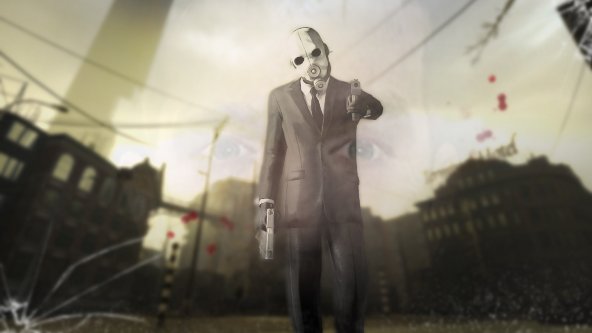
@Elan, I see where you were going here, but it kinda left the workshop in a bit weird way. The mask effect doesn't really look as a mask, but rather like a view frm behind a glass window, which is also ok. I generally adore how you edit things, even if posing isn't as :ok: as editing is, but it's getting better with each submission. The main problem is just stiff posing here to be frank, and empty ness of background, but other than that, it's a solid
@Danny, pretty much the same case as with Goode, just that it doesn't have much concept here. Rip
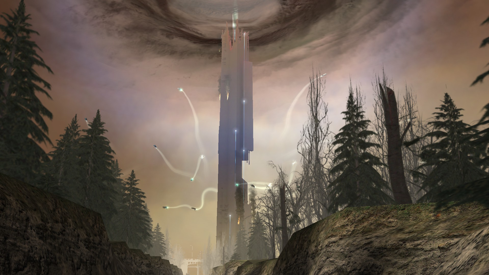
@Spork, looks like a screenshot to be frank, and there's nothing more than that. It's just a well made, exploding citadel, but nothing more is present here. No running refugees, no crashing pods, no chaos whatsoever, just the citadel itself. Feels rushed, especially without effects to hide the ugly textures on left and right, but oh well.
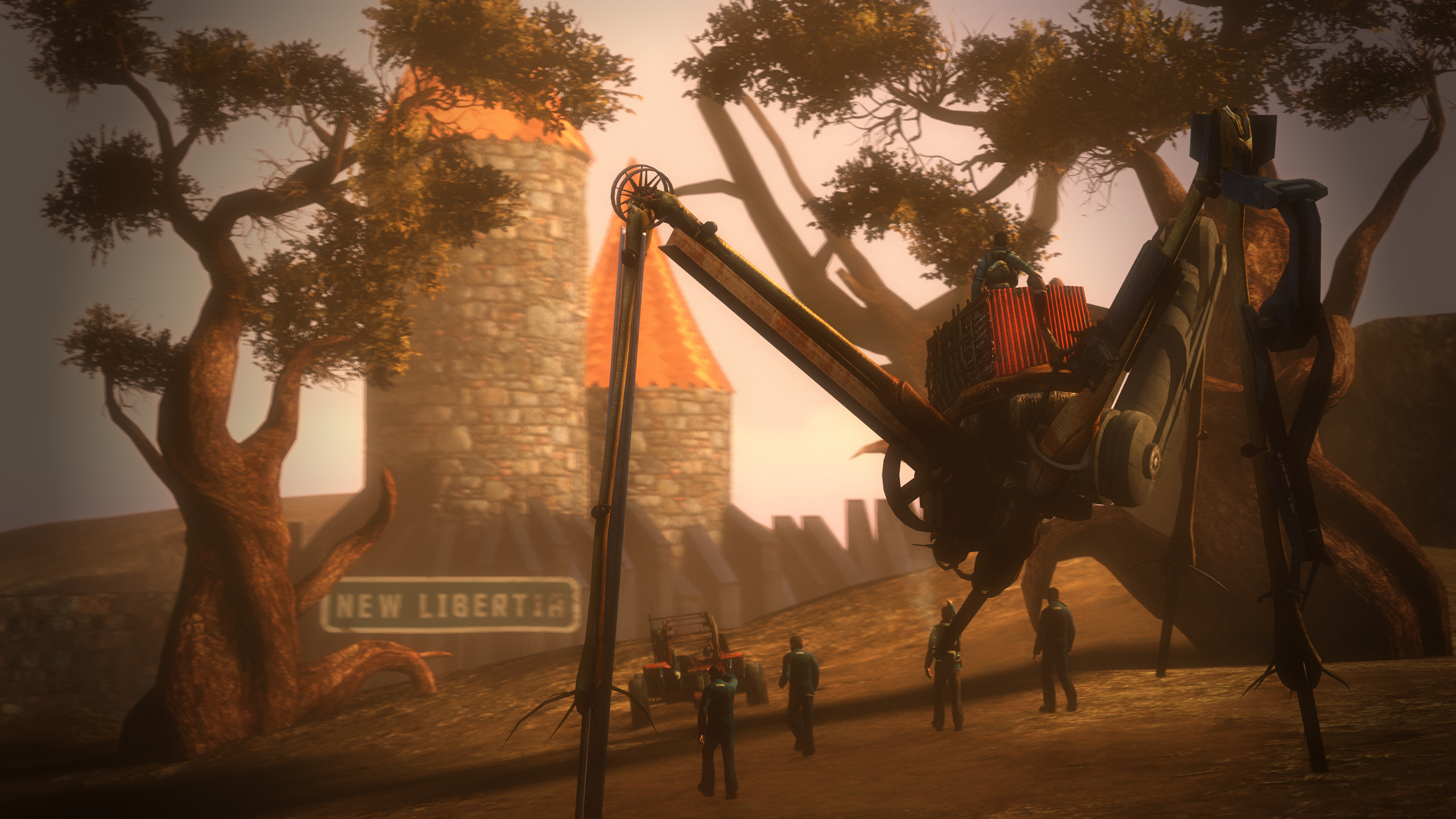
The big winner of today is @Anleas, with his amazing loading screen
Then we have that fuck @Erkor, who finally did something decent enough to lower his ban
mainly for the editing
And finally @SkinVest, for the amazing climate that he makes in his poses, keep that style up fam

cunt I carved your mom's face into pumpkins so i scare the kids away in hallowen