
Isuckatgaming
Rictal-Approved
- Joined
- Apr 26, 2016
- Messages
- 16,455
- Nebulae
- 56,923
Hello, this is a small guide I made to show off the way I create posters, as some people have been asking for help or some sort of tutorial on it. Well, here is a small step by step guide to the process of creating one.
FOREWORD
Well hello there! If you're reading this, you're probably one of the few enthusiastic people who enjoy the propaganda posters I make. You're likely also one of the people who've asked me ''Yo bro teach me how to make those''. And here I am, with a step by step guide on making a poster in my style.
The style I use is very simple, but also very flexible. The complexity can easily be cut down without the picture suffering too hard, and it's a very nice way to work. So, let's get into it!
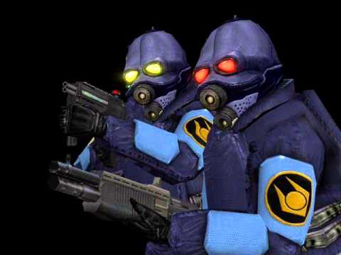
For this tutorial, I will use the poster ''Arm of our benefactors'', a HL2 themed poster about the OTA. Of course, HL2 is not the only theme these posters can be made in, but it's one of the ones I've found great inspiration and fun in making stuff from.

So, let's get into it shall we?
STEP 1: CONCEPTION
Just like posing, you don't get anywhere without a good, solid concept to back you up. Everything from imagery and message needs to be considered here. This is generally one of the harder steps, and I tend to look to other places for inspiration, like movies or games. But, sometimes I also just look through my picture folders to find anything of worth to use. Or just scroll through google images after typing in a few keywords and just look for a thing that could work as imagery for a poster, and wing the message from there.
For this one, I obviously wanted an OTA standing there, but not in a threatening way. The citadel actually came later in the process, but in this guide we'll treat it as it was in one of the starting processes.
STEP 2: GATHERING AND PREPARING ASSETS
I cannot stress how important this part is. Before you make your poster, you should have everything you want to use prepared. It's obvious that I used two images in this (that aren't overlays), all of which are simply ripped out of google images, run along with a low power blur tool after removing the background and converting it to a png. Boom, it's that easy. Of course, it may be less easier to some.
Firstly for the OTA, I found this picture which I thought was damn amazing and fit very well, but's it rather rough and pixely, and it has a black background... A big no no for your posters, using no background pngs is advised.
The pic in the state I found it:
As you can see, we won't get very far with this. So that's when we use Photoshop (or if you don't have it, pixlr.com is a great website), we remove the background and run it along with a blur tool, save it as a png and:

Kaboom, much better.
Next up is the citadel, which I also just found lying around. Can't find the original though, so you only get the blurred version:

STEP 3: CREATING THE FOUNDATION
Now you got the things you're gonna be using nailed down, time to move on to actually making what the actual fuck you want to make.
First, decide the dimensions. You should make it taller than it is wide, as it is a poster after all. Although in certain circumstances, making it wider than it is tall can work (sometimes you should cover this in the previous step, although it depends really).
Here we have our blank canvas, our frame, ready to get filled out with delicious propaganda:

Now, make sure it is a clean no background png with all of the middle being empty and devoid of content.
Next up, we add our background and first object in two separate layers, all of them below the frame. We do a little brightness/color/whatever modification on the Combine soldiers and I personally used a filter called ''Oil painting'' because it gives an even more painted and rough feel.
Should look like this now:

Although, it's a bit empty ain't it? Well, that'll be fixed in a minute!
Protip: Never make things pure black, it messes with overlays and generally looks bad. Use a very dark gray instead.
STEP 4: ADDITIONAL FILLER AND TEXT
So now the imagery of the poster is down, we should of course add some text to bring out propaganda message out! (Or, y'know, just name the thing on the poster, as it turns out in this case).
Putting text on your poster, there are a few things to keep in mind:
The font - Typically people would consider Impact as the go-to propaganda font, but other fonts can work.
The size - You don't want the text to cover the entire poster, but you need it to have a little filler... About 1/4th of the poster usually does it.
And a few pro tips about text:
Use block capitals; It's easy to read and looks good.
When creating different sized texts next to each other, use small boxes to fill out the rest of the space below the larger text.
Avoid full stops if possible. They work well as replacements for commas if you want to nail in a point, and they generally look cleaner than commas. Question marks and exclamation marks are usually fine to use, although still avoid them for normal text if possible.
Here is our image after the text addition:

Still looks empty?
Well, we'll go ahead and create a new layer with the citadel, move the player behind the soldiers' layer and boom. Easy. Having things in the background look darker than the foreground is a general good rule of thumb you should try and follow too.

Still, it looks too clean, don't it? Next step will take care of that.
STEP 5: OVERLAYS AND DIRTYING THE PICTURE
This step is fairly simple. Find some pictures that resemble cracks, scratches, dirt stains and other stuff. Add a new layer on top of all the old ones with those pictures in them, change the opacity and voila.

Of course you can mess around with different opacity levels/color modification/other ways of modifying the layers' look.
This looks good, but we need that final touch. I recommend using pngs of blood stains to add dirt/whatever to your picture and color correct it to look brownish.
And this is the finished result:
Post questions if you have any, and I'll try to answer them.
Making posters this way is pretty fun, and as said, it's rather flexible, with many ways to do it. It's in no way set in stone, this is just how I do it and it works.
Last edited:
Reactions:
List
