AOTW / WEEK 20/53 / 2020
Lets go
This is pretty cool, I like the concept and the small scene on top but the lighting just isn't on your side again with some insonistencies - such as teh light source being blue - the cones still dip into darkness from the lights direction. And the small scene on top has the same flaw unfortunately. The darkness / shade on the characters should be coming from the left - not behind them. Otherwise, it's a nice pose :)
COD_MW_Cucked.jpg is an interesting file name. However, the posing here is good with the overexaggerated facial positioning. The lighting to display the models is great too, I just wish to see them in a great scenebuild some day. Nice stuff as per Piggy.
This is great! The colours and the border are fantastic. The patterning in the mask works great with the background and other materials. I got no negatives here, all the space is great and used perfectly. Noice.
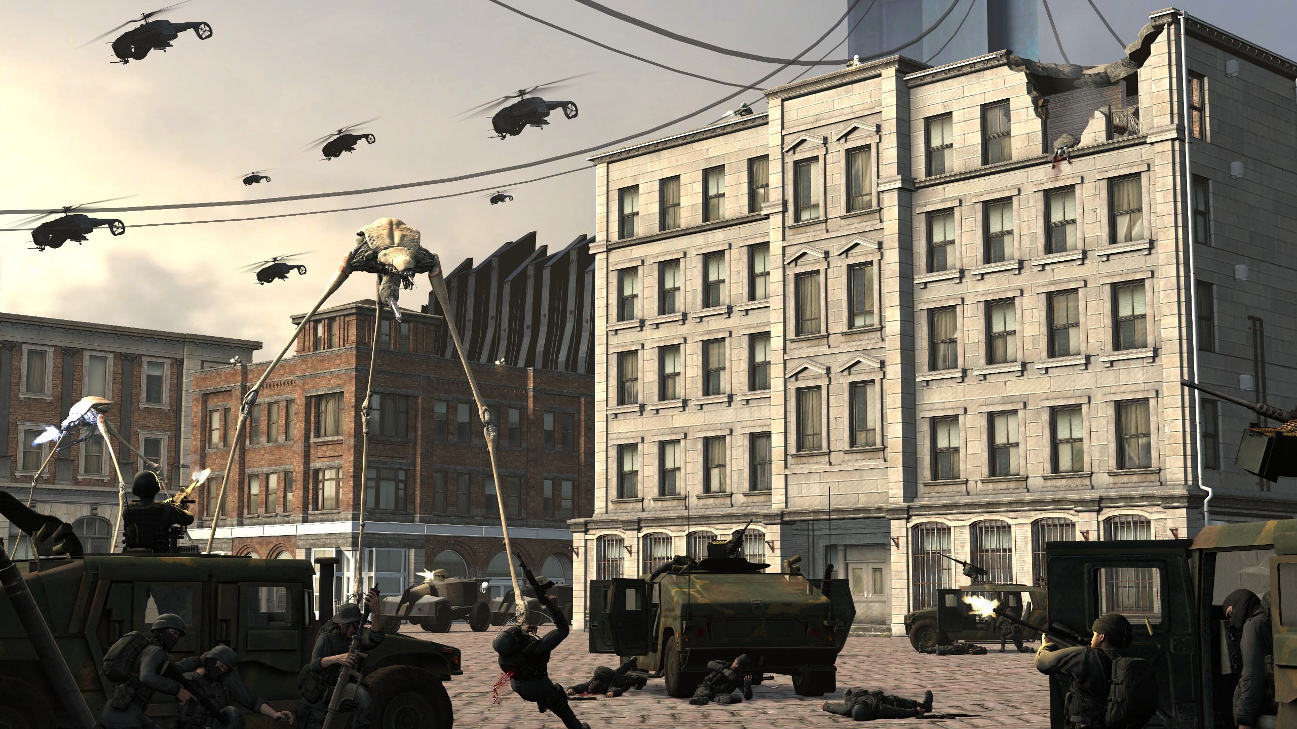
This is an example of a good scenebuild, with good separation of posed models and muzzle flashes, with a great structure. All it is really 'missing' is some inner scene detail and separation - or just background detail on the patio of the courtyard like a fountain or some kind of fortification. Maybe even a few taller buildings after the final ones on the left to give the city more depth instead of it being one straight line of buildings. Lighting is consistent though, great angle... I just like details.
Big bold for the design and probably like, 6 layers, some colour correction - looks cool though: @Flanders
A secondary bold for @Stelios
-
Nice submissions this week fellas
Have a good'n
- Danny