D
Deleted member 5162
Guest
thank youtry vgy.me
also use soft lights addon if you arent already
and I am
Last edited by a moderator:

thank youtry vgy.me
also use soft lights addon if you arent already
wduwant.comalso please give me a good image uploader that can hold all of the resolution and not compress everything it comes across to
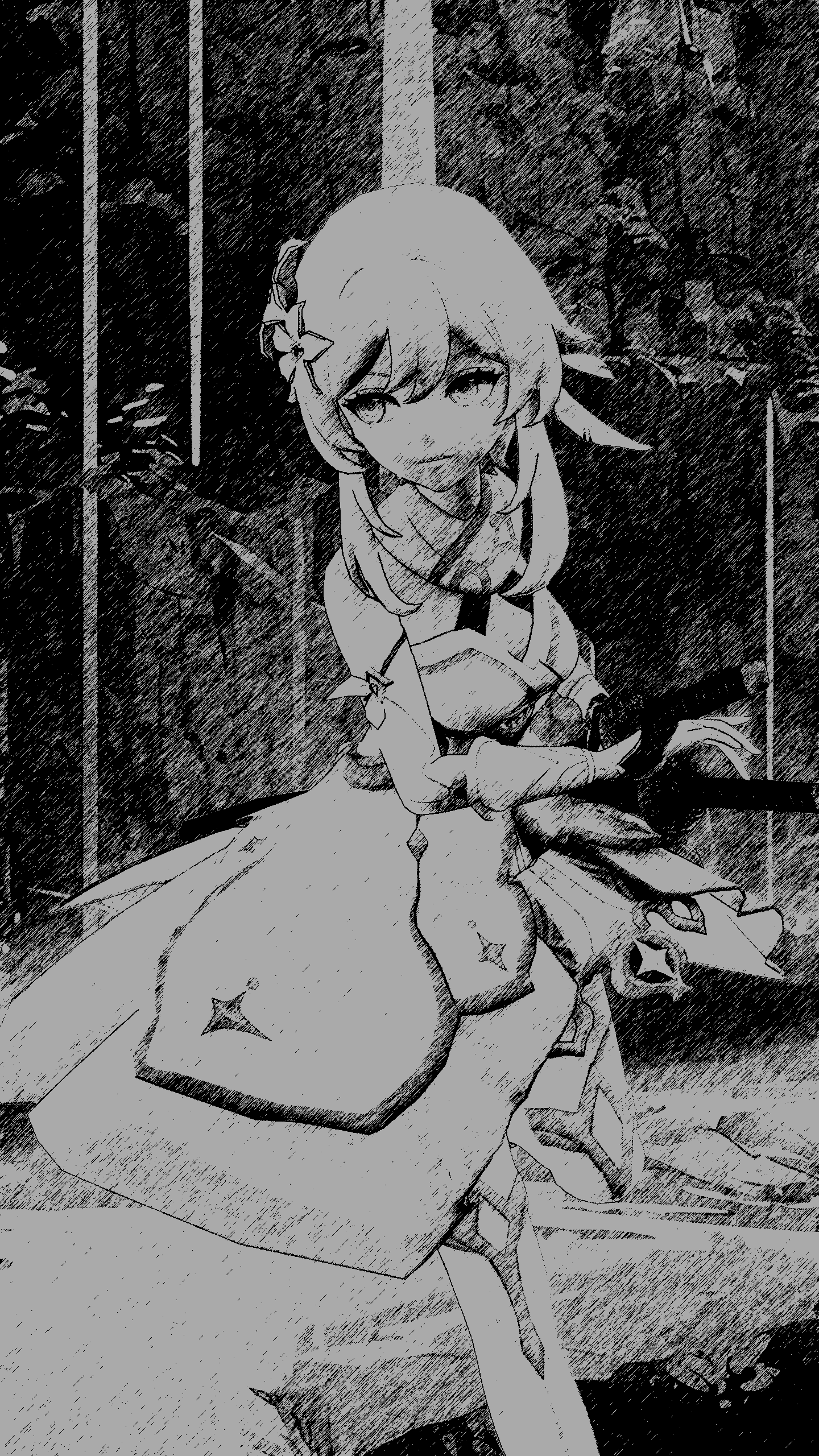
Looks kinda cool tho ngl
so uhh I don't know why but suddenly my shadows are being gay, I've checked my console commands, here they are;
r_projectedtexture_filter 0.2
r_flashlightdepthres 4096
mat_slopescaledepthbias_shadowmap 2
mat_depthbias_shadowmap 0.00001
All lamps are using Heavy Light, rendering the poster will obviously show up with these artifacts and with AA on, those with artifacts will be kind of "blurred" out
help?
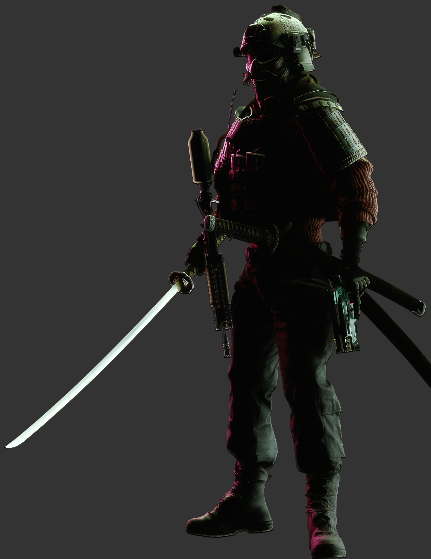
Fabulous piece of posing here ol chum, the posture, the legs the arms the weapon hot damn. The highlights and the shadows, the small sketch filter that gives it that painted look - anD THE PerfECT BORDER. Yeah, it's good, y'know what though? Gotta give you some ideas - how could you have added this into a scene? What kind of scene? What if they are: special swat police in a crowded area getting looks off people, or in a busy firefight idk - just ideas, still fantastic
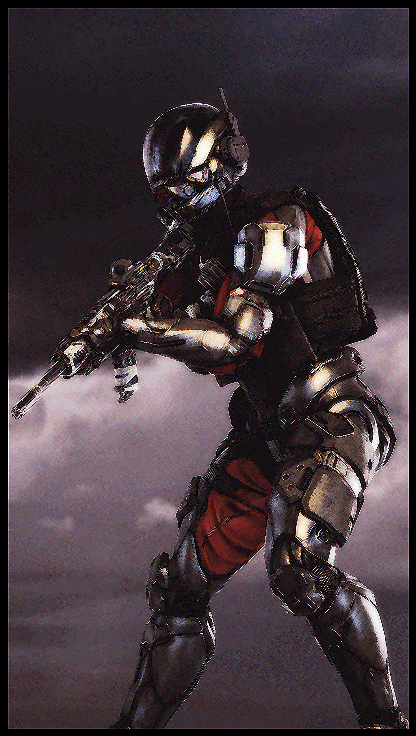
Fantastic, looks amazing, love the colours, love the glow, love the angle - it's perfect. I've never animated a thing in my life, don't know what kinda advice to give what about some ideas like: Putting object in an object, or maybe animating around something that is more still, or perhaps animate some kind of glowing artifact - just ideas. Looks awesome
Idk how ya make these things but they are cool! Especially on yur main thread. The style of this reminds me alot of Space Rock Galactic and I think this style of polygonal scene making is smn not enough people do. For real feedback tho - it is simple and it's nice, I think some things are missing some texture though such as the walls have a planky texture, maybe the foundation it's on needs smn similar - or the dirt surrounding it could have some little darker patches etc. Something to think about, awesomechanging my submission to this

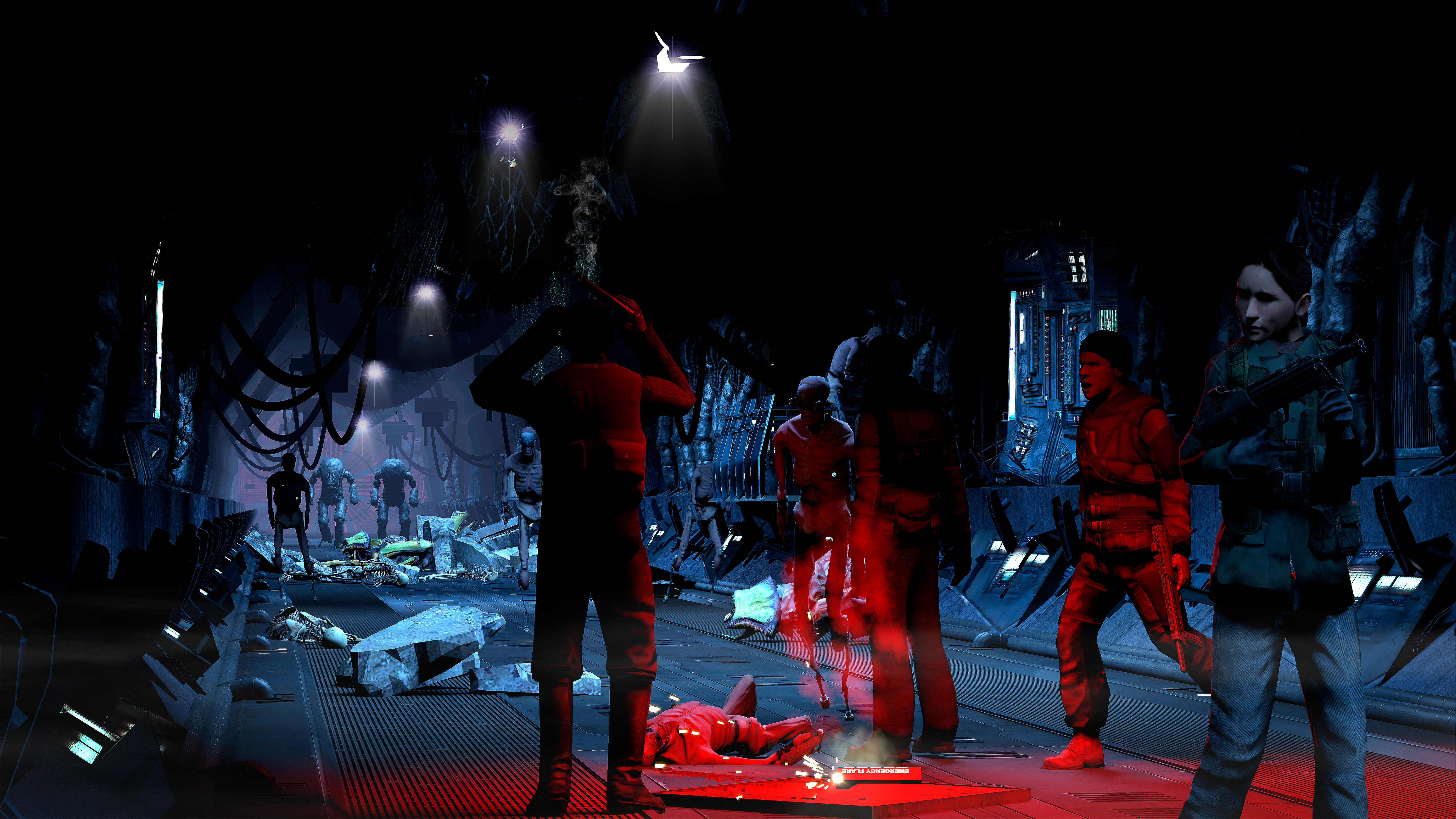
The scene got depth, the scene got character, the scene got the neccesary things, and you know what - not being able to see the ceiling is ok. It should be dark - but I sure would love to see more of the characters faces (more importantly the girl on the right, and the guy with his hands raised on the left). The best posed person in this scene is the man walking over all angry - smn about that you've done very well. More of this partner, more of this - see if you can come up with smn in a similar environment :^)
Yer foolin no one yous posted this a few months back ya crookI return with more photography

AOTW `50 of 53, 2020
. o k
Fabulous piece of posing here ol chum, the posture, the legs the arms the weapon hot damn. The highlights and the shadows, the small sketch filter that gives it that painted look - anD THE PerfECT BORDER. Yeah, it's good, y'know what though? Gotta give you some ideas - how could you have added this into a scene? What kind of scene? What if they are: special swat police in a crowded area getting looks off people, or in a busy firefight idk - just ideas, still fantastic
Fantastic, looks amazing, love the colours, love the glow, love the angle - it's perfect. I've never animated a thing in my life, don't know what kinda advice to give what about some ideas like: Putting object in an object, or maybe animating around something that is more still, or perhaps animate some kind of glowing artifact - just ideas. Looks awesome
Idk how ya make these things but they are cool! Especially on yur main thread. The style of this reminds me alot of Space Rock Galactic and I think this style of polygonal scene making is smn not enough people do. For real feedback tho - it is simple and it's nice, I think some things are missing some texture though such as the walls have a planky texture, maybe the foundation it's on needs smn similar - or the dirt surrounding it could have some little darker patches etc. Something to think about, awesome
The scene got depth, the scene got character, the scene got the neccesary things, and you know what - not being able to see the ceiling is ok. It should be dark - but I sure would love to see more of the characters faces (more importantly the girl on the right, and the guy with his hands raised on the left). The best posed person in this scene is the man walking over all angry - smn about that you've done very well. More of this partner, more of this - see if you can come up with smn in a similar environment :^)
Yer foolin no one yous posted this a few months back ya crook
Cute lil thing though inny
OK OK OK, @steambored can be the highlight this week
-
I think yur all highlights really, av been here long enough to see ya all progress and it's great :^) I know I forget sometimes but I do enjoy coming to this thread when I can just studies got me busy. Till next week!
If I see one of god's little critters I'll give it a nebFooled @Blackquill though
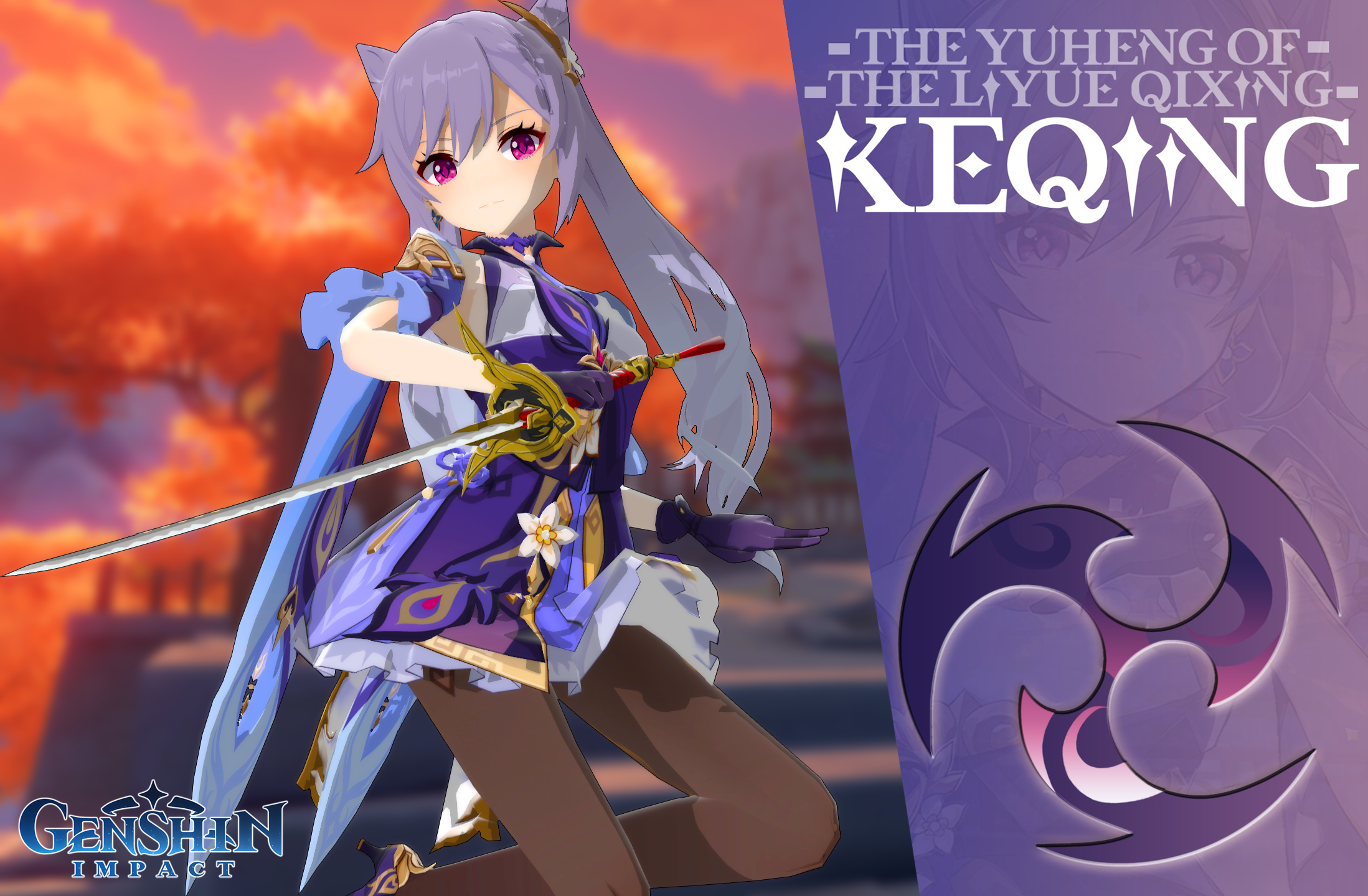
Ayo Idk how this was made but it's definately pretty cool! The thing sticking out the most for me are the shadows and outfit choice - specifically how the shaded areas of the outfit aren't totally taking away part of the picture which gives it a studio lighting / quality feel imo. The full design with the title and name etc is great too, with good choice of font and colouring it all fits together quite nicely. Maybe though; for some critiscm think more on your text and if you want it to be bunched and scrunched into a corner or maybe just shortening it's size so it can fit more in the middle of the purple area etc. Still, great work
I'm liking; the angle, the mwah lighting, the just enough prop items, and the kind of attitudes on display. There's a lot of character in this still that is enough to convey some kind of narrative of "This suit just slid my death warrant across this table" judging by the worried look on his face. And the use of grain/textureing and the vignette on the sides just adds more of a comic booky - graphic novel vibe. Great stuff man, can't think of anything to pick you up on here :^)
Great stuff for a first try, but got damn it boy can't see a darn thing past the woman it's SOOOOO dark. There are a few tricks to this: manual lights, or even in the cameras settings you can raise the tonemap_scale I think it is called. Which just raises the overall brightness of the map / environment. This is like a WIP picture to me, get some extra lights on it and it could be a scene in no time. Keep at it Dvn.
Another whacky piggo post, you've always been good at putting a total mix of characters together and they just work together so well as if it's a cartoon. Nothing to pick up on here Piggyboy. Maybe give a hand at trying some scene builds tho? Like try and build character from an environment as well as you make build character in your poses. Cool

For context, in my picture there‘s Donnie (the brown guy) who just got a job offering from a mysterious Gman like dude who whispers to him, the job is a dangerous trip and Donnie has to sign the contract with his blood via a scalpel. If he didn‘t sign it he‘d be left to die in a wasteland.AOTW `52 out of 53, 2020
Thought I'd atleast get the day right this week
Ayo Idk how this was made but it's definately pretty cool! The thing sticking out the most for me are the shadows and outfit choice - specifically how the shaded areas of the outfit aren't totally taking away part of the picture which gives it a studio lighting / quality feel imo. The full design with the title and name etc is great too, with good choice of font and colouring it all fits together quite nicely. Maybe though; for some critiscm think more on your text and if you want it to be bunched and scrunched into a corner or maybe just shortening it's size so it can fit more in the middle of the purple area etc. Still, great work
I'm liking; the angle, the mwah lighting, the just enough prop items, and the kind of attitudes on display. There's a lot of character in this still that is enough to convey some kind of narrative of "This suit just slid my death warrant across this table" judging by the worried look on his face. And the use of grain/textureing and the vignette on the sides just adds more of a comic booky - graphic novel vibe. Great stuff man, can't think of anything to pick you up on here :^)
Great stuff for a first try, but got damn it boy can't see a darn thing past the woman it's SOOOOO dark. There are a few tricks to this: manual lights, or even in the cameras settings you can raise the tonemap_scale I think it is called. Which just raises the overall brightness of the map / environment. This is like a WIP picture to me, get some extra lights on it and it could be a scene in no time. Keep at it Dvn.
Another whacky piggo post, you've always been good at putting a total mix of characters together and they just work together so well as if it's a cartoon. Nothing to pick up on here Piggyboy. Maybe give a hand at trying some scene builds tho? Like try and build character from an environment as well as you make build character in your poses. Cool
-
Good job @Ricsow, you got the bold
-
Till next time!
Happy holidays!
Ayo Idk how this was made but it's definately pretty cool! The thing sticking out the most for me are the shadows and outfit choice - specifically how the shaded areas of the outfit aren't totally taking away part of the picture which gives it a studio lighting / quality feel imo. The full design with the title and name etc is great too, with good choice of font and colouring it all fits together quite nicely. Maybe though; for some critiscm think more on your text and if you want it to be bunched and scrunched into a corner or maybe just shortening it's size so it can fit more in the middle of the purple area etc. Still, great work