ought to be multiple winners occasionally otherwise it's just going to go to whoever pulls out blender or maya
[doublepost=1611634635][/doublepost]anyway this week I figured I'd try making a basic scene without using 200+ props
Fyi, there's no Combine horse model. Had to manually Photoshop half of the horse in. It looks /realistic/ with a blur and when you don't zoom in. Made with SFM as usual.
I'm going to fix some aspects of this tomorrow e.g the flying xen things and maybe add more to the foreground.
and that rock looks out of place, don't know if I like it
What a great picture. What I like the most about it is the natural and believable environment with the lighting that is blended so well together. It doesn't have any complex scene building on top of it and is just a raw landscape that I honestly haven't seen so well done as this before. While also including a loose narrative of these former soldiers left to die out there, I think some continuation or more fleshed out narrative in mind could elevate it: otherwise as just a picture, it's brilliant.
Theatrical is a good word to use here I think, it's a well composed image and the lighting is that of maybe a comic strip. If we wanted to elevate this image a little; I personally would've put an effort into making that glowing sign above more prominent: i.e. could have an extra light or lamp hidden to give a glow to the edge of characters that are otherwise in shadows anyways - maybe even of the car. It's a huge part of the picture (even if it isn't the focus) and I think that glow could've added that extra bit of atmosphere. Great pose and structure as well :^)
I do love me a bit of signage, and this is done pretty well - I like the layering and texture of the board the sign is on but I think there are a few ways to improve this: firstly, I'd either shorten the sign width-wise or twist it on it's side so it's taller vertically as the empty space around the whole thing is kind of un needed (unless it was a flag). Second, I'd make that text bigger and maybe even make it a brighter colour... say if it matched the color of the skul, it could have a thin black outline to help it stick out? It would suit the skull a bit more too. Some great ground works here tho
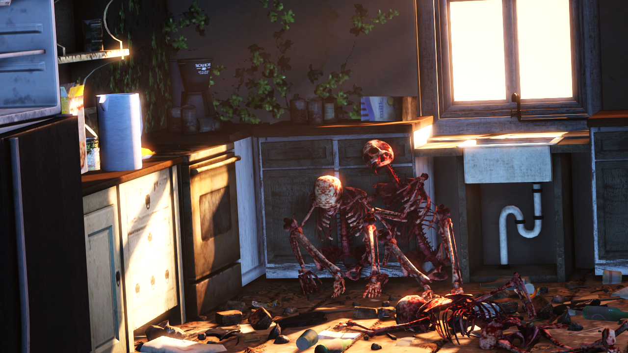
Alotta skeletons this week - this is good, looks very loading screen esque with the slightly slanted camera angle and use of bright light. The scene is built up enough to know we're in the home of a family that's no longer knocking about for xyz - personally I assumed the big flash is a bomb but that's just a (game) theory. I have not got much to add onto this, this is a good pose bruda.
I'm liking the wide angle, and sometimes less is more as what you're going for but I believe you gotta capitalise on what is there if that is the case. For example, the car lights are a great touch and you're making something out of that car. Now the campfire, I know it's smoldering and in embers but think of the character that could've been added if there was a glow reaching to the top of the boulders behind it or lighting up some of the car. Maybe you could add in some guys sneaking up behind the car too. Could have had a very DayZ energy to this screenshot
This is hella cool and looks great. I love the way the Americas is on the combine symbol too that's a great touch. The details on the jackets, masks, backpack - superb. As a simple concept piece: that horse is as good as or even better than what's already out there for combine horseback. Would be awesome to see a full body concept of the kind of robe that the one on horseback is wearing. Fabulous work.
-
Highlights of the week go to @Viper and @Dicknose,
for their skeleton escapades
Oops, the picture did not load for me so I just went on thread and assumed it was the red one as that's the only one that showed for me at the time... sorry!
feedback:
Got a good tone on the lighting at the front of the image but I think it could probably be brighter going further forwards into the fog - the only thing that I think throws it off is the narrow sun/moonlight coming in which looks like it should be bighting things up more than it actually is. The scene itself is pretty cool, horse is super well done! Would be nice to see more focus or light on the skull and revolver but that's just a personal take. Lastly, the ships or whatever in the distance are a bit too blurry to quite make out. Maybe if they were soaring at an angle going to the right so we could see the full body it would look more menacing.
I render it in 4k, then downscale to 1080p to fake anti-aliasing. though this one didn't produce a good result because I forgot to run poster_aa as well.
my previous artwork I posted here is a good example of how it fakes anti-aliasing when poster_aa is turned on.
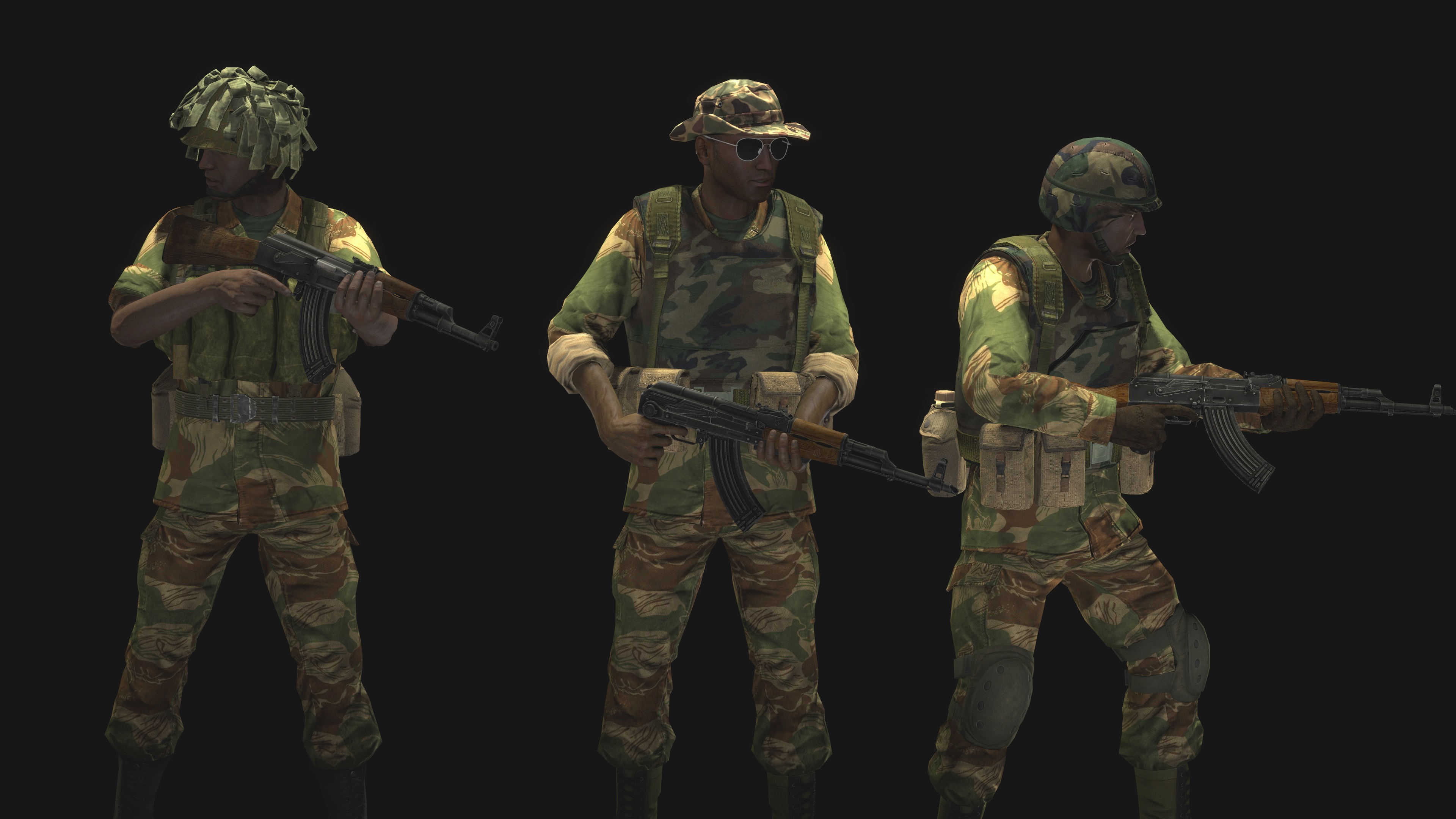
The angle is superb, I like the selection of what's on show and how everything has a reaction to an action going on elsewhere. Lighting is great too, though maybe the shield the soldier is carrying is a bit too bright imo and could use a little less contrast to match the warm surrounding. If I coulda add anything myself; in post I woulda considered adding some ricochets to the APC - not giant ones but like, subtle. Gives off a larger action vibe. Great work Viper
-
This site uses cookies to help personalise content, tailor your experience and to keep you logged in if you register.
By continuing to use this site, you are consenting to our use of cookies.