nice
@Anleas, yeah, fucking around. I like when people make one of those scenes where the camera is far from the scene itself, and while it kinda points towards the main character, there's still lots of stuff going around. It feels a bit like a Gmod menu screen tbf. Only big problem I see with it, is the dull, white ligh, that covers the whole poster, insead of gently lighting up only that horse/dragonborn. An ok meme
@bjfgpkqkdmtnspwndsjt, represents your inner side, that I can tell
@Pict, asked my friend to help me on this, but she took your thing seriously and now she's trying to interpretate what you ment by that
So ye, I'll just leave it here
@Hydralisk, good old slav architecture. Nothing else besides that tho
I'd aim for capturing something unusual, or something that we don't look at usually. Road doesn't count. You get something like that, as well as apply the golden rule of thirds, maybe even play with shadows/any other effect that nature makes for you, and then we will talk fam
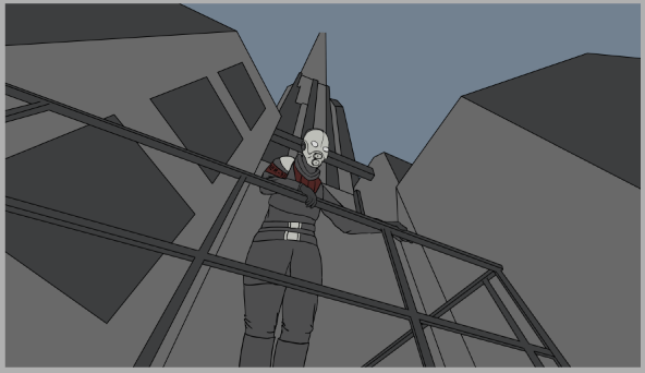
@$Vex$, motion is captured, concept is there, posing isn't too shabby... Pretty good, it's just the editing that's messed up, with a dull, completly white lighting and a camera that's a bit too far from the centre (I'd cut it to something
like this, just with the 16:9 proportion ofc), but it's not that bad honestly. I give it a solid 7/10, keep it up dude
@Scone !, you keep doing this to me fam, fill the dam scene up mang. It's top shelf, but it's too damn empty
At least that little preview of you next one is actually full. Bit late, but it's always an improvement
@Tenebi, even if it's not really a serious one, I really like the color palette you used there, definitely in point right there. Other than that, I get it's idea, but you could add more of them, so that it'd look as if they cover the entire sky, instead of being pushed into this small circle, create an open composition. Big plus for that color choice tho, pumped that saturation up just as I like it
@ConstantDisplay, not really a fan of those, but it keeps it's style with pride. It's well made overall, just that this "darling's" face stands out with being a bit too bright. It could also possibly stare at the viewer, giving those little scary vibes. I mean, can't say no to this one, just didn't really make me fancy it
@Prospekt, as with many posters the main problem is emptyness, which is solved in a very easy way on movie posters like
this one, or more complex like
this one. You got to leave as little of empty space as you can, while showing your main dudes with all the power you can. I'd also work a bit with the lighting, adding more of a subtle one, to not leave those two chars on the sides completly dark. Speaking of them, I'd also move everyone close to eachother, like with their backs touching, as they are covered by about ten zombies
Ye
@ecchikawaii didn't bother to watch more than one tbf
Had to
@spectry, take your win and leave for few weeks