lemon
Sells cheap beer
- Joined
- Apr 26, 2016
- Messages
- 1,426
- Nebulae
- 3,435
here I am
So, in your first posters there, you pretty much just made every possible mistake you could: weird lighting that either seems artificial, or doesn't line up with other props (especially on the first one, his face is just pure comedy to me, plus few bushes in the background are so close to eachother, that lighting doesn't actually light them up), lack of content, despite tons of bushes around (that don't really match the surroundings, they really feel forced), and lastly, really boring concepts that doesn't convey any emotions. I'd honestly just scrap them, as in my opinion, they'd need some serious rework to look good, which isn't worth it considering the second post you made contained a pretty neat poster. I really like it's style of both little screen snowing, and B&W color pallet, as it fits with the atmosphere you're trying to show here. Few problems I have with it however, are that you should've added more, as well as reposition few of those gunships and choppers. In my opinion, at least one should be flying out of that black portal, indicating that it indeed is a portal. Second thing, spread those flying chunks of metal around, they are way too close to eachother, which leaves a lot of sky empty. Last thing, add in few other people staring at it all, maybe talking, being scared, calling it up on the radio, you name it, it would just add a bit more life to this very still pose. Other than that, this B&W poster you did is really good and you should continue going in that direction, as it seems to be working out with you. Good job

https://nebulous.cloud/threads/shodans-random-arty-stuff.25753/
@SHODAN, not an expert in Photoshop, so I'll just get few other fags to give you a proper rating here: @MaXenzie, @Elan, @Anleas, @James


@Schoenberg, I'll only rate the first pack of poses and the second picture, as the first pack has many issues and the second picture is actually quite good.

So, in your first posters there, you pretty much just made every possible mistake you could: weird lighting that either seems artificial, or doesn't line up with other props (especially on the first one, his face is just pure comedy to me, plus few bushes in the background are so close to eachother, that lighting doesn't actually light them up), lack of content, despite tons of bushes around (that don't really match the surroundings, they really feel forced), and lastly, really boring concepts that doesn't convey any emotions. I'd honestly just scrap them, as in my opinion, they'd need some serious rework to look good, which isn't worth it considering the second post you made contained a pretty neat poster. I really like it's style of both little screen snowing, and B&W color pallet, as it fits with the atmosphere you're trying to show here. Few problems I have with it however, are that you should've added more, as well as reposition few of those gunships and choppers. In my opinion, at least one should be flying out of that black portal, indicating that it indeed is a portal. Second thing, spread those flying chunks of metal around, they are way too close to eachother, which leaves a lot of sky empty. Last thing, add in few other people staring at it all, maybe talking, being scared, calling it up on the radio, you name it, it would just add a bit more life to this very still pose. Other than that, this B&W poster you did is really good and you should continue going in that direction, as it seems to be working out with you. Good job
@ConstantDisplay, it looks like you're constantly making mediocre poses, only to suddenly get on a wave of superb ideas, do that one masterpiece and get back to mediocreness. I think we're starting to see that wave right now, as you did the lighting in an interesting way, matching it's colors with environment, it's just that there isn't much going there, it's dull. Looking back at your masterpieces, I'd honestly advise you to do with what you were going before, that is intense colors, contrast and focusing on very few elements. Right here, I'd see you working out this concept in a much better way if you'd capture a scene of one of these cops beating that civilian up. Set up the camera from eyes of the victim, get that CP sitting onto him, with his fist in the air, add in those amazing colors of yours and spice it up with whatever you think would fit. That would be something worth seeing in my opinion, as you really seem to do good with this type of posters. Good luck, I'm waiting for your masterpiece to show up any second now

@Club Ace, to be frank, both of your posters suffer from bad use of lighting, even though you did use it in a neat way on the second one, as well as from being pretty dull. I like the second one more, so I'll focus on it, as right off I can say that it does have an interesting concept, but you just left it to rot there, not giving it enough attention. An idea of two soldiers dying at the end of battle, with no bullets or strength left, is something I haven't seen in a while and it has so much potential. You gave this scene an interesting lighting and atmosphere, yet it's meaning is so literally blended in, that I had to scan it all for about ten seconds to even notice that there are soldiers there. What would work out here way better, would be positioning them really close to eachother, as well as lighting them up. Also I would change that camera angle and move it the fuck up towards these two guys, it's way too far from them. Other than that, simple editing, but it works. Not bad, but seriosuly man, zoom in

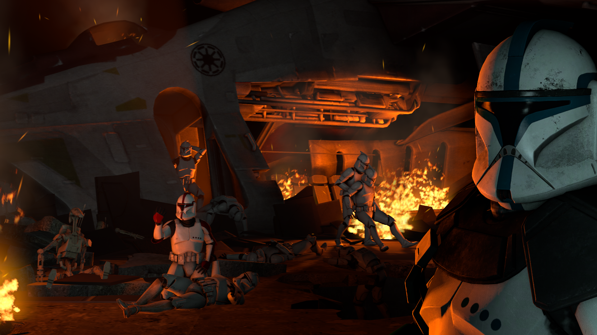
@Dicknose, to answer your question, not too much, it's nearly there. First of all, I would add more clone troopers into the picture, there's only three of them, and lots of space gets just wasted, while it could be used for showing some medical action, people at distress, that stuff. Also, that clone that is shooting down the hole should just vanish, he doesn't fit here at all. Everyone is either dead here, or staring at the camera with their lifeless stare, while that troop is just casually shooting. You get what I mean. Another thing I'd add would be some very soft lighting over the background, to light that transporter a bit more up. Not much else to improve, post it next monday, I'd like to see what you worked out there

@RGB, this is getting unfair for everyone else, you're improving too fast.

https://nebulous.cloud/threads/shodans-random-arty-stuff.25753/
@SHODAN, not an expert in Photoshop, so I'll just get few other fags to give you a proper rating here: @MaXenzie, @Elan, @Anleas, @James
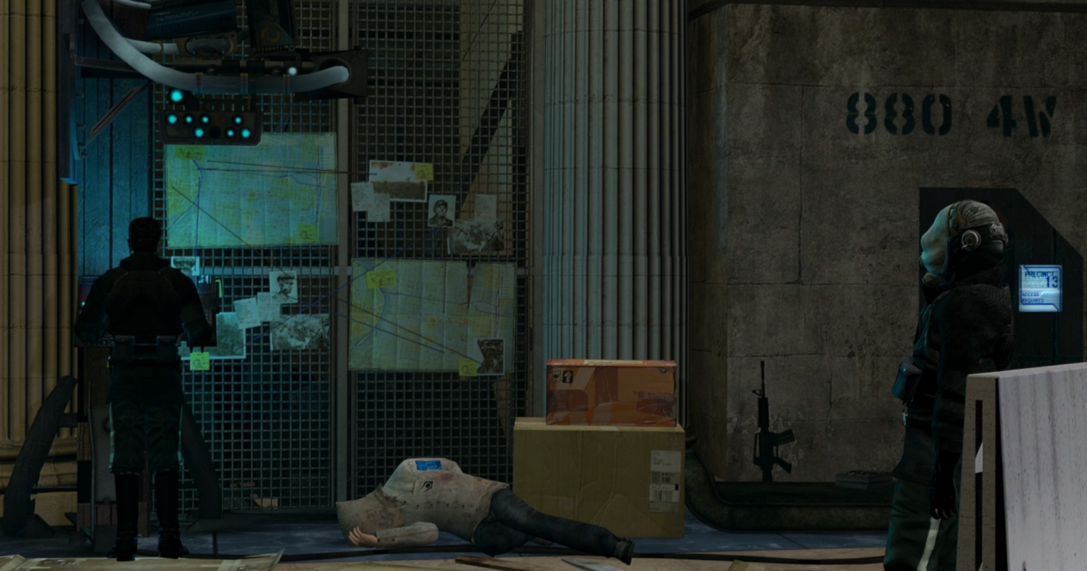
@Jer, one issue - remove that fence and put something interesting in the background. This just looks stupid, as if you were too lazy to do the background, which is a big shame, because posing here is so good. Gah. Do that background thing, we'll talk next monday about it
@247-0006-0001 'Jimbo', if what @RGB did was unfair, then this is just full scale cheating."For the Tsarina, Bless her soul."
(Made as a request from: @my name ein)

"Who decides the fate of Animals?"

@Erkor my boy, disperse for the next few weeks
Reactions:
List