Fuck, I'm tired today
@Anleas, I honestly can't say much bad things about this one, maybe too much lighting bloom, but that'd be all. All, if not to count that the concept of Spyro just standing in one place got stale for me after the third time. I'm not saying that it's bad, but that this kind of pose is more like a show off for what you can do (editing and posing, both are fucking great), rather than something wallpaper worthy. You know, action, drama, explosions, that stuff is missing here. Still, it's easily worthy of
@GenericPlayer, nice one, but I'll mock anyone that exports their posters in resolution from now on, starting from you. Low resolution is pretty much a guarantee of your work not being wallpaper worthy, as it just won't fit the screen, unless it's exceptionally good. Having said that, while I can't say that it's bad, or even mediocre, I can't say that I like it fully. First of all, camera angle. You've placed four characters here, and pretty much all of them are barely visible, which is a shame, as this guy in top left corner looks neatly posed (especially his face). I like the atmosphere you set here with colors, but I'd definitely go for seeing more of the white sky and less of the brown ground (while of course still keeping it being visible). One other thing I don't like here, is how contradicting poses of all these soldiers look. This guy near the sandbags looks like he's in some serious shit, with that gasmask on and rifle pointed towards his enemy. However, rest just seem to be either struggling from the chill, or chilling like there's no war happening. I mean, both the colors I mentioned earlier and general grim of destroyed buildings around are rather suggesting that it's all happening on the battlefront. Other than all that though, it's actually pretty good, especially posing. Just fill it up a bit more, fix what I mentioned and it'll be quite a good one in my opinion
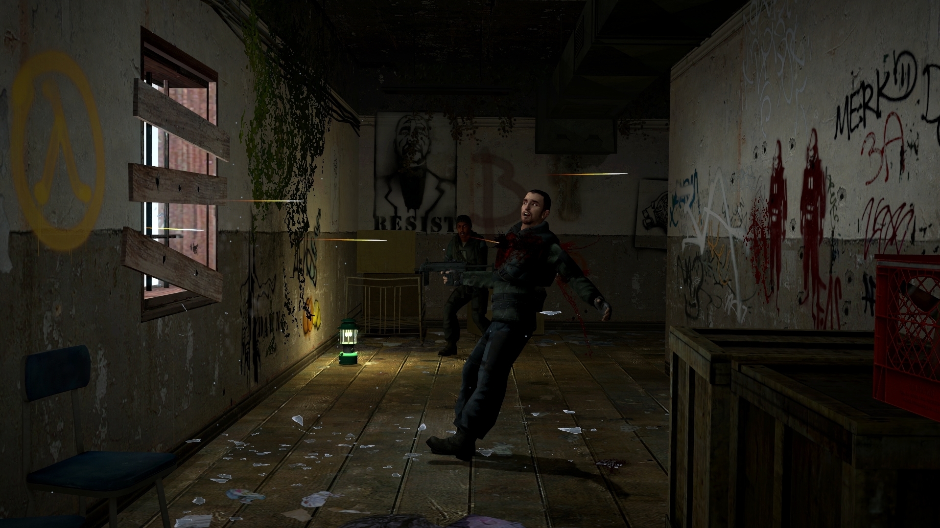
@Heck, fucking hell, my fingers start feeling pain just from watching at this reincarnation of hell. Good job at reminding me of one of the coolest games I've ever played, I think you even got the camera angle right,
@ConstantDisplay, you did it again fam, lack of lighting. Honestly, that's the biggest problem of this one, there is absolutely no lighting. Look it up in the
guides, even the SFM ones, you'll find your answers there man
@Snowyy, an easy, yet working concept with good posing and editing. If I were to nitpick here, I'd say that the biggest flaw to this one, is that it's placed in a rather boring place. You know, you're presenting soldiers here, soldiers that look like they've just won some battle - get them to some kind of a military outpost, or even remains of the battle itself. I'd also group them a bit closer together, to me, it looks as if the three on the right are the only guys that like eachother, while Fox, Griffon and Churkin are pretty much lone wolves that just happen to serve in the same group. Other than that though, posing is good, doesn't look too stiff (except for the female, but I know how wonky these models are), and can't complain about anything else. Good job,
@Dicknose, simple, not bad, but honestly, the scout's pose is just a tad too boring for me. I'd go for maybe turning him around, to see his back, like in all these edgy poses, or doing anything that's at least a bit interesting. Not bad effects though, plus it's not a bad idea
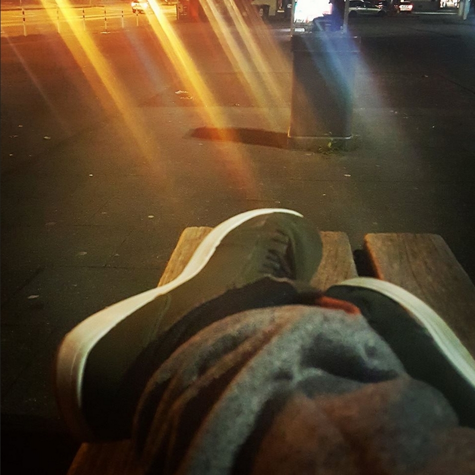
@Dallahan, cool shoes
@Jer, same as said to Constant, lighting is all you need. That, plus something to fill the background (you can even add a door and pretend it actually leads somewhere, I've done it many times and it works nice), and you're all set.
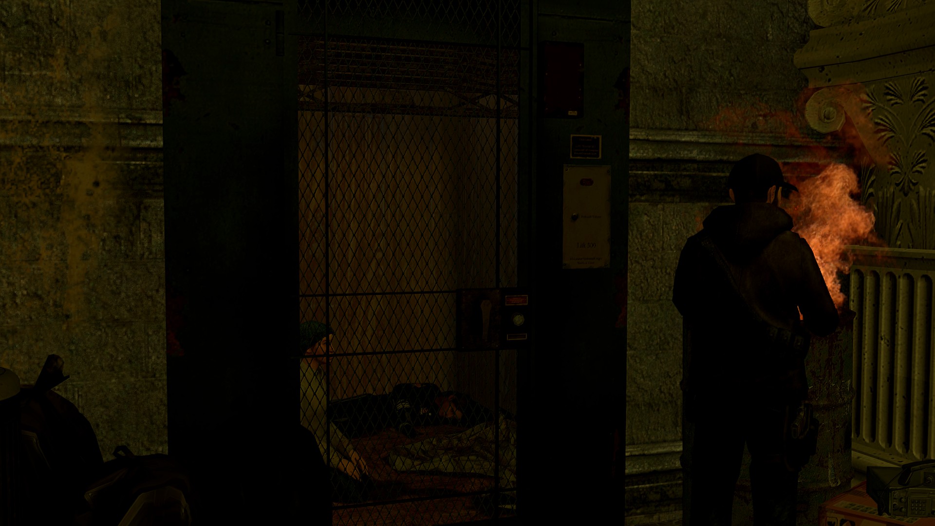
@Schoenberg, besides filters, it's pretty much just three NPCs standing in a corridor. I think you know what I mean by that, but I gotta say, you actually did the camera work pretty good. Both focus and camera angle is really nice here, plus the filter itself isn't too strong, nor too weak. Even though it's very barebones I actually like it. Good job, but try to pose it yourself next time while keeping this style
@Club Ace, same as I said to Snowyy, just with the addition of changing fonts to being a bit bigger and of the same style. Good posing though
@FieldersNL, doing the second one, as it's far better in my opinion. I must admit, you've improved quite a lot and you don't stop improving. Really alive and well posed poster, with attention to details and polish. Few things though, try adding some lighting next time, as well as placing your camera in a way, that it doesn't leave so much empty space in the picture (something like
this is good). Great work though, I'm getting more and more proud of you each time you post something,