@Kazuhira, not bad. I like it's beat, it's a song that's very pleasant to tap your foot along with. It's obviously unfinished, but it's not shabby at all, in fact, I'd be interested in hearing it once it's finished. Can't give you any real advises though, I don't know two shits about music theory. Good luck anyways, music is something we lack of here
@liew, I have to agree with
@ramsey when it comes to framing, but I think you did depth pretty good here. I really like this little mist in the background that creates that feeling of cold you get from this picture. Not only that, but also the color palette is quite cold as well. When it comes to framing, all you had to do, was put this guy on left in a kneeling position, maybe searching a dead guy or something. After that's done, I'd merge the lighting on him, because he blends into the background with the current one. First off, I'd position that light somewhere else, to add some shadowing, and then put a second one behind him, but only as a
volumetric lighting, to kinda separate him from what's behind him. You could generally play with volumetrics here, to make it feel even more like the sun is trying to get through the leaves of all these trees. Either way, a solid one, I like it a lot, it just has a very little problem with framing and lighting, but it's totally loading screen worthy.
@John McRee, a neat poster to say the least. Honestly, all this needs is a better framing and some editing. As for framing, I'd personally do it
this way, but there's a lot of other stuff that could be shown, so I leave it up to you. All that matters here, is that Dog is way too in the middle, which makes it a bit dull to look at. Idk about the others, but when I see a picture with
rule of thirds, it automatically makes me see two things; one, the main character in question on one side, and two, the other side of the picture, which usually adds context (a guy with a knife on right, corpses on left, etc). It makes it feel as if these two parts are equally important, rather than having just that main character and background that means nothing. When it comes to editing, I think that all the little eye-candies would do the trick, stuff like more sparks coming off that blue ball of energy, more fog, contrast correction and etc. It's still a good picture though, and I see that you like strong lights very much. I suggest you to look up on the internet how to match colors, so you can use these strong lights to their full possibilities. Good luck man, I'm counting on you
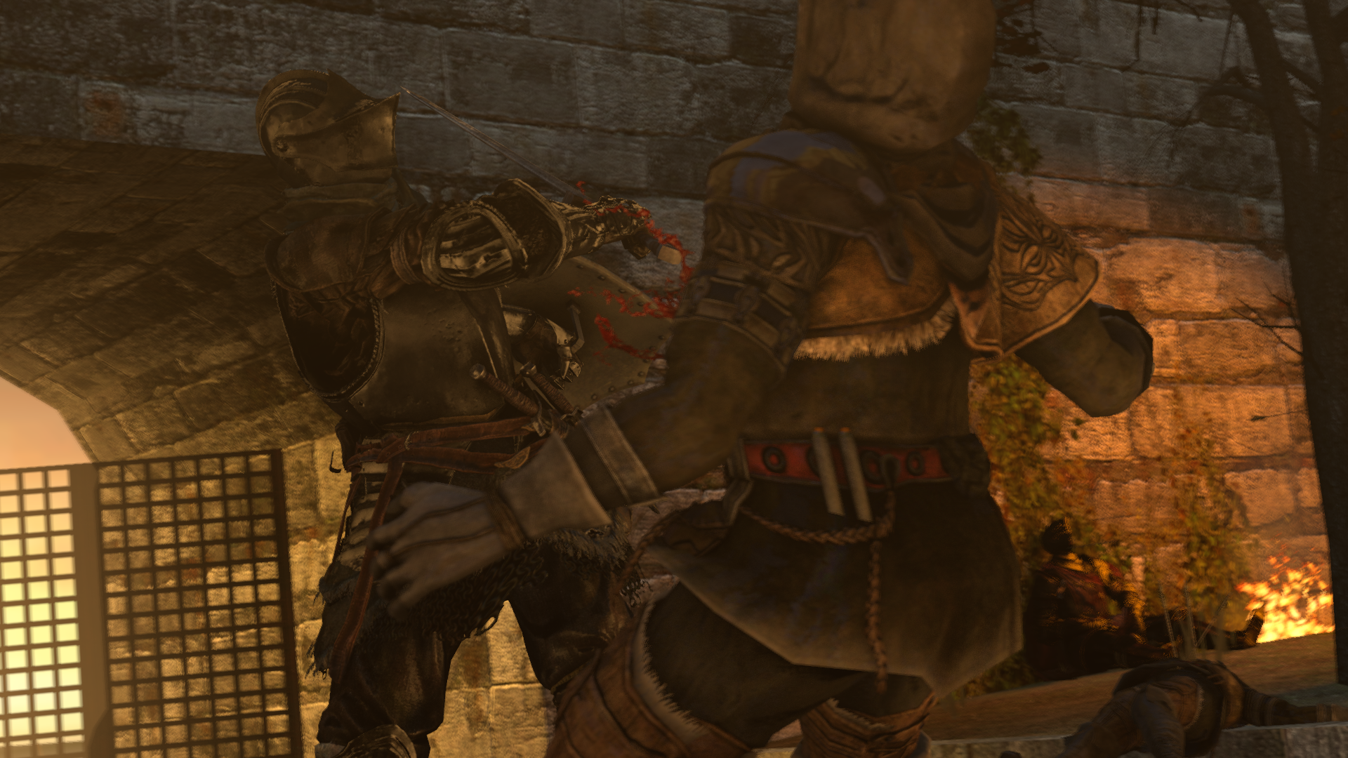
@Dicknose, a simple, yet not that bad picture. I dislike the fact, that you left that space behind the gate empty, you could've added some trees there at least, to make it look more... Filled, I guess. The other thing is the problem with lighting, you've put two very bright spots on both right and left (gate and that fire over there), which automatically turns your attention there, as they're the brightest spots. However, everything that's actually interesting happens in the middle, but no lights are there to show that, and that's probably the biggest issue here, it would've changed a lot, trust me. Other than that though, not bad, a little bit stiff, but good posing with visible movement, but nothing too shabby. Same with the poster overall, it's not shabby, but it isn't too good either, mainly because of that lack of light. I'd give it 6/10, so above average either way
@CloudBucket, pretty original piece, I must admit that. One thing that ruins it though, is lack of style. It looks like you had an idea, wanted to do it in a certain way, but chose to play safe and not put any colors, or even get rid of them. These neon text just scream for all the lights to be like that as well, bright and strong. The floor and that flashlight however try to put a little hit that you could go for something like
Hatred, with dark and gloomy tone and only few colors left here and there. That's what's missing here in my opinion, that sharp style that would make it stop looking dull. Good idea though, experiment like that whenever you can, you might find some really good ideas that way
As for the winner, I go with @goose
I just love it, don't know why though. Maybe it's how rushed it looks, or how
the colors match up nicely, who knows. Most important thing is that it looks good