Completed [Competition] Art of The Week

Status
Not open for further replies.

fofa

Atom
Joined
Jun 9, 2018
Messages
3,111
Nebulae
5,716
Camera could do with adjustments. Having the CP's schlong take up a third of the shot really seems counter-intuitive.
I think this could look even better if you rotated the camera to the left so that the line of CPs forms a diagonal on the screen's corners, would give a better sense of motion and depth imo.

Maybe you can try, and see if it's any good or if I'm saying nonsense.
I'll do it tomorrow, thanks for the feedback, appreciated x
 

>Luna

Proton
Joined
Aug 13, 2017
Messages
191
Nebulae
815
By no means is this beautiful artwork, but some critique on editing style/video itself would be appreciated if that's your thing
If not, enjoy the funnies

 
Reactions: List

lemon

Sells cheap beer
Joined
Apr 26, 2016
Messages
1,426
Nebulae
3,434
Artsy review of the two weeks

4247E2B2246A77FF9A76DAFE98E77D8DB771248E
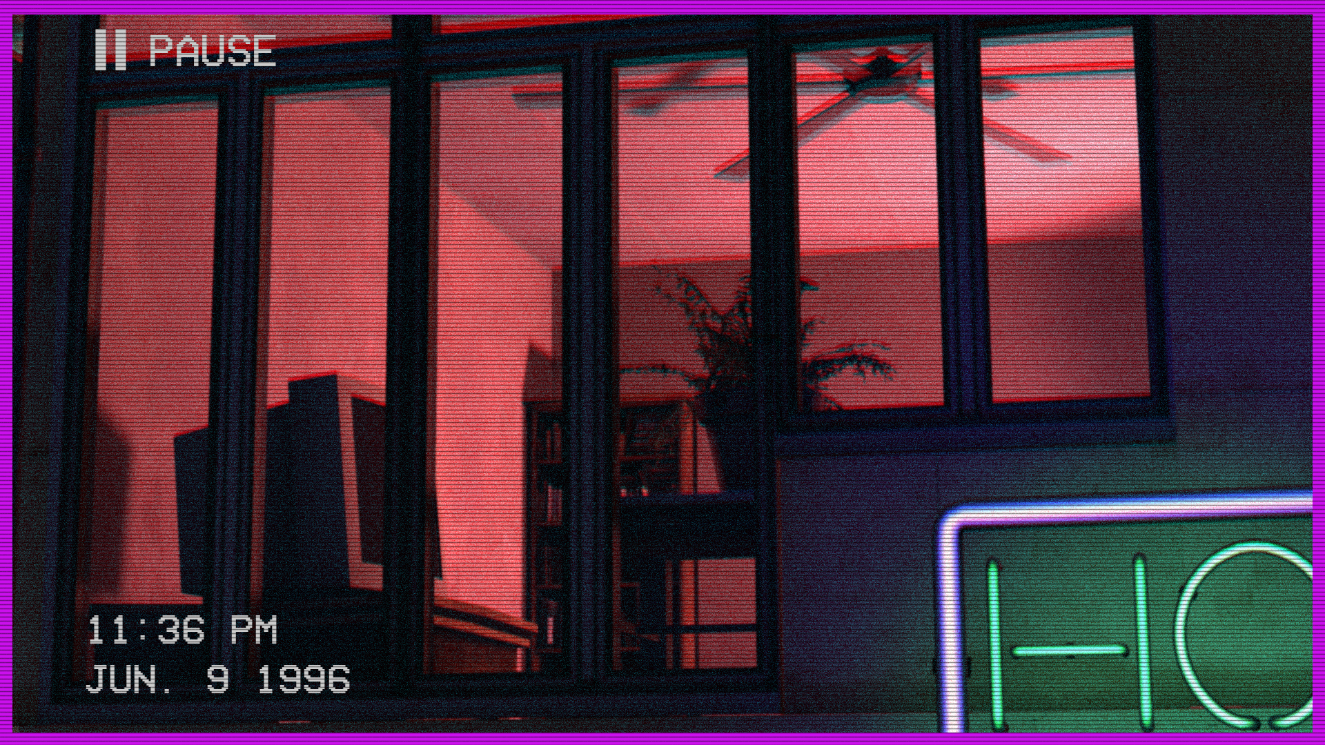
@Dicknose, atmospheric, but not much more than that. Nothing really is happening here, although I get where you got the inspiration from so it kinda excuses you a bit. I'd however modify it a little bit either way, add a shadow of one person shooting other, or anything else that's fun and joyful. Also, get rid of these filthy purple borders. It's all perfect otherwise tho,
thumbup1.gif


@Piggo, just get your
thumbup1.gif
and get out

@Danny, going to let my girl do this one, as she's far more into photography than me. She said something like this:
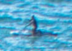
Nice place, but not so interesting photo by itself. Doesn't show much stuff apart from a nice cliff, which makes it a tad boring. It's mostly because of the perspective, instead of being horizontal, which would widen the picture a far bit and get rid of the empty space above what's shown. It has it's style, and sky is nice, don't get me wrong, but it looks like you're trying to make the viewer focus on the cliff, rather than the big blue above.
I still like it a lot myself though, photography like this really makes you see some wonderful places. You also have your own style, which would look really good as wallpapers on phones. Also, this guy seems to be waving to us, so that's a big plus
e49313821547399c9839e07dd59601e4.png

I give
thumbup1.gif
for nice views

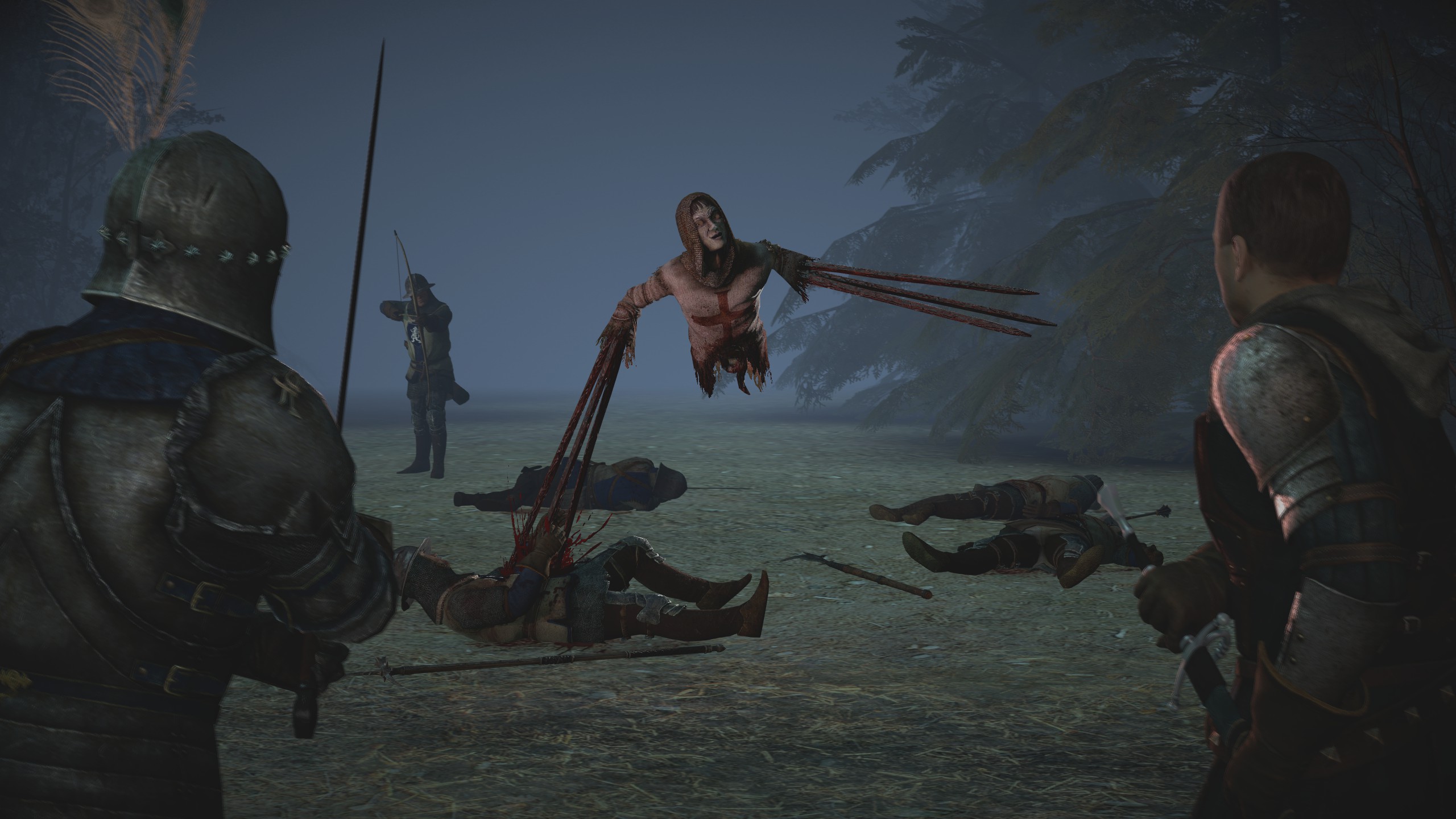
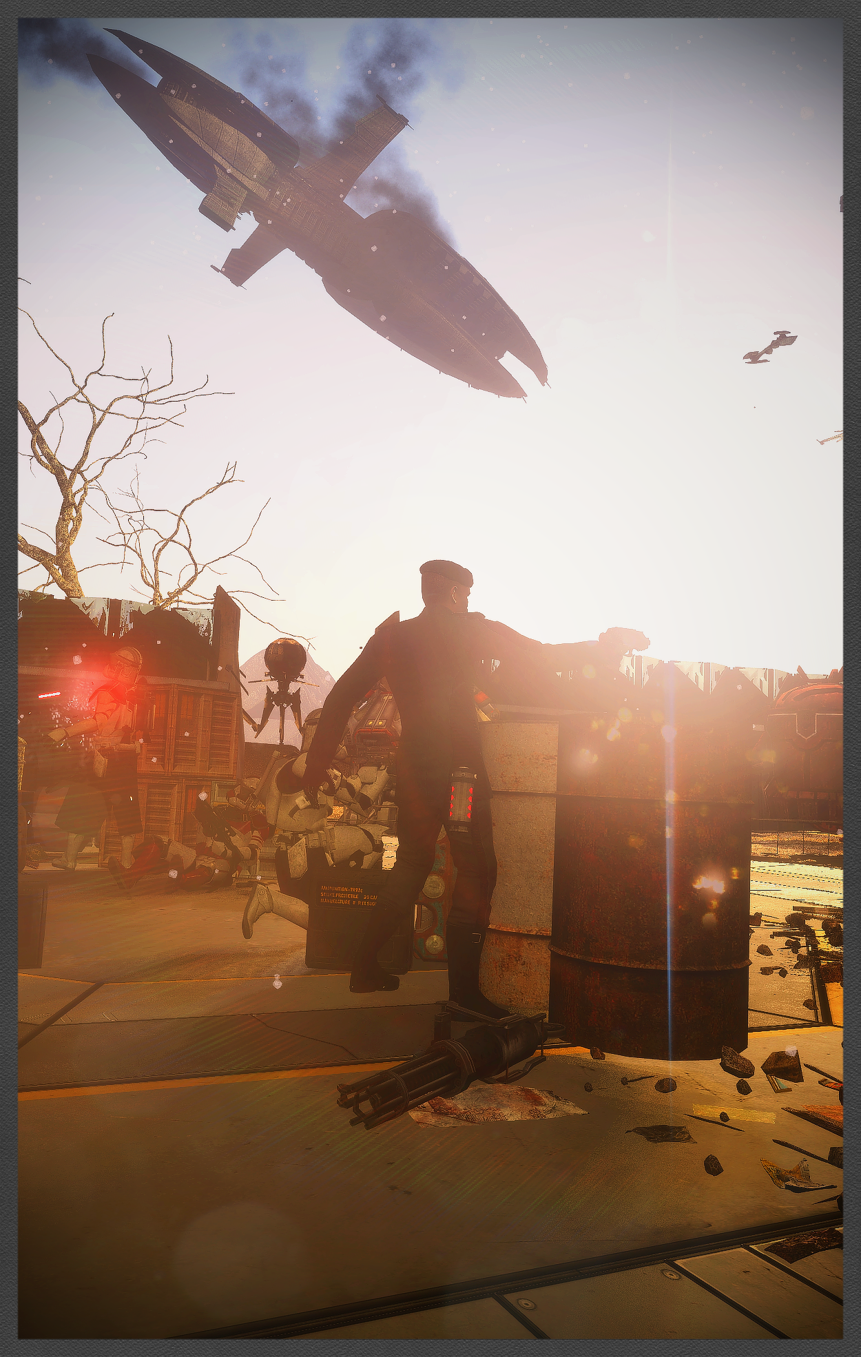
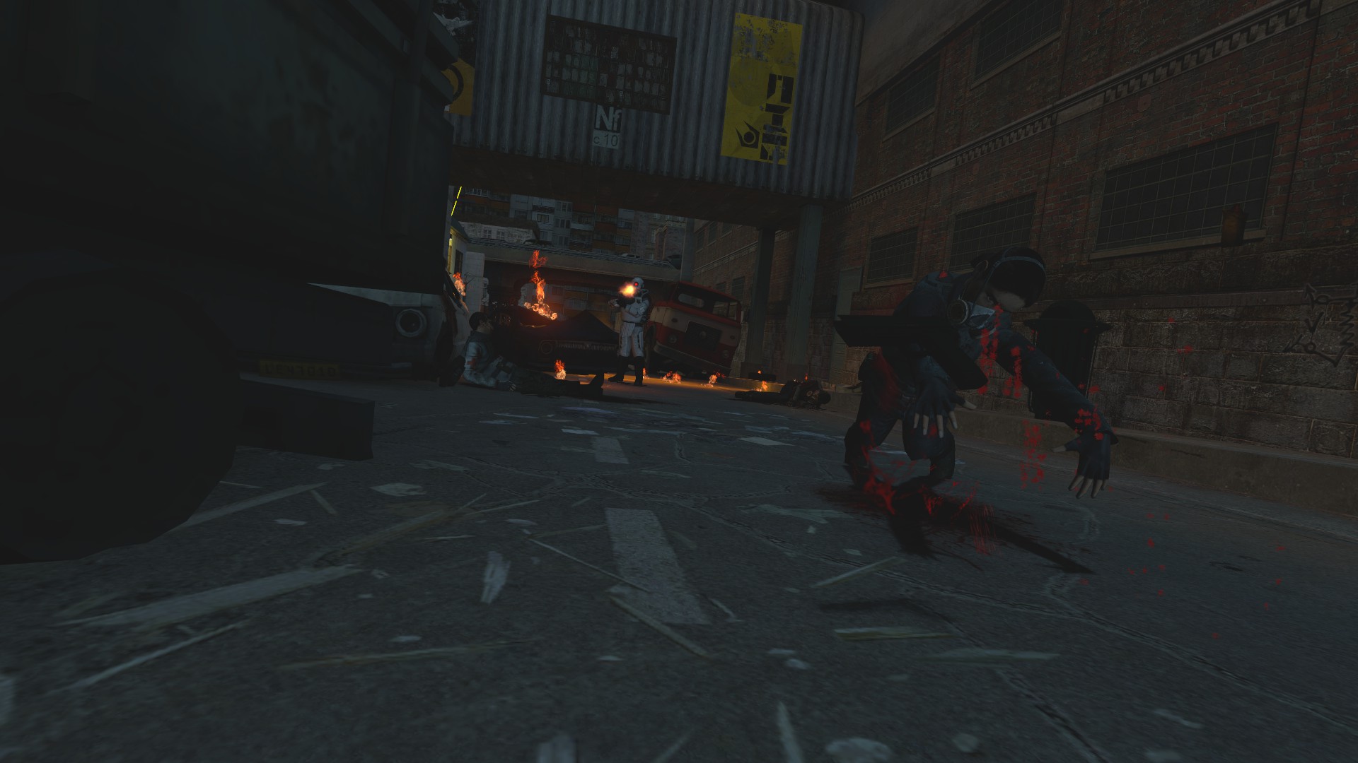
@Viper0419, as one genius once said, military poses are getting a little bit stale, but I have to admit that this one looks like it took a little bit of your time. It has some very fluid, alive posing, where each character does something themselves, or interacts with others. The only issues I see here would be that unnatural light and very low render quality. If I were you, I'd put the light way up in the sky, and change it to something yellow-and-red-'ish, to give it dawn vibe. Also, one light isn't enough, sometimes you need to light one person more than the other, so don't be afraid to use many lights in one pose, just make it seem like it's one light. How to fix the second one is pretty obvious, just pump these rendering settings up, I personally render in 3840x2160, but it's also important to take care of ambient occlusion and stuff alike. Otherwise, it's goodie, I like

@Mateozz,
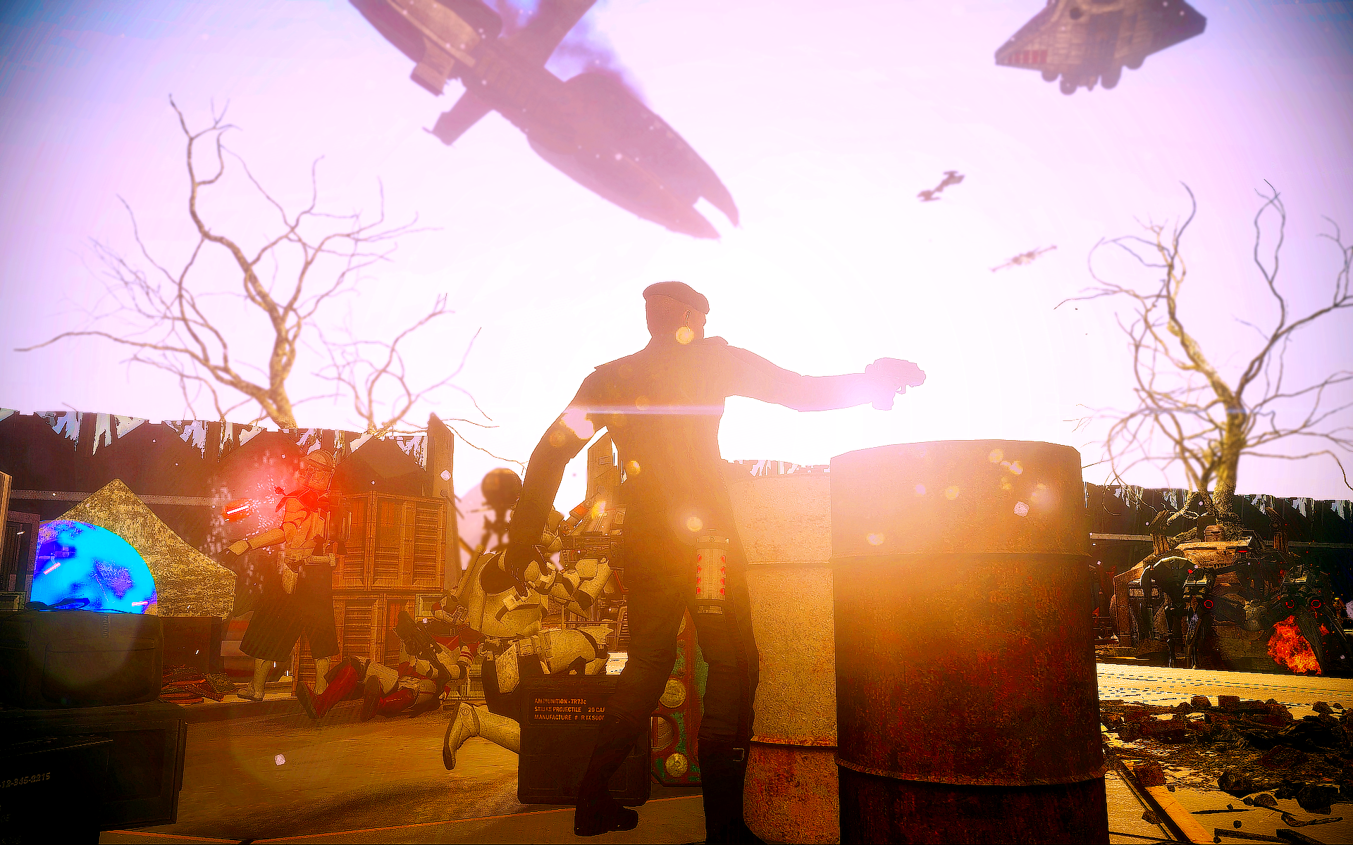
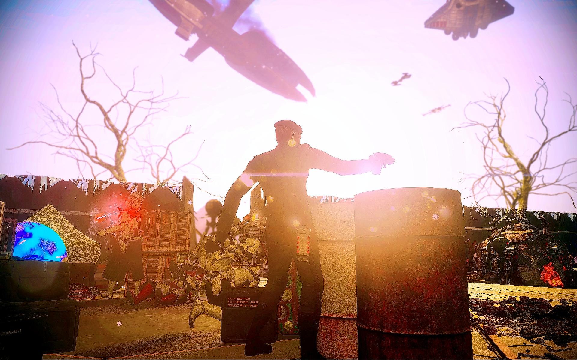
I think this could look even better if you rotated moved the camera to the left so that the line of CPs forms a diagonal on the screen's corners, would give a better sense of motion and depth imo.
Gotta agree with this edited quote, but I also have to congratulate for a very nice camera angle and color choice. That red in the background goes perfectly with white-blue. Widening the screen would add a hell lot, as that quote said, but I would also highly fucking recommend you to use HD models for my and other viewers' sake, either this, or this. Giving this one a
thumbup1.gif
tho, amazing progress you did there


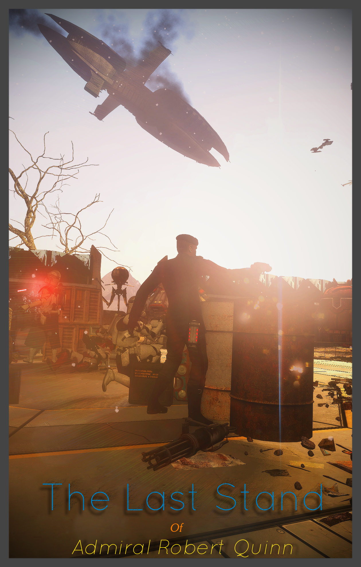
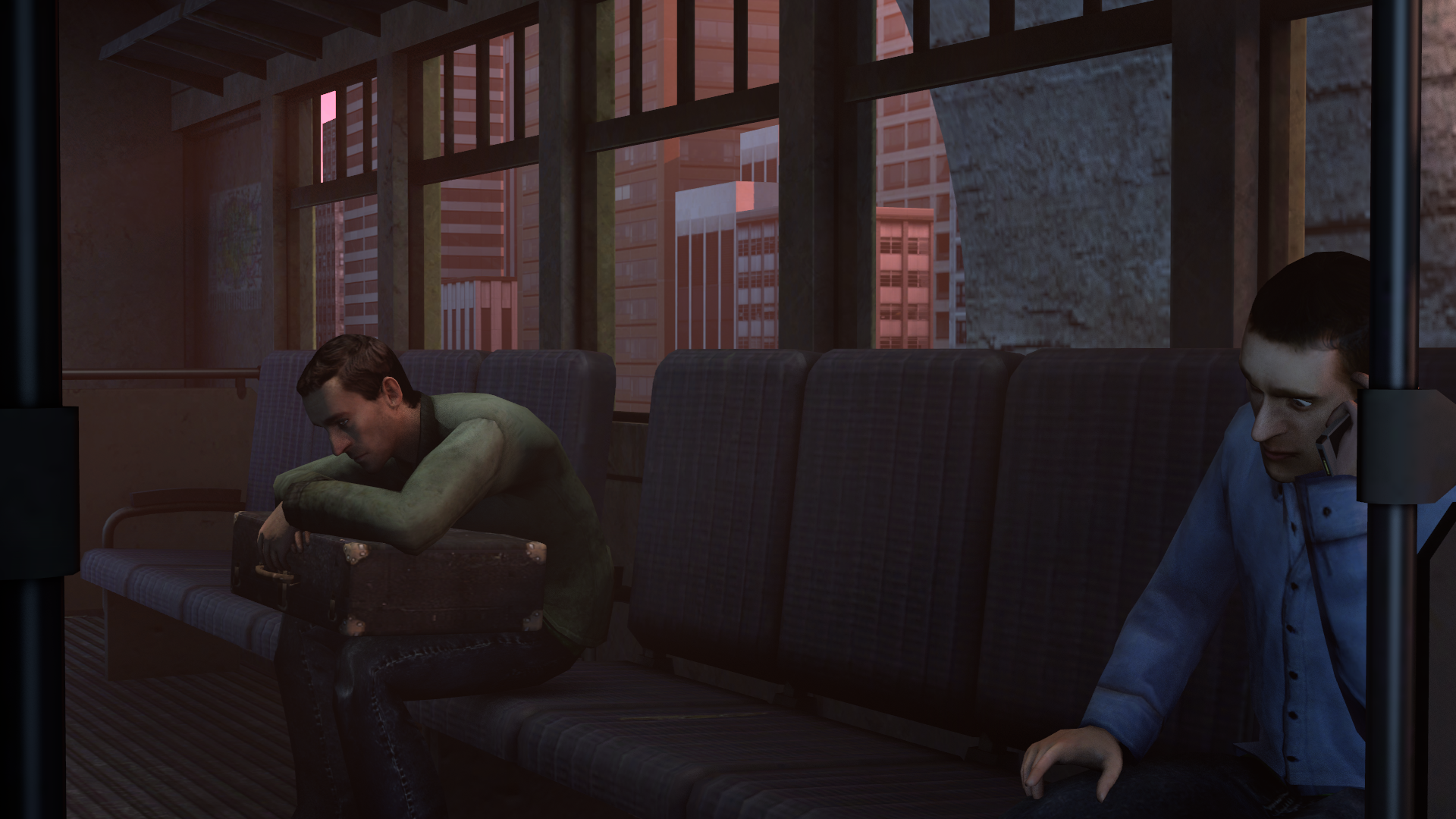
@>MJ, no idea how to do these, so won't judge, but I did enjoy the funnies, so
thumbup1.gif


Biggie of this round is @Cavity, but please, choose one next time
Really neato posing, lighting and pretty much everything

100dab.jpg
 
Reactions: List

fofa

Atom
Joined
Jun 9, 2018
Messages
3,111
Nebulae
5,716
aGJBd4v.jpg

My biggest problem with this pose is that the eyes are not properly posed, thus it makes the pose a little bit stiff, but nevertheless, I'm happy with the camera angle, the general pose and the lights
 
Reactions: List

Stelios

Nucleus
Joined
Nov 14, 2017
Messages
1,138
Nebulae
7,615
Damn, not a lot of submissions this week. Here's mine for Halloween :

SNIP THAT : Changed my submission with updated version.

D54BD3039B10DBD6285861DB231C3E90D638F1BD
 
Last edited:
Reactions: List

Sixx

Proton
Joined
Jul 28, 2016
Messages
220
Nebulae
286
Damn, not a lot of submissions this week. Here's mine for Halloween :

D54BD3039B10DBD6285861DB231C3E90D638F1BD
Looks cool, but the archer on the left is holding his bow in such a weird position, and the two dead bodies on the right look like they're overlapping one another.
 
Reactions: List
D

Deleted member 5162

Guest

vindication_of_the_mad_by_ml0301-dcrgwi5.png


Sorry, but I got totally inspired by @Danny 's work with the titles, and I really liked it. So, big credit goes to the nice guy!
What I am doing, is an event poster for Star Wars Roleplay server, event-maker named Poseidon asked me to do it, here's the results.
In my opinion, it turned out to be pretty good!


I don't know much about the event itself, but what I've heard, is that on a some planet, there's a virus on the outbreak and goes into the highly-populated cities filled with the citizens, they're dying. I do not know who exactly is that person on the poster, but she's clearly involved in it.​
 
Last edited by a moderator:

fofa

Atom
Joined
Jun 9, 2018
Messages
3,111
Nebulae
5,716

vindication_of_the_mad_by_ml0301-dcrgwi5.png


Sorry, but I got totally inspired by @Danny 's work with the titles, and I really liked it. So, big credit goes to the nice guy!
What I am doing, is an event poster for Star Wars Roleplay server, event-maker named Poseidon asked me to do it, here's the results.
In my opinion, it turned out to be pretty good!


I don't know much about the event itself, but what I've heard, is that on a some planet, there's a virus on the outbreak and goes into the highly-populated cities filled with the citizens, they're dying. I do not know who exactly is that person on the poster, but she's clearly involved in it.​
mateozz45 here, with some critique
Looks cool and all, but I feel like there's too much grain / distortion on this picture. It would really look better if you could trim the grain / distortion down.
The sky is black without any stars, or anything, looks pretty bland.
Same with the city, just normal building. If there's a virus outbreak, then I'd expect the buildings to be somewhat broken, collapsed, and so on.
Image-4-%E2%80%93-buildings-overgrown-with-lush-foliage.jpg

Here's an example of how the buildings could look, considering the fact that there is a lot of flora near the city.
And almost the last thing - The text doesn't really look good. The blue colour doesn't really blend in with everything. You could blur out the buildings, and use the white colour on the text if you'd want to.
And onto the last thing - there's visibly no fire on the corpses, or whatever that is. I'm not sure if it's caused by the photoshop filter, or if you really didn't use any fire particles. You can clearly see that there are only lights highlighting the corpses, not fire particles or anything. The filter made it only look more obvious.
I hope that I helped, somewhat
 
Reactions: List
D

Deleted member 5162

Guest
mateozz45 here, with some critique
Looks cool and all, but I feel like there's too much grain / distortion on this picture. It would really look better if you could trim the grain / distortion down.
The sky is black without any stars, or anything, looks pretty bland.
Same with the city, just normal building. If there's a virus outbreak, then I'd expect the buildings to be somewhat broken, collapsed, and so on.
Image-4-%E2%80%93-buildings-overgrown-with-lush-foliage.jpg

Here's an example of how the buildings could look, considering the fact that there is a lot of flora near the city.
And almost the last thing - The text doesn't really look good. The blue colour doesn't really blend in with everything. You could blur out the buildings, and use the white colour on the text if you'd want to.
And onto the last thing - there's visibly no fire on the corpses, or whatever that is. I'm not sure if it's caused by the photoshop filter, or if you really didn't use any fire particles. You can clearly see that there are only lights highlighting the corpses, not fire particles or anything. The filter made it only look more obvious.
I hope that I helped, somewhat
The sky bugged out upon re-loading the save and I forgot re-set it up, damn, grain is probably the sharpness you're talking about. I wanted corpses to be in the forest, since, y'know, government is still in the control, and it's all based off the Star Wars, so I won't take the design from the Last Of Us, and... Yeah, text wouldn't fit anywhere anyway. For some reason, particles didn't seem to show up whenever I spawned them, I later found out that they were dissapearing due to the props/effect, and it made them look pretty bad, so I just ignited some of the corpses while having an addon vFire, and the pile of corpses were in a simple effect ring, so I couldn't ignite them.

Thanks for the opinion!
 
Last edited by a moderator:
Reactions: List

Corey

Kino™ Certified
Joined
Sep 28, 2017
Messages
1,246
Nebulae
3,095
COMPETITION SUBMISSION


Resistance sniper in City 2 suburbs (East London)
2013 (Early occupation)


4000_screenshots_20181107230359_1.jpg
 
Last edited:
Reactions: List
Status
Not open for further replies.