Yeah
@RGB,
:^)
@ramsey,
what I do on a large scenebuild like that is that I take 1 or 2 spotlights and put them very far away and then increase the distance the light shines so that it catches all of the objects and makes shadows etc to look like it's a sun, and then the other spotlight the opposite of that with lower brightness as a filler light, I found some more in depth tutorial about this, my explaining is kinda confusing
and sometimes you also need a couple of more if there are things like windows etc that might reflect the light, in which case you need to make fake light reflections etc since the source engine doesn't bounce the lighting like 3d softwares such as Blender does
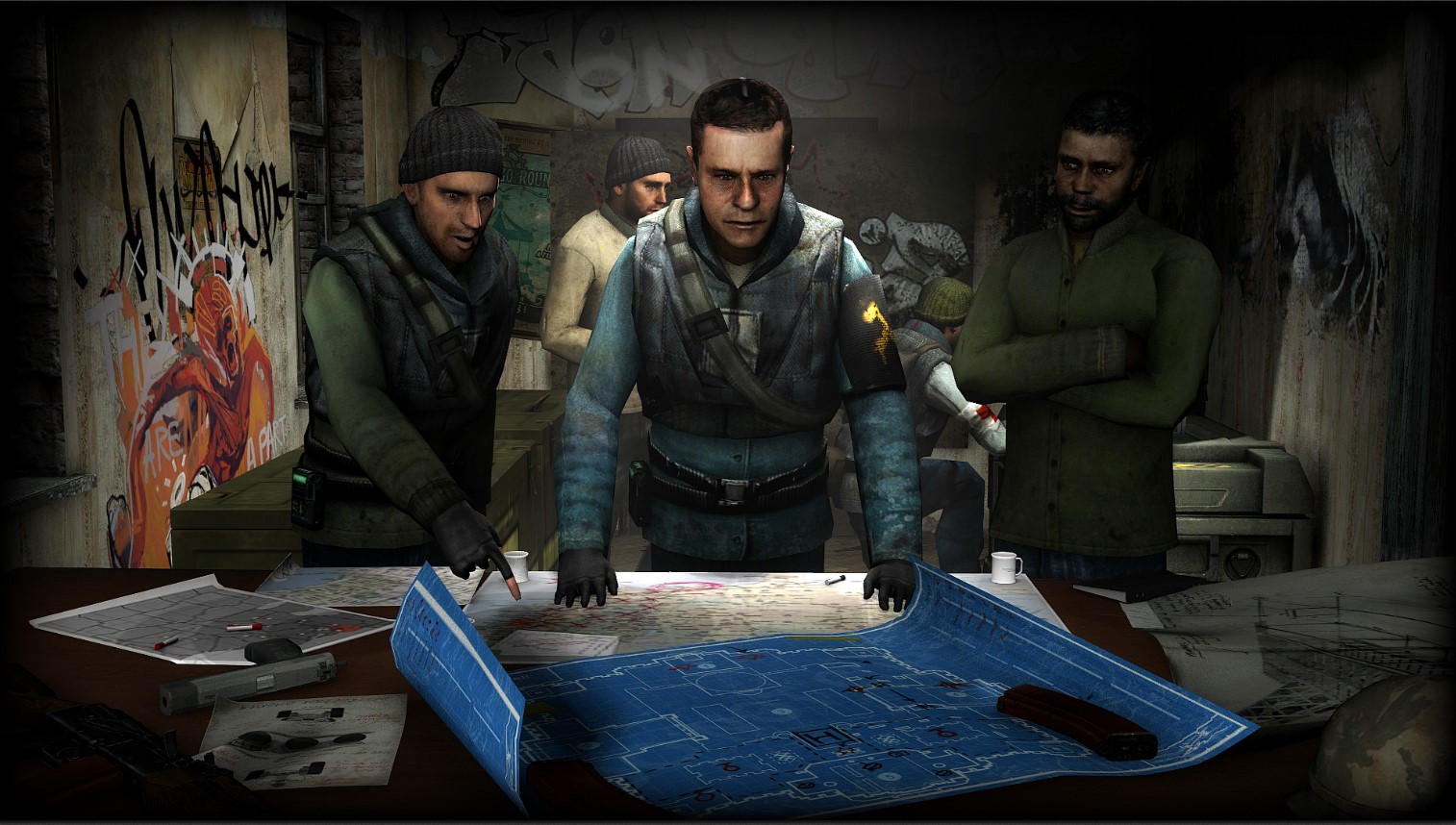
That in terms of lighting. I don't have any problem with posing, but what troubles me a bit here, is that there is still some space left there and that a;; these buildings and windows looks pristine in quality. Could also use some muzzle flashes and etc, general polishing. Nice scene though, good scenebuild
@Cavity, this looks like something straight from a loading menu for some HL2 game. It's pretty decent overall, even though it doesn't shine too bright in any aspect, but it's still quite good. Can't exactly say what's wrong here, because there's nothing wrong per say, it's just that it's a little bit bland I guess. Either way,
you get yourself a gold medal with this one, I actually like it, just decided to review it here, because why not
@Viper0419, yep, it's pretty good. Honestly, the only problem I have here is the camera placement, because as it is right now, it leaves a lot of unused space both in the top left side of the picture, but also on the sides. I'd place it just behind the nazi soldiers, leaving a small gap between them so the viewer can see that bloodbath on the stairs. I particualry like how you did OTA there, with many good effects (bulletholes, blood, lighting) and quite dynamic posing, even though most of it is just standard sequences (but they feel real, which works for me). Really good work fam, keep it up
@Rees, it might not be the most complicated one, but it looks alright. However, there are few things that we need to discuss here. First of all, the style in which you edited that scanner doesn't fit the style of that metrocop (another thing is that the CP in question is actually from somewhere else, rather than your original work). There's also tons of white dots in the background that really mess it up for me. Overall though, it only needs polishing, as the main concept is simple and works, same goes for how it looks, it just works.
Just, if you don't spot these little details. Nice work anyway
So, as I said above, goldie goes to @Cavity, yay