Here I am
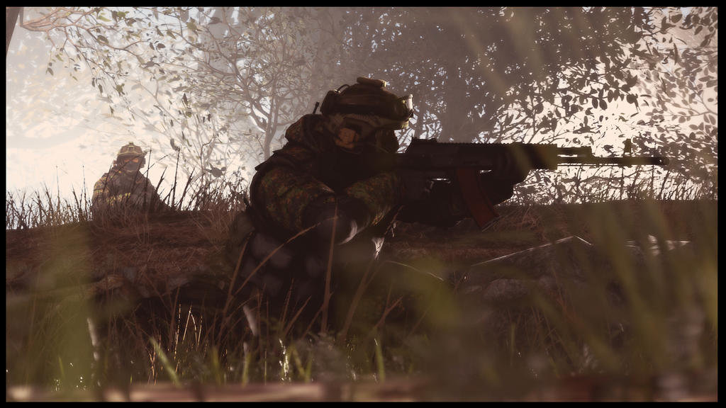
@RaphaelDeFusco, a really well made one in terms of atmosphere. Minimal lighting, even though there could be more of it, works very good here, setting a dark ambiance around the scene. The corner where all the soldiers sit is absolutely great and I can't complain about it, other than the act that you could add some light for shadows. However, everything besides the atmosphere and that corner is really lacking of quality. With the camera angle you picked here, it would seem as if you'd like to show us something going on behind these barricades, especially that one soldier is telling us to shush. There's nothing there however. Literally, it's all empty sets of barricades, without even a single person on that watchtower. Also, the left side of the screen is empty as well, you could've either moved the camera so it isn't visible, or add something on it (a knocked out guard for example, meaning that these soldiers took care of him). Other than that though, it's really good. I like your style and I encourage you to continue doing what you do.

@Dallahan,
, but portrait posters are getting tad boring. Nice lighting though
@Cavity, a really solid one you did here. I especially like the fact that you did a ton of scenebuilding here, or at least it looks like. To be quite fair, the only problem I have here, is that the lighting is off. You can't see almost any shadows and when you do, they doesn't seem to match, which makes it all look artificial I'd make several lights on a similar angle just everywhere, so they'd cover the whole poster. Cold've also darkened the ground in postprocessing. Other than that though, quite a fair pose you did,
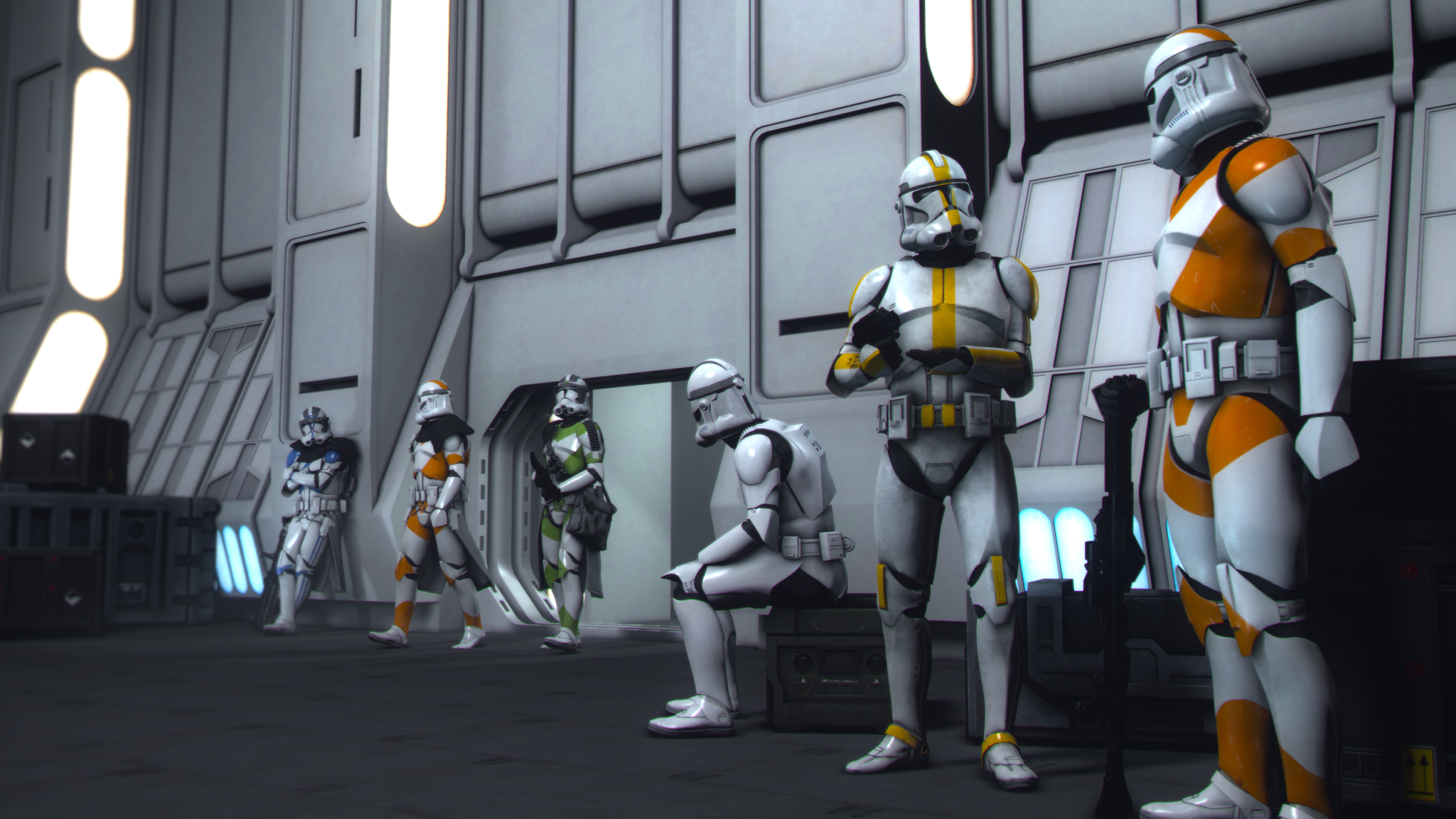
@Lyon, I see what you were aiming for here. The main problem here is the perspective, and I'd see this situation in a perspective like
this one,
this one, or
this one made by papa
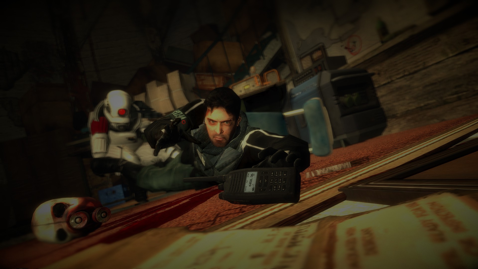
@Erkor, of course just displaying what you're trying to show. Besides that, you did posing quite well, but then again messed up the lighting. Most of the pose is simply left without it, which shows quite straight on, even though the parts that you did lighted up are okay. I'd look up on the guides
here for more in-depth info, but you aren't doing bad if I may say so, especially in the terms of posing. Good luck man, there's a long road ahead of you, but you're going in a right direction,
@Heck, where did the sun go man? It's completely dark here, without any lighting, which even in the darkest of poses is a bad thing. You should've added at least one light somewhere on the side to give some shadows here and there, which helps the pose seem less flat. Also, if you're going for that "he shot his arm off" type of deal, try to put the amputated limb in a such pose, that it doesn't look like it's just dropping, like you'd drop a glass of milk, but rather like it'd be hit by a sledgehammer. Besides that though, I like your camera angle and how you tilted it a bit to add a small portion of movement to it. Good job though, but remember about lighting next time, okay?
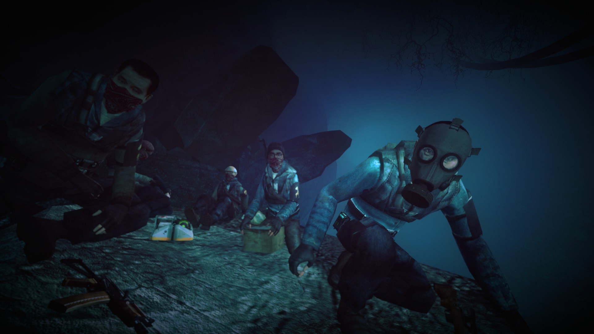
@Tortilla Jackson ツ, another solid one. I honestly don't have much to say here, except that it lacks of an interesting story. Like, the setting is there, you have atmospheric caves, with good lighting, you also have some good looking characters and a nice camera angle, but nothing is happening there. You don't show anything that could attract me for anything else than effects. As I said many times, concept is the most important thing in a poster. Other than that though, as previously stated, really good lighting.
I suppose everyone placed their bets on @Elan and get the payout today
As a honorary winner though, @Eddard Stark takes the cake, simply because of taking a
rather old, but still good looking concept for a pose. If only the background would be
completely in flames and rubbish...