Cavity
Proton
- Joined
- Nov 4, 2016
- Messages
- 201
- Nebulae
- 518
No, this is w/out lighting and it isnt rendered.Is this rendered with mat_fullbright 1? :wink:

No, this is w/out lighting and it isnt rendered.Is this rendered with mat_fullbright 1? :wink:
i dont play nebulous but i hang on the forums??I thought you moved on from us Lil'
i dont play nebulous but i hang on the forums??
you gotta choose one
What to heckHi. I am Jimbo.
^ Made in Garrysmod.

What the actual.. This thing is amazing ! :DHi. I am Jimbo.
^ Made in Garrysmod.
you could work for @Larry Crude The Good he needs something like this I think
I've been getting in to re-purposing old propaganda for Half-Life 2 Roleplay. I drew over the original and made a new outline and text and whatnot.
My criticism.
fucking cool bruv, really good i like yes
Since I'm not an expert in judging art, I have a good, meh and badFucc nobody wants to critism me ;( how can I improve furtherrrrrrr waaaaaa
Check out my post on here and give me an analysis on your thoughts.i offer criticism and guidance to aspiring artists in many aspects of visual art fields, i am free for steam adding.
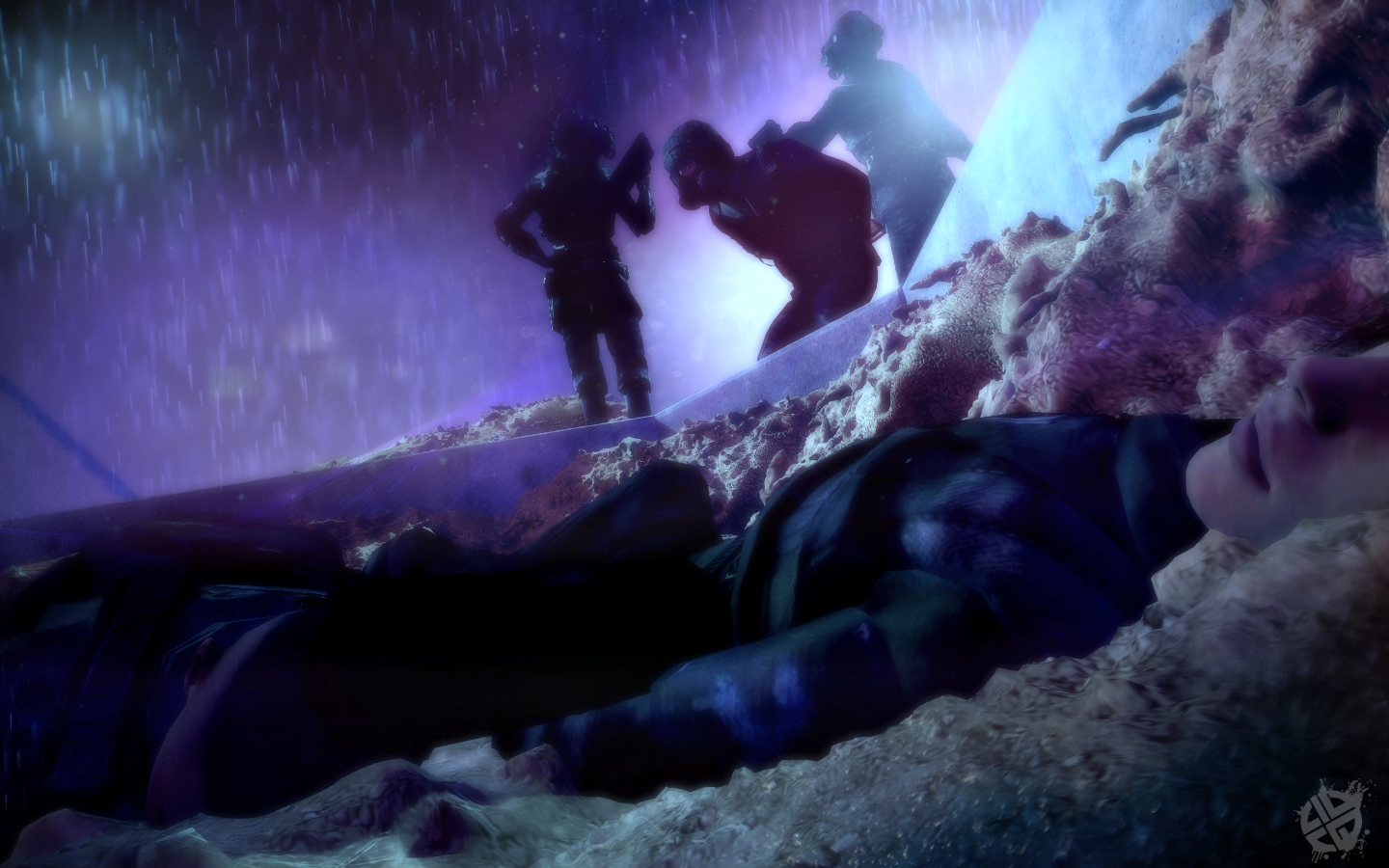
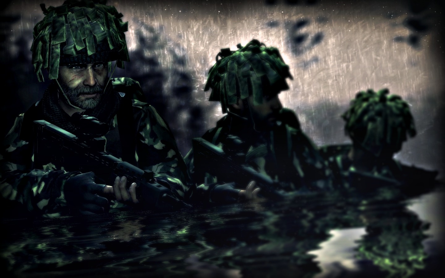
You probably won't like a majority of my stuff then as it focuses on darkened environments then anything else- I'll try to dig up a lighter one for you real quick...well hombre all i can say is good work on the posing and concept.
although the lighting feels bland for me, this is a personal taste for i prefer a bit more brighter/colorful things, but it certainly does wonders for the pose and makes it seem like a special ops force moving through some deep shit enemy lines thing.
now, what i do dislike is the contrast, god forbid the contrast and it honestly takes it away for me, but this is a double edged sword, some like the dark contrast and feel like it compliments the artwork, but there's another side that feels a contrast this dark is extremely unnecessary.
all i can say is, it's a p good one, but just for the huge contrast alone it takes it away by a lot for me, couple with the rather strange rain and vignette edits/effects.