@Dindex,
,
@Hoovie the Apansenok
While it's nice to see those characters once again, no real concept is present here, and the camera shows too much wasted space. You could zoom in way more, as well as give some interesting angle. Atmosphere however feels pretty nice, even if space around is wasted by empty trees, it does feel dark. Still, work on concept mate
@Sheldor, same as above, no story present here. I like how you played with light, but it doesn't really show anything. Such a light like that would be expected to highlight someone infront of it, or to serve as some metaphor that could be easily understood (idk, you ment that the cop is taking the beaten guy from 'hell'?). Camera is actually in a pretty neat place, gives that third person view from the female, and if only the guy on right wouldn't stare at her, like he's stoned, and there'd be way more going around in background, this could work. I'd delete the black male, or place him in background, he attracts too many attention that should be focused on female, as I guess we're taking it from her pov. As for now, good experiment, but only that, even if camera and effects are neat
@ToasterRoboto, I like how you come up with something original every week, but this zeppelin feels more like a sprite from some game. I'd honestly suggest you to go in that direction, but way bigger, that is making some interesting poster in your pixelized style. I believe you can do it, just remember about the posing rules and all that stuff that I usually talk about to other guys, and you should pull that off pretty easily
@spectre, I feel like he's facepalming, rather than crying. You don't cover your whole face with your hand if you're crying, right? You rather put it
like this (couldn't find a better pic). Also, a camera view like that would be far more interesting, you'd just need to lower it a bit to show dogtags, and
add some light. Ok models I guess
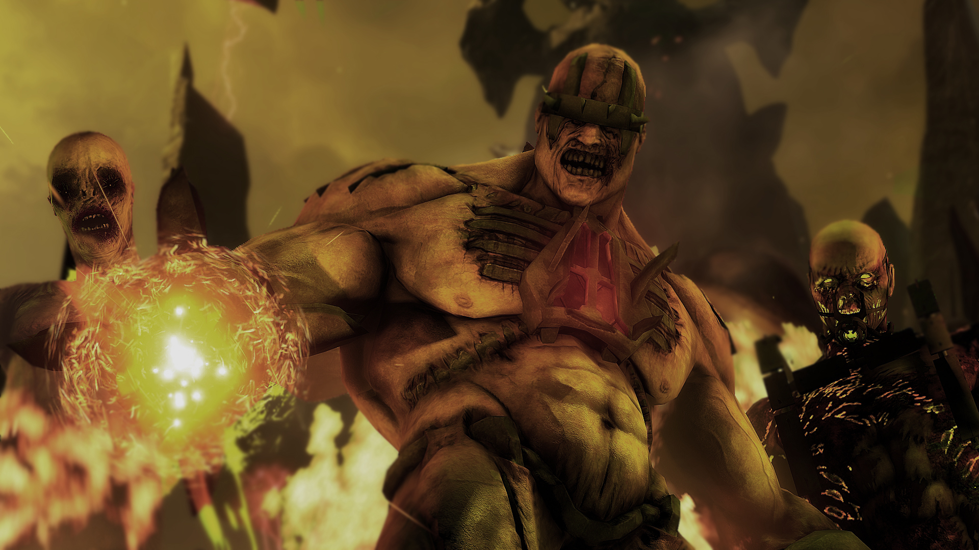
@Maxim, it's mainly the problem of low res. There is also not much going on, as it's only three soldiers, which also ruins the scene a bit. Still, they do look tense, even if I'd bend them forward a bit. Generally good posing, work with emotions, and concept (bit stale, but always good). I guess that you could also add some moon light with volumetrics, but it's not that bad honestly
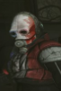
@Elan, it's p much just slight edit of an old pic, but I like it. I'd maybe add a glow from his eyelids, but that's it honestly, it's a fine piece of work
@Heisensperg, a really good idea to use reflection, but if you're doing that, the reflection should show what the said character is doing, and I can't really see anything there. Also, moving the camera right a bit to both show his bloody shirt and hide that empty space on left could work as well. Nice idea, just something went wrong in the middle. Still, good one
@Legolas, good reference to TF2 comics
Honestly though, in my idea it'd look way better if both of them were on left of the camera while behind them you would see a snowy landscape, with footsteps of Heavy, destroyed plane and knocked out polar bear. Then that'd look really interesting, but now it's just a good reference, pleasant to eye, but not worthy a wallpaper
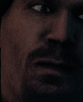
@Danny, resigned just to post here, eh?
C'mon, you can do better resolution man. Could also use the camera being moved to the right, with him actually peeking through the window while the viewer would be able to see what's going on outside through one of the gaps. Still,
nevertheless
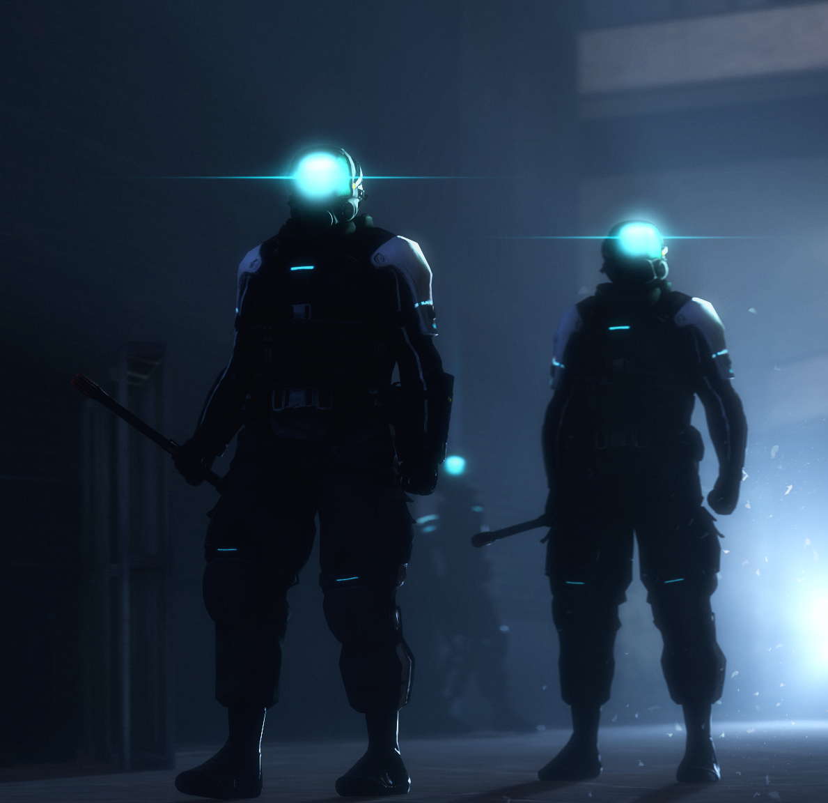
Now you'll feel punished Erkor, as the winner is @Wolfaye
Even if it could use some spicing up with editing for sure,
I can just taste the motion in each of those soldiers.
Also, good camera angle and placing of characters,
with main one both being highly visible and on the side of the pic
Learn from him people
Next one is obviously @Erkor, with second, honorary place,
mainly for awesome editing

.full.1706517.jpg)