rocky
bonk gang
- Joined
- Apr 27, 2016
- Messages
- 205
- Nebulae
- 148

Are you ready to die for your land? lay down with a gun! in your hand!
Why is there no winner rating?
Oh well, a neb will have to do.

Are you ready to die for your land? lay down with a gun! in your hand!

@CloudBucket, pose wise, it's a solid work, but that's not the main focus here. It's supposed to look like an ID, and it doesn't enough. The font you've used is far too dark and blends in with the background (should've used plain white font here). Next thing is that the logo actually covers most of Charlie's face on that ID, which is also no bueno, because, well, it's and ID, it should help with identification, and it's sort of hard when the person in question has shadowed face. A very good thing about this artwork is it's design, I really like how dirty it looks. It's alright overall, although flawed here and there.
@Exile, fairly simple one with a surprisingly low resolution. Besides enlarging it, I'd sharpen it up with some more contrast and saturation. Also, cut off everything that's outside of that body, that is that tiny bit of sky and traces of the tree. It's still neat though, even if it's just a test, solid material for an avatar.
@ConstantDisplay, not questioning it, since there's nothing to question. It looks like one of these Gmod main menu posters that kind of break the fourth wall, showing you a scene in progress of being built. I actually like it, it has something magical to it, even if it didn't render properly, as you said. That being said, it's still pretty barebones, but it works as of now. A little bit of improvement here and there, and you'd have some mighty fine wallpaper right here, especially if you'd add more stuff happening, as everything else looks good enough.
@Heck, it actually looks more like a screenshot from some game, rather than a poster. This has both disadvantages as advantages. First of all, the lighting here lacks of saturation, which in theory makes it far less interesting to look at, but also gives a grim and sad atmosphere, especially when most of what we see here is concrete. With how they are all stiffly posed, I can have only two conclusions: A), you got a little bit lazy and didn't focus enough on posing them, or B) the're really tired, from a long shift of guarding that one outpost. In other words, it lacks that polishing that'd give the viewer the possibility to feel what's happening there, rather than to guess. Give these soldiers a little bit more horizontal poses, a little bit more of leaning, extending their arms to mess with the radio, or their hand hanging from the bed bunk, because they fell asleep. I'll give this one a 6/10 right now, but it has a lot of potential that's yet to come up. Fiddle with it a little bit more and show it again
@Piggo
@Axi0m, learning how to forfeit documents, eh? It's pretty good to be frank. If I'd see something like this as an official document, I wouldn't really mind showing it off, it looks decently formal, while retaining that sweet modern look. Good work, even if it's not the type of work I'm used to seeing here
@Mickey Toast, a really good upgrade in your style. I'd honestly love to see more comics made by you, you have this certain singularity about your works that makes them both dark in tone, as well as fluid and funny in more technical side. Can't wait for more,

thank you daddy lemon~ this was my first time making a fake halo badgeaa
@CloudBucket, pose wise, it's a solid work, but that's not the main focus here. It's supposed to look like an ID, and it doesn't enough. The font you've used is far too dark and blends in with the background (should've used plain white font here). Next thing is that the logo actually covers most of Charlie's face on that ID, which is also no bueno, because, well, it's and ID, it should help with identification, and it's sort of hard when the person in question has shadowed face. A very good thing about this artwork is it's design, I really like how dirty it looks. It's alright overall, although flawed here and there.
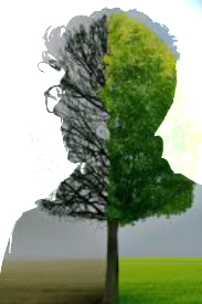
@Exile, fairly simple one with a surprisingly low resolution. Besides enlarging it, I'd sharpen it up with some more contrast and saturation. Also, cut off everything that's outside of that body, that is that tiny bit of sky and traces of the tree. It's still neat though, even if it's just a test, solid material for an avatar.
@Elan, it'd be a great screensaver, that for sure. With a little bit of stuff added here and there, like comets, spaceships and other debris it'd look just completely gorgeous. Develop it further and show it here once you think it's finished, would love to see it and probably give it a goldie.
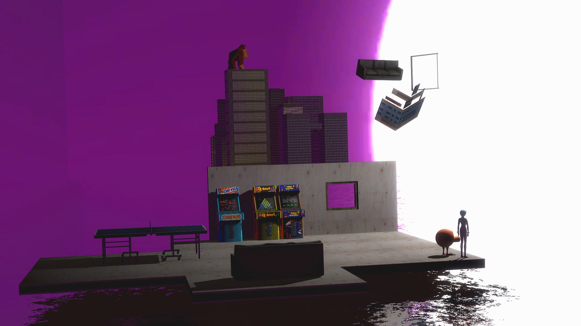
@ConstantDisplay, not questioning it, since there's nothing to question. It looks like one of these Gmod main menu posters that kind of break the fourth wall, showing you a scene in progress of being built. I actually like it, it has something magical to it, even if it didn't render properly, as you said. That being said, it's still pretty barebones, but it works as of now. A little bit of improvement here and there, and you'd have some mighty fine wallpaper right here, especially if you'd add more stuff happening, as everything else looks good enough.
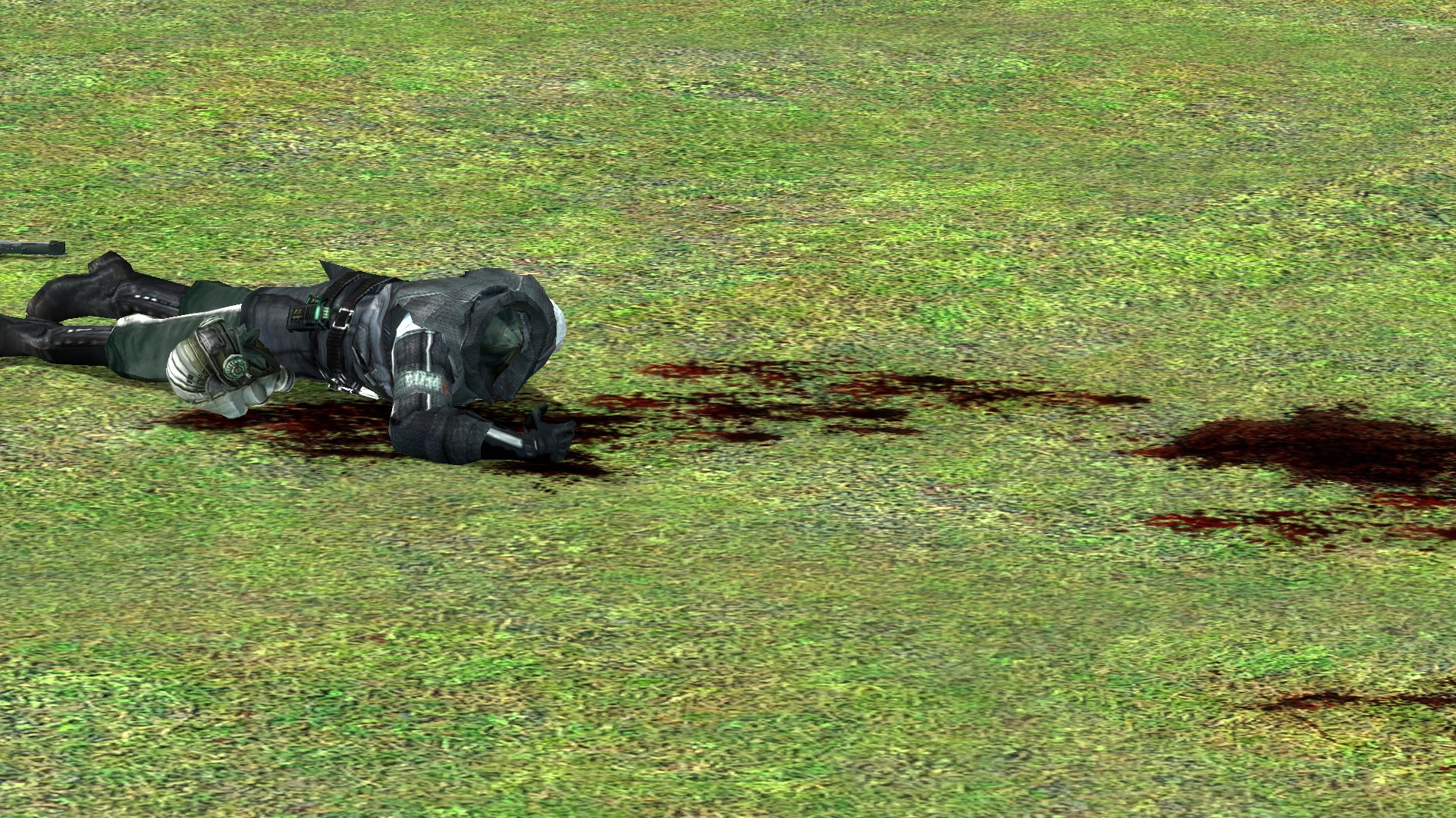
@Heck, it actually looks more like a screenshot from some game, rather than a poster. This has both disadvantages as advantages. First of all, the lighting here lacks of saturation, which in theory makes it far less interesting to look at, but also gives a grim and sad atmosphere, especially when most of what we see here is concrete. With how they are all stiffly posed, I can have only two conclusions: A), you got a little bit lazy and didn't focus enough on posing them, or B) the're really tired, from a long shift of guarding that one outpost. In other words, it lacks that polishing that'd give the viewer the possibility to feel what's happening there, rather than to guess. Give these soldiers a little bit more horizontal poses, a little bit more of leaning, extending their arms to mess with the radio, or their hand hanging from the bed bunk, because they fell asleep. I'll give this one a 6/10 right now, but it has a lot of potential that's yet to come up. Fiddle with it a little bit more and show it again
@Piggo
I'd write a Haiku,
if only I could.
Thumbs up will do
as your work is quite good.
@Axi0m, learning how to forfeit documents, eh? It's pretty good to be frank. If I'd see something like this as an official document, I wouldn't really mind showing it off, it looks decently formal, while retaining that sweet modern look. Good work, even if it's not the type of work I'm used to seeing here
@Mickey Toast, a really good upgrade in your style. I'd honestly love to see more comics made by you, you have this certain singularity about your works that makes them both dark in tone, as well as fluid and funny in more technical side. Can't wait for more,

May Robert Charlson and Ashley Moore rest together, away from this dark world.
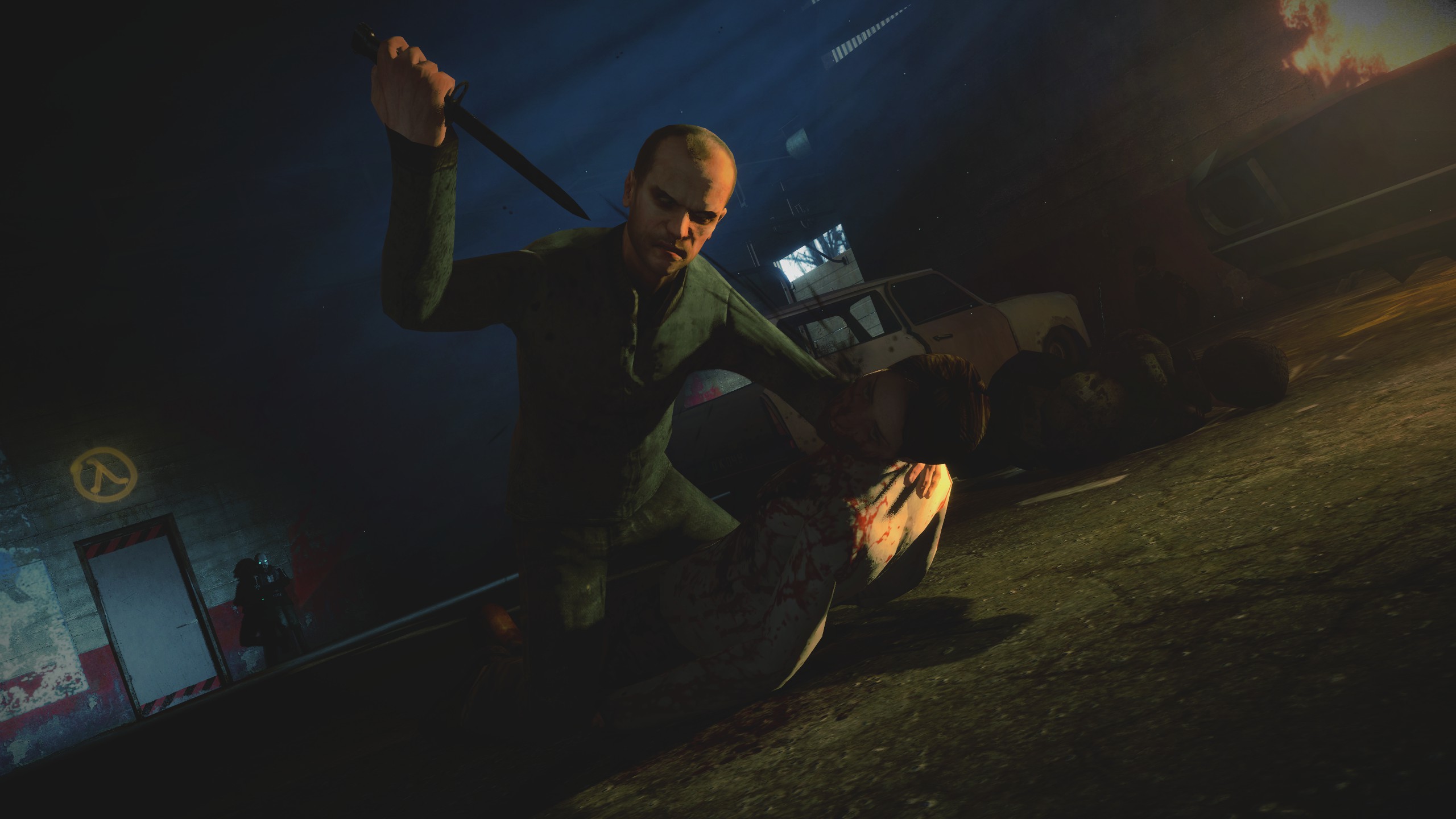
Oh man, never liked posing hands, but when I was putting them on their positions, I just felt like they fit pretty well, but thanks for the tip anyway!The posing is pretty good, but you should do something with these hands, they're all in default position