Dudu Fadende
Proton
- Joined
- Jan 17, 2019
- Messages
- 147
- Nebulae
- 347

a lot of them actually@Lemon Cuntcake needs a beer
@Cookie_ crisp picture, really satisfying to look at, but I think you overdid it a lil' bit with the amount of colors. Replacing that red with green and giving the background a bit of blue would do the trick. The scenebuilding is superb tho, same as the idea itself. Really happy of this one being here, looking forward for more cyberpunk material.

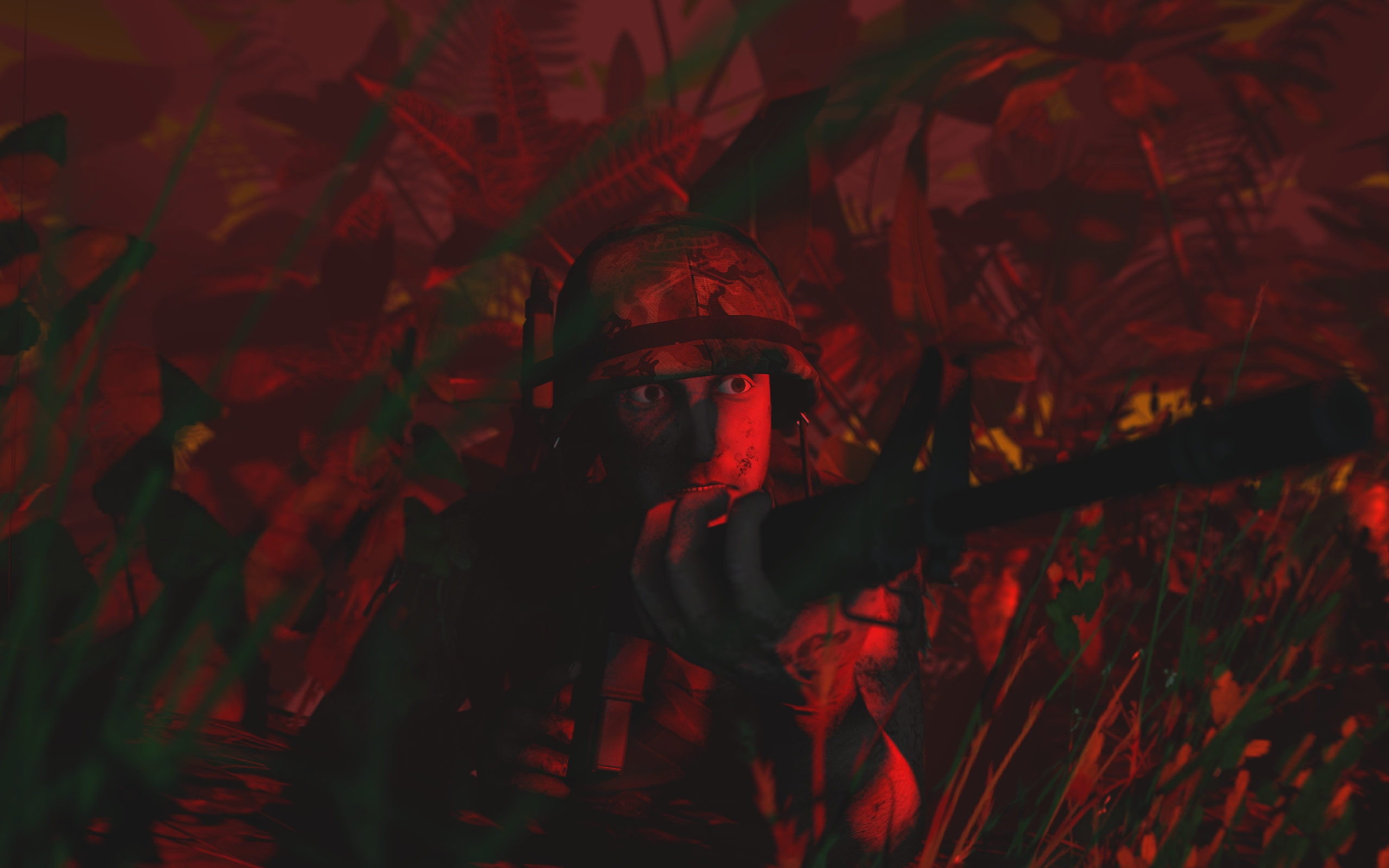
@Dudu Fadende, Imma choose this one, for one reason - it portrays emotions far better than the other one. It even looks like some shot from a movie, and the red lighting really gives off a good mood. I'd only maybe add a guy or two in the back, just for the good measure, but it's really fucking good otherwise, glad to see you improving rapidly. Turn the ambient occlusion a bit higher, and you've got yourself one fine poster.
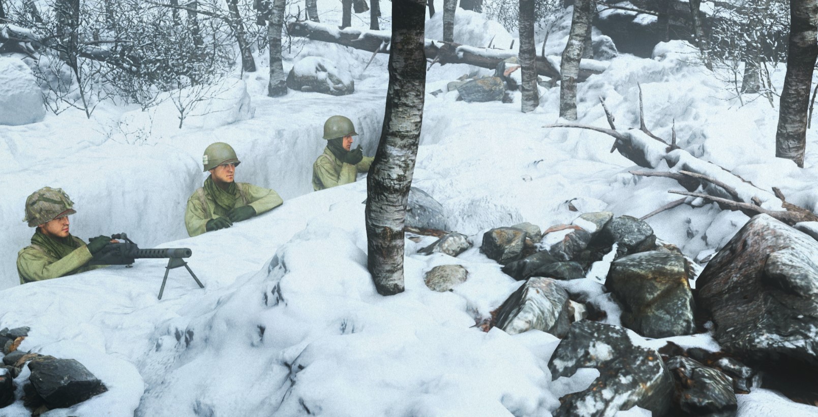
@Cavity, I feel like you've got something for scenebuilding. Talent even, I should say, because the scenery itself looks beautiful, almost as if taken straight out of some fairy tale. That's the great part of the poster, the not-so one is posing of the soldiers you have there. They aren't really relaxed, but rather stiff, which just doesn't mix well with how pretty and thought-through rest of the picture is. Getting posing right is far more tricky than posing a rock, obviously, so I understand your problem. I always liked to imagine posing guys as me, taking the wheel and being there myself, with my body. So, I'd actually stand up and get my body in the position I want my character to be in. From there one can pinpoint exactly which muscle goes where and how to bend the body so it's relaxed/tense/holding onto something, depending on the situation. I know how it sounds, but it really helps. Also, different faceposing helps a lot too, but that's a side note.
@Pale Rider, this is one of the few instances where I fully allow just using standard animations and even recommend. It's a simple, yet breathtaking with the perspective you've given the viewer. Looks like one of these fancy pictures you see in even fancier magazines next to an article about some serious problem. Really well done, go in exactly that direction, you seem to have a very firm grasp on this style.
@Antloin, fix that leg and add shadows, that's all I'm asking for. You can maybe even go overboard with the shadowing, as you already seem to take a lot from @Danny and simplify it (in a good way). Try adding some very heavy light, so the shadows are as long and dark as asphalt on Route 66. That should let your work feel a little different from what your mentor does, and you could continue from there, trying to flesh out your own style. Goodie,
@liew, I have no idea where you got the urge to go with such style, but it seems to be working out real well, especially with this take on Fallout. I can't really pinpoint what exactly bugs me about this one, but I think it's a little bit low amount of contrast that could be fixed with adding more lights here and there, but then again you'd need to be very careful with it, so that it doesn't lose this grim atmosphere you gave it. A tricky one, and can't really help you with it, but there's definitely potential with this way of making posters. I mean, I'm probably going to regret summoning the demon, but @bjfgpkqkdmtnspwndsjt makes great and grim posters and maybe you should take look at at least few of them.
@Dallahan, spoking inside is stinky, stop
@Piggo, although I doubt it qualifies as art, I need to quote it just because of how neat these models areGot some models for you peeps, they're tested for both SFM and GMod.
The MP5s, M240, M16s, M4 and Uzi from Insurgency Sandstorm
with all attachments
and some weapons from RS2
https://imgur.com/a/uDwZIum

T
here might be a few issues because some of the shit like the bullet links for the M240 are designed for advanced bone tool
dunno if its right to post this here so please feel free to tell me to move it asap
https://mega.nz/#!U6hBUSoK!757NHcArVUM2NftcxGwGB_L_j8jGogZeyJnTJOS7llU
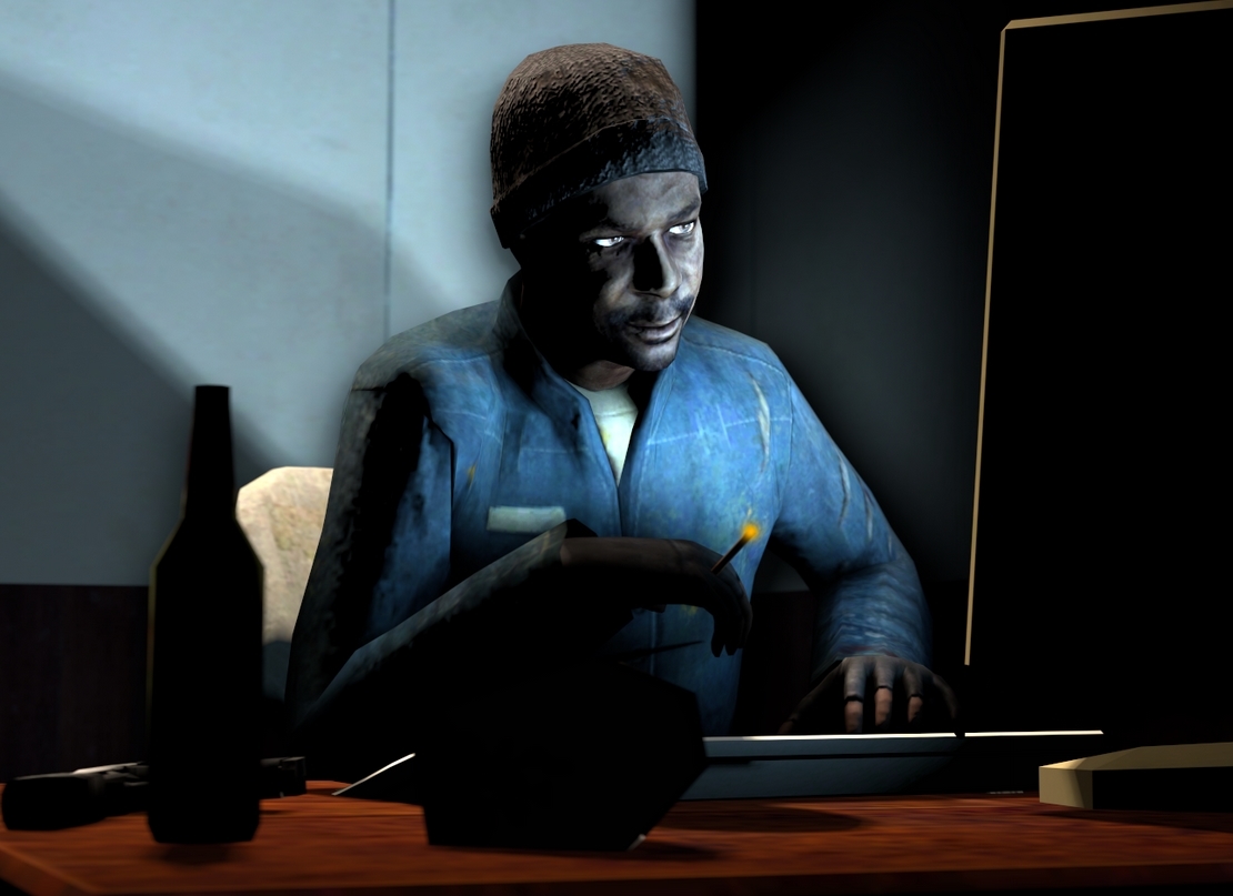
@Heck, really simple pose, but I honestly dig the atmosphere here, and the background looks fairly decent. It obviously needs some improvement in terms of posing, which could be a bit more alive (for example bending him forward and making him lean on one arm, so he looks bored/pensive). Also, adding some foliage just in front of the camera would've been a nice touch, even if it'd be only branches of some bush. It's really not bad overall tho, there's something calming about. Could even see this one as a loading screen for some outland survival server
@Dudu Fadende, memes are art as well, though my sense of humor is a harsh judge when it comes to that
@Spungey, what even happened to that vampire game anyway? It just vanished one day, after a long time of being advertised. Either way, simplistic, yet effective artwork, which gives me no more room for explanation of my point, because I already made it. It's good. Is it ambitious and provoking? No, but who the fuck cares if it's a cool fanart done properly.


a lot of them actually
It's a bit late, I'm tired and got some stuff to do tomorrow, but I don't have that pink tag for nothing
@Cookie_ crisp picture, really satisfying to look at, but I think you overdid it a lil' bit with the amount of colors. Replacing that red with green and giving the background a bit of blue. The scenebuilding is superb tho, same as the idea itself. Really happy of this one being here, looking forward for more cyberpunk material.
@Dudu Fadende, Imma choose this one, for one reason - it portrays emotions far better than the other one. It even looks like some shot from a movie, and the red lighting really gives off a good mood. I'd only maybe add a guy or two in the back, just for the good measure, but it's really fucking good otherwise, glad to see you improving rapidly. Turn the ambient occlusion a bit higher, and you've got yourself one fine poster.
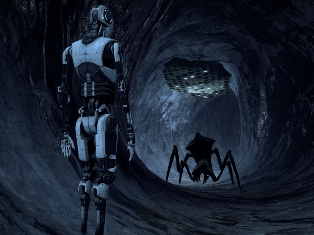
@Cavity, I feel like you've got something for scenebuilding. Talent even, I should say, because the scenery itself looks beautiful, almost as if taken straight out of some fairy tale. That's the great part of the poster, the not-so one is posing of the soldiers you have there. They aren't really relaxed, but rather stiff, which just doesn't mix well with how pretty and thought-through rest of the picture is. Getting posing right is far more tricky than posing a rock, obviously, so I understand your problem. I always liked to imagine posing guys as me, taking the wheel and being there myself, with my body. So, I'd actually stand up and get my body in the position I want my character to be in. From there one can pinpoint exactly which muscle goes where and how to bend the body so it's relaxed/tense/holding onto something, depending on the situation. I know how it sounds, but it really helps. Also, different faceposing helps a lot too, but that's a side note.either way for this magnificent worldbuild you did here
@Pale Rider, this is one of the few instances where I fully allow just using standard animations and even recommend. It's a simple, yet breathtaking with the perspective you've given the viewer. Looks like one of these fancy pictures you see in even fancier magazines next to an article about some serious problem. Really well done, go in exactly that direction, you seem to have a very firm grasp on this style.
@Antloin, fix that leg and add shadows, that's all I'm asking for. You can maybe even go overboard with the shadowing, as you already seem to take a lot from @Danny and simplify it (in a good way). Try adding some very heavy light, so the shadows are as long and dark as asphalt on Route 66. That should let your work feel a little different from what your mentor does, and you could continue from there, trying to flesh out your own style. Goodie,
@liew, I have no idea where you got the urge to go with such style, but it seems to be working out real well, especially with this take on Fallout. I can't really pinpoint what exactly bugs me about this one, but I think it's a little bit low amount of contrast that could be fixed with adding more lights here and there, but then again you'd need to be very careful with it, so that it doesn't lose this grim atmosphere you gave it. A tricky one, and can't really help you with it, but there's definitely potential with this way of making posters. I mean, I'm probably going to regret summoning the demon, but @bjfgpkqkdmtnspwndsjt makes great and grim posters and maybe you should take look at at least few of them.and fingers crossed
@Dallahan, spoking inside is stinky, stop
@Piggo, although I doubt it qualifies as art, I need to quote it just because of how neat these models are
@Heck, really simple pose, but I honestly dig the atmosphere here, and the background looks fairly decent. It obviously needs some improvement in terms of posing, which could be a bit more alive (for example bending him forward and making him lean on one arm, so he looks bored/pensive). Also, adding some foliage just in front of the camera would've been a nice touch, even if it'd be only branches of some bush. It's really not bad overall tho, there's something calming about. Could even see this one as a loading screen for some outland survival server
@Dudu Fadende, memes are art as well, though my sense of humor is a harsh judge when it comes to that
Not a banger, but still would've given it an upvote
@Spungey, what even happened to that vampire game anyway? It just vanished one day, after a long time of being advertised. Either way, simplistic, yet effective artwork, which gives me no more room for explanation of my point, because I already made it. It's good. Is it ambitious and provoking? No, but who the fuck cares if it's a cool fanart done properly.
Thursday winners of the week:
@$Vex$, @RGB, @Elan, @Dudu Fadende
@$Vex$,
I have absolutely no idea how you came up with this character design, but it's funky as fuck
and the execution is flawless as well. Well done amigo
@RGB,
Do I even need to say anything about this madman? You should work at character design, same as the guy above
@Elan,
I honestly love watching how much your style grows over time, starting with simple photoshop mashup-edits
to a full fledged digital art. I honestly don't know what to say, your skills are just beyond my league
@Dudu Fadende,
You're seriously improving, and while the effects clearly look fake, it could be used as part of the work itself, especially that you're using characters from one of the most saturated and stylized series that takes tons of characteristics from 80'ies and their famous effects. Really like both this and the second one you posted
Sorry for the delay guys, but sometimes I barely have time for myself, let alone babysitting you all on your road to artsy greatness. Feel free to send me a link to something you work on over Steam, I might be able to respond there while I'm on a tram or something
Really nice round

a lot of them actually
It's a bit late, I'm tired and got some stuff to do tomorrow, but I don't have that pink tag for nothing
@Cookie_ crisp picture, really satisfying to look at, but I think you overdid it a lil' bit with the amount of colors. Replacing that red with green and giving the background a bit of blue. The scenebuilding is superb tho, same as the idea itself. Really happy of this one being here, looking forward for more cyberpunk material.
@Dudu Fadende, Imma choose this one, for one reason - it portrays emotions far better than the other one. It even looks like some shot from a movie, and the red lighting really gives off a good mood. I'd only maybe add a guy or two in the back, just for the good measure, but it's really fucking good otherwise, glad to see you improving rapidly. Turn the ambient occlusion a bit higher, and you've got yourself one fine poster.
@Cavity, I feel like you've got something for scenebuilding. Talent even, I should say, because the scenery itself looks beautiful, almost as if taken straight out of some fairy tale. That's the great part of the poster, the not-so one is posing of the soldiers you have there. They aren't really relaxed, but rather stiff, which just doesn't mix well with how pretty and thought-through rest of the picture is. Getting posing right is far more tricky than posing a rock, obviously, so I understand your problem. I always liked to imagine posing guys as me, taking the wheel and being there myself, with my body. So, I'd actually stand up and get my body in the position I want my character to be in. From there one can pinpoint exactly which muscle goes where and how to bend the body so it's relaxed/tense/holding onto something, depending on the situation. I know how it sounds, but it really helps. Also, different faceposing helps a lot too, but that's a side note.either way for this magnificent worldbuild you did here
@Pale Rider, this is one of the few instances where I fully allow just using standard animations and even recommend. It's a simple, yet breathtaking with the perspective you've given the viewer. Looks like one of these fancy pictures you see in even fancier magazines next to an article about some serious problem. Really well done, go in exactly that direction, you seem to have a very firm grasp on this style.
@Antloin, fix that leg and add shadows, that's all I'm asking for. You can maybe even go overboard with the shadowing, as you already seem to take a lot from @Danny and simplify it (in a good way). Try adding some very heavy light, so the shadows are as long and dark as asphalt on Route 66. That should let your work feel a little different from what your mentor does, and you could continue from there, trying to flesh out your own style. Goodie,
@liew, I have no idea where you got the urge to go with such style, but it seems to be working out real well, especially with this take on Fallout. I can't really pinpoint what exactly bugs me about this one, but I think it's a little bit low amount of contrast that could be fixed with adding more lights here and there, but then again you'd need to be very careful with it, so that it doesn't lose this grim atmosphere you gave it. A tricky one, and can't really help you with it, but there's definitely potential with this way of making posters. I mean, I'm probably going to regret summoning the demon, but @bjfgpkqkdmtnspwndsjt makes great and grim posters and maybe you should take look at at least few of them.and fingers crossed
@Dallahan, spoking inside is stinky, stop
@Piggo, although I doubt it qualifies as art, I need to quote it just because of how neat these models are
@Heck, really simple pose, but I honestly dig the atmosphere here, and the background looks fairly decent. It obviously needs some improvement in terms of posing, which could be a bit more alive (for example bending him forward and making him lean on one arm, so he looks bored/pensive). Also, adding some foliage just in front of the camera would've been a nice touch, even if it'd be only branches of some bush. It's really not bad overall tho, there's something calming about. Could even see this one as a loading screen for some outland survival server
@Dudu Fadende, memes are art as well, though my sense of humor is a harsh judge when it comes to that
Not a banger, but still would've given it an upvote
@Spungey, what even happened to that vampire game anyway? It just vanished one day, after a long time of being advertised. Either way, simplistic, yet effective artwork, which gives me no more room for explanation of my point, because I already made it. It's good. Is it ambitious and provoking? No, but who the fuck cares if it's a cool fanart done properly.
Thursday winners of the week:
@$Vex$, @RGB, @Elan, @Dudu Fadende
@$Vex$,
I have absolutely no idea how you came up with this character design, but it's funky as fuck
and the execution is flawless as well. Well done amigo
@RGB,
Do I even need to say anything about this madman? You should work at character design, same as the guy above
@Elan,
I honestly love watching how much your style grows over time, starting with simple photoshop mashup-edits
to a full fledged digital art. I honestly don't know what to say, your skills are just beyond my league
@Dudu Fadende,
You're seriously improving, and while the effects clearly look fake, it could be used as part of the work itself, especially that you're using characters from one of the most saturated and stylized series that takes tons of characteristics from 80'ies and their famous effects. Really like both this and the second one you posted
Sorry for the delay guys, but sometimes I barely have time for myself, let alone babysitting you all on your road to artsy greatness. Feel free to send me a link to something you work on over Steam, I might be able to respond there while I'm on a tram or something
Really nice round
I fixed my previous drawing and I think it looks much better than before
I have to agree.@liew, I have no idea where you got the urge to go with such style, but it seems to be working out real well, especially with this take on Fallout. I can't really pinpoint what exactly bugs me about this one, but I think it's a little bit low amount of contrast that could be fixed with adding more lights here and there, but then again you'd need to be very careful with it, so that it doesn't lose this grim atmosphere you gave it. A tricky one, and can't really help you with it, but there's definitely potential with this way of making posters. I mean, I'm probably going to regret summoning the demon, but @bjfgpkqkdmtnspwndsjt makes great and grim posters and maybe you should take look at at least few of them.and fingers crossed
I had some time to learn. However, It's not perfect. I always need to take a pattern in something because I'm not good with all things. For example. If I want a certain shape to be drawn I have to have a photo of said shape like on my second monitor so I can always look up to it and compare. Hence why I sometimes find pictures of random people/characters in a pose I desire, this helps me replicate the pose and add other things that I'm comfortable with.when the fuck did you get good at drawing
https://steamcommunity.com/sharedfiles/filedetails/?id=272273537yo anyone have any good water models for SFM. I'm trying to add some r i p p l e
i remember finding some somewhere, you could colour it tooyo anyone have any good water models for SFM. I'm trying to add some r i p p l e