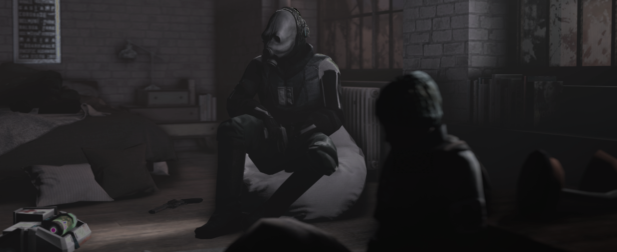
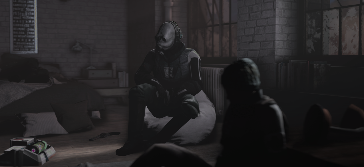
Completed [Competition] Art of The Week

Status
Not open for further replies.

steambored

Make no mistake, this is a one-way trip.
Joined
Apr 26, 2016
Messages
1,207
Nebulae
2,013
e7b90e214195.jpg

ill post this here anyway
 
Reactions: List

Danny

Visual Powerhouse
Joined
Apr 26, 2016
Messages
1,267
Nebulae
5,181
e7b90e214195.jpg

ill post this here anyway
Swear this is just one of the banner poses anyways, regardless cool lighting and stuff - are all Apex models out there already on the workshop(s)?
 

lemon

Sells cheap beer
Joined
Apr 26, 2016
Messages
1,426
Nebulae
3,434
Does anybody even read these
Especially if the round is so short

@Piggo, idk, memes are some form of art and I respect them a lot. Neato posing as well, so
thumbup1.gif


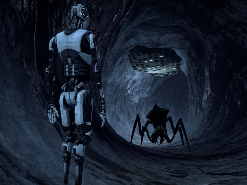
@Dallahan, that's a very simple one, but I like the lighting a lot. It is only two sequences put onto two models that doesn't seem to form a coherent story, but it's still somehow really nice to look at. I'd honestly explore this tunnel theme more, maybe with some great cave on the other side and few volumetrics/fog to enhance that atmosphere. If I were to rate this, 3.5/5 would be the score, purely for them sweet lights

@Mizaye, superb lighting, that for sure. Pretty much a really good pose for a typical poster for Steam Workshop, or a fan movie, if you'd edit it a bit in post-processing. Could've been sharpened a little, but meh, it's still worth a
thumbup1.gif


Imma just give @$Vex$ and @liew some golden words and go

7f31fc8a1ddd8e4fcbcbd7a2779d573a.png


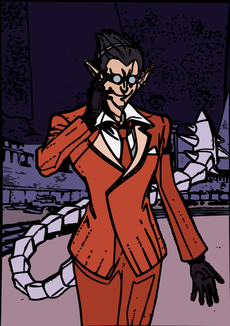
Obviously great lines, I'm really surprised by how quickly you seem to have got a really good grasp on drawing.
Stuff like this could've been easily put in some comics that I wouldn't be ashamed to pay for. GJ man

fKa9PzX.png


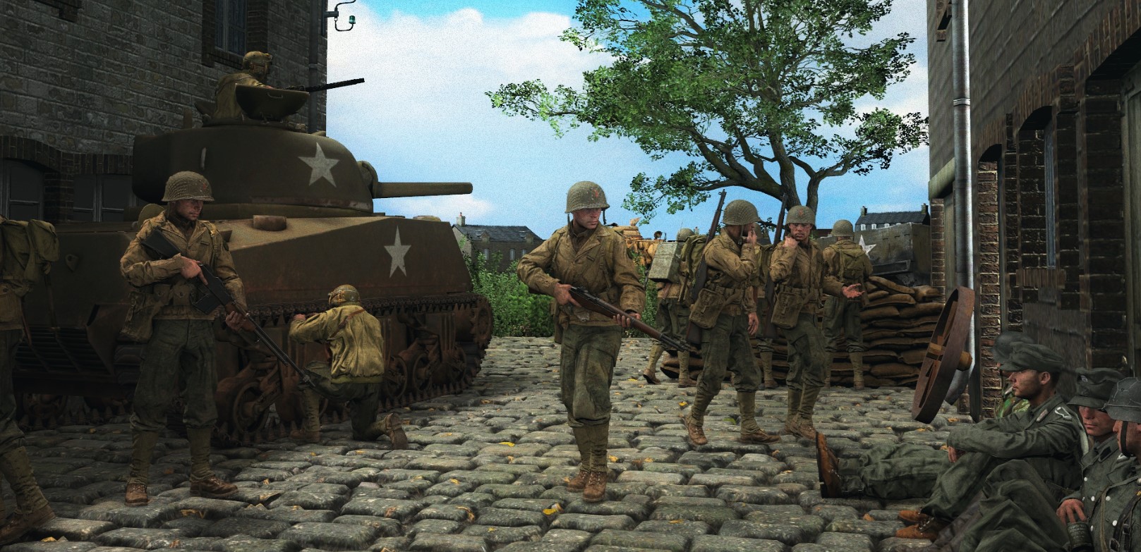
Definitely best of your scenebuilds, I get some real strong vibe of one of @Hoovie works.
Very nice lighting, solid posing and most importantly great style. GJ as well, real proud of ya
 

liew

Don't Shoot I'm Too Short
Joined
Apr 26, 2016
Messages
2,956
Nebulae
5,696
damn. i actually want to get into sfm posing, this looks neet
SFM is only good if u know what ur doing

use gmod, you can get similar (if not better imo) results if you use good lighting and post processing

it's also superior for scenebuilds if you're into that, and for me SFM has a sort of artificial appearance to it which puts me off

or at least start with gmod, then move onto SFM once you grasp the basics of posing
 

Bandit

Nucleus
Joined
Jun 27, 2016
Messages
1,193
Nebulae
1,303
SFM is only good if u know what ur doing

use gmod, you can get similar (if not better imo) results if you use good lighting and post processing

it's also superior for scenebuilds if you're into that, and for me SFM has a sort of artificial appearance to it which puts me off

or at least start with gmod, then move onto SFM once you grasp the basics of posing
gmod is better for posing but sfm is ofc better for animating
sfm works for me around 30% of the time before i give up on a project

also this
pCF8U6u.jpg
 
Last edited:
Reactions: List

Dudu Fadende

Proton
Joined
Jan 17, 2019
Messages
147
Nebulae
347

Loading Geometries: 62%
9E426DBFE571EC3466E693F58830C6F8BA5057E9

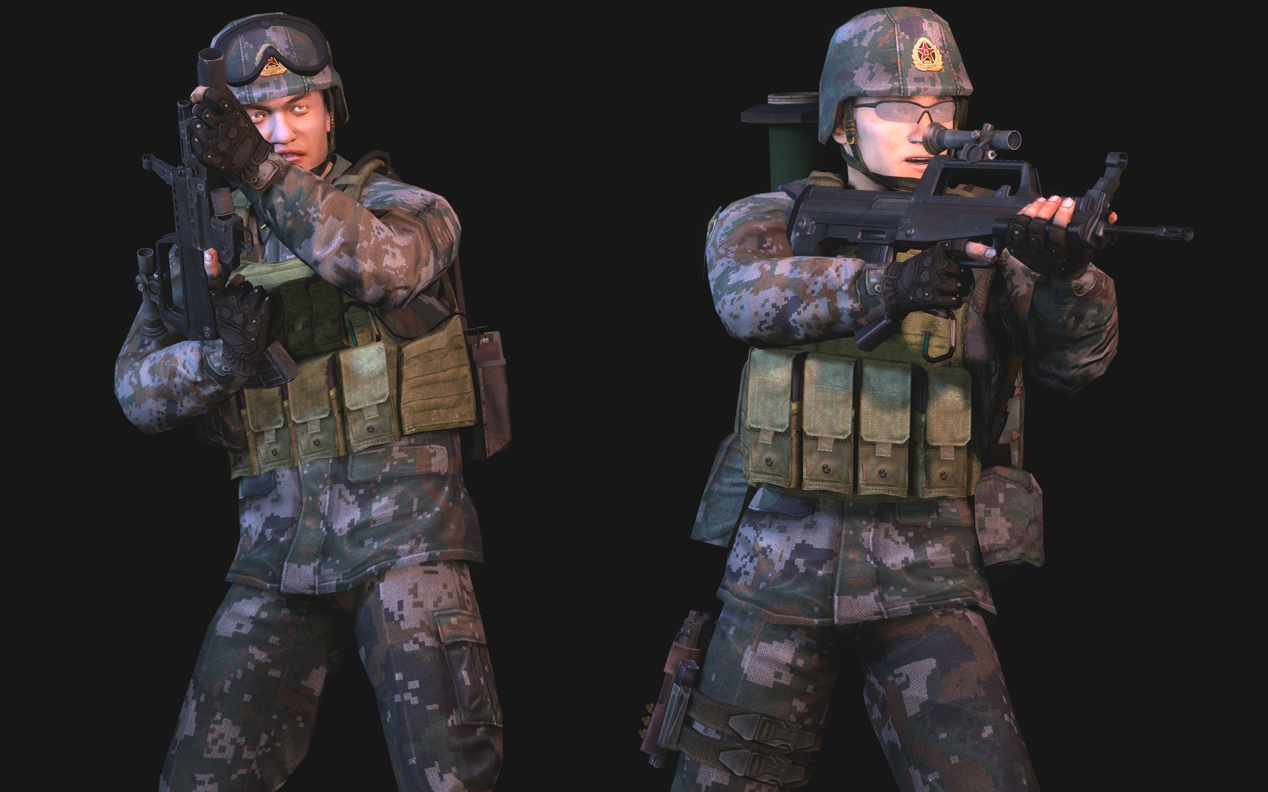
Really only putting this here because this has been like, my personal unicorn hunt for years but here you go anyway: One of the rarest sights you'll ever see in Gmod.
Modern Chinese soldiers.
 
Reactions: List

RGB

Proton
Joined
Nov 12, 2016
Messages
234
Nebulae
570

not the best but i still want some criticism
be4aa138f627a74579c197db7eeb891a.png


You've gone for some real A-grade minimalism stuff here buddy, and that absolutely works in your favour pretty bigtime. A few shaders are wonky but as you said, you haven't spent ages on it. It's not the best. Let's brush over the obvious.

It's too tall to be a banner, but it's squashed and with no dead space. What I find most off about this image is the composition itself. Your pose, lighting, and colour work all blend and work to advantage, but it feels crammed in with no open room. This is usually solved with a little margin of extra buffer space around our subject, in this case, the CP.

My advice is to give him a little headroom and it'll work wonders. Just a little more space over his head and it'll open up the whole image.
 
Reactions: List

Luft

a bad memer
Joined
Apr 26, 2016
Messages
15,041
Nebulae
28,672
You've gone for some real A-grade minimalism stuff here buddy, and that absolutely works in your favour pretty bigtime. A few shaders are wonky but as you said, you haven't spent ages on it. It's not the best. Let's brush over the obvious.

It's too tall to be a banner, but it's squashed and with no dead space. What I find most off about this image is the composition itself. Your pose, lighting, and colour work all blend and work to advantage, but it feels crammed in with no open room. This is usually solved with a little margin of extra buffer space around our subject, in this case, the CP.

My advice is to give him a little headroom and it'll work wonders. Just a little more space over his head and it'll open up the whole image.
this better?
79e6b44fb2b525222ad9fcaeaef3e8c9.png
 
Status
Not open for further replies.