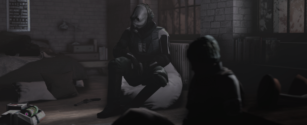
You've gone for some real A-grade minimalism stuff here buddy, and that absolutely works in your favour pretty bigtime. A few shaders are wonky but as you said, you haven't spent ages on it. It's not the best. Let's brush over the obvious.
It's too tall to be a banner, but it's squashed and with no dead space. What I find most off about this image is the composition itself. Your pose, lighting, and colour work all blend and work to advantage, but it feels crammed in with no open room. This is usually solved with a little margin of extra buffer space around our subject, in this case, the CP.
My advice is to give him a little headroom and it'll work wonders. Just a little more space over his head and it'll open up the whole image.