is this the dick measuring contest???
@Hans Armstark, a pretty basic pose, with barely any dynamic (
idk, this helps a lot) going on, plus stiff posing. Still, I can read the concept and few things you posed are well done, like the guy in the background, hopping down, it actually looks decent. The background editing with pasting the text is quite meh, as you didn't really apply shadows to it, not to mention the low res walls and map in general. Try using maps fron new Black Mesa, think you can import it's content into Gmod. I'd also get a hang on camera positioning (I mentioned it so many times in previous reviews, lmao) and maybe add the things they're actually shooting somewhere visible. Not bad for start, as I take it you're beginner here.
@Luna, nice friend you got there, but
her make-up was either rushed, or I just don't get it's meaning. The other thing I don't get is general concept of this photo, it's meaning. As far as I can tell, it's just a pretty woman lying down in some forest, but nothing else. You know, rules of concept and etc are for this kind of art as well, and just a photo with a good device doesn't mean it's worth hanging in some art gallery. Definitely a good profile picture for FB, nothing interesting besides it though. Would love to see more photos here, so next time, please, get us some interesting concept, smething with a deeper meaning, right fam?
@b00ty_Senpai, a nice, casual pose, with edgy touch. Big + for that
@swagile backpack, though beanie of this guy is fucked up. Actually brings me memories of first Outlands, where the place you got there was the main hang-out thing. Still, the pose itself suffers from one, simple thing, and that is completly boring camera angle. Just look up on movie posters, on my previous posts, artworks of big guys like
@bjfgpkqkdmtnspwndsjt, or
@Gear's
guide. Other than that' it's an ok pose, I like when people do those passive poses.
@Prospekt, what's with media devs posting their stuff on our subforum, asking for opinions and then submitting it here
Basic pose, with basic editing but with boring concept and big, unused,
empty space. At least you got the camera good.
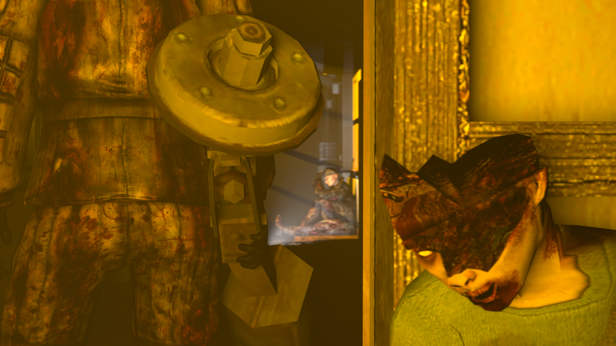
@key, that circle looks really out of place. 'There are no better tools in GMod itself' if no real good excuse, but I'll pass on it, as it's your first pose in a long time. I can see the exact same props (water bottle, bandage) being used twice, while you have tones of other ones avaiable. The guy looks pretty stiff, just like he'd be standing, but with his legs turned back a bit, not like he'd be sucked into the void. I also don't get the concept of it, no story, no nothing. First of all, if you want to do something like that, but don't have right tools, use your head to /get/ the right tools. If I were on your place, I'd get the camera about a meter behind that guy, and make the void actually a very strong set of lights, maybe even of different colour. If that wouldn't work, you can always put the camera near the void itself, aiming at the guy, so only part of this sucking thing would be visible, that is light volumetrics (it's shadowy light). Use your head mang, light is a brilliant tool and you can use it in as many ways as you want, just use your imagination.
@Fatality, empty sky, that's it, add some birds flying through, rise the camera so it won't fill half of the screen with it's emptyness. Maybe also higher resolution, and more junk lying around those dead streets. Concept is clear, camera angle good, nothing more to say.
@SkinVest, a bit to much editing I'm afraid. Light contrast is heavily over the top and the photo could use softening (at least that how my program calls it, it basically makes your picture less 'edgy', more soft like a painting). Other than that, the concept is visible and isn't shabby, just doesn't really rip me out of my chair. Not bad though, I give a
@ititan, the really old port of industrial to SFM, the map looks shitty. Use Gmad (yes, Gmad) converter to get the original map from GMod to SFM. The camera is also shitty as hell, guys, start looking on my previous advices (look on movie posters, how big guys do it, etc). Posing is very stiff, especially the faceposing of guy in the background. You need to practice, that's it, also, get some real concepts going on, I suggest listening to some good music. It's a waiting game for now, try to get a hang of SFM, play with it around, use different tools for posing and remember to actually try to stand up, and get into the pose you want your ragdoll to be by yourself. Watch closely which muscles are moving when you're going into that pose, to recreate it in SFM. That's all I can advise you for now, holding my thumbs very strong for you, my fellow user of masterrace posing tool.
@goose, fairly simple edit, it's nothing big tbf
I could complain about lighting on the strider, or lambda sign being shabby, but that'd exactly the end of what I could comment on this pose, as there isn't much in.
You're wasting your potential fam
@Maxim, looks like a shot taken from some short movie, or a background of HL2 main menu, something that'd normally be moving. Lots of stuff going on here, definitely took you some time to do it. It's not exactly a stunning poster, mainly because it doesn't follow the general rule of 'one target, many emotions', but as I said, a good shot. Totally deserves a
@RetroPirate1, fucking gold
@YOU ARE A PIRATE, tbf, if the camera would be moved a bit to right, or the left side of the poster that's unused would be cut out, this would look way better. Also, the guy in the middle should have his upper body lowered a bit and back moved back, so he'd look more natural. And yeah, the cop in the background seems out of place with that animation. I'd direct you to the guides honestly.
@Hoblit, pretty empty background, could be fixed with just placing the camera in a different place, somewhere where it wouldn't show the street that much. It's also a dull picture if I may be honest, I get it, it's just that noone really shows emotions here, even the guy with AK looks like stoned. Lighting and general effects are a-okay though, plus remaining of the posing seems quite well done, even if you can see only one guy being posed by you from the scratch, but hey, at least that.
@Adrenaline,
I'd direct you to the guides honestly.
@Lyon, arc troopers are completly from different times, there's no excuse for that. Their posing is also a bit stiff, and helmet of the dead guy covers too much screen for my liking. It's not much there honestly, don't really have much to talk about. I'd maybe get another light on that arc, just for him to fix that light bug, but that's honestly it. Spend more time the next time you'll be doing a pose, fill it in with way more radgolls and story. Good luck with that.
@Isuckatgaming, to be fair, it's a neat pose, but another camera ange would make it way more interesting, something near that rebel on right, still aimed on conscript. I'd also add more buildings, smoke, rubble and fight going on in the background, choppers in the sky, flames of war on the ground. Adding some lighting with volumetrics and bit of editing could add a neat atmosphere as well. Good one though
@Elan, I'm gonna keep giving you those
, that's all I can give you now
gj as always
An ok thing, guess it deserves a win