Serious [Review] Art of The Week

Danny

Visual Powerhouse
Joined
Apr 26, 2016
Messages
1,267
Nebulae
5,181
@Danny awaken my son
tumblr_nsziiecycm1uqkvpco5_500.gif
 
Reactions: List

Danny

Visual Powerhouse
Joined
Apr 26, 2016
Messages
1,267
Nebulae
5,181
AOTW 19 & 20 of 52, 2021

Fine, I'll give you my damn opinion

Typical me would probably say there isn't enough light, but for some reason the darkness here really sells it to me. I think it's the context you've given the image like; dark alley talks and so on. The sick aspect ratio gives it that cinematic look as well like it's such a tight angle and very well done. Only thing I have left to say is the posing which I think someone else already went on about, like the lax shoulders and stuff just doesn't sell it for me. Makes the conversation look semi-meaningless with that dead look in the armoured guys eyes. Like if they looked a bit more on edge with shoulders peaked and maybe wider eyes there'd be a sense of panic. Idk, if it's meant to look relaxed you've done a good job

The progress from the first picture is very very impressive, especially with the number of props on screen. You tell a real narrative with this CWU chap and the map. Gives off an explorer vibe, especially with the trap / mine inside the entrance to the tunnel. Lighting is a little off though don't you think? Like it resembles more of a collection of high powered spotlights before any kind of natural lighting. I recommend checking out this old guide about lights, even though it's about SFM you could still apply the same logic to GMod if that's your fancy. Last thing that really let this image down for me is the size, like I'm on a 2560x1440 monitor and I gotta scroll down my whole window to see the whole thing just annoying bro. To summarise: Great layout and scene build, posing is sick, just the lighting and image size that maybe needs more consideration

Lighting is deffo cooler than before in this image, great to see all the crisp edges on the Armor and such. Posture of the guy with the bat is a little funny to me, not entirely sure what it is but just looks mega tense whereas when swinging a bat I imagine the whole body is kinda in line with the bat if that makes sense? Idk. Blood and stuff real great touch, who cares about the NSFW rules anyways. The mouth piece grosses me out but suppose it's a good detail. The lighting is the real deal for this one :^) great work

Yeah yeah another great viper scene build. Windows are a real great piece of this image. As well as all the lighting that comes with it. This is an RTX ON image if I ever saw one, how there's no shadow which is completely black and almost looks like there's light bouncing off everything in the room. Only thing in my analysis to pick on is the top of the brick pile behind the doorway gets too much light compared to the rest of the pile? (Not the pile IN the doorway, but behind against the wall) If there was a window there why isn't there the same lighting fx as the first room. That's right, get nit picked, what I said is probably too unreasonable and just mean - but I can't actually fault this image in any other way. Great work.

From what I can see of the scene, looks like a cool build, The nest detail behind the man on the right is floating a bit and the weird blue stuff to the left is kinda odd seeing how everything else is red. Poses going from left to right are all pretty standard and interesting until you get to the last man which really just looks kinda baffling. Thought the rifle was wedged under their arm first until I saw the hand. really just looks as if the guy is entirely armless IMO. Maybe needs a bit more lighting? Like the selective red is kinda cool but it would still bounce around the room and light up the back of the room a little bit too. Just some food for thought, aspect ratio is hella cool - just wish I could see more

Hmmm yes this is a nice screenshot and is an acceptable post here! Composition of it is great. Haven't really got much to add since almost all things in this kinda submission are out of your control most of the time. Awesome screenshot mang

At first glance I just kind of thought this man is walking on garbage, now after more looking it looks like it's a body on top of garbage perhaps? Needs more LiGHTS man I wanna SEE the details. The filter works really well though too, like the patchy cell look of it and the background is superb. It's just the details closer to the viewer that maybe needs some more thinking on like: how much is visible, is it clear what you're trying to display to us. Good work here man
-

@Ricsow and @Dicknose can have a bold this week
667495CD4BAD36749E51922905D743EF65C1440C

6C5ACB1C1574AEFFF771DCC2248EA0832121AA17

-

Great submissions guys, I hope my feedback was useful
Been working on my dissertation these past couple weeks
Will get on top of doing these on time someday


Til then', adios
 

A. Vaher

I make events of varying quality
HL2 RP Administrator
Premium Member
Joined
Apr 6, 2021
Messages
711
Nebulae
900
If I posted here I'd feel inadequate because I am bad at making things and you people have a Media Doctorate in Gmod Art
 
Reactions: List

Viper

Neutrino
Joined
Jan 23, 2021
Messages
36
Nebulae
258
If I posted here I'd feel inadequate because I am bad at making things and you people have a Media Doctorate in Gmod Art

never feel discouraged to post your work because other people here put out great stuff. we all started somewhere, and if Danny remembers me correctly from back in the day, he should also remember my not-so-great cs_jungle poses.
 
Reactions: List

Danny

Visual Powerhouse
Joined
Apr 26, 2016
Messages
1,267
Nebulae
5,181
AOTW 21 of 52, 2021

Two fifths through the year already, how crazy is that?
Was my birthday this week, it's been good


These are pretty neato, my favourite of the two is the latter. So I'll focus my feedback on the first one: the mountain of skulls and the guy on the top is super cool, like the details and so on. Which is also my only gripe, like, it is drawn or spray painted onto this crazy degraded wall. Which makes me think that maybe both images would benefit from a little wear-and-tear on the black paint which could age it a bit? Perhaps give it some more character? I do think maybe the text on the first one could have been split up a little more and not so bunch together, but the font choice and position is otherwise pretty good. Great work here man - if you made these PNGs there's no reason why these couldn't be on the server. Of course though, it is up to staff.

Waaaaaaaaaah I think it's 
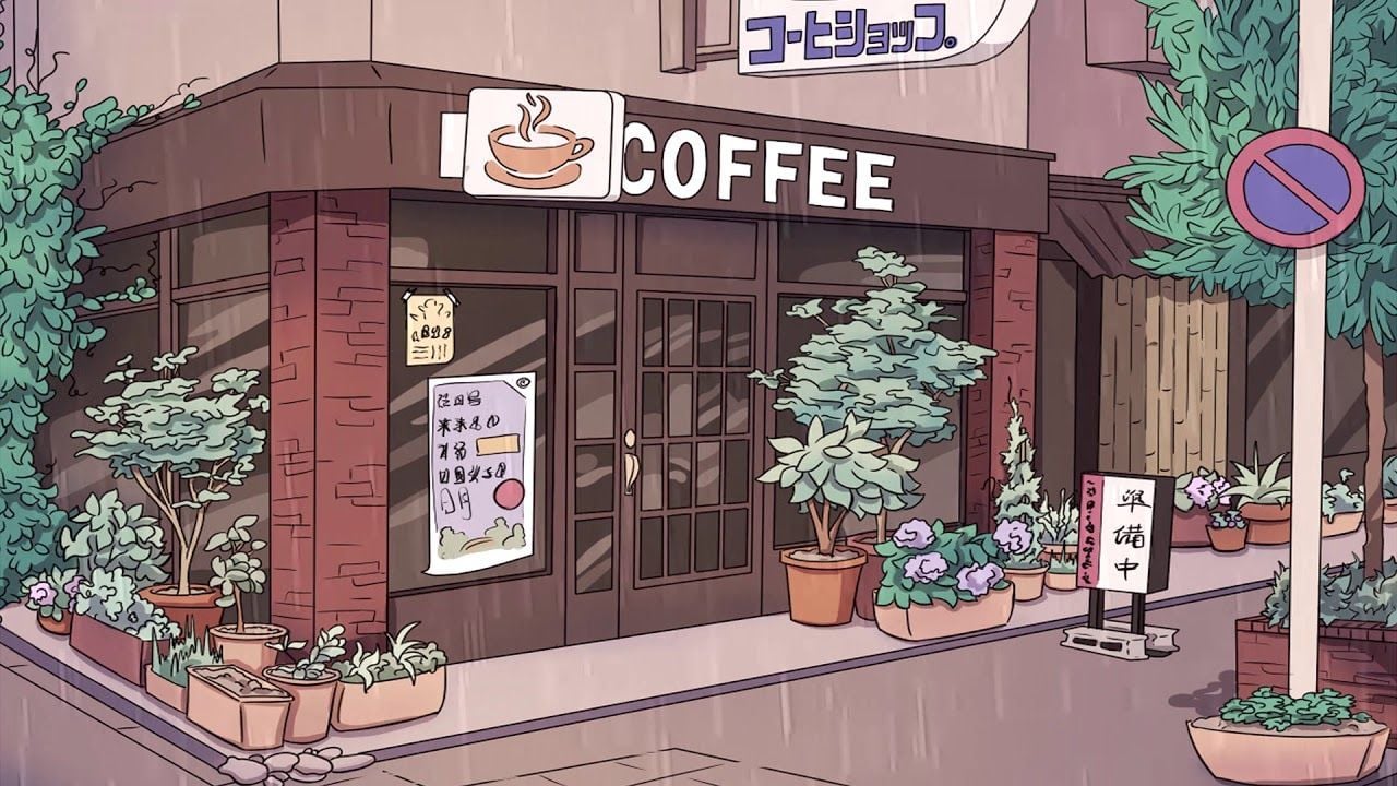
too dark mang. Like, nigh time is cool but literally can't see a darn thing in any of this almost. Doesn't need to be much brighter, you'll see in some drawings like this that at night time they just wash over stuff with a dark blue usually. Either that, or I think maybe elements of the image shoulda been brighter to illuminate other pieces - like the coffee signs, or maybe a streetlight or two just to shed some light on the environment. I think you should give this another go :^)

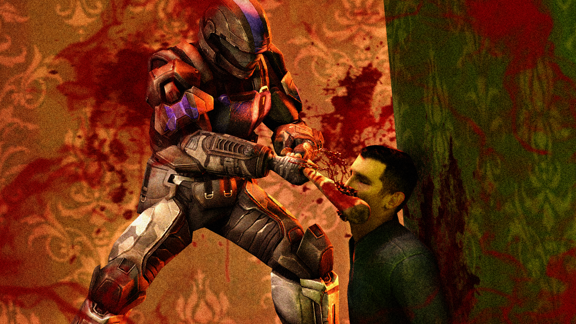
You're right, it is good - which means I get to be very picky. Starting off with: Who the hell runs down stairs like that? Not me, I'd fall forward and die - when I think of running down stairs people tend to either leap down steps or side step their way down with their arms close to their chest. (Example 1, Example 2). Other than that, the props and effects are pretty cool - maybe if the light hitting the mans head came more from above it could look more dramatic. Great work here, man

This is cool, I like black and white ruined kind of images with harsh lighting. BUT, in this case - kinda difficult to understand the angle don't you think? Like first two characters on the left are pretty cool, but he ones going to the right confuse me quite a lot. I wanna see MORE, doesn't have to be centre stage spotlight, but maybe some ambient moonlight or something could have helped that. And with that extra lighting, maybe expose some more of what is in the dark with props or other characters. Just some ideas for you - keep it up!

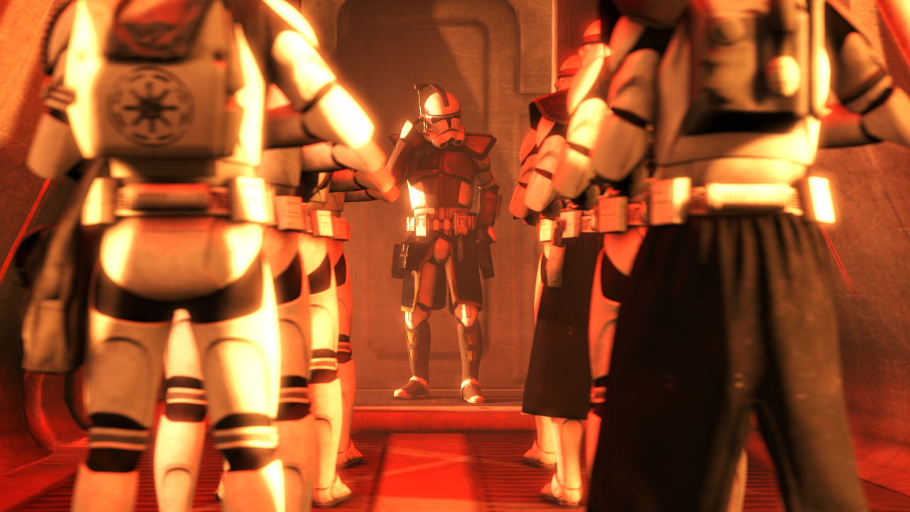
Judging by the light this must be a Geonosian deployment, and the bloom on the armor is a super cool effect with the depth of field involved. Overall the main character in this image is the lighting, and its best suited to the clone at the far end. Don't really have much to add to this one, clearly the soldiers are a bit copy and pasted - maybe some individual nudges to arms and such could help in differentiating or giving some character. Otherwise there is nothing here which sticks out except the lighting and the character at the end imo - still, cool work :^)

Hi Bill, welcome to Nebulous and Art of the Week.
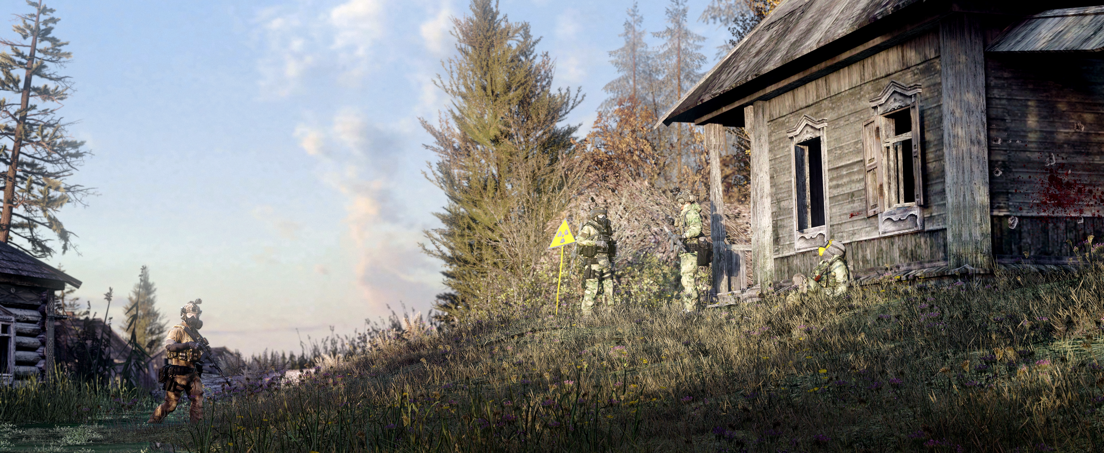
Some great work here with a lot of consideration for light and how things are exposed. My favourite detail is the trees that cannot be seen which are still casting shadows on the grass slope leading up to the house on the right. Gives a real consideration for the whole environment which the camera maybe cannot see. If I had to add anything myself, would've maybe been a little smidge of more light in the house just to get every detail possible - instead of being pitch black through the window but that's just me. Soldiers are great and the little blood details add a bit of narrative too - to really nit pick maybe something was needed in the gap after the first soldier from the left. Maybe a helicopter or plane? Buildings off the distance maybe? Idk, some ideas there. Great work.

might replace with another entry but i do like this
Wolfhound.png
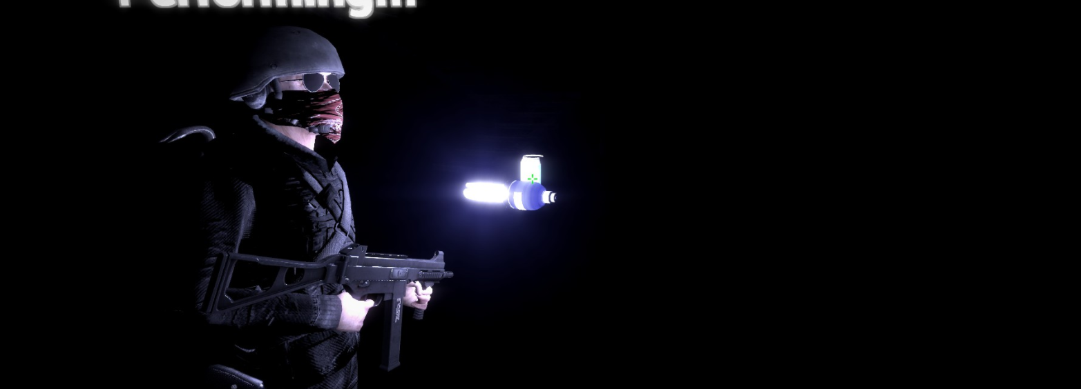
You've got some solid main lighting this time which is good, and the amount of things to focus on like the helmet, goggles, weapon and so on is a plus. Maybe just needed something to fill up that space instead of rocks, like a tent, or a truck, something. Given the wider angle it would be good to fill up some of that space with something - otherwise maybe it would've been worth cropping the image to just the left portion and having a portrait.
-

@ZeroPants gets the bold for his cool graffiti designs
mfFilFv.png

Uqk2oPo.png

-


hope my feedback was useful
have a good one