Serious [Review] Art of The Week

Danny

Visual Powerhouse
Joined
Apr 26, 2016
Messages
1,267
Nebulae
5,181
AOTW 7 of 52, 2021

Eo05KeS.png

Mmm yes I do like the look of this one, it's a bit pixelated here and there but there is good detail. I think the shadows would have benefit from more under-lighting so you could see more of the cop on the left and the side of his face covered in darkness. Other than that, maybe if the camera was raised a little bit more so there's less dirt on screen? Just kind of seems like an un-needed thing. mountain in the background is a nice touch, and the sunset colours are coolio - nice​

Could've sworn you've posted this before.
Anyways, the lighting is pretty top notch ambience wise - no harsh shadows or discrepancy here. I think that maybe the edges of the Armor shines a little weird considering how it looks as if they are all meant to be under cover because of the pillar behind them (noting some kind of structure above head?). The yellow of the text at the bottom coulda been a little brighter, bit hard to make out at a quick glance which is not a good characteristic for a subtitle / closed caption

Intimidating civil protection officer
move_back_right_now.jpg
There's a hecka lotta dark here but can clearly see the aesthetic being aimed for here which makes it pretty neato. The subtle glow effects on the models are great - I especially like the glow on the back of the man peering out and how the two have made clear eye contact. I'm nit picking this really, I think the bulb above the cop coulda got a bit of a glow effect too as it just looks dull to be casting as bigga light. I'da personally drawn the image in width-wise so it was more square just so there isn't too much negative space but it works I this way you've done it too I think. Great work


Certainly an interesting picture with an interesting layout, but there are some cool things about this. The purple and bright light behind the flying dudes is really well done I think - has a nice curve to it which I like. I think it coulda been cooler if the head of the other CP was detached and just kinda floating instead of stretched out. I do dislike the border however, just think it has an odd layout with the white lines that cut out and stuff. Keep it up, think abouta ya angles too perhaps (where you see more of the body and their limbs are kinda stretched out as if trying to float)
-

Great submissions this week guys, ttyl
 
Reactions: List

john

barbecue chips aint shit
Joined
Aug 26, 2016
Messages
14,523
Nebulae
72,929
really wish i hadn't put as much effort into something that probably won't look nearly as original as i'd imagined it would since half of it looks like map scenery but i wanted to put it here anyway because i usually don't as much effort into my stuff as i did this time. (made in gerolds mod)
VtIsVlD.jpeg
 
Last edited:

Dicknose

Whatever happens, happens.
Joined
Oct 11, 2016
Messages
2,048
Nebulae
1,632
really wish i hadn't put as much effort into something that probably won't look nearly as original as i'd imagined it would since half of it looks like map scenery but i wanted to put it here anyway because i usually don't as much effort into my stuff as i did this time. (made in gerolds mod)
VtIsVlD.jpeg
Roy the ship
 
Reactions: List
Joined
Oct 21, 2016
Messages
1,145
Nebulae
2,526


qualitytest-finished-1.png


3X5Ptim.png

made this, was thinking about doing a lore doc so

mix of sfm and photoshop

slapped on effects which i thought look cool
 
Last edited:
Reactions: List

Danny

Visual Powerhouse
Joined
Apr 26, 2016
Messages
1,267
Nebulae
5,181
AOTW 7 of 52, 2021

I like the misty colours and pastel kinda tone that comes with the filter. Feels like the opening shot to a long scene where the camera just goes past the boat (or vice-versa), Definitely looks like a map which I think makes it a convincing kinda scene - woulda been nice to see at least one character in the spotlight of it all just for the eye candy part of things but aside from that this is a solid bitta work buddy I like it :^)

Yeah yeah ok I get it you can make cool pictures, Viper - allow me to be fussy and just add in my own ideas instead; that sign at the top left makes it seem like a ruined hiking trail which I really woulda capitalised on personally with some extra fences which coulda been decorated with tattered cloth or something maybe going from left to right? Hope you can see what I'm thinking of just to build more ontop of 'just a forest'. I really like the little detail of what I suspect to be some kinda mine on the bottom left... coulda been cool to see like a long wire spool off to the distance with some rebels in the shadows or something (very small and far off just watching or something). Great image

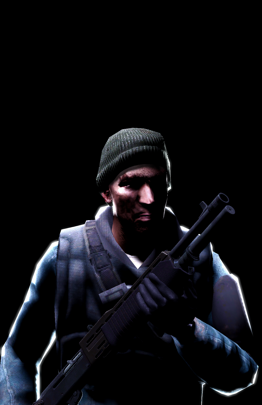
Too DaARN dark can't quite tell what you've made or what you've taken a pic off - imagine if there was like a camp fire or something around some wrecked cars with guards and have some vortigants having a 1v1 or something and people placing bets idk just looks like the kinda environment - put MORE IN :^))))) some light. Keep it up!!!

Because of the citadel and the placement of the synch robot thing - I thought that it was a GIANT one and it was stomping over land of a ruined city or something which I think is really cool - but then I see that it's just like this hellish landscape (which is still cool!) I just wish there was more to be seen in it. Like WHAT IF, there were some crashed cars piled around or players waiting in ambush. Like the scanners are out too which indicates to me that they're looking for something but what is it they are looking for exactly? Not much evidence of it here that we can see........ keep it up, think about your narratives perhaps. Try and think: why am I putting this model here, how can I give it more purpose than just being a set piece?

-

Till next week folks
 
Reactions: List

Viper

Neutrino
Joined
Jan 23, 2021
Messages
36
Nebulae
258
this is an older artwork of mine when I first started experimenting with first person/gopro views. it's probably one of the more fun artworks to edit cause I got to mess around with a lot of stuff to make it look low-quality.
liveleak_shit-studio.jpg
 
Joined
Oct 21, 2016
Messages
1,145
Nebulae
2,526


pPkF8lo.png

5eIHQWk.png


quick one this week

i made some of the stuff overlap the blur because it looks cool and for some reason gives me a gta loading screen vibe

the usage of silhouettes is to pin focus on the soldier

i've got a few event posters put can't post them rn sorry

I just wish I had the time to animate, man, I would totally make a SFM short but it's so time consuming and finecky
 
Last edited:
Reactions: List

john

barbecue chips aint shit
Joined
Aug 26, 2016
Messages
14,523
Nebulae
72,929
there are no black shadows, at least not completely black. not possible. throw some soft bounce lighting (same light from the opposite direction like 1/4th of the brightness(or less, experiment with it)) into your stuff I guarantee it'll look better.
 
D

Deleted member 5162

Guest
there are no black shadows, at least not completely black. not possible. throw some soft bounce lighting (same light from the opposite direction like 1/4th of the brightness(or less, experiment with it)) into your stuff I guarantee it'll look better.
I tried using it once and while it's results are spectacular, doing it is so bad that I can't be bothered. I put these two posters in less than an hour out of boredom, so no real effort was put into them
 
Reactions: List

Viper

Neutrino
Joined
Jan 23, 2021
Messages
36
Nebulae
258
I think the lighting is fine personally, to me it seems like it's the lighting style you're going for and it definitely works.
 
Reactions: List