Grr
@Havok✪, definitely a lot is going on here, but I kinda feel like this combine filter is a bit too much. I also don't get the camera angle, it feels a bit too far from the main character. Other than that, it's actually not bad, it does look like something you've spent a bit of time with. I especially like how you used all the particles and other effects. Posing is a bit stiff, but that's alright. You get a pass from me.
@Piggo,
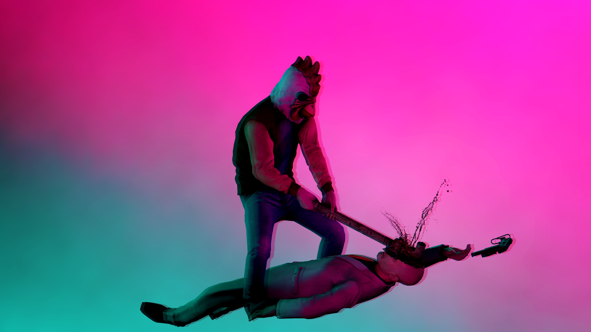
, the guy in the bottom left corner is probably my favorite ragdoll that I've seen here for a while, gorgeous posing. Bit of tired with the meme though, but as expected, the quality is just your standard level, which means one can put it as their wallpaper. I'll give the amateurs a chance though
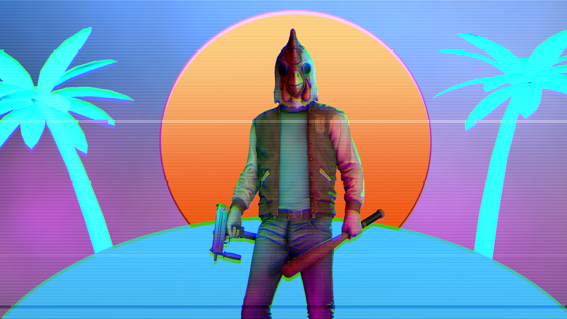
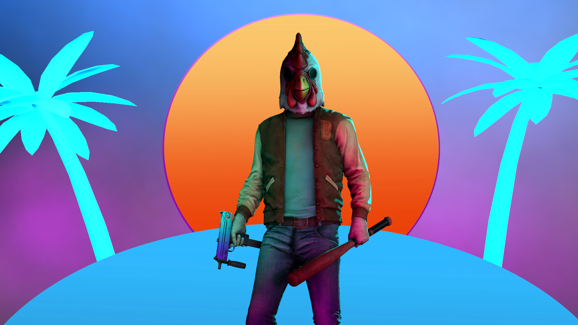
@Dicknose, honestly, I'm impressed with this one. Colors both on the ragdolls and in the background match perfectly, while keeping some contrast. However, there's something that I can't quite grasp, but is bothering me about this picture. I assume it's the lack of ground, but I'm not sure. I'm sorry that I can't pinpoint it out here. Either way, this one is (while fairly simple in terms concept) a quality poster. Good job man,
@FieldersNL, like I said, you're getting closer to perfection, one step at a time. I kinda don't get the concept here, unless it is just a fight scene, but I really like everything else about it - the editing, the posing and especially the lighting. Can't really advise much here either, it's simply missing the "oompf" that a fighting scene should have - explosions, visible enemy, danger, casualties. Here, you show only one side of the conflict, and it's hard to tell if they're ambushing someone, someone is ambushing them, or if it's just a simple and brutal shoot out. I'm impressed either way, especially that I remember your first poses. GJ
@liew, interesting palette of colors.
@ramsey says it's too dark, but I'd say that the problem lies somewhere else, although still in the lighting. You tried to make it very high contrast and low saturation kind of poster, but you didn't quite added enough lighting to make it work. For example, this destroyed vehicle on the right is properly lit, while the soldiers on the sides aren't, resulting in them blending together with everything else. I do however like the post processing on this one, you did a good job with this rain. Same goes for the idea. Neat
@ramsey, like I said before
That'd honestly fix it all. Add one from the background to imitate the sun, another one from the front ot light them up, color both to make it look more natural, done. A bit of faceposing also wouldn't hurt. If it's a scenebuild, it's pretty decent. Yeah
aa
@maga and @Fatality
And as for honorary, it goes to @CloudBucket
This one just begs for some more stuff, it could've been amazing with it