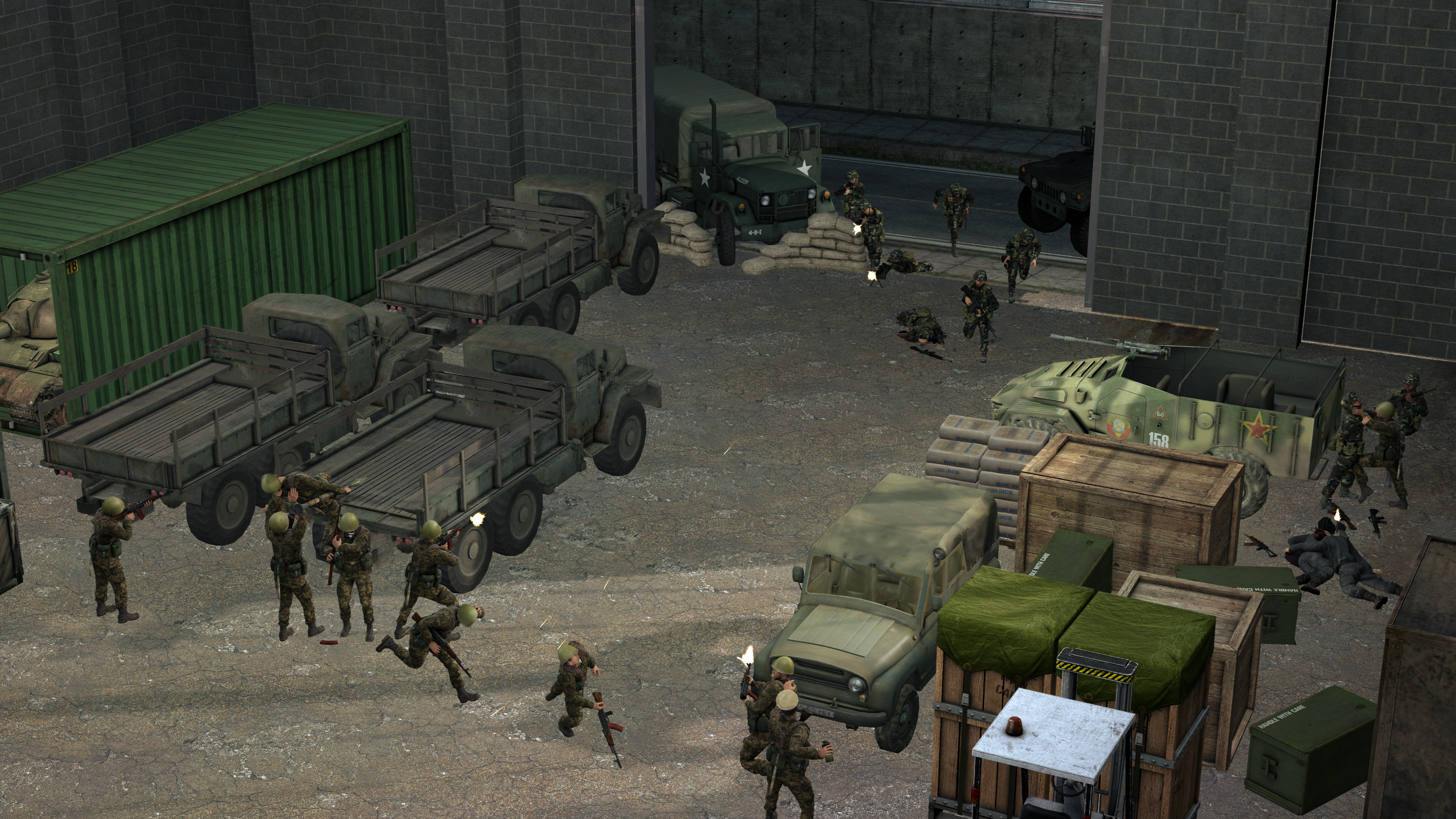
hi, I really want some advice on how to make my lighting much better
I made a quick scenebuild to practice my lighting on; so while the scenebuild isn't the main focus, if you happen to have any scenebuilding advice that would be lovely too.
so this is what I've been messing with for the past hour, and I want to know how I could improve on my lighting skills.
@Cavity, a simple, but decent poster. Kind of weird how you made these fingers, but rest seems ok. As you said yourself, it might not be anything special, but it isn't bad as well. I give it a solid 7/10
@CloudBucket, although I never had a chance to play Halo, and I don't think I understand fully what this poster is about, I still like this one. Really good idea of shadowing these two on the left, while keeping what's in the background lit. Barely any space left unused and decent posing. the only thing it could use, would be some editing, like dust bouncing off the ground, pushed by helicopter rotors, or anything else that you would see fit. Either way, I like it, very much even
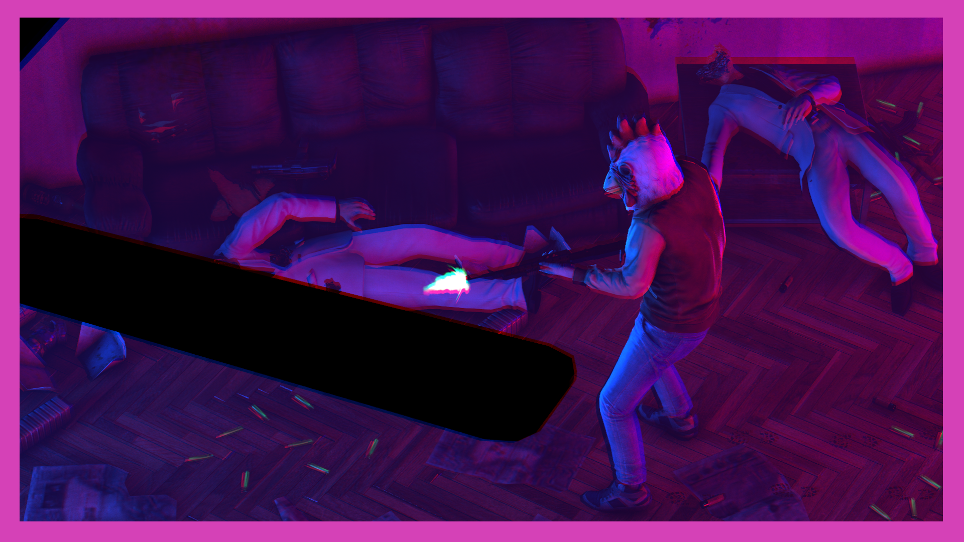
@Dicknose, honestly speaking, that bonus is actually better, lol. There has been countless of the same Hotline Miami posters, and to be frank I'm just bored of them. This one is above average though, so at least that's that. I like the camerawork here, a little bit of isometry is always on top, and color palette is fairly loyal to the original. It's alright, just not as fancy as something new and fresh
hi, I really want some advice on how to make my lighting much better
I made a quick scenebuild to practice my lighting on; so while the scenebuild isn't the main focus, if you happen to have any scenebuilding advice that would be lovely too.
so this is what I've been messing with for the past hour, and I want to know how I could improve on my lighting skills.
@Viper0419, there's a good lighting guide by @Piggo here: https://nebulous.cloud/threads/piggos-gmod-lighting-tutorial.31461/
Generally speaking, your poster is quite well done, but here are my advices if you want them. When it comes to scenebuilding, you should always go all in, which means creating both the scene and lighting yourself. With that in mind, gm_black, or any other similar map will be your best friend. When it comes to lighting, I usually set one/two lights as the main source of light, like sun or a spotlight, then add a bunch of other, smaller lights like spices to a dish. If you'll look closely at any work of our pink devs, you'll see that they all have a little bit different styles when it comes to playing with light and colors, but all of them use quite a few, delicate lights, rather than three strong ones. I highly recommend you to look up works of @Hoovie the Apansenok, @Danny, @Erkor or any other of our professionals
As for the criticism, I'll never say no to a pretty good drawn Snake. I'm not good with sketches, so I'm directing you to @RGB for more in-depth advices. What I personally like here, is the black to white contrast, which greatly highlights all the little details, like face features and etc. Honestly speaking, with that hand of yours, I'd seek some paid requests, you have some talent
This drawing does a bunch of things, and it does almost all of them well.
You've pretty much nailed the semi-realism semi-stylised look here, and with a pencil, man I suck at using a pencil. Your shading is on point, the effect from the way you trail it off into whitespace is incredibly effective for simulating that fade, and gives the drawing its whole own style and personality. The clothing has crinkles, weight, and depth, the proportions almost all work with the single exception of his weapon-hand looking a little iffy. You can actually draw animate and inanimate objects equally as well, judging from the quality of that gun, too.
All in all you've done a hell of a lot here with just one tool, almost all of it is superb. It's a pose and a reference right out of promotional material, I'm sure, but that hardly matters, because it's clearly got enough of you and your style in it to make it yours. It's hard as hell to take a reference and duplicate it in the first place.
Like Cuntcake said. I'd pay for you to draw me shit if this is what you can do.
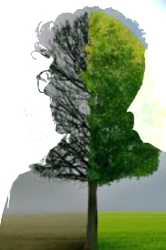
Increase brightness, increase contrast between the sides, and perhaps consider having the trees cut off sooner, or go right out the top, that tiny bit of sky is bad, either more sky or no sky.
This site uses cookies to help personalise content, tailor your experience and to keep you logged in if you register.
By continuing to use this site, you are consenting to our use of cookies.