Doing these late at night is unusually calming
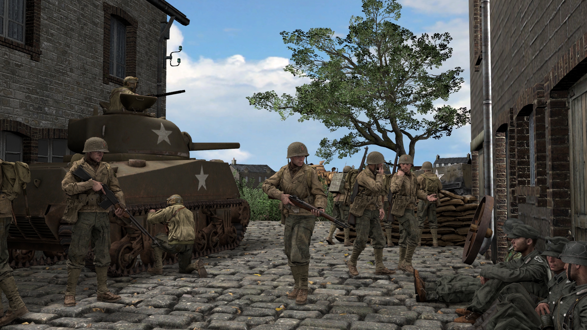
@Cavity, solid poster pretty much in every aspect. The only things bothering me are the colors and very weak shadows. Now, the "bothering" part should be taken with a grain of salt, as it comes down to what kind of style you want to take. As a cartoony or simplified story about good guys holding bad guys hostage, it's alright as it is, maybe with more brave tweaks to color palette. If you're going for a bit more realistic point of view, I'd go ahead and lower the saturation a fair bit and maybe head over towards something similar to black and white. Also, sharpen that ambient occlusion, it seriously needs a little help, otherwise it all look like plastic. Great work in every other aspect tho, real nice scenebuilding.
@Bahdit, very simple, but still great use of particles and after effects. Nice and action filled camera angle make it a
worthy poster. Enough said, it's that good man
@Pale Rider, that's a funky poster. Seriously dig it, would love to see more like that. By itself, right now it isn't too complex, which is it's biggest flaw, but at the same time I guess it's more to just show an idea, which is pretty good. Hope to see more of that
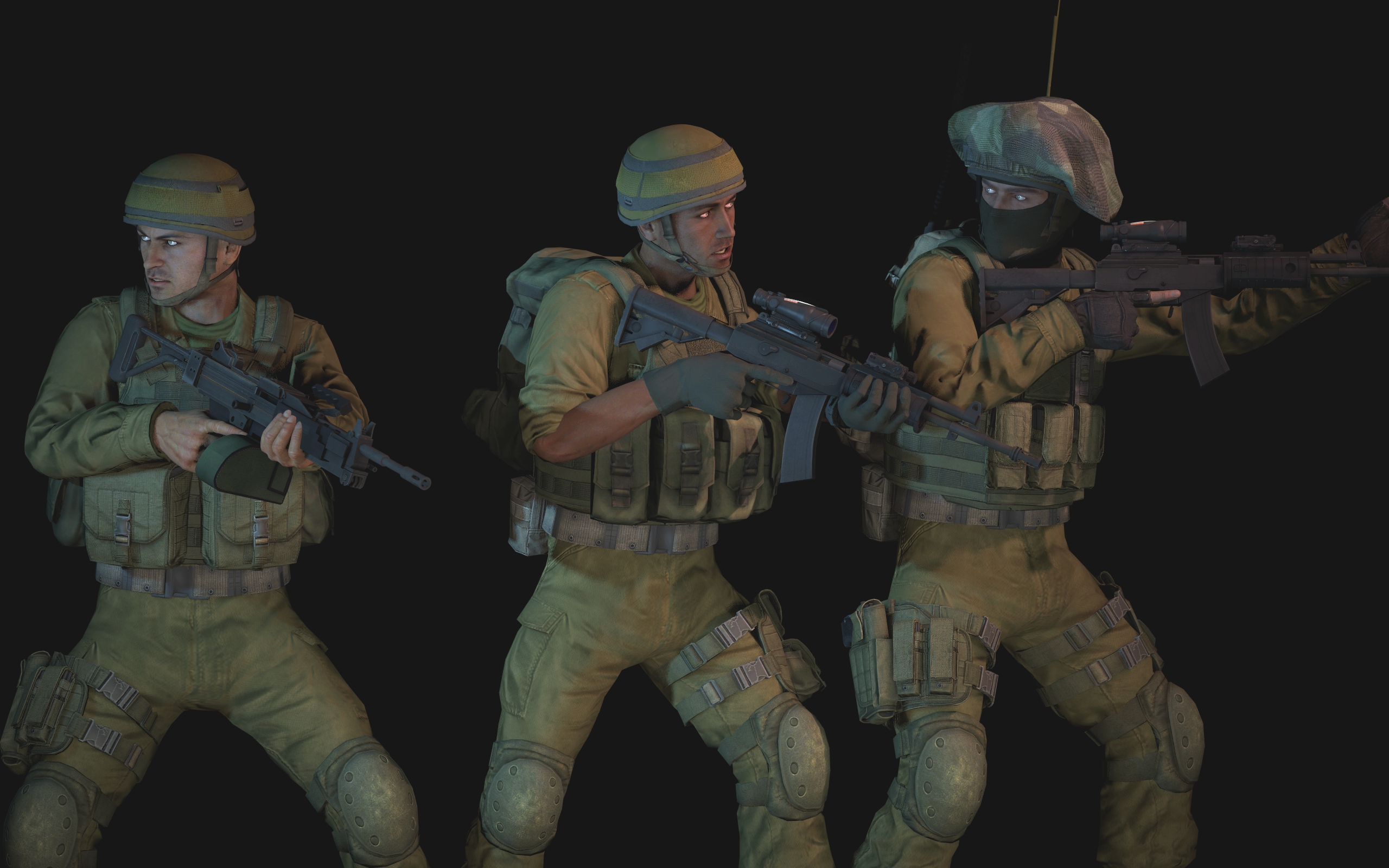
@Dudu Fadende, model showcases like this one are usually very well lit, and this one is no different. Sending likes from Poland, all of them are really good, hope they did make it to the Steam workshop
@Dallahan, that's a very cool perspective. Putting this citizen in front and making her (or him? can't tell) so blurry adds a lot of depth to the picture, and the rest of the poster isn't so bad either. It has it's own atmosphere, own story and most importantly, an idea. Lack of lighting and strong colors is exactly what I meant while talking to
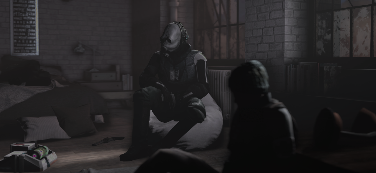
@Cavity, this one has really thick atmosphere. Like it a lot, keep it up man,
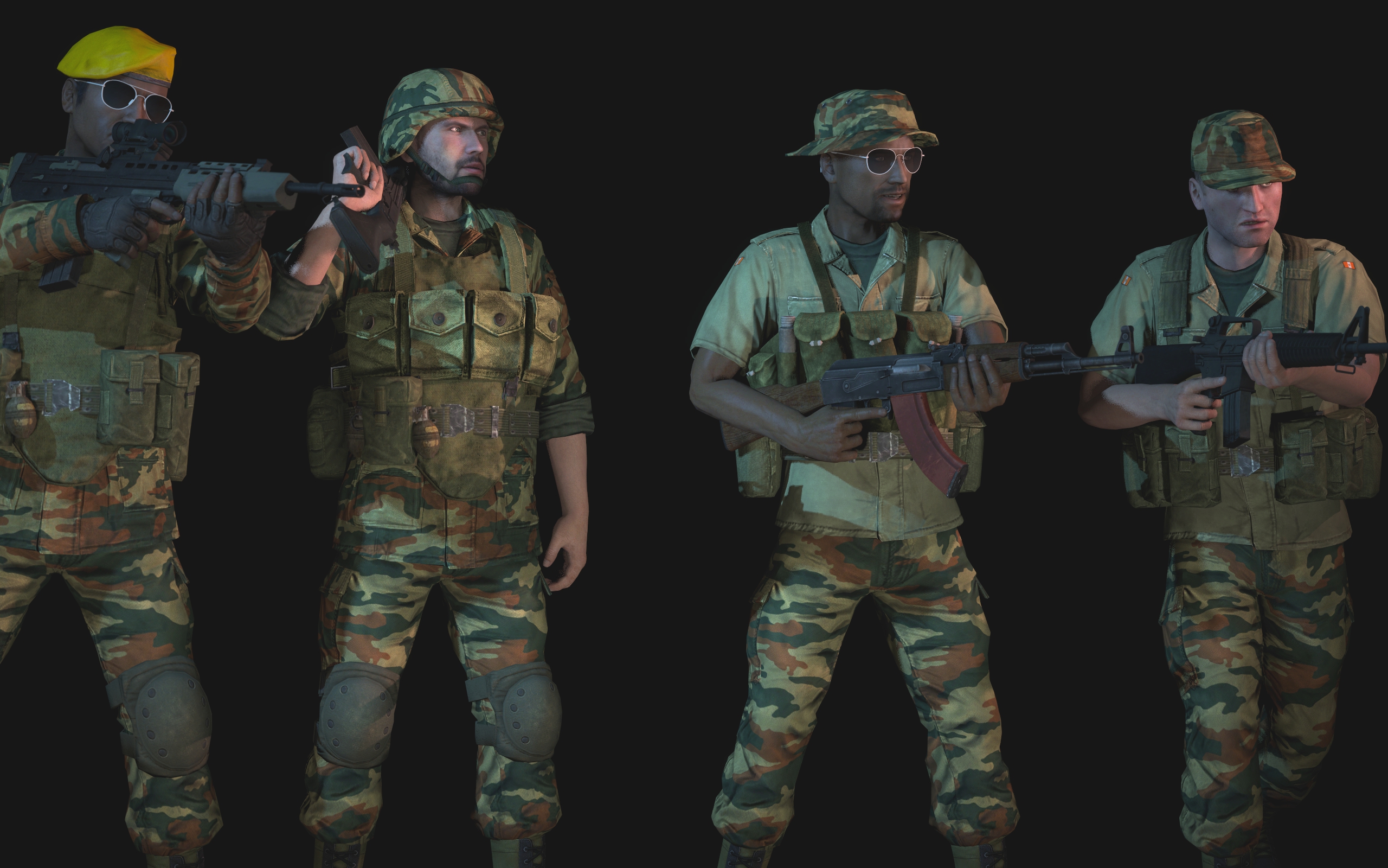
Except for the bottom, this has a really nice TF2-ish feel to it. That's a cool thing, especially that your artwork is also unrealistically exaggerated and that's the most cool part about it. I see you've decided to go a little bit more realistic here though, but it still doesn't make any difference to the fact, that the work is really good either way.
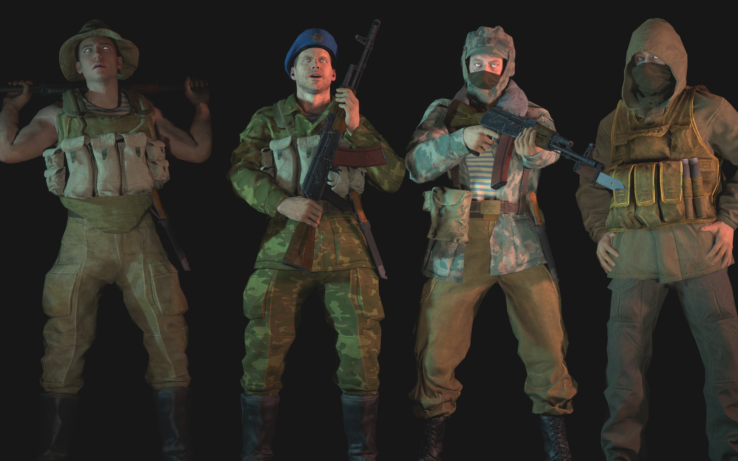
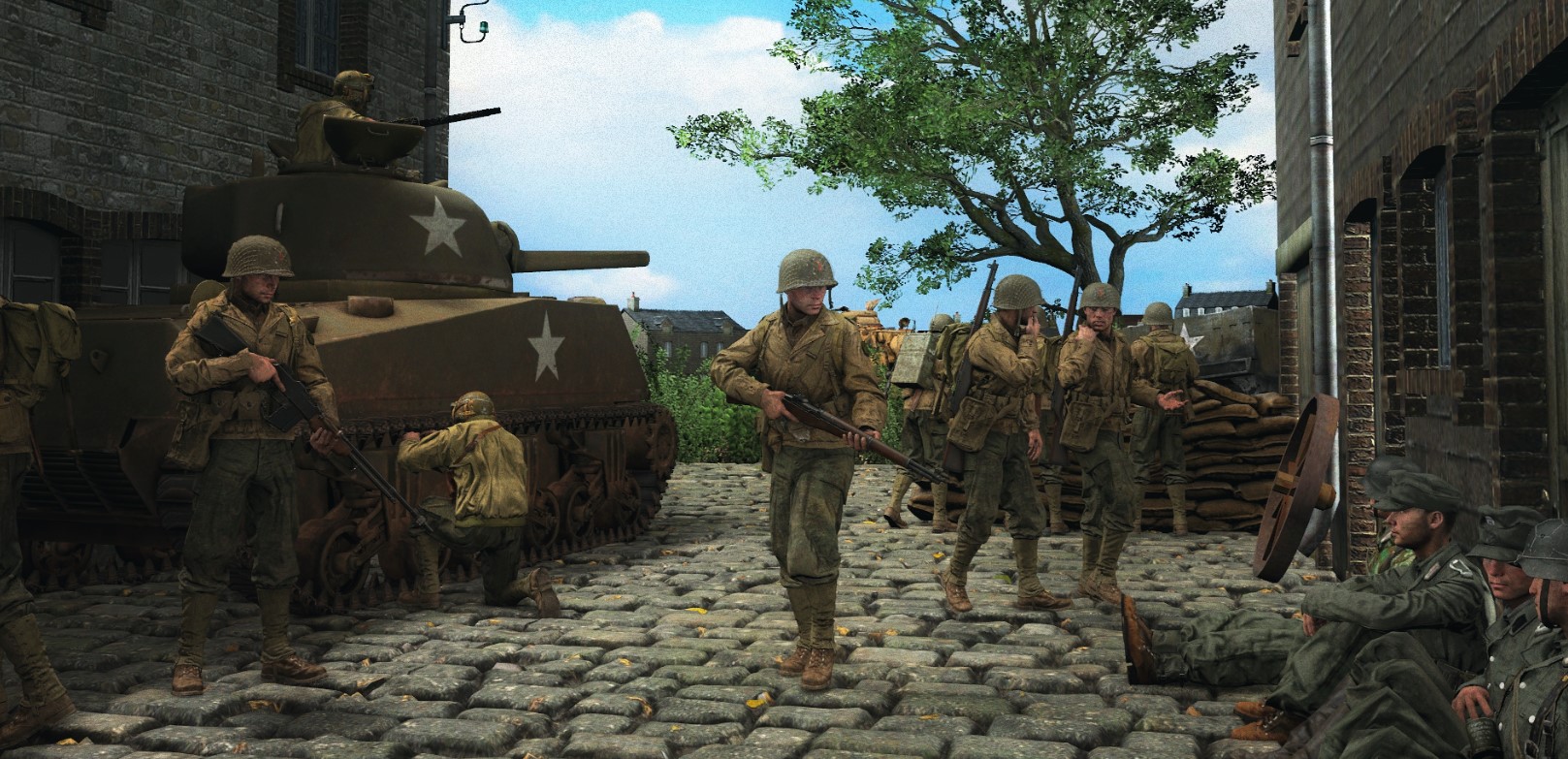
So, here come the big boys
@liew and
@Pyromaniac
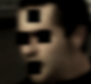
Seems like low poly models make posters far more gritty. Paired with a neat camera angle and some expressive faces, we've got ourselves a really nice contender in this competition. Really well done fam
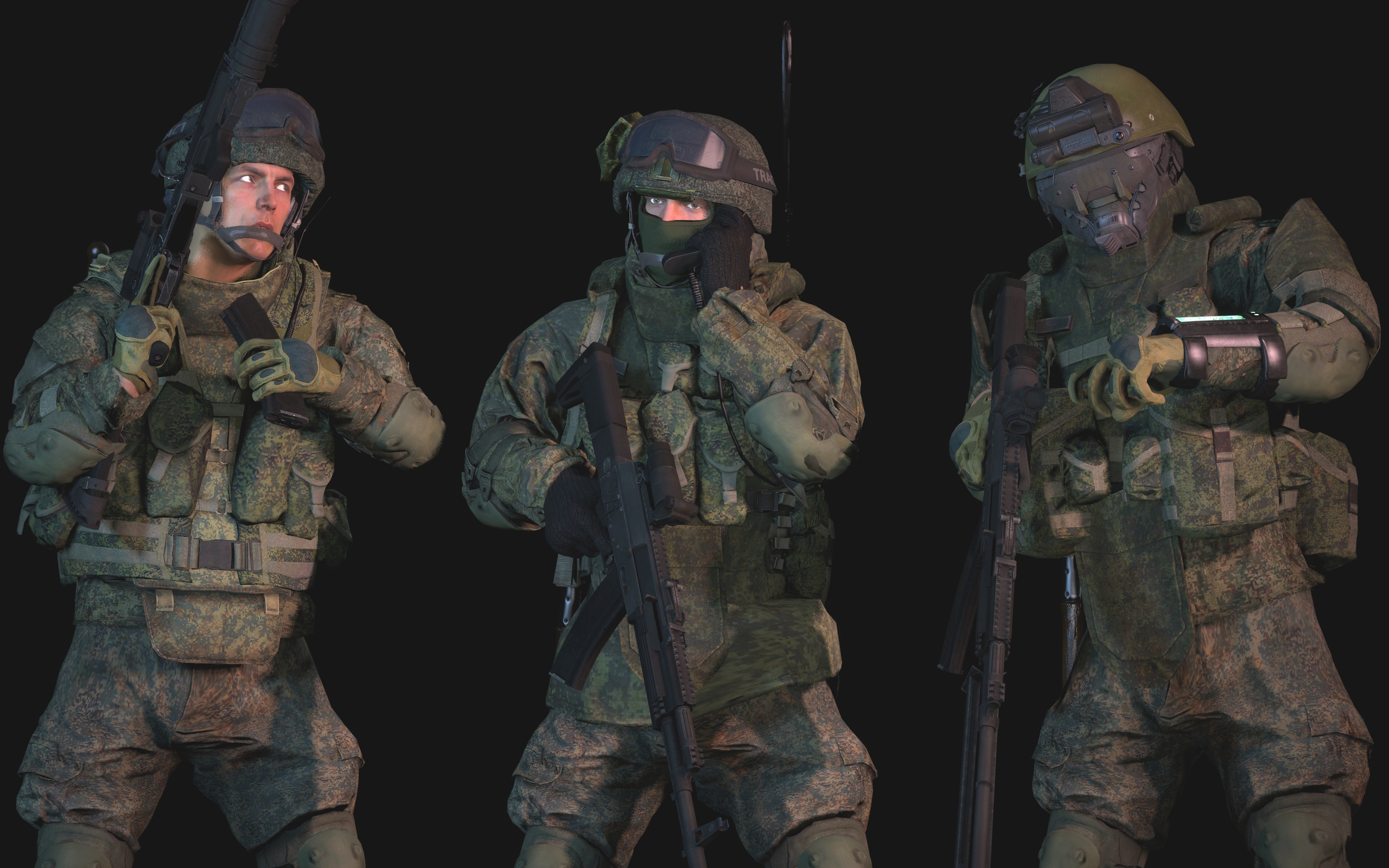
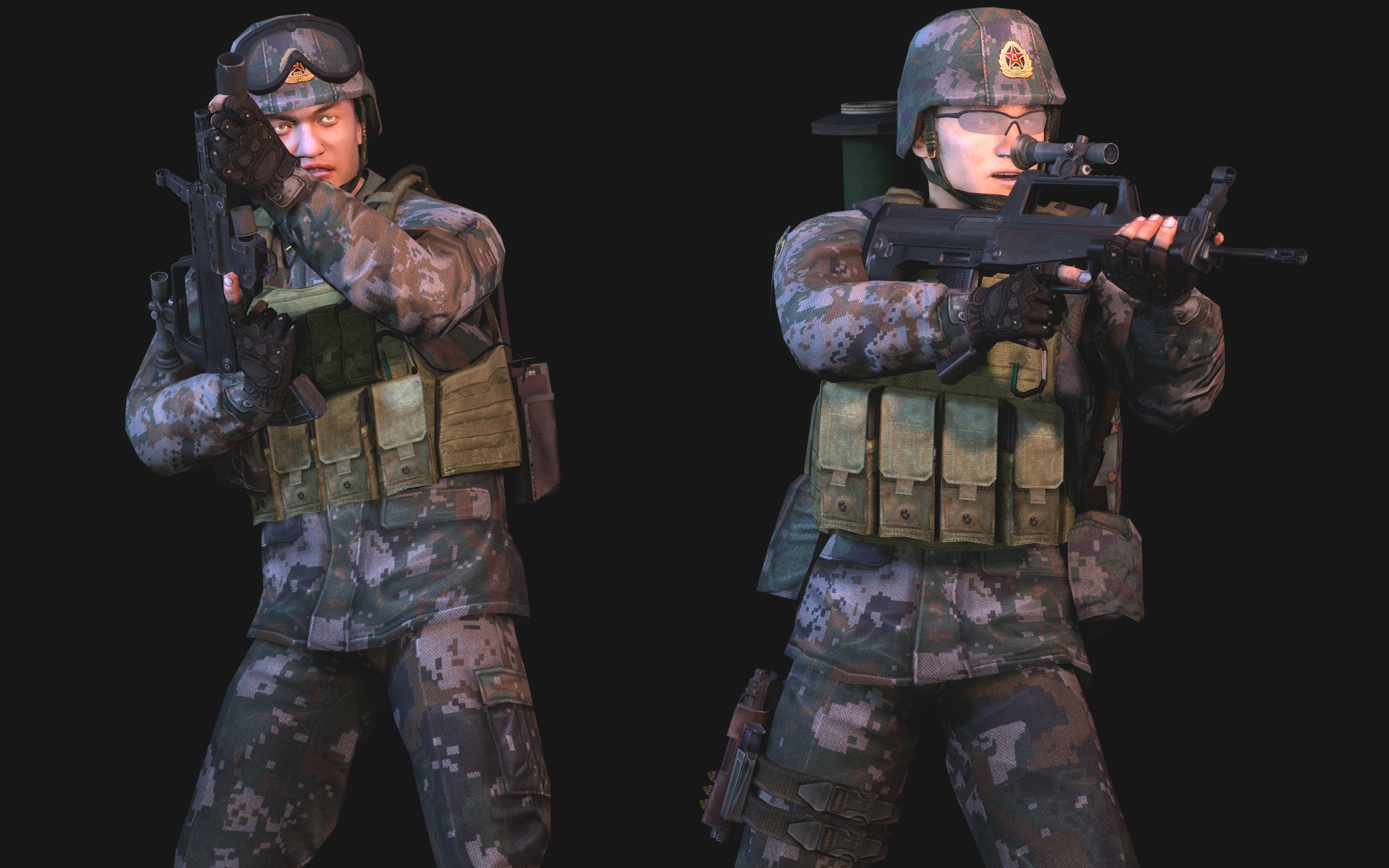
Two things: interesting format ratio, and finally some flames that actually look hot. Good debut to start with, for sure
As well as with posting the results, I'd like to change the rules a far bit.
For about 5 years this competition was about this little, HL2 themed group focused on making art to share and improve upon.
It was never about me, but about you guys, so why the hell should I be the only judge?
From now on, I'll simply stay back, do all the technical work, while the real deal is going to happen here, through your comments and voting.
I will obviously do that as well, just won't be the only one.
To sum it up, every Monday I'll create a vote pool for the previous week. You can both vote and address the artwork in question.
Then, next Monday we'll see who's got the most votes and wins that week
We're all here to improve after all
I'll change the main post later, it's late at night rn