.
@lesbian sausage, it's concept isn't fresh, but it still holds classy, even though rest falls flat. Every pose there is taken straight from HL2 files, without even a slight modification, as well as most of them don't make much sense: We have a zombie jumping at Breen? Nah, let that guy mounting a turret rest, he had a shitty day. When you use HL2 sequences, try to use them only for stuff that's in the background, or if you can, modify them, so that they don't look so stale. Another thing that bugs me quite heavily, is the fact, that the fire in the background is blinding the viewer slightly (which is alright, even though it's a tad too strong), but it casts no light on it's surroundings; the floor near it is literally dark. That's also some edgy model of that elite you got there, what server is that from?
@Pale Rider, honestly, it'd be okay, if just not for the complete lack of stuff to look at - it's dull. Pretty much only two colors are present, without much alterations to their shades, or stuff alike. Even the ragdolls there are completely black, which makes them unable to be identified. I know what you were after, but not much is really speaking to me there. Cool concept though, I'd like to see more of stuff like that.
@Sixx, give yourself a little break, you're smashing them right here
@Elan, it could serve for some nice avatar I would imagine. As I said before, if it's a photoshop artwork, I'd be glad to see the picture of how it looked like before all the editing, but this one is pretty good, so I'm giving it
a good ol' honorary.
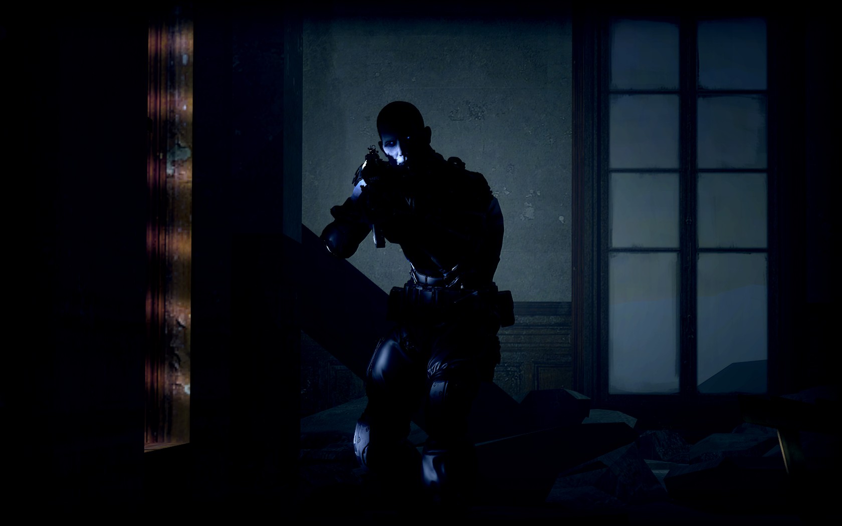
@Cow, I hate being brief like that three times in a row, but it's simply too blurry. I can tell that the guy on left is an OTA, but that's just because of me knowing how they look, while it would be just a blob of dark paint for a standard viewer. You need to show your vision in a way that can be understanded, no matter of who the viewer might be. Good placement of those figures tho, finally someone listening to me whining about rule of thirds.
@ConstantDisplay, don't really know why people are obsessed with this theme nowadays, but won't complain, as it's dope either way. It looks bit rushed and quite easy to make, but it works, which is the most important thing.
I'll give you a honorary just for that.
@Derpy, again, another photoshop, great. Another short answer as well, which is, again, making me uncomfortable - it could be worthy of wallpaper, if only you would fit the background with what's inside those triangles. Space doesn't really fit with wood, now does it? It's also pretty easy, as you said, there are programs that do that very quick, but yeah, the main thing is that it's inconsistent.
@rest are pretty much memes, just with
@MaXenzie doing some quality one. I'll let you rest once more tho


 got a 24 on intimidate