
You are using an out of date browser. It may not display this or other websites correctly.
You should upgrade or use an alternative browser.
You should upgrade or use an alternative browser.
Completed [Competition] Art of The Week
- Thread starter lemon
- Start date
- Status
- Not open for further replies.


CloudBucket
Proton
- Joined
- Jun 3, 2017
- Messages
- 356
- Nebulae
- 723
i didn't have it on right with samples lmaoyour AO is grainy as fuck, whats your render setting?
Piggo
Electron
- Joined
- Jan 24, 2018
- Messages
- 513
- Nebulae
- 680
well regardless its funny imoi didn't have it on right with samples lmao
Goonsworthy
Whatever happens, happens.
- Joined
- Oct 11, 2016
- Messages
- 2,052
- Nebulae
- 1,644
Goonsworthy
Whatever happens, happens.
- Joined
- Oct 11, 2016
- Messages
- 2,052
- Nebulae
- 1,644
lemon
Sells cheap beer
- Joined
- Apr 26, 2016
- Messages
- 1,426
- Nebulae
- 3,435
Doing this one fast, that Project Zomboid update ain't gonna play itself
 if you tell me where you got these models
Your second picture has the same problem, too empty. It's still nice though, I especially appreciate the posing here. Same fix as above, add more stuff, boats for example
, but I'm also really impressed that you did it in only 2 hours

@Piggo, a solid and simple poster, with decent lighting for sure. It's nothing outstanding, but I treat it as more of a test for you, knowing your skills and what you can do. Either way, it's really well posed, decently lit and has the possibility of being used as a wallpaper, which is probably one of the best things that can happen to your artwork. Great lighting guide as well

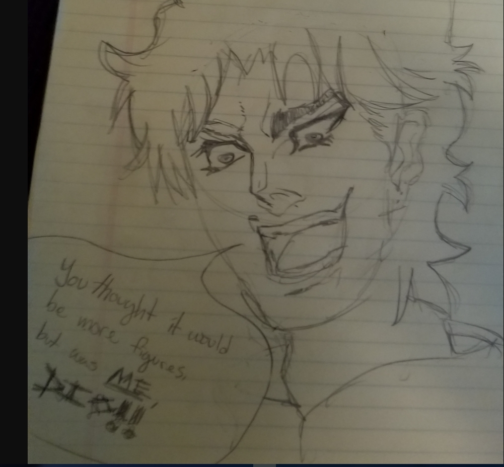
@Flanders, I choose this one, because rest of the drawings are worse (although still not bad, I need to point this out) and the pose is just meh. This drawing here is pretty accurate to the original, I can just hear Dio screaming that dialogue again. Not a big artist man that knows how to draw, but I can tell it was basically ripped from an image that you had on the side. However, it was ripped properly, and if I wouldn't have known of JoJo (which would be a fucking blessing) and you wouldn't have added that source material, I'd say that you're on a similar level as @RGB. Speaking of him, he's your mentor from now on, listen to him, rather than me if you want to advance in the doodling techniques
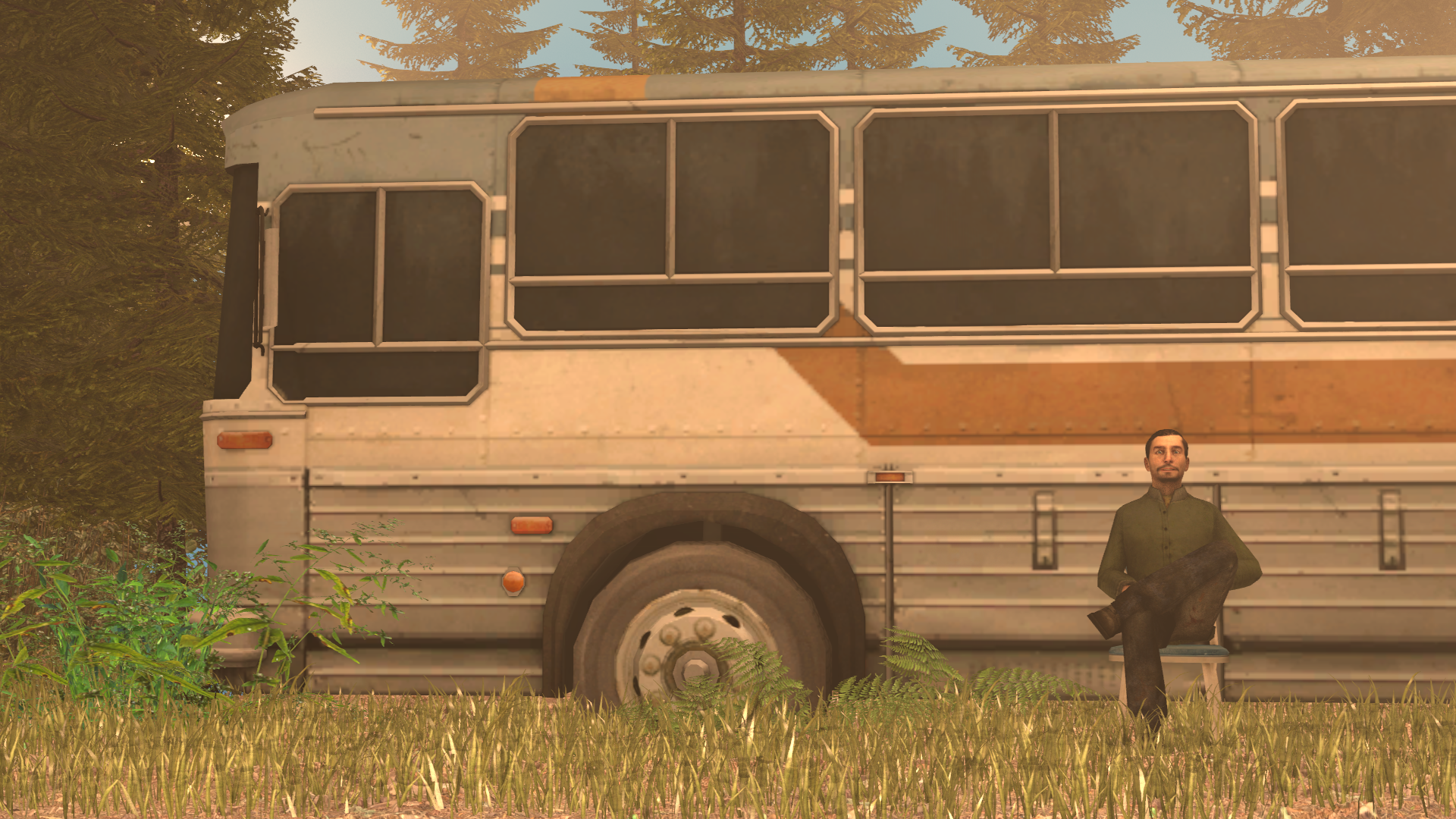
@liew, another solid poster, you're getting better and better with lighting. I also love how tense this soldier in front looks like, I can feel him constantly looking around, aiming at everything that can cause even a remote uneasiness. I'll give this one a


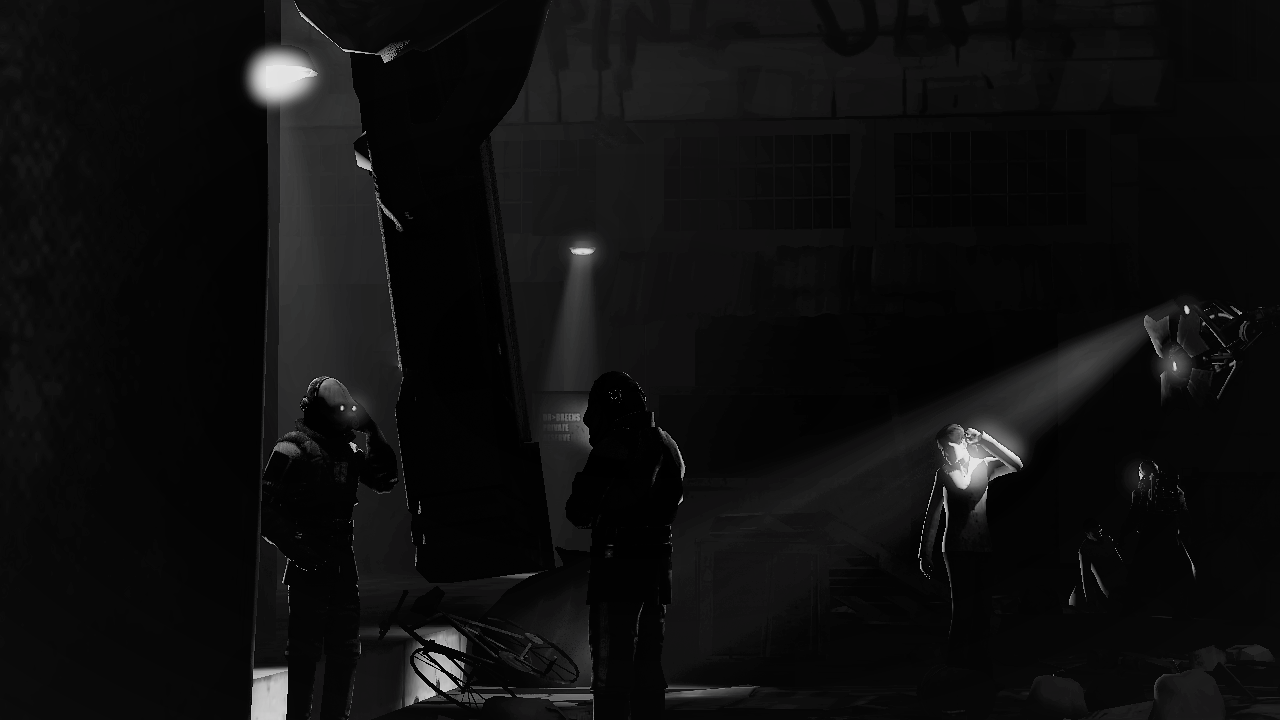
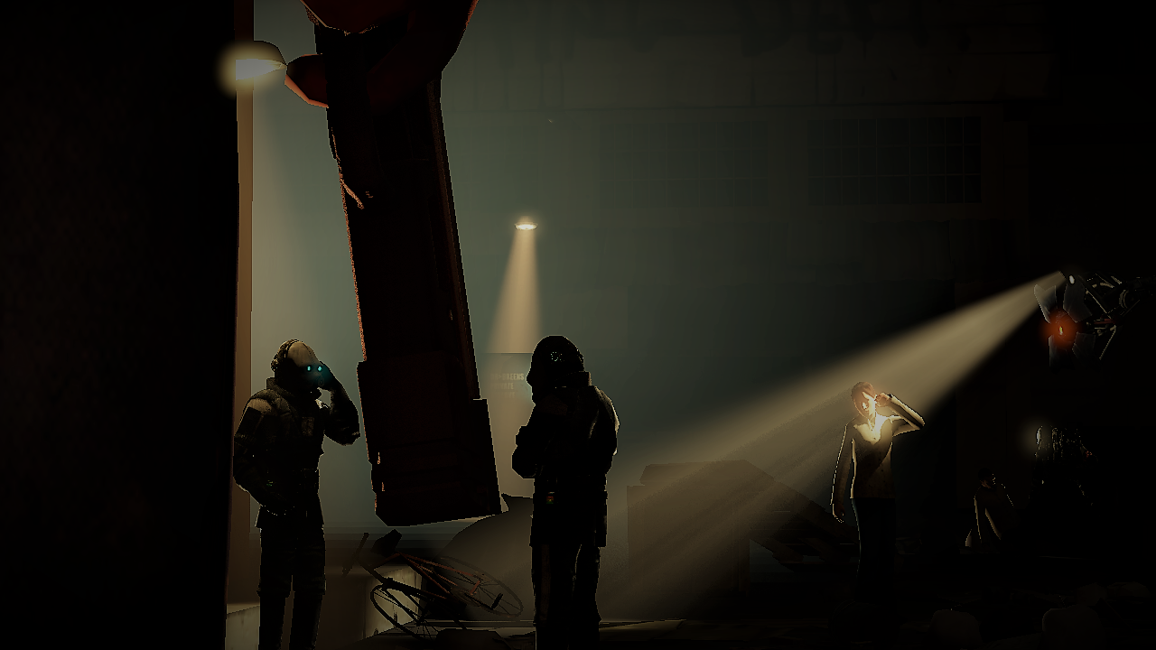
@Viper0419, these two soldiers feel very much like they'd be greenscreened in, probably because the lighting on them comes from a wrong side, while it doesn't light anything around the fire. Outside of that problem though, it's a pretty good pose, even if a bit too empty. I'd probably move the camera far more to the right, to get those two soldiers on the left side of the scene, so we, the viewers, can generally see where are they heading, instead of being blocked by the poster ending. In short, I'd add far more stuff into the poster, maybe some corpses, maybe some other soldiers, depending on what you're going for here. Also, first edit is better imo, it's much more natural and darker(with dof)

Your second picture has the same problem, too empty. It's still nice though, I especially appreciate the posing here. Same fix as above, add more stuff, boats for example
@RGB, something that could easily fit into some kind of fantasy universe. You know my answer, it's always

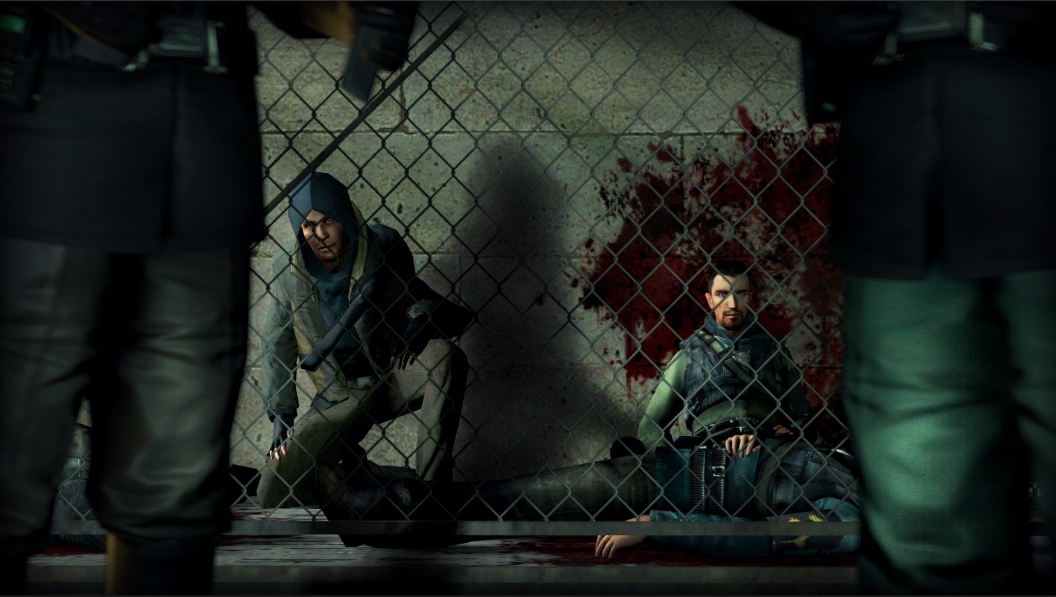
@CloudBucket,
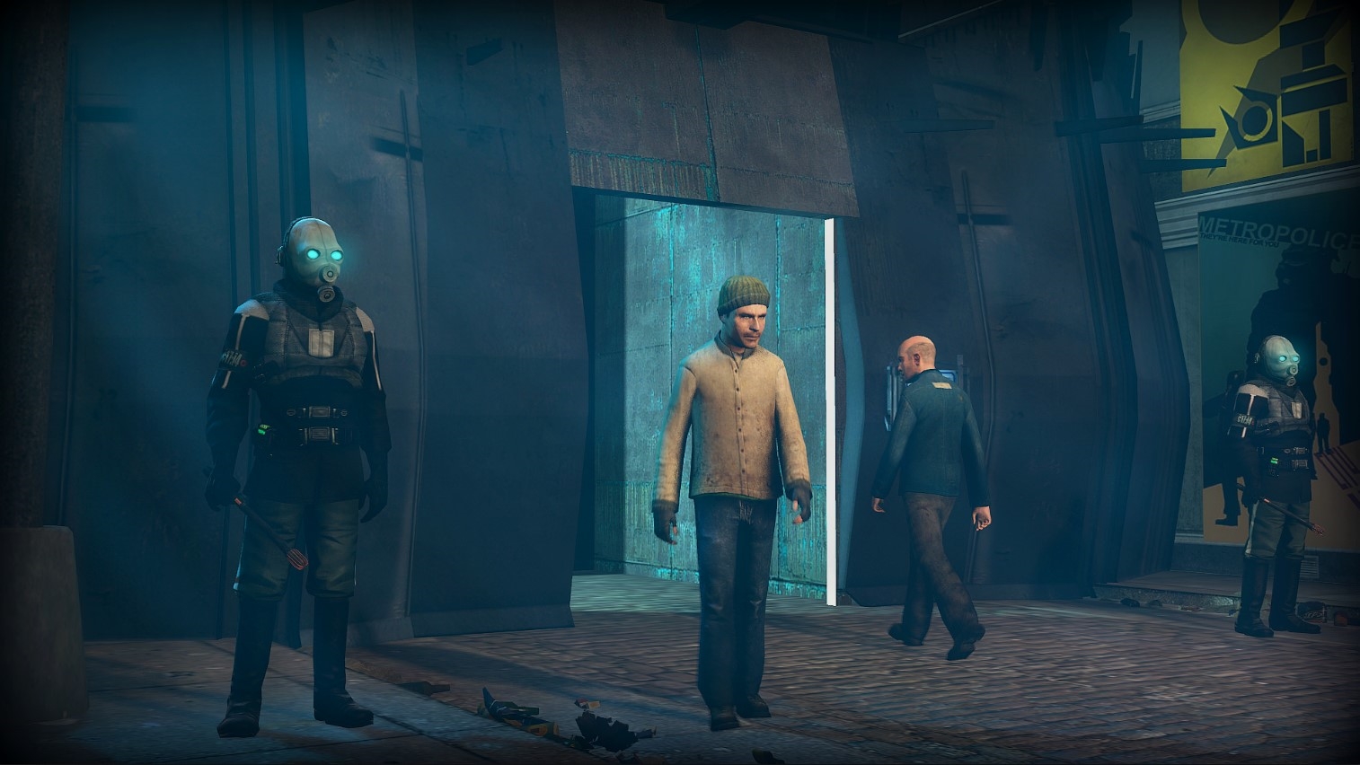
@Dicknose,Just a placeholder until I make something else

Reactions:
List
Flanders
Atom
- Joined
- Apr 14, 2017
- Messages
- 3,726
- Nebulae
- 11,425
please dear lord any one of them but this one '@Flanders, I choose this one, because rest of the drawings are worse (although still not bad, I need to point this out) and the pose is just meh. This drawing here is pretty accurate to the original, I can just hear Dio screaming that dialogue again. Not a big artist man that knows how to draw, but I can tell it was basically ripped from an image that you had on the side. However, it was ripped properly, and if I wouldn't have known of JoJo (which would be a fucking blessing) and you wouldn't have added that source material, I'd say that you're on a similar level as @RGB. Speaking of him, he's your mentor from now on, listen to him, rather than me if you want to advance in the doodling technique
i regret this one very much
CloudBucket
Proton
- Joined
- Jun 3, 2017
- Messages
- 356
- Nebulae
- 723
offical review or my poses become worseDoing this one fast, that Project Zomboid update ain't gonna play itself
@Piggo, a solid and simple poster, with decent lighting for sure. It's nothing outstanding, but I treat it as more of a test for you, knowing your skills and what you can do. Either way, it's really well posed, decently lit and has the possibility of being used as a wallpaper, which is probably one of the best things that can happen to your artwork. Great lighting guide as well
@Flanders, I choose this one, because rest of the drawings are worse (although still not bad, I need to point this out) and the pose is just meh. This drawing here is pretty accurate to the original, I can just hear Dio screaming that dialogue again. Not a big artist man that knows how to draw, but I can tell it was basically ripped from an image that you had on the side. However, it was ripped properly, and if I wouldn't have known of JoJo (which would be a fucking blessing) and you wouldn't have added that source material, I'd say that you're on a similar level as @RGB. Speaking of him, he's your mentor from now on, listen to him, rather than me if you want to advance in the doodling techniques
@liew, another solid poster, you're getting better and better with lighting. I also love how tense this soldier in front looks like, I can feel him constantly looking around, aiming at everything that can cause even a remote uneasiness. I'll give this one aif you tell me where you got these models
@Viper0419, these two soldiers feel very much like they'd be greenscreened in, probably because the lighting on them comes from a wrong side, while it doesn't light anything around the fire. Outside of that problem though, it's a pretty good pose, even if a bit too empty. I'd probably move the camera far more to the right, to get those two soldiers on the left side of the scene, so we, the viewers, can generally see where are they heading, instead of being blocked by the poster ending. In short, I'd add far more stuff into the poster, maybe some corpses, maybe some other soldiers, depending on what you're going for here. Also, first edit is better imo, it's much more natural and darker
Your second picture has the same problem, too empty. It's still nice though, I especially appreciate the posing here. Same fix as above, add more stuff, boats for example
@RGB, something that could easily fit into some kind of fantasy universe. You know my answer, it's always, but I'm also really impressed that you did it in only 2 hours
@CloudBucket,
@Dicknose,
Cavity
Proton
- Joined
- Nov 4, 2016
- Messages
- 201
- Nebulae
- 518
Inaudible™
Karl-Police Approved
- Joined
- Sep 4, 2016
- Messages
- 2,130
- Nebulae
- 3,428

- Joined
- Apr 26, 2016
- Messages
- 17,450
- Nebulae
- 25,068

Goonsworthy
Whatever happens, happens.
- Joined
- Oct 11, 2016
- Messages
- 2,052
- Nebulae
- 1,644
liew
Don't Shoot I'm Too Short
- Joined
- Apr 26, 2016
- Messages
- 2,956
- Nebulae
- 5,699
planes look a bit off due to your fog settings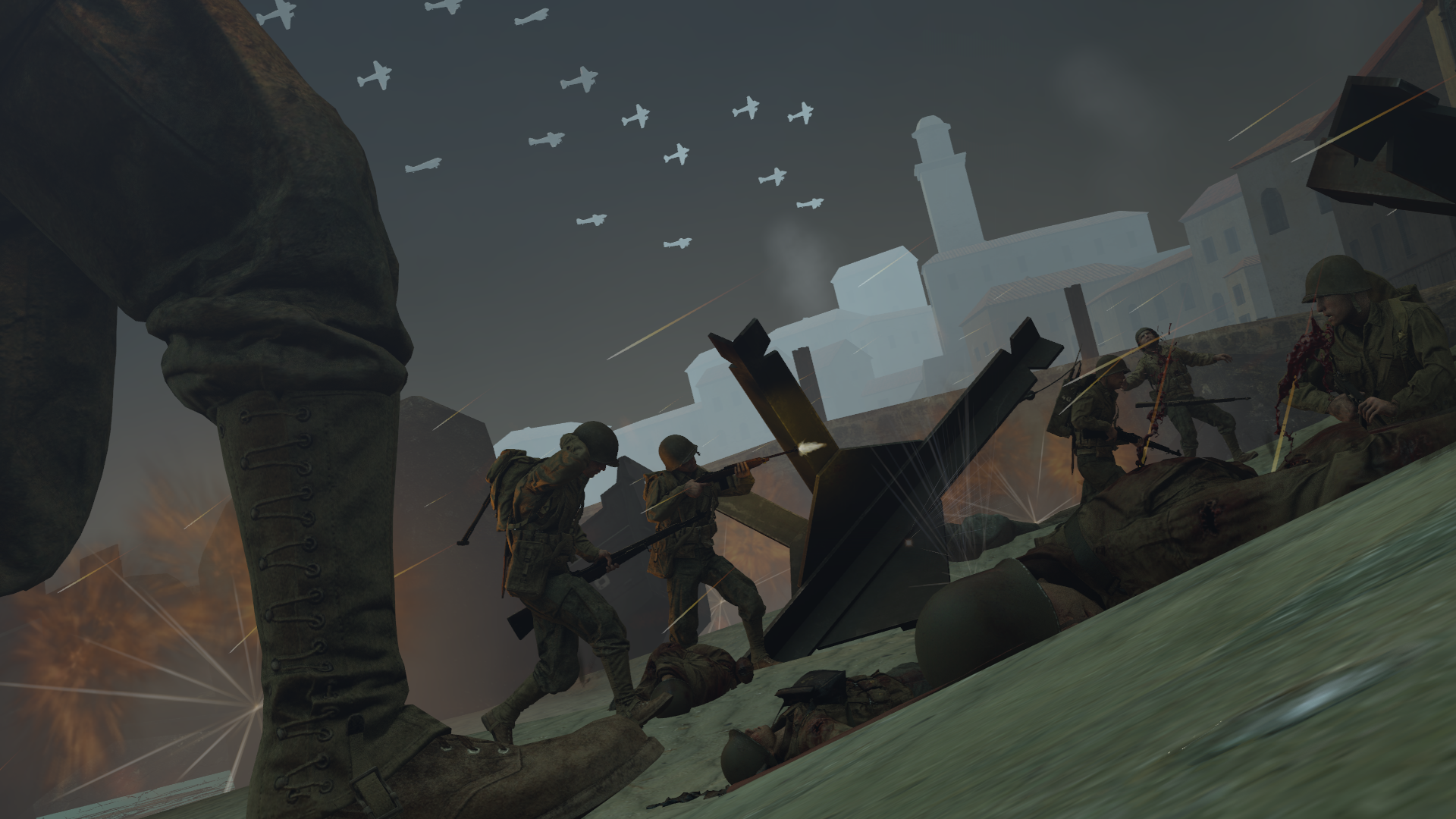
I tried. Any feedback, suggestions, etc?
Goonsworthy
Whatever happens, happens.
- Joined
- Oct 11, 2016
- Messages
- 2,052
- Nebulae
- 1,644
I also do not know any US uniforms from the second World War, so it might inaccurate
[doublepost=1528228505][/doublepost]
[doublepost=1528228505][/doublepost]
Those are in the skybox. Its to mask that those are TF2 planesplanes look a bit off due to your fog settings
Piggo
Electron
- Joined
- Jan 24, 2018
- Messages
- 513
- Nebulae
- 680
Goonsworthy
Whatever happens, happens.
- Joined
- Oct 11, 2016
- Messages
- 2,052
- Nebulae
- 1,644
Aight. I didn't want it to look goofy, I'll do it once I'm out of workThe fog is off coloured and this dude isn't aiming

try this

Johnny B. Goode
Objectively Best MGS poster
- Joined
- Apr 26, 2016
- Messages
- 6,888
- Nebulae
- 23,483

- Status
- Not open for further replies.