
You are using an out of date browser. It may not display this or other websites correctly.
You should upgrade or use an alternative browser.
You should upgrade or use an alternative browser.
Completed [Competition] Art of The Week
- Thread starter lemon
- Start date
- Status
- Not open for further replies.


lemon
Sells cheap beer
- Joined
- Apr 26, 2016
- Messages
- 1,426
- Nebulae
- 3,435
Sorry again guys, but new year's preparations got me busy to the point that I barely even have time to write this. In theory I have most of the work done, but I'd like to cover each one of the submissions, so I'll finish it up and post it tomorrow, while morbidly hungover
Happy new year everybody, I'll drink to you this night
Happy new year everybody, I'll drink to you this night
Reactions:
List
Goonsworthy
Whatever happens, happens.
- Joined
- Oct 11, 2016
- Messages
- 2,052
- Nebulae
- 1,644
thanksSorry again guys, but new year's preparations got me busy to the point that I barely even have time to write this. In theory I have most of the work done, but I'd like to cover each one of the submissions, so I'll finish it up and post it tomorrow, while morbidly hungover
Happy new year everybody, I'll drink to you this night
Reactions:
List
lemon
Sells cheap beer
- Joined
- Apr 26, 2016
- Messages
- 1,426
- Nebulae
- 3,435
That’s a big fucking round

to this as well, though I suggest doing bigger pictures next time, with more characters and stuff going on, while retaining this style
Either way, it's a really simple edit, and doesn't really add much to the picture, but kudos just for reminding me of that game. I need to listen to that ost again
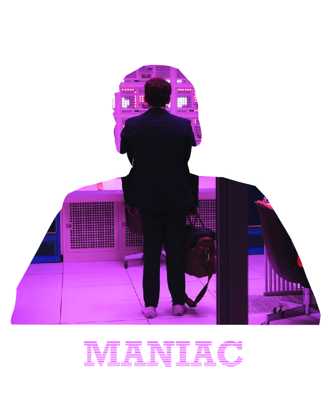
@CloudBucket, I have several questions, but I'm not sure if I want to hear answers. The video gives me Thoopje vibes, which is a good thing, but I'll wait till it's finished. Ye
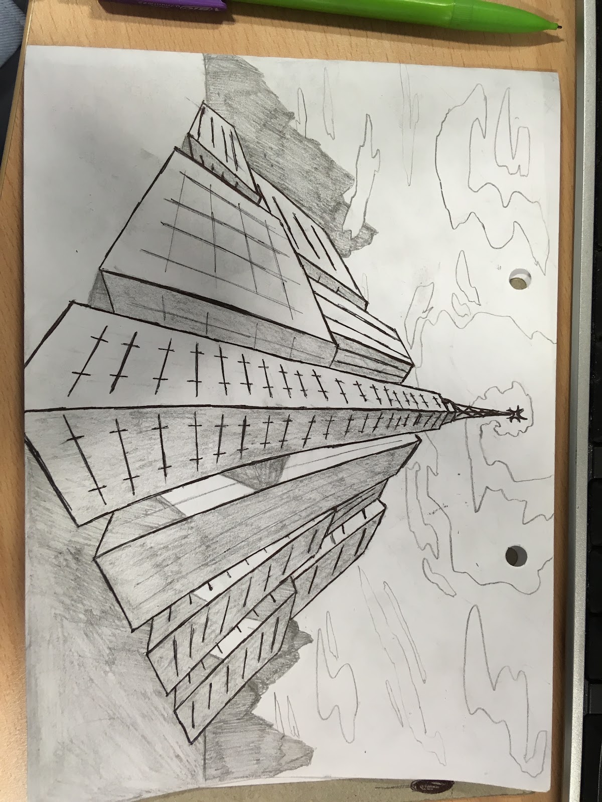
@RGB, if I’m to rate it, I give it an 8/10, for pretty and sharp edges, as well as a really nice perspective. I honestly can’t complain about a thing here, it’s just that it’s quite basic, although looks like a fun thing to draw.
@Dicknose, imma stop you right there pal, before you take another win. This one is fairly similar to the one that got you gold and even better, I think.
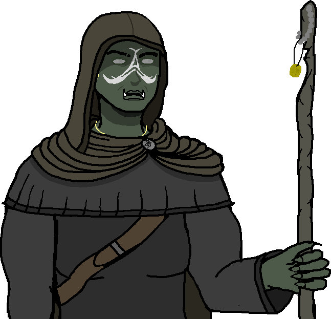
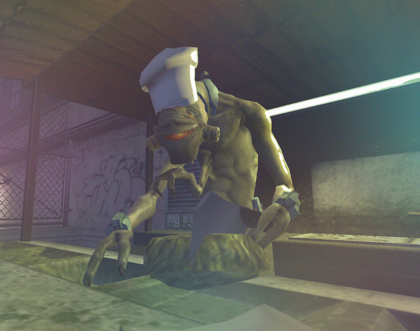
@Omni, while I prefer bipedal snakes in terms of TES races, orcs were far more interesting. I’m quite amazed how you did something like this in MS Paint, even if a detail here and there looks a bit wrong (I’m looking at you unnaturally curvy biceps). Pretty solid drawing nonetheless, something like this could end up as a really nice comic, or anything big for that matter.
@einulus, a pretty easy edit, but looks good nevertheless. I guess I’m missing on the reference here, since I don’t really remember this movie, so I don’t really have much to say here, but I’d definitely do something with the background. Maybe add more of these silhouettes with different frames from that movie, or something alike
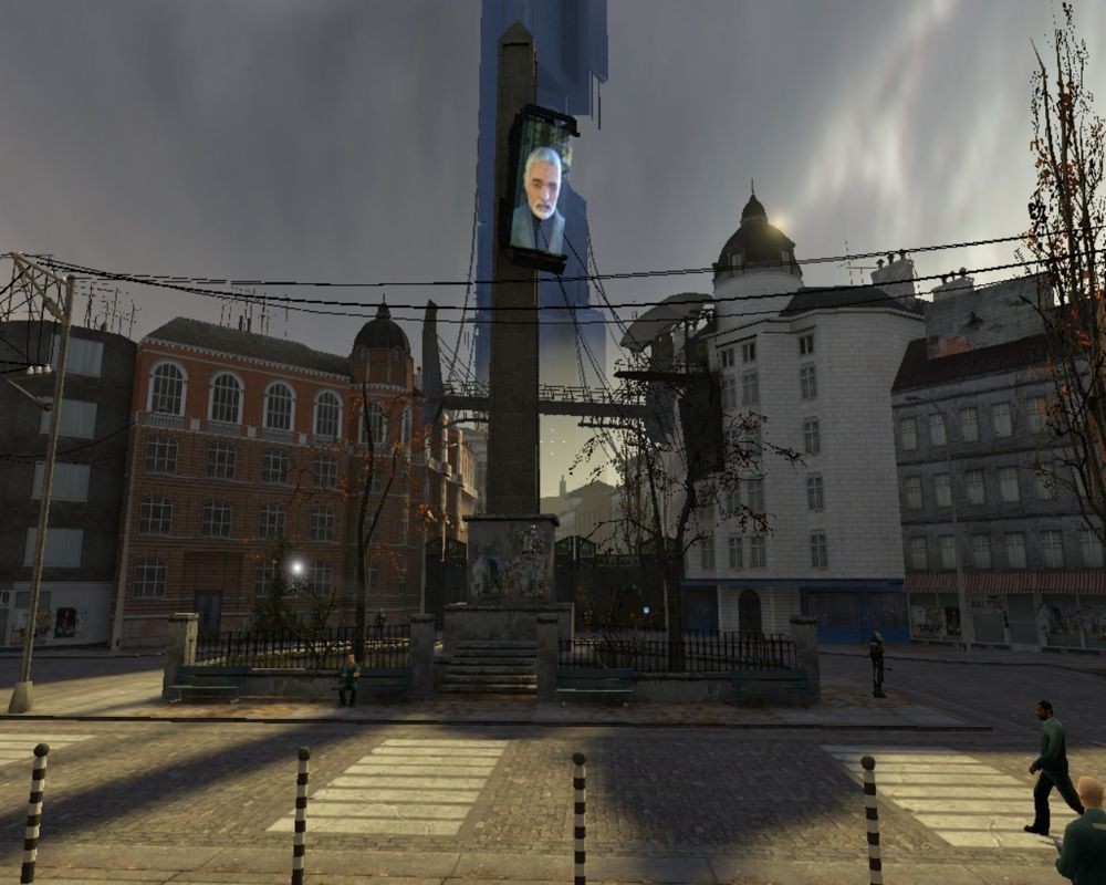
@Cavity, well, first of all I’d fix that lighting, but you know it already. I think that what will be most important here, is to choose what kind of mood this picture will try to show. If it’s one of these happy-exploring types, then go ahead with adding bright lights, maybe a few volumetrics here and there, but not too much. On the other hand, you can try to make it a gloomy, dark exploration at night, which obviously would need other sky texture, but also far more very delicate lights. I’d say that if you’d choose the second option, you should go for more volumetrics than with the first one. Oh, and also, add more foliage, no matter which style you choose, both on the walls as well as the props and ground, greenery makes wonders. Looking forward to this one manHere's a little project I've been working on, tell me what you think and changes that should be done. There is no lighting or editing that has been done yet.
@Lambda Coyote, I must admit, this one has some neat feel to it, it's very atmospheric. It's probably because of these well done lights that even match the mountains we're seeing in the background. Posing is quite solid and you can easily feel the movement involved, but I think the guy lying down could use a reimagination of his role there. Imo, a far better pose for him to be in would be post-impact of that sword, where he tries to grasp it, and maybe even pull it out, but is beginning to loose the remainings of strength he has. That way not only we get rid of that disgusting cylinder blood particle, but it also gives a nice connection between the peaceful mountains in the background and the eternall peace the unlucky guy will have soon. Might've gotten a little bit too poetic here, but that's what I imagine would fit here the best with what you've already built. 8/10 overall I'd say, gg

@John McRee, Jet Set Radio > Tony Hawk, prove me wrong

Either way, it's a really simple edit, and doesn't really add much to the picture, but kudos just for reminding me of that game. I need to listen to that ost again
@Dallahan, now this has some style and it does look distinct. I don't have any expert tips, but all I can and want to say, is that you should continue going in that direction. I like it. A lot

@CloudBucket, I have several questions, but I'm not sure if I want to hear answers. The video gives me Thoopje vibes, which is a good thing, but I'll wait till it's finished. Ye
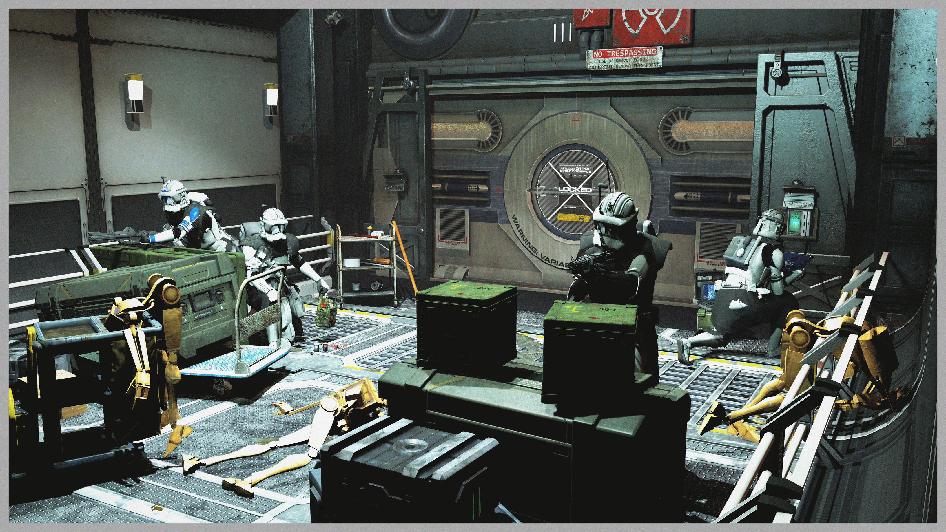
@GenericPlayer, pretty straightforward pose, one of the many picturing a raid, but I like the scenebuilding (except for that rug on the floor that looks like stones). I can't say that it's a masterpiece of any kind, especially that most of the animations here are just ripped sequences, the lighting makes everything flat, and the poster itself has no character, but these issues can be fixed. First of all, I'd work on your camera angles, and by that, I highly recommend you seeing some more "artistic" movies and try to look at how they're framed and how the use of colors and scenography makes them look unique. Wes Anderson has pretty much legendary style when it comes to camera framing, there's also Utopia that focuses mainly on vivid colors, or recently put on Netflix Birdman that has some more nice shots as well (seamlessness is cool, but I'm talking about framing here). @Piggo did a nice lighting guide that can be applied to whatever program really, just look at how he places the lights. I'd look for your own style man, it's the most important thing in art, to show what you feel, so that others can feel it as well, and making it look distinct is what helps a lot

@CloudBucket, as @liew said, a fog here would be real nice, and it would probably save the picture. Just generally anything to make it seem like a harsh environment, rather than just a centimeter of snow with some real ugly rocks sticking into our faces. Seriously, use higher resolution models for something as close to the camera as that stone on the right. I must agree though that this pose does have a nice feeling to it, and after some refining it'd be pretty fucking cool. 6.5/10 for now, but I like the cocnept

@Neythi , I personally like the old version more, it looks better when it's darker. Some really solid posing here, that's for sure, but I think the scenery is a bit empty. Throwing a clock into the background doesn't really fill it, but getting another CP there, holding a bloody, broken mask of that guy on the floor does. I also think that the lighting could've been more red here, but idk, that's just me. Speaking of which, how the hell did you get such sharp shadows? They look really artificial, try moving the light a bit further back, so the shadows are spreaded. Despite these minor issues, I still like this one, probably because of how well the camera is placed. Goodie

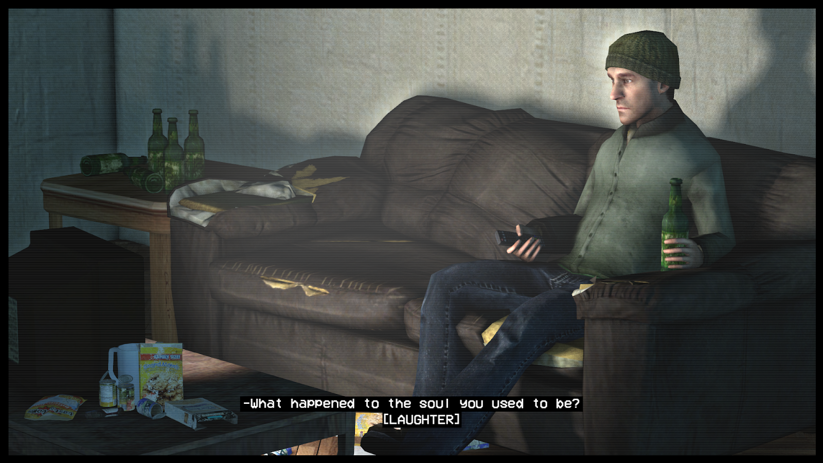
@egg, not much here, just a guy in an idle animation with some filter on, but it somehow holds some magic. I'm really not sure on what it is, but my best bet is his eyes and how bored he looks. I really don't know what to say, I think someone smarter than me will know what's up with this picture, but there's something neat about it

@Exile, real nice model, wish I'd get something like this for Christmas, but these fuckers are expensive as fuck, so I'm not surprised. Either way, not much in terms of being "artistic", but it is a nice picture if you'd like to remember that particular present. Nice christmas tree btw

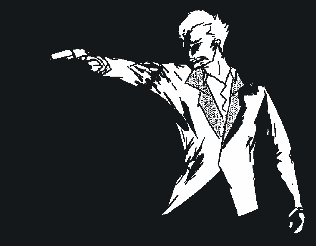
@Omni, weird picture, but ok. As the theme of this round is me saying the word "artistic", this here is probably the definition of that word. I don't get it, as with much of modern art, but it looks funky as hell, and I take it as a plus. 7/10 I think, though might change later based on what I'll drink


Reactions:
List
Cindy
*sigh* ud know this if u read the silmarillion...
- Joined
- Feb 28, 2018
- Messages
- 2,263
- Nebulae
- 7,555
oh oops i thought a week had passed since i submitted my mspaint orc
:grimace:
also @Lemon Cuntcake I was trying to portray that they had something underneath their cloak hence why the biceps looked a bit inflated but it ended up a bit dorky
:grimace:
also @Lemon Cuntcake I was trying to portray that they had something underneath their cloak hence why the biceps looked a bit inflated but it ended up a bit dorky
Last edited:
Reactions:
List
CloudBucket
Proton
- Joined
- Jun 3, 2017
- Messages
- 356
- Nebulae
- 723
thank you master. this was not my finest work. apologiesThat’s a big fucking round
@RGB, if I’m to rate it, I give it an 8/10, for pretty and sharp edges, as well as a really nice perspective. I honestly can’t complain about a thing here, it’s just that it’s quite basic, although looks like a fun thing to draw.
@Dicknose, imma stop you right there pal, before you take another win. This one is fairly similar to the one that got you gold and even better, I think.to this as well, though I suggest doing bigger pictures next time, with more characters and stuff going on, while retaining this style
@Omni, while I prefer bipedal snakes in terms of TES races, orcs were far more interesting. I’m quite amazed how you did something like this in MS Paint, even if a detail here and there looks a bit wrong (I’m looking at you unnaturally curvy biceps). Pretty solid drawing nonetheless, something like this could end up as a really nice comic, or anything big for that matter.
@einulus, a pretty easy edit, but looks good nevertheless. I guess I’m missing on the reference here, since I don’t really remember this movie, so I don’t really have much to say here, but I’d definitely do something with the background. Maybe add more of these silhouettes with different frames from that movie, or something alike
@Cavity, well, first of all I’d fix that lighting, but you know it already. I think that what will be most important here, is to choose what kind of mood this picture will try to show. If it’s one of these happy-exploring types, then go ahead with adding bright lights, maybe a few volumetrics here and there, but not too much. On the other hand, you can try to make it a gloomy, dark exploration at night, which obviously would need other sky texture, but also far more very delicate lights. I’d say that if you’d choose the second option, you should go for more volumetrics than with the first one. Oh, and also, add more foliage, no matter which style you choose, both on the walls as well as the props and ground, greenery makes wonders. Looking forward to this one man
@Lambda Coyote, I must admit, this one has some neat feel to it, it's very atmospheric. It's probably because of these well done lights that even match the mountains we're seeing in the background. Posing is quite solid and you can easily feel the movement involved, but I think the guy lying down could use a reimagination of his role there. Imo, a far better pose for him to be in would be post-impact of that sword, where he tries to grasp it, and maybe even pull it out, but is beginning to loose the remainings of strength he has. That way not only we get rid of that disgusting cylinder blood particle, but it also gives a nice connection between the peaceful mountains in the background and the eternall peace the unlucky guy will have soon. Might've gotten a little bit too poetic here, but that's what I imagine would fit here the best with what you've already built. 8/10 overall I'd say, gg
@John McRee, Jet Set Radio > Tony Hawk, prove me wrong
Either way, it's a really simple edit, and doesn't really add much to the picture, but kudos just for reminding me of that game. I need to listen to that ost again
@Dallahan, now this has some style and it does look distinct. I don't have any expert tips, but all I can and want to say, is that you should continue going in that direction. I like it. A lot
@CloudBucket, I have several questions, but I'm not sure if I want to hear answers. The video gives me Thoopje vibes, which is a good thing, but I'll wait till it's finished. Ye
@GenericPlayer, pretty straightforward pose, one of the many picturing a raid, but I like the scenebuilding (except for that rug on the floor that looks like stones). I can't say that it's a masterpiece of any kind, especially that most of the animations here are just ripped sequences, the lighting makes everything flat, and the poster itself has no character, but these issues can be fixed. First of all, I'd work on your camera angles, and by that, I highly recommend you seeing some more "artistic" movies and try to look at how they're framed and how the use of colors and scenography makes them look unique. Wes Anderson has pretty much legendary style when it comes to camera framing, there's also Utopia that focuses mainly on vivid colors, or recently put on Netflix Birdman that has some more nice shots as well (seamlessness is cool, but I'm talking about framing here). @Piggo did a nice lighting guide that can be applied to whatever program really, just look at how he places the lights. I'd look for your own style man, it's the most important thing in art, to show what you feel, so that others can feel it as well, and making it look distinct is what helps a lot
@CloudBucket, as @liew said, a fog here would be real nice, and it would probably save the picture. Just generally anything to make it seem like a harsh environment, rather than just a centimeter of snow with some real ugly rocks sticking into our faces. Seriously, use higher resolution models for something as close to the camera as that stone on the right. I must agree though that this pose does have a nice feeling to it, and after some refining it'd be pretty fucking cool. 6.5/10 for now, but I like the cocnept
@Neythi , I personally like the old version more, it looks better when it's darker. Some really solid posing here, that's for sure, but I think the scenery is a bit empty. Throwing a clock into the background doesn't really fill it, but getting another CP there, holding a bloody, broken mask of that guy on the floor does. I also think that the lighting could've been more red here, but idk, that's just me. Speaking of which, how the hell did you get such sharp shadows? They look really artificial, try moving the light a bit further back, so the shadows are spreaded. Despite these minor issues, I still like this one, probably because of how well the camera is placed. Goodie
@egg, not much here, just a guy in an idle animation with some filter on, but it somehow holds some magic. I'm really not sure on what it is, but my best bet is his eyes and how bored he looks. I really don't know what to say, I think someone smarter than me will know what's up with this picture, but there's something neat about it
@Exile, real nice model, wish I'd get something like this for Christmas, but these fuckers are expensive as fuck, so I'm not surprised. Either way, not much in terms of being "artistic", but it is a nice picture if you'd like to remember that particular present. Nice christmas tree btw
@Omni, weird picture, but ok. As the theme of this round is me saying the word "artistic", this here is probably the definition of that word. I don't get it, as with much of modern art, but it looks funky as hell, and I take it as a plus. 7/10 I think, though might change later based on what I'll drink
Reactions:
List
Lambda Coyote
Don't forget Hawaii
- Joined
- Jul 29, 2016
- Messages
- 188
- Nebulae
- 317

Inaudible™
Karl-Police Approved
- Joined
- Sep 4, 2016
- Messages
- 2,130
- Nebulae
- 3,428

D
Deleted member 5162
Guest
CloudBucket
Proton
- Joined
- Jun 3, 2017
- Messages
- 356
- Nebulae
- 723
flexing on me... smh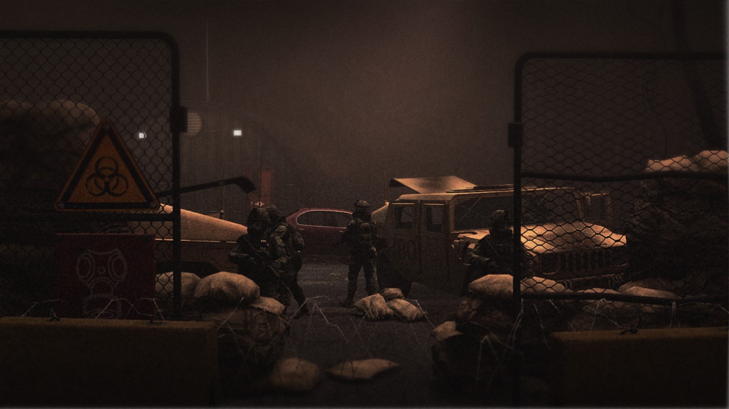
IDK I got bored, so here's something I put together in about 10 mintues
Mickey Toast
All I do is post art and shitpost in OOC chat
- Joined
- Apr 26, 2016
- Messages
- 274
- Nebulae
- 924
Piggo
Electron
- Joined
- Jan 24, 2018
- Messages
- 513
- Nebulae
- 680
lemon
Sells cheap beer
- Joined
- Apr 26, 2016
- Messages
- 1,426
- Nebulae
- 3,435
Hi, it's me again
 for a good picture
@Lambda Coyote, I think this one is probably the best one you've ever made. It's quite nicely packed with stuff, along with some neat effects and lighting. It's like some good, homemade food - it isn't anything fancy, or overdone in any way, just some simple, tasty dish that I'd gladly eat again. The only piece of advice I can give, would be to place two soldiers (possibly running into the battle) right in front of the camera, one on the right and one on the left. It'd fill it out the few, little empty spots and that'd be perfect, nothing more is needed. Obligatory
@Exile, what's with these ultra-dark pictures? I really can't see anything, although what I can see looks alright. The split light at the top of your poster looks neat, bit like a hologram just like the walls on the sides, but that's about all that I can see. Sorry mang
@Cavity, fairly simple, but I adore the atmosphere you gave your picture here. I just wish it was in higher resolution, but that's about it. Love it man,
@Mickey Toast a re-take on the classic I see, eh? It's great as always, although I think too much darkness ruins this piece a bit, as there are no clear outlines with such a pixelated style. Despite that however, I still like it and without a single doubt I give this one a
So, the winners of this amazingly short round:
Biggie: @Neythi

Amazingly fluid animations, and really simplistic, but effective editing. Well done
Biggie: @Neythi
Amazingly fluid animations, and really simplistic, but effective editing. Well done
Smalls: @Omni

If I'd me making some 2D rpg, you'd be the one I'd hire for the character avatars.
If I'd me making some 2D rpg, you'd be the one I'd hire for the character avatars.
Reactions:
List
Sil
jus one more fing
- Joined
- Aug 28, 2016
- Messages
- 6,588
- Nebulae
- 8,299
- Status
- Not open for further replies.