- Joined
- Apr 26, 2016
- Messages
- 14,433
- Nebulae
- 49,294
ah I made it so it’d be like a real newspaper not on a screenmade it look a little more terminal like, not sure if it looks good enough

but ok
Reactions:
List

ah I made it so it’d be like a real newspaper not on a screenmade it look a little more terminal like, not sure if it looks good enough
@Dicknose, honestly speaking it's a really good poster, just lacks a bit of contrast. By that, I don't mean the post-processing one, but rather something that'd make our hero and onion-boy stand out a little bit more from the scenery. It could be anything, a rug, some different lighting, or even complete change of camera angle, but I guess that'd change the concept itself a fair bit. I'm also a little bit confused by the perspective, namely this fence/slab/whatever that they're sitting on. It looks like some sort of stone fence, but at the same time that sword is lying at it, as if it'd be on the ground. It's not bad, really, maybe a little too bland with the colors, but I'm not too sure about changing them. It has a nice feel to it, just needs a few little touches here and there. 8/10, 4/5, 2 michelin hats and one

@Antloin, if there's one guy from who you can take heavy inspirations from when it comes to making event/movie posters, it's @Danny, and you did a real fine inspired poster here, friend. I have no beef with it, I actually really like the atmosphere, but it's a little bit empty, which kind of takes me away from it. If you'd add gunships moving out in flocks from the direction of this clone officer towards the horizon, that'd be not only cool, but would fill up a significant part of the sky, adding some form of context to the poster. Generally speaking when you make really open landscapes it's important to know that with great perspective come great responsibilities to fill it up with interesting stuff. Do just that and I tell you that this image will be the hit
@Dallahan, by no means am I a Photoshop god, but I'll try my best to at least sound like one. First off, the main filter you have there is a pretty simple distortion effect, but looks really nice, so I'm not gonna bash you for using it, but it kinda doesn't really fit with the text. I mena, from what the text says, it's sort of like a profile shot on some loyalist Facebook or Tinder and I highly doubt that a profile shot for an application as serious as Tinder with some distortion over it would pass. It's cool nonetheless, but a bit weird
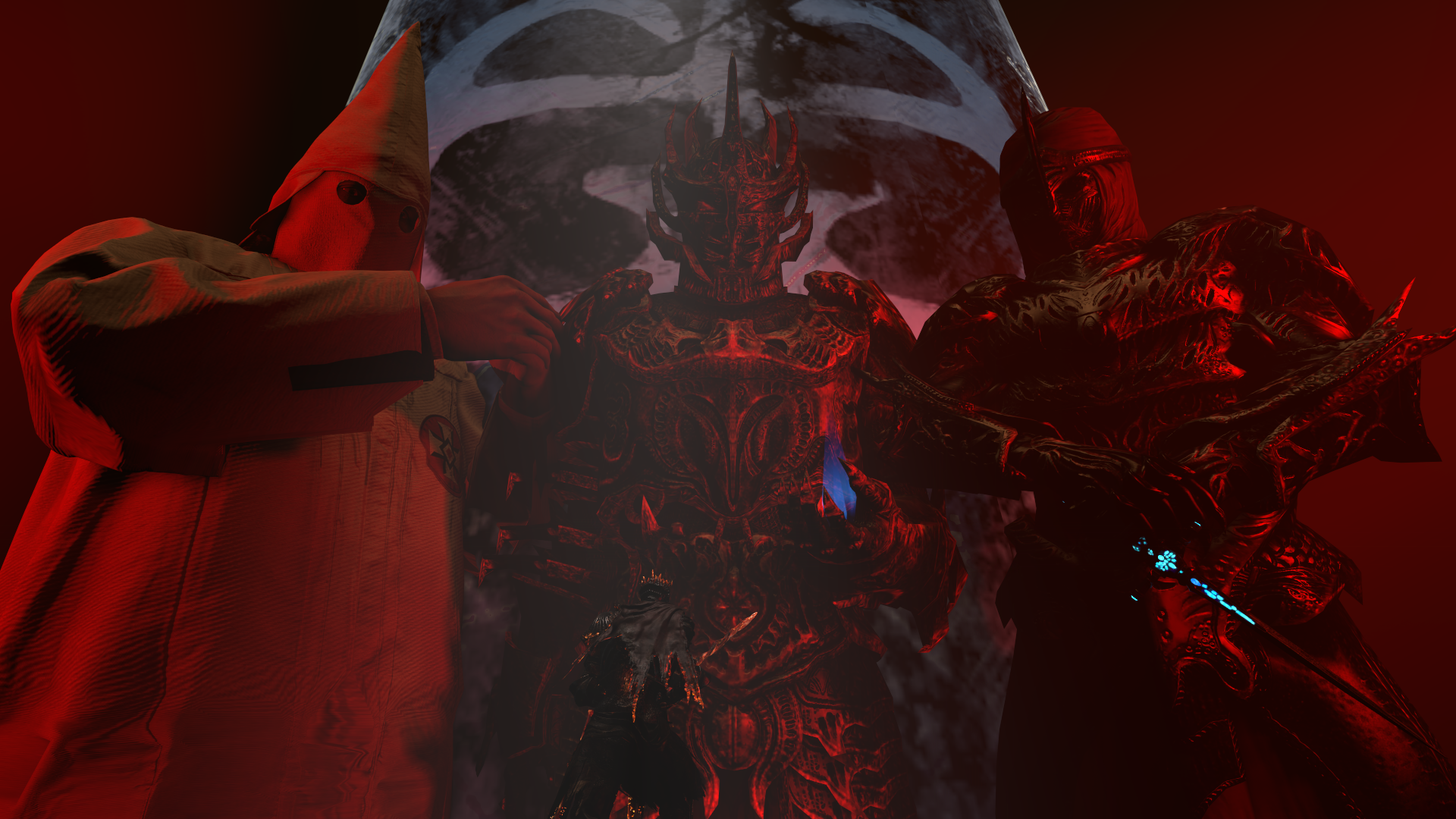
@$Vex$, a really typical style for some rap music cover, and I really regret that you haven't put chains and baseball hats over these sick looking Dremora and a ghost dude. As with the poster few submissions above, this one lacks a little bit of contrast to show that guy in the bottom in full glory (I actually noticed him after a solid 10 second scan of this image). Also, the particle effect of that Pyro's flamethrower flame is really shit when outside of TF2, don't use it. Still, big like just needs a little zoom out and some lighting at the little duder below
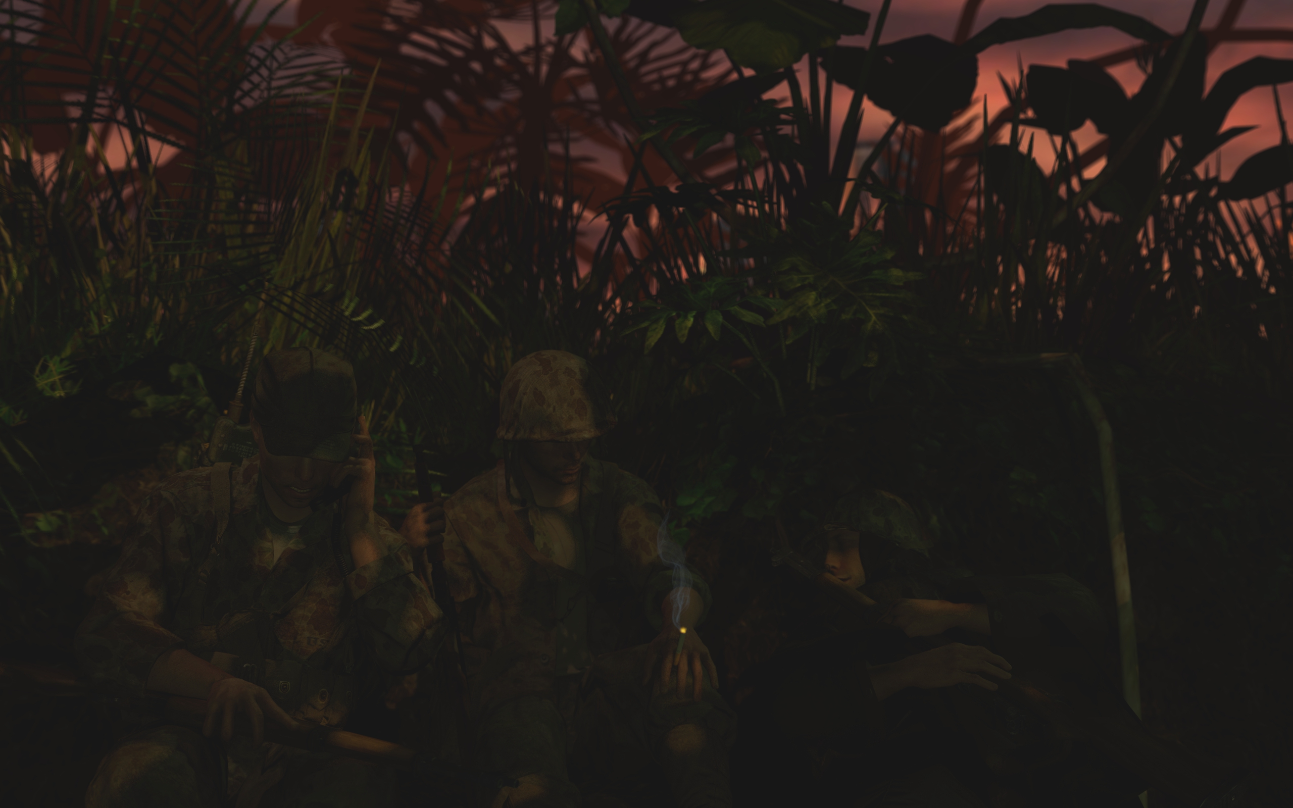
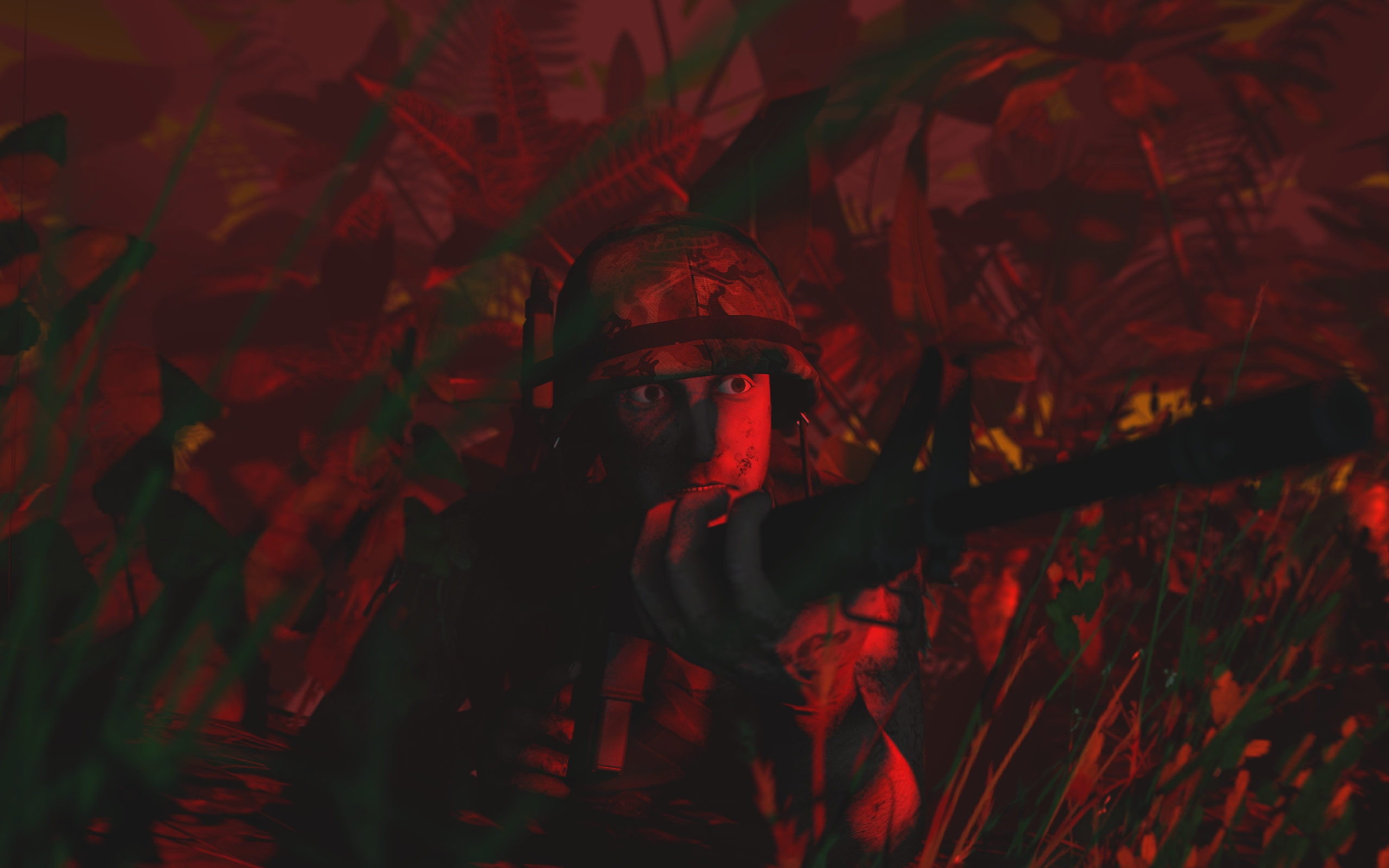
@Trains, oh look, finally I can do something with my college education. I'm actually studying journalism, so I can finally look smart for once, even though I won't say anything revolutionary. So, first off, it's really blocky, and by that I mean that every frame is a boring square, side by side with eachother. Not necessarily bad, but it's far more interesting and pleasing to the viewer's eye if you add "layers", so to speak and line up every frame with eachother, so that one doesn't seem to be just a little bit higher than others. For example, that text about Jerome could have some sort of a shadow dropping from it's frame, so it looks as if the article would be slapped on the page like a sicker. Also, try to use the same text size across all of the articles, it's easier to read. Aside from that, the lid, so that text below the title that you bump a little bit in size in the article about City 8 should interest the reader but also say a little bit of information about the matter - just saying that the event was shocking isn't really going to get me to read it all, right? It should also be noted that lid should stand out from rest of the text, so you can add a little line below it, or just more space between it and the text itself. The top text is the best one that you did, but it has it's problems as well. First off it describes everything we want and need to know just there, so no need to turn to page 2, really. However, if you'd add something along the lines of "Turn to page 2 for interview with minister XXX about the matter" then I'd pay to read that. Last advice, justify your text, really, it's far better to read when text is properly formatted. If you're writing in Word, then just click the most right one from this image. Good luck on writing for Terminal, was there before and it's tough shit, but you're essentially making the world far more alive and reactive to what players do. Really important and pleasing job, so gl fam
@John McRee, technically, good propaganda poster. Practically, it's just portraying a wrong scenario for this type of poster. Don't get me wrong, you posed and edited it quite good, it's just that even if you look at the original "I'm doing my part" video from that fucking amazing movie that is Starship Troopers, it shows us what their duty is - protecting people. Still, they don't show it in too much graphical form, so it isn't scary or troubling to watch, but rather happy and joyful wit that kid saying that he's a soldier too. What you did here is two guys standing on guarding duty, which doesn't get me too excited to enlist. My idea would be to give these guys some clear situation in which they look heroic, so for example sticking a Union flag into some pile of rubble in a destroyed city, taking down Lambda flag, posing for the photo with some wide smiles and no dead bodies around. That's just my idea tho, so let your creativity flow mang
@Dudu Fadende, really simple one, though I always liked putting cosmetics of different classes on some other ones, like you did with Scout here. I don't think I need to say much, it simply misses more stuff in the scene and that's all. I must however congratulate you on the faceposing and camera angle, both really expressive and the viewer can feel as if they'd be there with such positioning, so keep being on this track, as it works out
@RGB, there's something in your style that makes each piece look so relaxed and happy, so going with a summer vibe on this one was definitely spot on.
@MaXenzie, Castelvania good, same as your lighting, but these two are obvious facts.
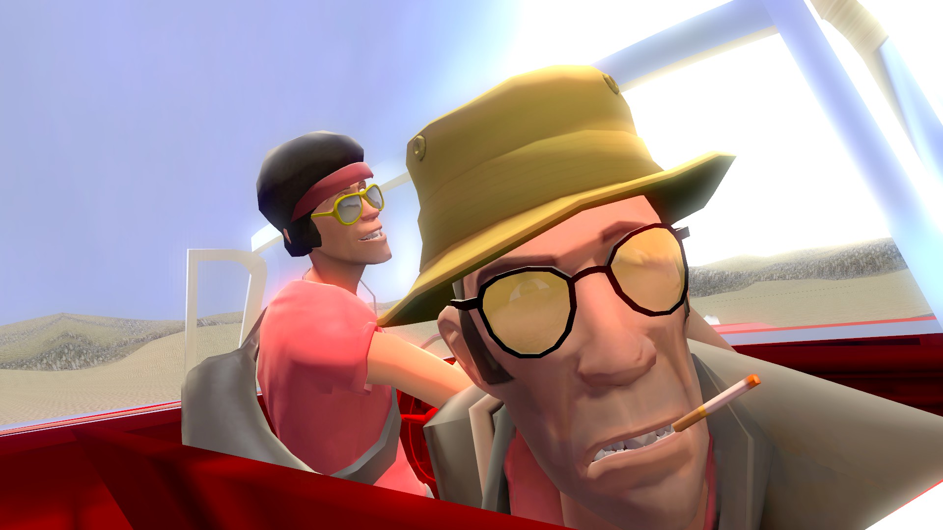
a brief glimpse into what a more cyberpunk hl2 would be like.
me likey
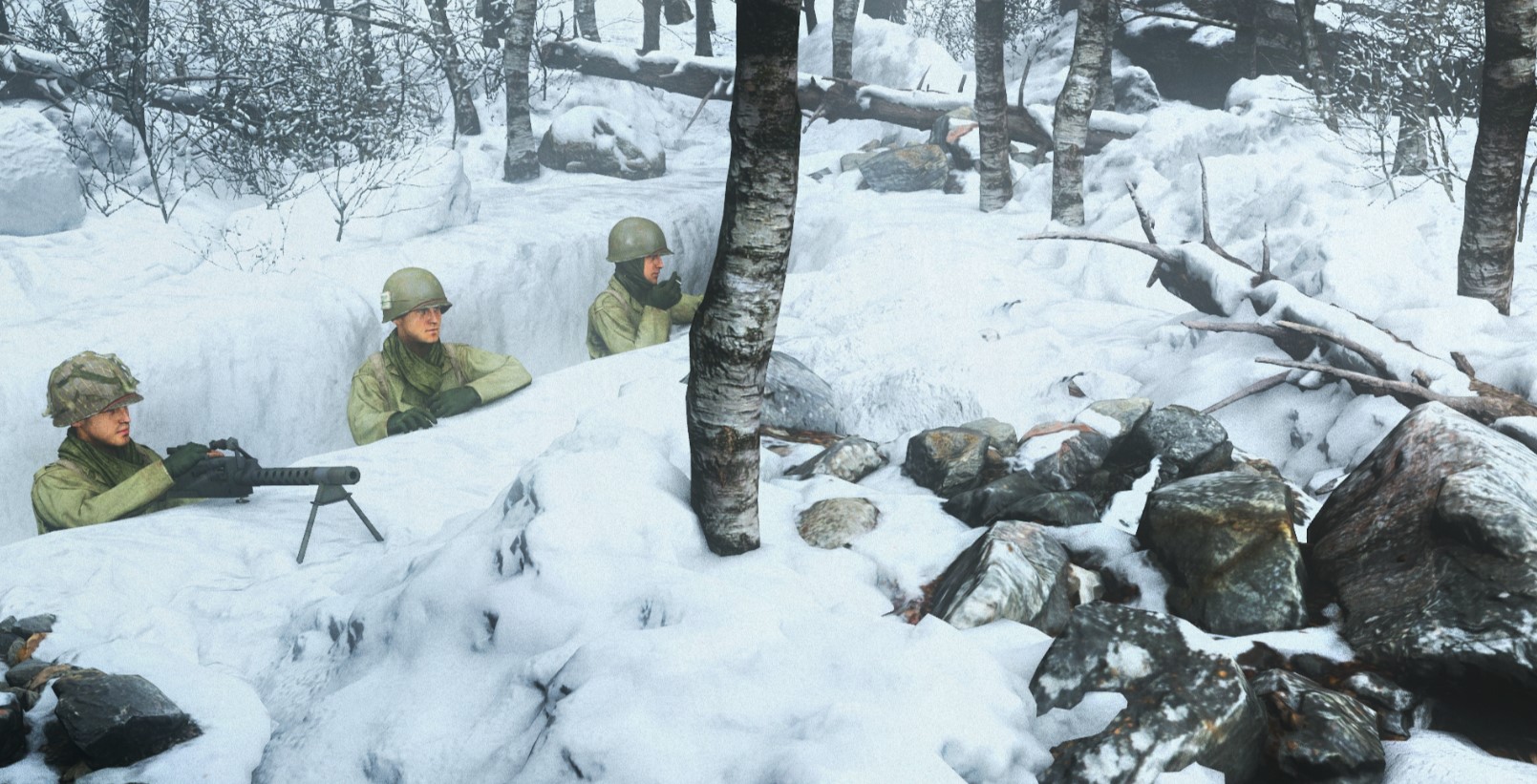
Make it say Proselyzation then idk dad. The man baked you a pie now Eat it!hell no conscripts dont look like that those are proselytes