D

You are using an out of date browser. It may not display this or other websites correctly.
You should upgrade or use an alternative browser.
You should upgrade or use an alternative browser.
Serious [Review] Art of The Week
- Thread starter Danny
- Start date

Goonsworthy
Whatever happens, happens.
- Joined
- Oct 11, 2016
- Messages
- 2,052
- Nebulae
- 1,644
Hope everything turns out okaySorry fellas I’ve had a rough couple weeks, should have time to catch up and get a review done tonight hopefully
Reactions:
List
Danny
Visual Powerhouse
- Joined
- Apr 26, 2016
- Messages
- 1,267
- Nebulae
- 5,181
Art of the Week W29.52(2021)
---
-
This week, I'm really vibing with...
@Cavity and...

... @Dicknose ! (and not because you sent a nice message)
Awesome submissions these past couple weeks guys (difficult to pick a favourite!!), was great to see what you've all been up to. Was mostly a lot of compliments in the feedback, you're all getting a little too good and I can't come up with a solid way to challenge your posts sometimes. Hope you found whatever feedback I had given as useful.
ttyl
---
Awesome work here on this one, the colours have clearly been thought about on some level as it all matches great. Especially love how the tallest building takes centre of the image without being too in-your-face about it. Makes it way more believable as an environment. Next, the lighting is just great all over the rooftops, you get the edges and ridges of the roofs very well and the tones are just perfect. I can really only nit pick on this, and the only thing that sticks out to me is the lighting on the soldiers to the right - I think it's just the lack of shadows at the feet but aside from that I think this is a pretty image. Especially as you say you've pushed it to the max. Great work here. Cannot think of anything to add for you unfortunately.

Now this is cool, I really had to think if this was a scene from Reach or not as the lighting is just so on par with the cutscenes from the mission in the falcons. The posing is spot on as well, I think that it is hard to make armoured characters look injured or weak sometimes but the stance the model is posed with: the one hand on the stomach look, really sells it. I especially like how the banshees and falcon are like a minor detail - could have maybe added to this with some tracer rounds going off between them perhaps? Just to sell the dogfight, otherwise this is fab - great work!
Definitely ambitious and outlandish in terms of environment, but you sell this world to us in the image very clearly and with good dramatic action. I really like how you can look in between any point of the image and find something new to look at. Clearly a lot of attention to detail has been given to make these isolated floating landscapes. Cannot fault you for anything here or have much to add, so just take my compliments

The scale and quality here is fantastic, how practically every single model is different is just so insane to zoom in and look at. The scene build itself around the models is pretty good too, the only thing that I personally think looks a little odd to the rest of the image is how clean the grass looks y'know? I just think maybe some muddy yard could've sold the environment even better since nothing else is as crisp and clean (i.e. the Armor on the soldiers, the ruins and such blah blah). It is a nit pick thing to point out but just an opinion. Awesome work here - give yourself a break and work on something with less and more isolated I say!

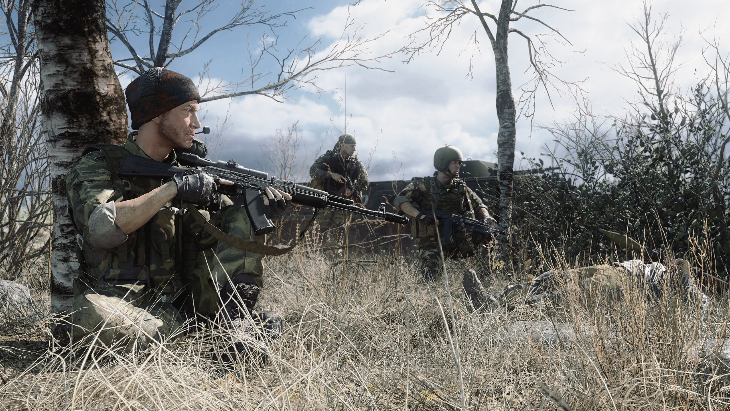
This image catches a very realistic and interesting atmosphere than other images might do. A lot of images can look very posed or modelled, which is quite hard to not do. However, the atmosphere I get here is very relaxed - post the moment which is usually made in images. I digress: the scene is great! The dull grass and shrubbery, a few trees, some kind of armoured vehicle in the back as well. The skybox/sky edit looks awesome as well. Lighting is great, the small amount of depth of field adds to it all as well. Just all round great image here.
Loving both the images here, the one with added blur more so. While the full width image is impressive and nice to look at, having that isolated portrait with the two cops in the background is also a very nice stylistic choice. I'm really liking the soft lighting as well on the buildings and mask - makes the entire image look like velvet and you've sold it fantastically. However, I do wish there was a little more in the background of the image. Doesn't have to be a massive change, but even like some birds knocking about, or a post-edit graffiti - scanner around the tree perhaps? The main content of the image is great though. Awesome..

This is a lot of sparks! I've got a feeling from what I can see that this was some kind of grenade suicide situation which went the worst way? I think that maybe this scene would've benefit from being a few moments before? Like building a scene with tension, maybe some people were stuck behind the guy and held hostage - the lighting is dark, two cops trying to talk him down... there's a lot of potential for a scenario like that to build and make something of. Otherwise: lighting is pretty good, the angle you've chosen is great as well - maybe just a little too many sparks coming from all over the place. Hope my ideas help!

I deffo do not have enough time tonight to go through all the drawings but they are great! I think I may have given some feedback before on some of these but must have been a long time ago, hope you get back into your hobby!


Loving the angle, there's a lot going for the scene here as well. Really like the dust that's been added to the bottom of the image as a kind of gradient which alleviates. I just think that maybe everything has been spaced out a bit much? Say we moved the camera a little to the left, zoom in a little bit - move the big robot thing on the right a little closer to the group - finally have the citadel clipping into image in the background and move the models around a bit so they all fit with their own screen space and you could have a really chaotic and fun looking action poster. It just seems to lose its touch at the edges of the image, hope you see what I mean. Nice work!!!

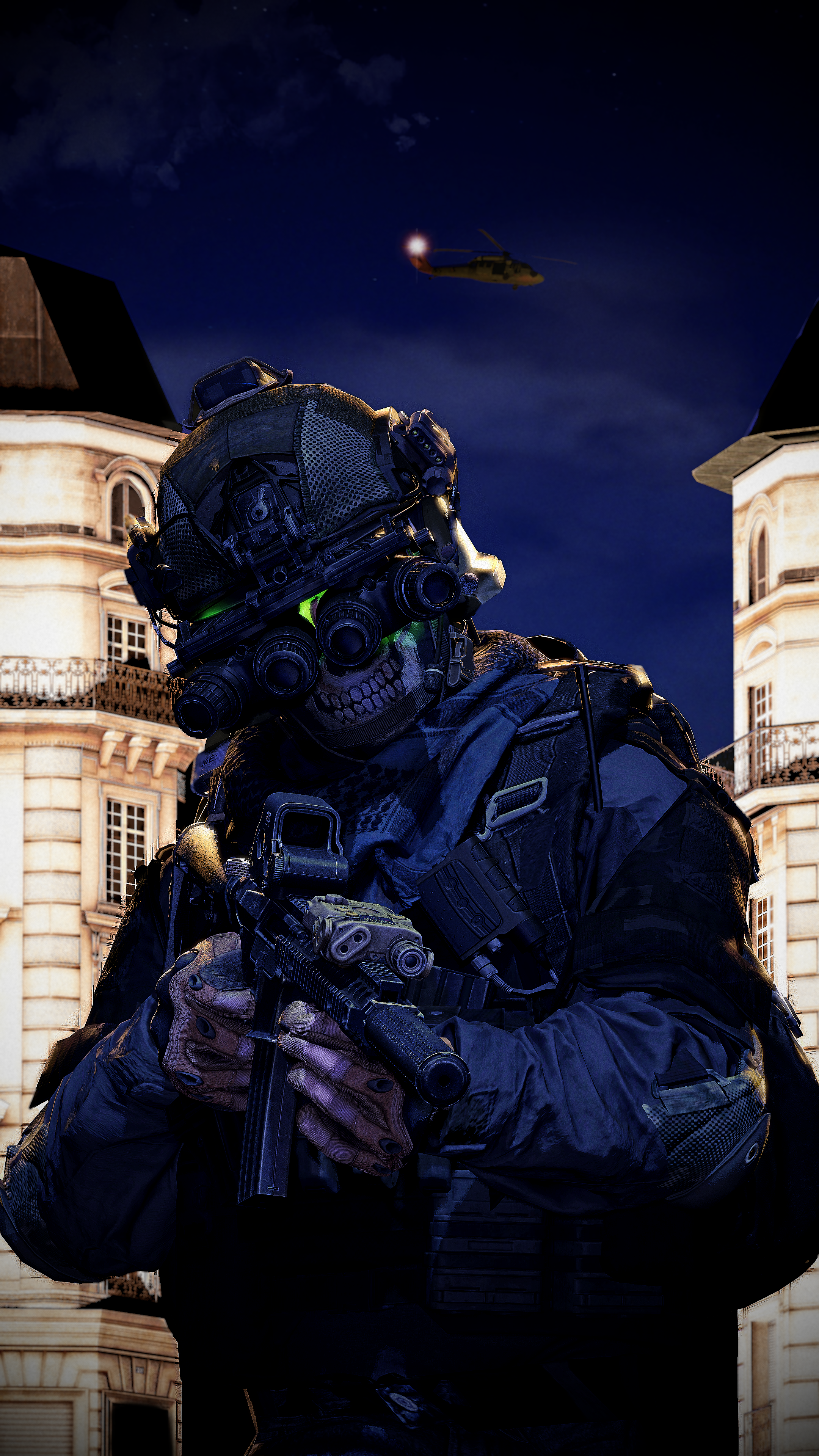
Loving the portrait angle, the model and colours at the front of the image. The background with the helicopter is a super nice touch as well. One thing that is a little off for me personally is the gradient/vignette at the bottom corners of the image? Don't think they were all that needed perhaps. Maybe some of the street lights could've hit more of the body of the soldier but that could just be me. The posture and hand posing is just great though, really captures that prowling patrolling soldier look. Expand your surroundings a little I say, and don't be scared to start increasing the width of these images to include things like: more soldiers, scene details, literally anything. Cool stuff.
-
This week, I'm really vibing with...
@Cavity and...
... @Dicknose ! (and not because you sent a nice message)
- Although both of the images are maybe missing out on those smaller little details, the body of them is great - and the shading / lighting on both is just great I think
Awesome submissions these past couple weeks guys (difficult to pick a favourite!!), was great to see what you've all been up to. Was mostly a lot of compliments in the feedback, you're all getting a little too good and I can't come up with a solid way to challenge your posts sometimes. Hope you found whatever feedback I had given as useful.
ttyl
Reactions:
List
steambored
Make no mistake, this is a one-way trip.
- Joined
- Apr 26, 2016
- Messages
- 1,207
- Nebulae
- 2,013
yeah, it took me a week and a half after i made that poster to realize that i did not have any of my startup commands at all, so everything looks not as good as it would have been.I think it's just the lack of shadows at the feet but aside from that I think this is a pretty image
and second problem was that shadows simply did not work as i wanted them at all, the lack of shadows on the soldier? yeah i couldnt figure out why the light simply refused to put shadows from the soldiers onto the ground, initially i moved the light up so it did give a bit of shadows but the problem then was i would have needed significantly more shadowed lights that would have overblended.
that and the shadows were massively blocky for some reason for them, probably due to no startup commands.
only took me a week and a half to realize why i felt so unsatisfied with all the shadows in my projects for about 2-3 posts here now
[doublepost=1626988748][/doublepost]also couldn't be arsed to do anything with the ground as sfm memory limit has killed any chance of making severe edits to it. that and these jap props are from world of tanks so its already ass to build around to begin with, as the way i have placed them makes making the road incredibly difficult, especially when i want to make it curve
Reactions:
List
- Joined
- Apr 25, 2017
- Messages
- 3,266
- Nebulae
- 4,349
I know precisely what you mean, it's exactly what I felt without being able to figure out why I felt it, Thanks for the input!Loving the angle, there's a lot going for the scene here as well. Really like the dust that's been added to the bottom of the image as a kind of gradient which alleviates. I just think that maybe everything has been spaced out a bit much? Say we moved the camera a little to the left, zoom in a little bit - move the big robot thing on the right a little closer to the group - finally have the citadel clipping into image in the background and move the models around a bit so they all fit with their own screen space and you could have a really chaotic and fun looking action poster. It just seems to lose its touch at the edges of the image, hope you see what I mean. Nice work!!!
Reactions:
List
Goonsworthy
Whatever happens, happens.
- Joined
- Oct 11, 2016
- Messages
- 2,052
- Nebulae
- 1,644
Yeah I thought about adding that stuff, but I am not that great with photoshop and it didn't look particularly good when I used props/particles. Otherwise, thank you for the praise!ould have maybe added to this with some tracer rounds going off between them perhaps? Just to sell the dogfight, otherwise this is fab - great work!
Reactions:
List
D
Deleted member 5162
Guest
PADEX
Electron
- Joined
- Apr 22, 2017
- Messages
- 827
- Nebulae
- 1,315

Goonsworthy
Whatever happens, happens.
- Joined
- Oct 11, 2016
- Messages
- 2,052
- Nebulae
- 1,644
- Joined
- Aug 23, 2016
- Messages
- 9,896
- Nebulae
- 36,540
Made this for a bio but i think i'm going for a different style, keeping this uploaded however

Reactions:
List
Viper
Neutrino
- Joined
- Jan 23, 2021
- Messages
- 36
- Nebulae
- 258

- Joined
- Aug 23, 2016
- Messages
- 9,896
- Nebulae
- 36,540


Goonsworthy
Whatever happens, happens.
- Joined
- Oct 11, 2016
- Messages
- 2,052
- Nebulae
- 1,644
I wish I could do 4:3 or a different aspect ratio in SFM. But it keeps crashing whenever I try to apply the overlay
Last edited:
Reactions:
List
Danny
Visual Powerhouse
- Joined
- Apr 26, 2016
- Messages
- 1,267
- Nebulae
- 5,181

Art of the Week
W.30/52-2021
On time, this time.
-
-
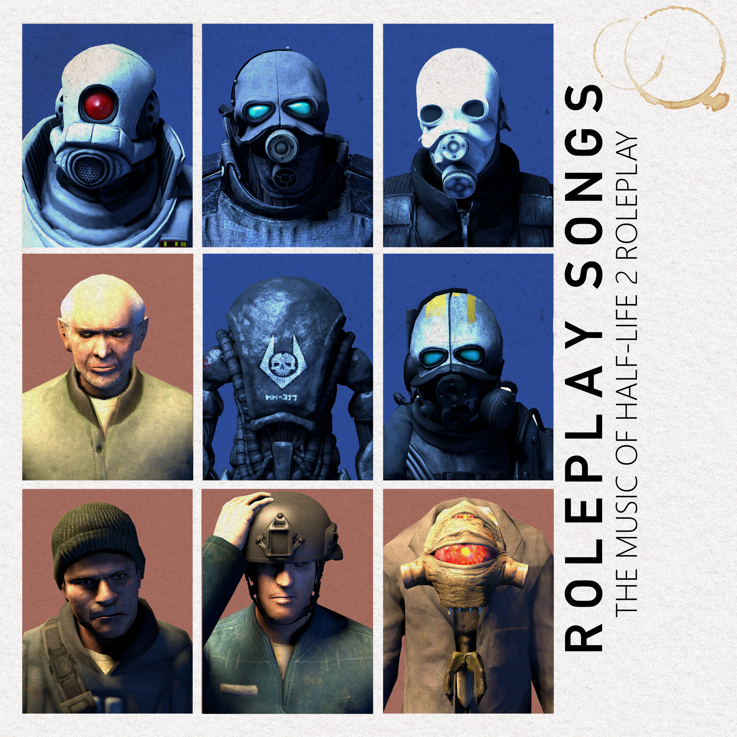
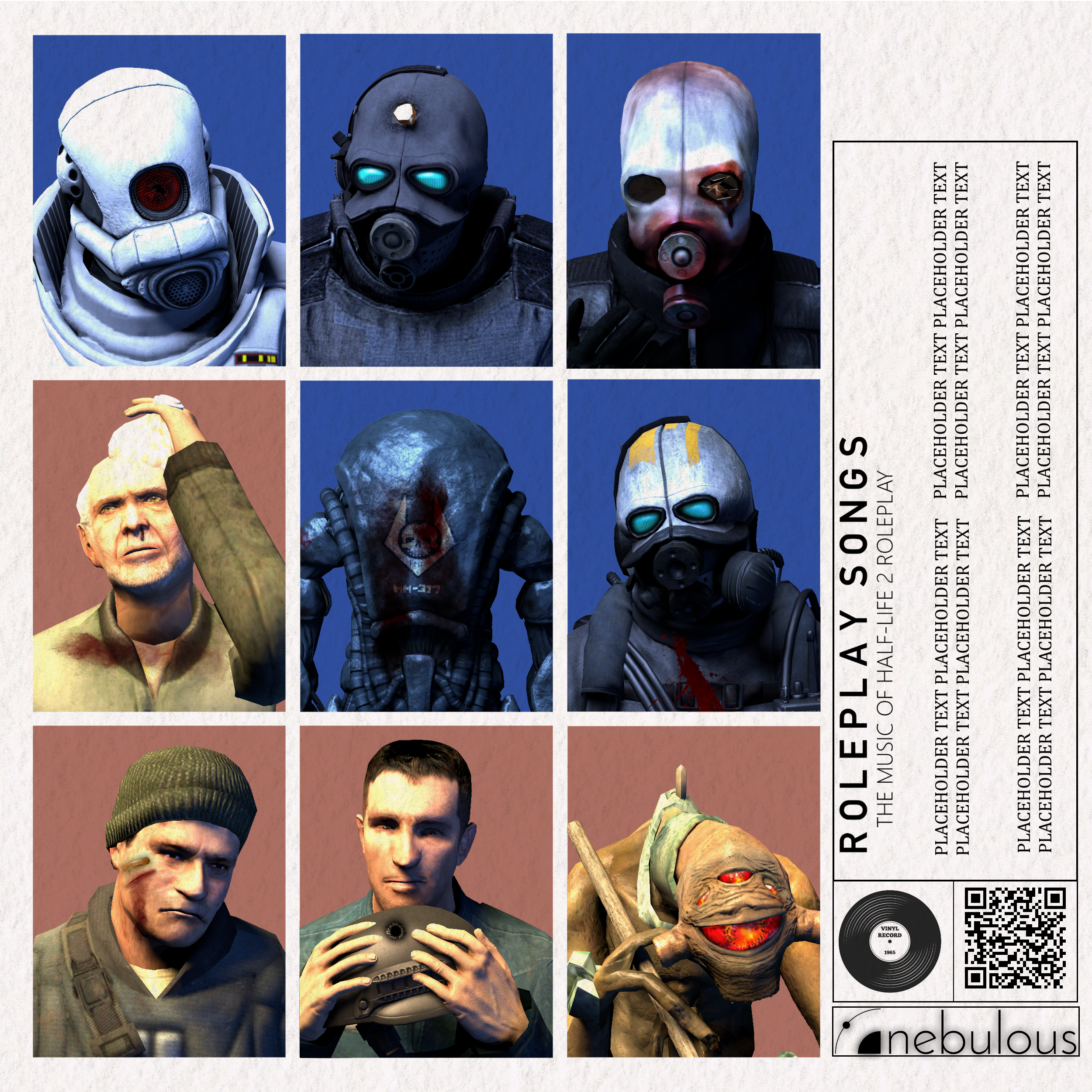
Loving this so much, the layout of each portrait works so well and having the back cover filled with injuries and other details is a great touch. This is one of those things that I can only nit pick on so allow me to elaborate on some details. For symmetry sake, I think it could've added if the middle portrait of the robot thing was just a dull grey that matches the two tones you've gone for - could have even been experimental with it maybe and tried some inverted colours and such to really draw the eyes in. The outer black glow on the nebulous logo is pretty weird looking, would have maybe added some padding like the vinyl and qr code as well so it looks all balanced and stuff - the boxes are a little misaligned too. Lastly, this is mainly for the front cover - general rule of thumb I've observed from some other album covers I copied in college is that (if the text is not upright,) the text's ground is usually the content of the image. In other words, I would've maybe put the front cover text on the left side, so that the bottom of the letters face the portraits. Ok, hope that was some useful insight and opinions, lovely work here man fr
Loving the drawing here, especially such a hard hitting colour with the pink as well. Can see some linking to the Cremator thing from hl2 but it's very loose - has some Elite vibes from halo as well with the main head figure. My favourite part of the puzzle is the clothing though, shaded so incredibly well with a real eye for material and what things should look like. I.e. the shawl, scaly-neck and arm, the jagged knife edges at the back of the neck are really cool as well. I can't draw so can't tell you how I would've done it, but maybe adding some more character with some patterns or insignia on the clothing would be the next step to personalising this thing you've drawn. Awesome work
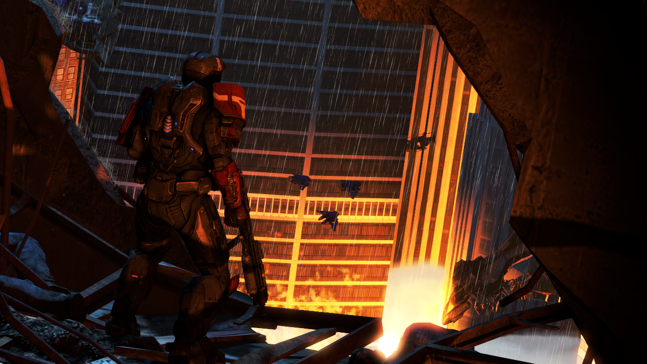
Very awesome looking stuff here, gonna say what I usually say which is maybe some more shadow lighting would be cool but it's all perfectly visible anyways. The water effects / reflection going on is super cool and well done as well. Not sure if you had much input with that or if it's the engine etc - looks fab though with the shrubbery getting involved too. The aspect ratio is a great touch, the image doesn't need the height - and the width of the scene gives off a great threatening energy. Would be cool to see this picture with some night time lighting with some flame-light flickering off the water and stuff... just an idea. I may have tried to fill the space on the far right a little more with maybe another skeleton soldier but that's just me, the tree at the back looks fine. Great as always Viper
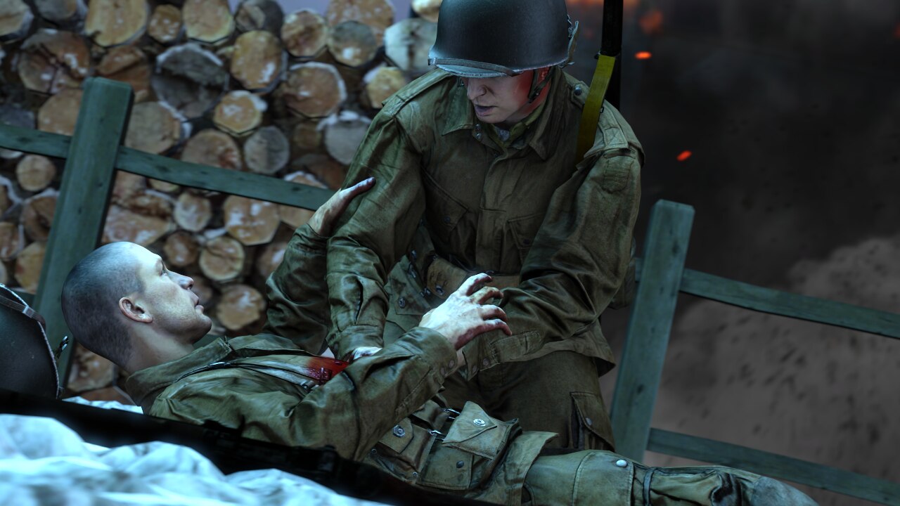
Really liking the 2D look that comes with this portrait you've posted this time. Gives off a kinda cigarette or tarot card kinda vibe with the lack of real details and just the body of the image. However, I do think some more consideration for some epic lighting could've gone a long way since this kind of looks like an image stuck between complete and missing those final couple things. If I was going for this vibe you've got going on rn, I would've angled the soldier more to the camera with some more wheat field behind the legs just to put them more in the centre in a 3d kind of way. The hands could maybe use some work but I appreciate that the actual bones can be a bit fiddly and hard to put right. So yeah, stuck between styles I think with this one. Still looks fab though, great stuff
Loving everything about this image here, the colours and gradient and how there's a clear coordination with the lighting of the image is just great. The body of the image itself is striking and super cool as well, the vines, diamonds/shards, trees and flowers just look awesome and bring a lot to the image. My favourite part is deffo the hand though. The gold and how it's shaded works very well, especially with the subtle reflection work going on as well. There is not much personality or character obvi - this could've been supplemented with maybe something like Viper did last week where there are little people knocking around on floating islands? Maybe a couple little buildings or something... but the content of the image itself is substantial already. Would be cool to see what the hand may be attached to? Hope to see more of the golden giant! Nice work as always Elan
-
This week, I'm really vibing with ...
@Elan and...

- Although one may be missing that little bit of character, I think that both of these submissions are pushing the boundaries of what both of you have been working on for a long time. These design choices are great, and maybe just need some small extra considerations for those little things which are missing or need some adjustments
- But that is just my opinion anyways
Click arrow to go to last week
Wrote this one a little different this time, just kinda wrote as I thought in my head to get this posted on time instead of thinking on things too long. Hope there was still some useful feedback in there somewhere. Great submissions over the weekend guys.
If you are still reading, was looking to decorate the front of the thread with something new. If anyone feels like making something or have something old which would look nice on the front page of AOTW, send it my way in a forum pm or something
ttyl
!
Reactions:
List
D
Deleted member 1974
Guest
Goonsworthy
Whatever happens, happens.
- Joined
- Oct 11, 2016
- Messages
- 2,052
- Nebulae
- 1,644
yo I'm proud of my photoshopping in this
[doublepost=1627525536][/doublepost]
yo I'm proud of my photoshopping in this
also does the dude's head injury look okay
Reactions:
List
