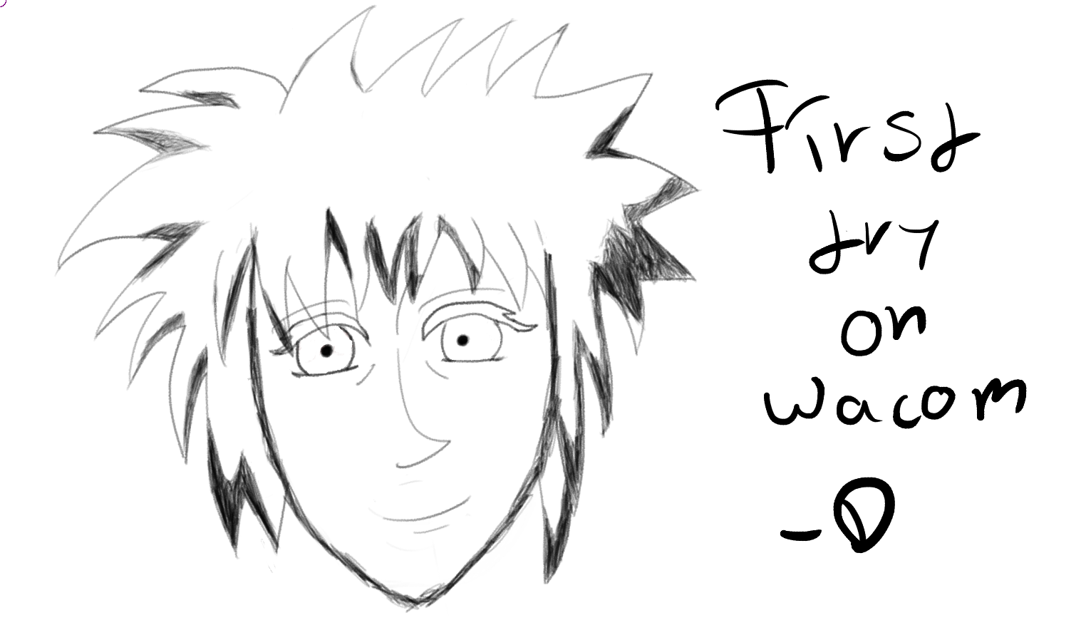
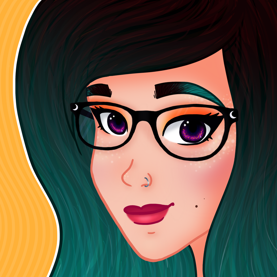
Hello friend, this is pretty alright for a first try.
If you're new to digital art there's a big difference to doing things traditionally. A big part of what makes stuff easier is being able to be sloppy as hell on sub-layers and then just... getting rid of them.
Specifically there's some weird stylistic choices that just don't work out here. If you want to keep them they need to be more refined and pronounced. Things like a beaky nose, bushy eyelashes but barely any eyebrows. The eyes are a pretty generic simple anime style. Everything else works pretty alright.
The big detractor here is the linework itself. A scratchy brush and inconsistent line opacity and thickness make it look very uncertain. Not to say scratchy and messy art is inherently bad. In fact, my own art style is moving towards that, but it's a very deliberate scratchiness in my case. In this case it's pretty clear you've bulked up the jawline to hide the odd shape. That extra padding helps hide your mistakes. I know that because that's what I used to do.
Actually, bit of advice. Thicker lines help hide all sorts of flaws and they're great to work with when starting out.
The big deal of digital art though is you can go wild with it much easier than traditional or SFM. Mess with layers, distortion, tools, drag and drop references, smash in colours, use multiply effects, use custom brushes. Whatever.
Software I'd recommend is either Paint Tool SAI, which is a perfect tool for digital art beginners. It's crisp and clean, only has a handful of simple but effective tools, and doesn't bog you down with a complicated UI, and comes with a built-in stabiliser that'll help hide wobbly lines until you get the hang of using a tablet proper.
After that, I use Krita a lot. It's like Photoshop but actually designed for artists with tablets. When using it I'd recommend the David Revoy brushpack.
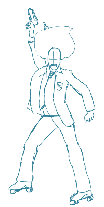
Here's an example of actually using some of these tools and techniques unique to digital art. An image I did in Paint Tool SAI, a sloppy sketch built up bit-by-bit by constructing stuff. This was made largely possible by being able to drag over references into the image and work closely with them compared to traditional media.
Start with a scrappy sketch, a vague idea that doesn't have to be neat, because you can edit this out by just hiding your layers
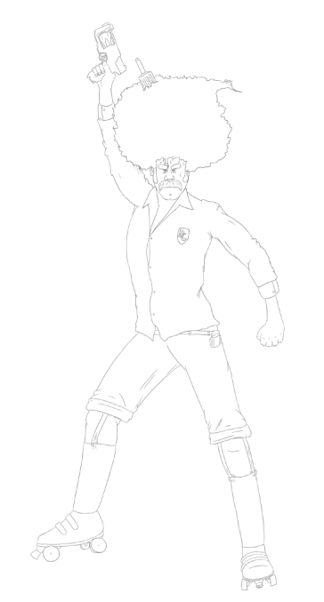
You can use that sketchwork as a framework. No shame in retroscoping your own sketches. Experiment with it as a skeleton, do loads of layers. This lineart here is sixteen lineart layers all edited and put together to make him look just how I want. If I decide I don't like part of it I can click it away without fiddly careful erasing, and still keep it as a backup.
You can even screw around and get creative with effects once you've got that down.
edit: Oh and buy an art glove. It's just helpful if you rest your hand on the tablet.