Aaaand I'm here. Sorry for the long wait, I'll post the results of everything that was posted past Monday tomorrow
@Exile, that's a solid improvement, especially with the framing. Although I can't say that I'm stunned by it, it still does look nice. If I were you, I'd now focus on adding something to the background, so that we have some artsy details to it besides the foreground. Overall, while I'm not an expert in this field, I'd say that it's a really nice foto for an album, but not necessarily entertaining alone. Still, I give a
@Dicknose, yeah, might've gotten a little bit too experimental and simplistic on that one. There simply isn't enough in the frame, and too much of the frame itself. I much preferred the first one of these series. I ain't stopping you from experimenting though, keep on doing it 'till you find what you're satisfied with
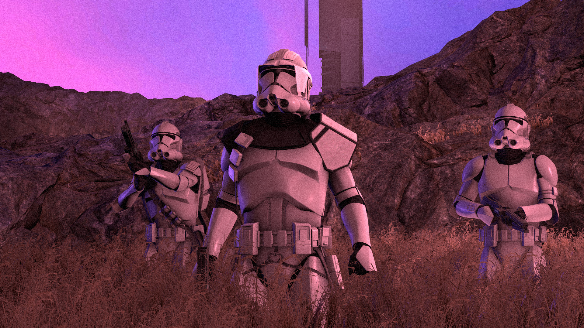
@Dallahan, your luck runs out buddy. If it weren't for the three guys at the bottom of this post, you'd get a goldie for certain. Imma give you a honorary, because not only framing here is pretty much perfect, but lighting as well. Also, we've got a fairly nice scene going in the background that fills us with the context of this pose perfectly. Simple, efficient, artsy.
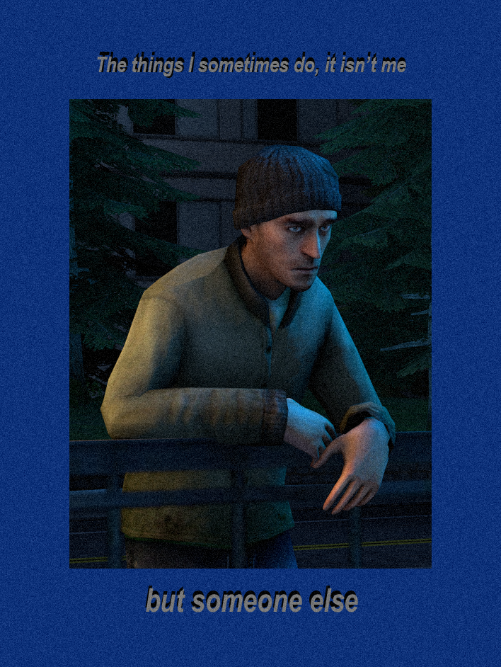
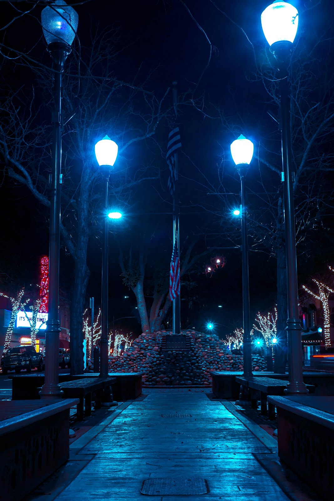
@Zombine, you really catched onto the fact that I like this sort of lighting and colors, eh? It's pretty good, and while the little rendering issue is noticeable, it doesn't really take much from the aesthetics, unless you zoom in. It has a real nice style and feel to it, like many of the "New York at night" photos you cna find in the internet. Me like, so me give
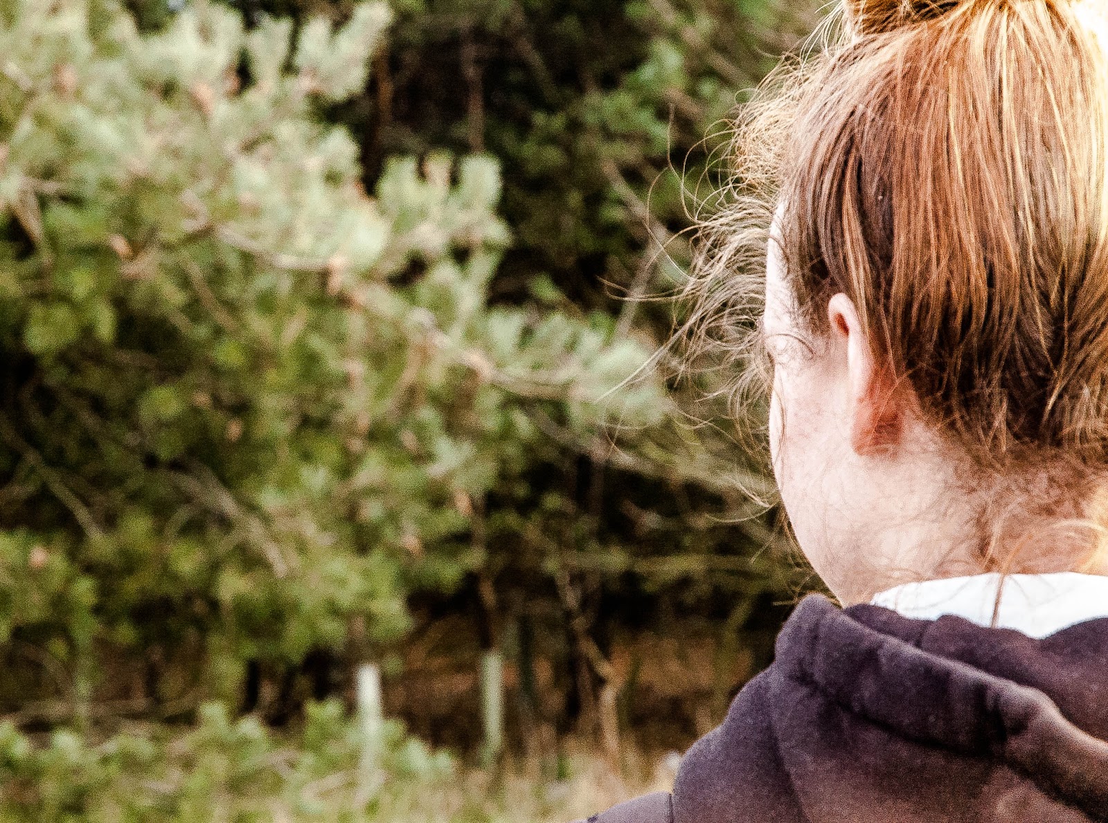
@liew, a real nice pose, and while still a little bit dark, I can now see everything with relative ease. Also, as
@Mateozz pointed out
looks like a map ripped straight out of cod zombies tbh
great job
it kinda looks like a clear rip, but I'm not sure, so I'm going to give you the benefit of a doubt and a
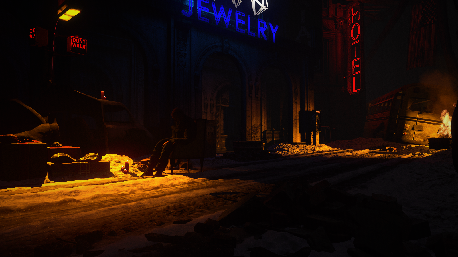
for amazing scenebuild. Solid lighting as well as neat atmosphere, but I struggle to see anything interesting here besides the scenebuild itself. If you'd add something happening here, be that zombies walking around, or even something HL2 related, it'd be far better. Either way, goodie, 8/10
@dee pixel, aside from the meme value, it's also a pretty neat model and effects put together, so I give a pure and simple
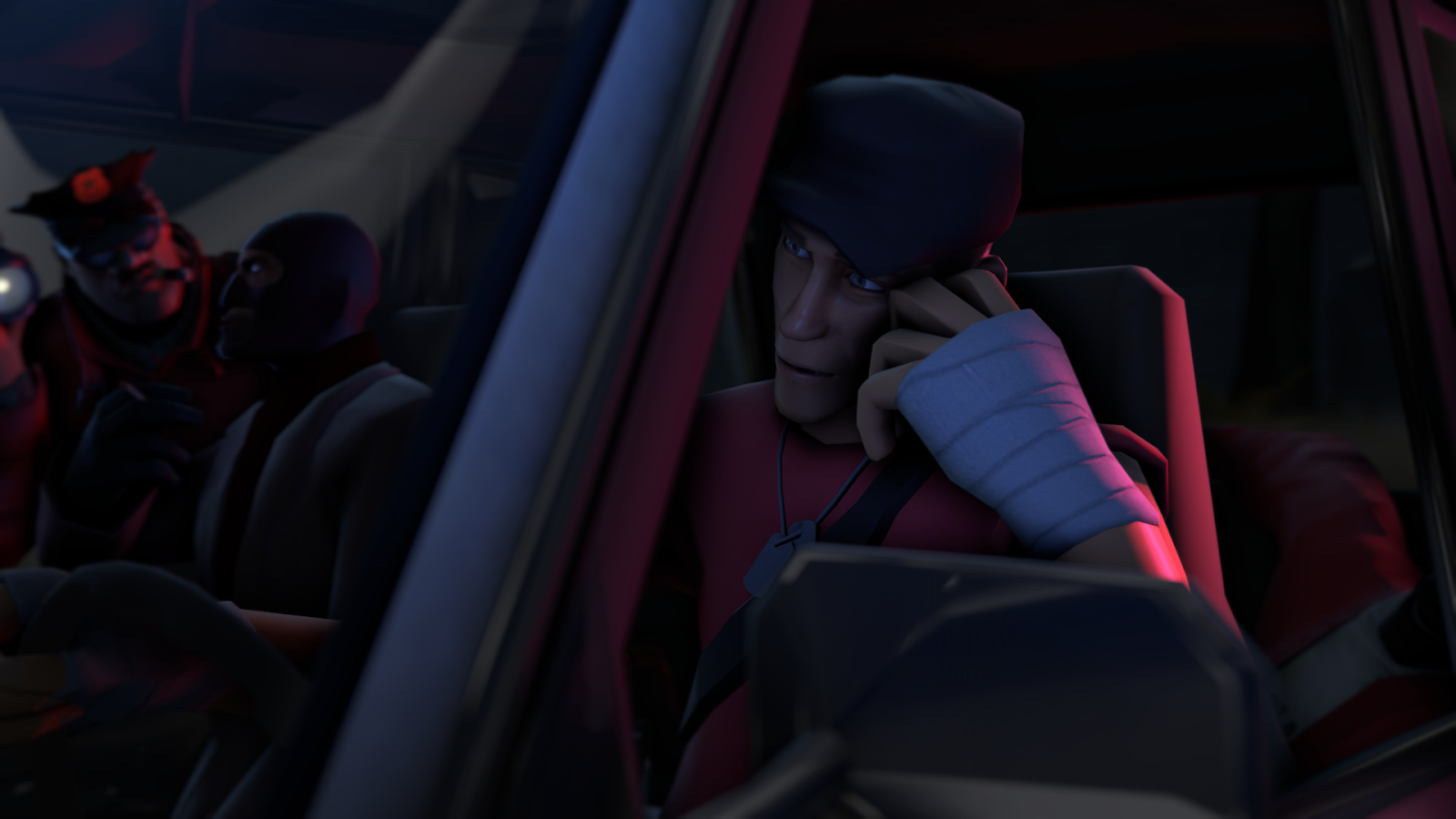
@Neythi, honestly solid poster if it weren't for the posing, especially on the left guy. Both of them look as if they'd be hanging on their elbows, or even floating, rather than sitting. The whitesuit looks real enough, especially with that light, but the man on the other side looks quite unnatural, especially with that faceposing. I'd personally give him some sort of leaning forward posture, with maybe lying his head on his hand or something, anything to make it differ from his partner in the talk. Pretty good otherwise, stuff like scenebuild and that window in particular looks very nice. Neat, but need a lil' bit of refining
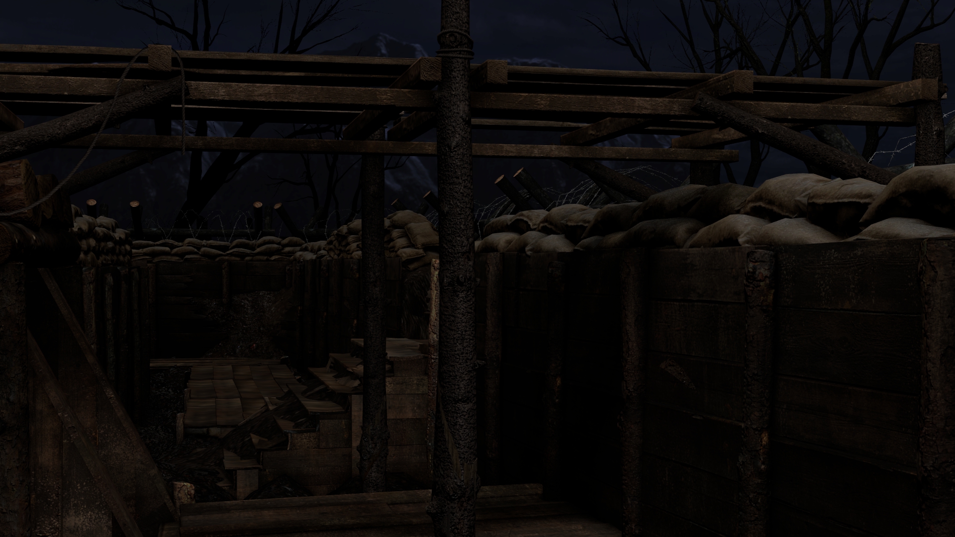
@Cavity, nice scenebuild, now make a pose with it. It's literally screaming for getting some story it deserves
So, as a conclusion, this round's winners. Because I simply couldn't decide which of you
is the best, all of you get a shiny, golden medal
@Charlie, this one is pretty obvious, so I'm not going to yabber nonsense
@Danny, perfect scenografy, really wide perspective. I'd only bump that sharpness and saturation up,
then you can post it on your Instagram or any other artistic place
@Cookie_, obviously as well, I love me some good scenebuild with many places to look at
See you tomorrow artistic peeps