gj Google
@4lpha, nice to see you back again, and thanks for the appreciation.
Good camera angle, although it could be moved a bit to the left, to meet the rule of thirds. I like the concept of it, but in all honesty, it looks more like a draft of some serious project rather than a fully made scene. The lighting you got there is simply too strong, and completly white, which is really unnatural. I'd go for shades of yellow combined with white next time, something similar to sun, and lower that intensivity. Another problem is what you did with your DoF setting, or rather, what you didn't do with them. Look up on
this gif to see how to properly set that sucker, so you'll get rid of those black grains all over your models, and get some classy shadows. Last thing I'd love to see change, is the lack of content in your pose. There is nothing interesting, nothing that'd enhance the story on that right side, you pretty much just put a cardboard box from a completly different century, and it isn't really adding anything. I'd honestly add some civils behind that soldier, and get that man one step infront of them, with his helmet in his hands, and dropping his rifle. That way, the scene would get a completly different meaning, an interesting meaning imo, a story about a soldier who refused to comply with an order to kill civillians, and instead, decided to join up with them, dropping his weapon.
But that's just how I see it fam
@MutumbaZomba, going for the atmosphere, eh? Can't say much about it, it's a good screen to be quite honest, but it lacks of content, and that is it's only problem right now. All you should do there, would be to simply add more life in that room, and behind that window, maybe a chopper flying by. That's it, really
@Cookie_-Chan,
i feel like this is a downgrade compared to what you usually post
|:grinning:
I like it's atmosphere and cold colours, but it lacks of that tensity
@Anleas had made with
his pose there. There's also the fact that Anleas did a far better work with playing around with lighting, where you placed maybe three lamps.
Meh fam, get good, get lmaobox
@Hydralisk, I like it, but it's missing few things. You sure did keep the tensity there up, but that elite on right seems to be just
thinking about the sense of his life. There could be some dead bodies, blood on the walls, broken tables, all that to add in some atmosphere. Is ok tho
@SkinVest, to be frank, I liked the one that got into The Hall more. The one you have right here is very empty, zoomed out unnecessarily. In all honesty, you were going the right way before, now it looks far more as if you'd be a complete beginner, which you are not. I love the atmosphere of your poses, but this time, the darkness just makes it hard to even see anything there, which lowers the visible content. You're loosing that mystery vibe you had before fam, go back
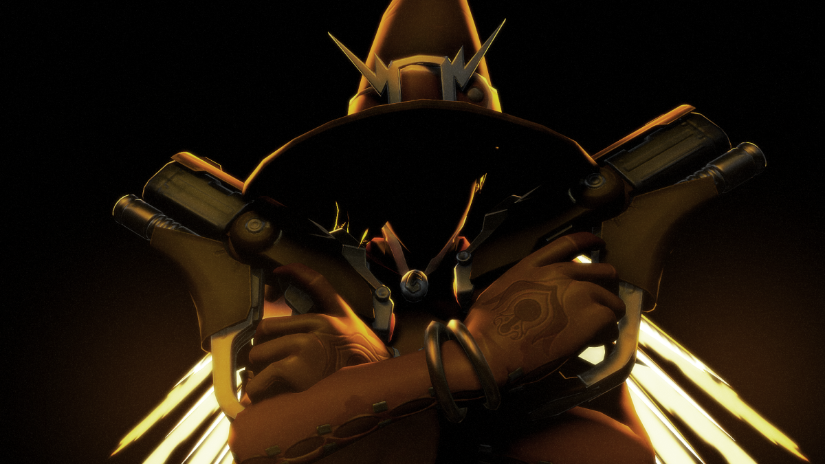
@MaXenzie, is that Mercy-Reaper-Tracer?
@PsychoParek, didn't see your submission when I posted this originally, aa
I like what you did with lighting, it gives the pose a bit of that 'plastic' feeling, like in TF2. The main problem I have with it, is that there's no real target there, which could've been simply fixed by placing one cop somewhere on the line of sight we have with that strider's left leg, just bit closer to the camera. I'd also add in more f them ragdolls and props, but otherwise it's pretty good. Conceptless, but good, something that could be a loading screen after the needed polishing
@Anleas gets promoted to the pros,
earning himself a partial ban like others