AOTW 18 of 52, 2021
this album cover fire tho
been goin through it recently, here's my opinion in no particular order:
Disclaimer, I can't draw and thus my opinion can be lame - now with the following feedback:
Brilliant work here MJ, love the different depths and widths with the lines that really give off a proper frame of dimension on the whole coin. I think the small lines going around the edges is a seriously good detail that just looks perfect and fits the rest of the shading on the whole image. Personally think that the helmet/hair/top of the head is a big achievement out of the whole thing with all of its curves and majesty.
BUT. and hear me out on this one. Depending on the size of this as a tattoo, Idk if its possible to get all of your little details in. Like in my head I imagine this will at least need to be the size of a hand to get
all those super little lines and delicate details in with good precision. Then again I am sure you took this into account, I don't know much about tattoos or how big it's gonna be anyways. Super duper good work here :^)
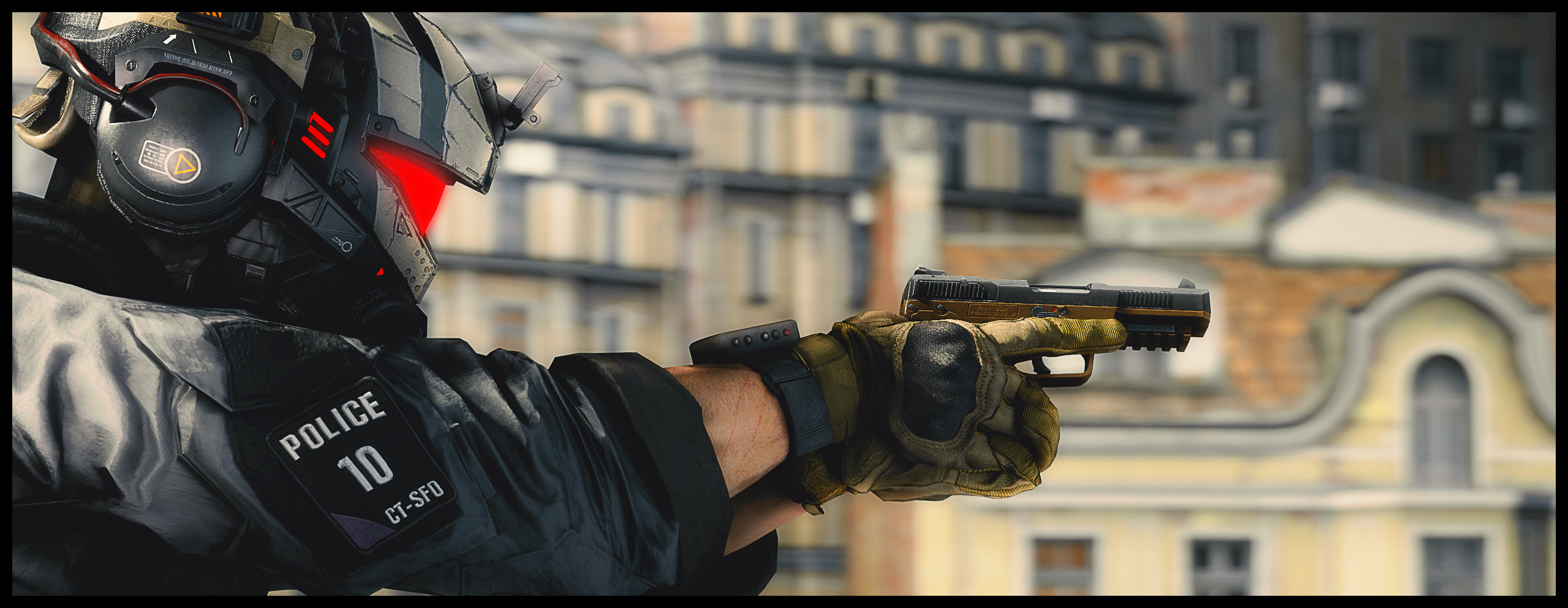
We got the LIGHTING, we got the POSE, we got the BACKGROUND, we got the COLOURS we got that ASPECT RATIO. High action, high calibre, it's almost deafening to me how much character this picture holds before it even gets to the hand holding the weapon. BUT what are the INTENTIONS. There's the feedback you may have wanted; what is this soldier looking at? Why are they hesitating? You've got some character in there but maybe it is just missing the real something we should have been looking at. Hope that makes sense. Great image.
Tell you what I've realised though, you've really only ever submitted modellings (at least that I can remember in my head). The scene always seems secondary to you but you're really good at just posing the actual models themselves into convincing positions. Challenge yourself! You're breathing through these! Find smn that'll choke you up a bit I say, you may just break into a new style too and consider more things for your images (if you really wanted to).
This is a brilliant scene build, however it was made or whatever you made it with: you've made some real progress developing this skill and the small little details in this picture make it worth it. Personal favourite is that the boat isn't empty although it's subtle, followed by the volume of light shooting out the top of the lamp then glowing AROUND it, super good detail. Then the little light bugs and such in the fog. If I had to say something I didn't like, I'd maybe nit pick and say the moon is hella bright for me at least but it fits pretty well really. Great work!
Some nice stuff here Ant, I'd even say you had all the pieces in the right place but was just missing one key solid effect which is some depth of field and some more gently lighting techniques. Like if the tree and soldier was gently out of focus and the rest of the image blended together with an extra mountain in the back perhaps: it woulda been a solid thing. If you still have the files I think you should give it some more nudges till something sticks. I really like this scenebuild albeit, maybe a little too tall of a final image. Like idk about you but having to scroll thru a whole page to see the image in full on forums can be a massive faff. "But danny the citadel too big" then tAKE THE guy and treE bACK A LITTLE. You have the power. You can do it. Keep it up :^).
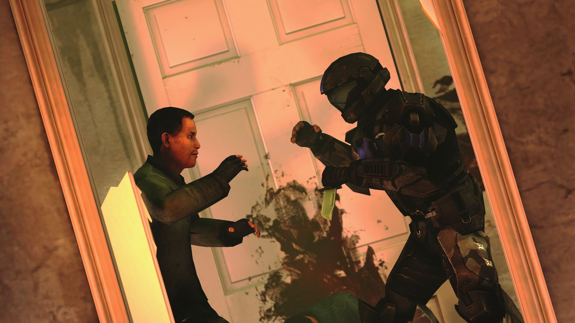
Ya were on to something here, the pose and the angle is super cool but I really think the lighting is missing some power. Like imagine if the lighting going through the doorway was like pure red evil and stuff, then in the hallway its kind of an ambient orange from flames around them - the shadows are dark and have solid lines so it looks like they are having their own fight on the wall behind. So yeah, scene's great just really dipped on the lighting. Woulda seen some more details on the armour too. Noice stuff.
-
Yeah yeah give it up for the square images from
@Elan and @>MJ
it's hip to be square
-
badabing, badaboom
Hope I was useful
ttyl