Serious [Review] Art of The Week

D

Deleted member 5162

Guest

just in time

that's cool and all, but

maxresdefault.jpg
 
Reactions: List

Dicknose

Whatever happens, happens.
Joined
Oct 11, 2016
Messages
2,048
Nebulae
1,632
67E780A2F9B30381779DEEEC695AF68ACD1F9FBD
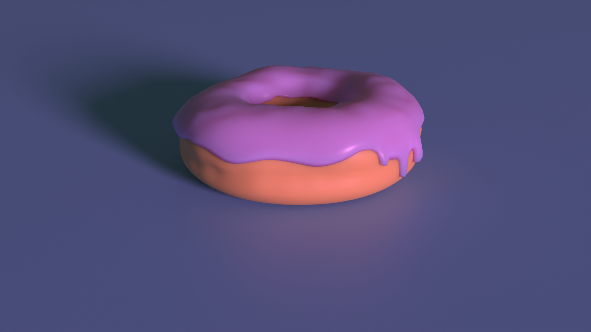
Sorry for my inactivity, I've been feeling HUGE burnout when it comes to SFM. So with that said, I'm learning blender and all of it's quirks. This is my first render, which I'm going to expand on
 
Last edited:
Reactions: List

Danny

Visual Powerhouse
Joined
Apr 26, 2016
Messages
1,267
Nebulae
5,181
AOTW 16 & 17 of 52, 2021


The layout of the magazine cuts is great and the posing looks like all that is neccesary to really get across the theme you're making here BUT it's so darn dark. Needs some light. Even if it is just some spotlight you could perhaps use that kind of thing to your advantage with it being a magazine art style. The text and bubbles are great but maybe a way to differentiate ambient things from voices would be cool. I get they have different edges but a different colour all together would probably be better. Nice work

Yeah yeah buddy keep posting buddy, your real good at what you do don't need to hear it from me - and you know what I'mma be a real dick and say that blossom tree leaf/petals aren't meant to be see through. You thought no one would notice huh? Well I DID, and that's the only fault here- nuh-uh don't try telling me something in motion makes it see through sometimes to the human eye AND You know what maybe you're right BUT petals don't move that fast. Besides that - Perfect image. :^). Lighting is great, composition is mwah, chefs kiss.

Few things here. There's a lot of LIGHT in the image but not actually any BRIGHTNESS which I hope you can understand the difference between. Like it doesn't look right and the only shadow that may portray this lighting is on the left side (idk what it is). Other than that the blur could maybe go a little? Like there are some good details in the face of that character it just needs some inner-shading. For example, hair positioning is hella cool but it has like no defining lines or many harsh changes in colour to really give the hair volume. Keep it up Yurrie!

Group selfie, hella cool. I like when you put a lot of models together for an image because even though it's simple - all the faces seem to fit together or show a different emotion. No space has been left unfilled here and you've made the most of absolutely everything. Personally I like the hawk at the back. Only PROBLEM. Which is out of your control is the contrast of quality or natural lighting that most models have. Like some just have darker textures than others which can make depth confusing but thats outta yur hands really. Nice pic.

I cannot seeeeee there is nothing heeeeeeeeeeeeeeeeeeere, it's too daaaaaaaaaaaark and zoomed out tooo faaaaaaaaar. Like c'mon man gimme a break I gotta open this in a new tab and zoom in to get a good look? You're on the right tracks now what I wanna see is FIRE COMING FROM THE DEPTHS BELOW, THE SHADOWS OF THE PATHFINDERS CAST UP ON THE ROCK SURFACE DEPICTING THE REAL DEVILS VENTURING THE SANCTUM OF THE DEEP WITH A TIGHTER ANGLE THAT SHOWS ALL THE CHARACTERS IN THEIR OWN TWISTED AND EXPRESSIVE MOVEMENTS. Get to it I hope that is useful feedback or inspiration. Work on that lighting. Like if you're only gonna have ONE light source and it's SMALL make it expressive or exaggerated imo


Ah fuck this is so damn cool, the music is such a great touch as well and the angles and the movements and the aaaaaaaaaaaa. Great work. Really great work... now... do a full scene :^).

I don't forgive you for the side ways pic. But once I saved the pic and turned it round through photo viewer it is better. Mega cool landscape the shading is just so well done especially the change of surface in the road corner. Definitely not something I would have thought of in my own sketches. This is the perfect balance to just enough details for a style and it's just brilliant. I really don't know much about drawing and can't give much feedback but if my positive thoughts get you to do more then; I hope you draw more! And maybe see if you can draw something from your head to challenge yourself perhaps? Could be
interesting

Wowie! A render! The lighting is so crisp and the camera angle is pretty tight too!. Even the smaller details like the reflections from the glass cup is pretty neat thought Idk how much control you have over that. The wall in the back looks kinda gummy and shiny but this is a cool image / render!

Much like Dicknose's, this is a very cool render and what I especially like about this is the range of motion being shown (albeit maybe missing some cool motion blur, only a little bit). Like the angle of the ball and the pins look fab and seem to make pretty good sense. Don't have much feedback to give besides to keep at it, rendering images like this is a good skill if you plan to make something of it all :^).
-

I don't really have a favourite this week because all these submissions are super good! Some may need some further experimentation and touches but the work that's been put into these is totally noticeable and fab

Great stuff guys really, keep it up

Hope that whatever feedback I gave was useful and apologies for lateness - been very bogged down with my reports and stuff recently. Deadlines and that.

ttyl
 
Reactions: List

>Luna

Proton
Joined
Aug 13, 2017
Messages
191
Nebulae
815
daniel i have come out of neb retirement to harrass u into r8ing the blackwork tattoo i desgined for my fren this week :^)

its a mercury dime !!

image0.png
 
Reactions: List

Danny

Visual Powerhouse
Joined
Apr 26, 2016
Messages
1,267
Nebulae
5,181
AOTW 18 of 52, 2021
this album cover fire tho

been goin through it recently, here's my opinion in no particular order:

Disclaimer, I can't draw and thus my opinion can be lame - now with the following feedback:
Brilliant work here MJ, love the different depths and widths with the lines that really give off a proper frame of dimension on the whole coin. I think the small lines going around the edges is a seriously good detail that just looks perfect and fits the rest of the shading on the whole image. Personally think that the helmet/hair/top of the head is a big achievement out of the whole thing with all of its curves and majesty.

BUT. and hear me out on this one. Depending on the size of this as a tattoo, Idk if its possible to get all of your little details in. Like in my head I imagine this will at least need to be the size of a hand to get all those super little lines and delicate details in with good precision. Then again I am sure you took this into account, I don't know much about tattoos or how big it's gonna be anyways. Super duper good work here :^)

We got the LIGHTING, we got the POSE, we got the BACKGROUND, we got the COLOURS we got that ASPECT RATIO. High action, high calibre, it's almost deafening to me how much character this picture holds before it even gets to the hand holding the weapon. BUT what are the INTENTIONS. There's the feedback you may have wanted; what is this soldier looking at? Why are they hesitating? You've got some character in there but maybe it is just missing the real something we should have been looking at. Hope that makes sense. Great image.

Tell you what I've realised though, you've really only ever submitted modellings (at least that I can remember in my head). The scene always seems secondary to you but you're really good at just posing the actual models themselves into convincing positions. Challenge yourself! You're breathing through these! Find smn that'll choke you up a bit I say, you may just break into a new style too and consider more things for your images (if you really wanted to).

This is a brilliant scene build, however it was made or whatever you made it with: you've made some real progress developing this skill and the small little details in this picture make it worth it. Personal favourite is that the boat isn't empty although it's subtle, followed by the volume of light shooting out the top of the lamp then glowing AROUND it, super good detail. Then the little light bugs and such in the fog. If I had to say something I didn't like, I'd maybe nit pick and say the moon is hella bright for me at least but it fits pretty well really. Great work!

Some nice stuff here Ant, I'd even say you had all the pieces in the right place but was just missing one key solid effect which is some depth of field and some more gently lighting techniques. Like if the tree and soldier was gently out of focus and the rest of the image blended together with an extra mountain in the back perhaps: it woulda been a solid thing. If you still have the files I think you should give it some more nudges till something sticks. I really like this scenebuild albeit, maybe a little too tall of a final image. Like idk about you but having to scroll thru a whole page to see the image in full on forums can be a massive faff. "But danny the citadel too big" then tAKE THE guy and treE bACK A LITTLE. You have the power. You can do it. Keep it up :^).

Ya were on to something here, the pose and the angle is super cool but I really think the lighting is missing some power. Like imagine if the lighting going through the doorway was like pure red evil and stuff, then in the hallway its kind of an ambient orange from flames around them - the shadows are dark and have solid lines so it looks like they are having their own fight on the wall behind. So yeah, scene's great just really dipped on the lighting. Woulda seen some more details on the armour too. Noice stuff.
-


Yeah yeah give it up for the square images from
@Elan and @>MJ

dXiFVIJ.jpg

image0.png

it's hip to be square
-

badabing, badaboom
Hope I was useful
ttyl
 
Reactions: List

deathwolf

I AM SPIDERMAN, GRIST LIES! I AM HIM REALLY! ﷽﷽﷽﷽﷽
GTA RP Playtester
Joined
Aug 23, 2016
Messages
9,729
Nebulae
35,938
first ever scene build using GM black and soft lamps and stuff :)
mefVnJt.jpeg
 
Reactions: List